Finsta by Werklig
Opinion by Richard Baird Posted 4 March 2014
In an industry that deals with clients who find themselves in a crisis or distressed and where business is often perceived as cold and insincere, Finnish law firm Finsta is a keen to position itself as empathetic and trustworthy.
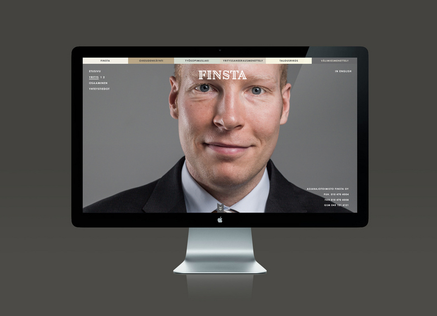
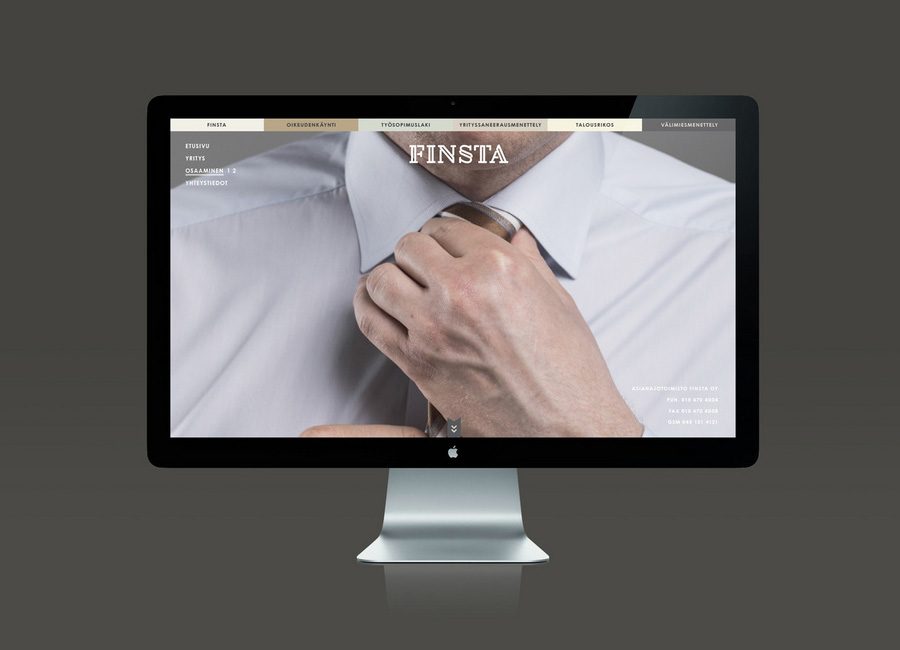
Design studio Werklig worked with Finsta to develop a new brand identity solution that, through an approach that disregards the visual conventions of the industry—bookshelves filed with law books, scales weighing right and wrong and generic stock photos—draws on the interests of the people that make up the firm to humanise and personalise their service.
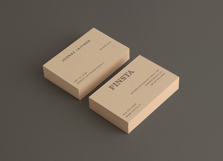
“Overall tonality for communication was found in the passions of our client’s leisure time. By concentrating on things closest to our clients heart, we were able to find a mirror for portraying our client’s values and ways of conducting business. Humanity, perseverance and will to fight for the best interest of clients were manifested through images of hiking and boxing.
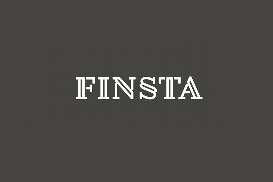
Finsta’s logo is based on the formulation of the letter s. It was adapted to fit the industry symbol § (clause in Finnish law literature). To prevent too banal highlighting of the symbol §, the same design thought was carried in all letters of the logo.”
– Werklig
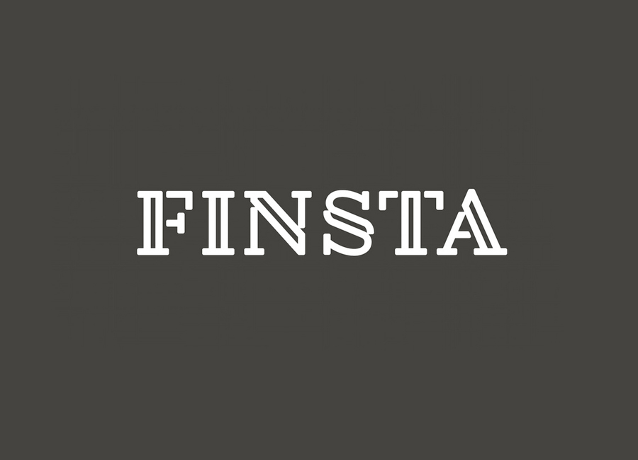
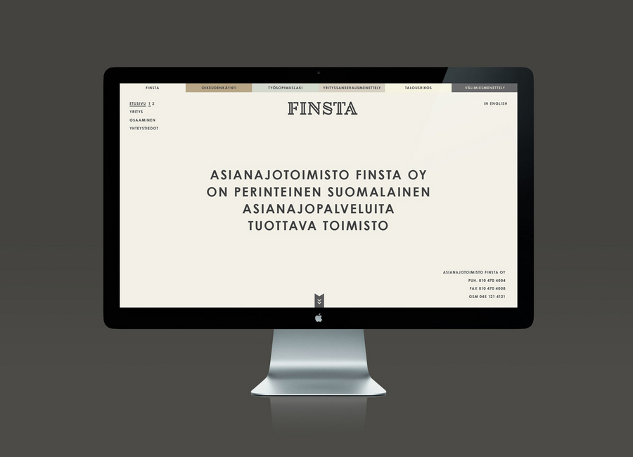
While I would not expect the the § symbol to be understood by a broad demographic it does, however, provide a reasonable starting point to inform the rest of the logotype. Its stencil cut, slab-serif, uppercase characters, softened by rounded corners, are distinctive and well balanced. Aesthetically it is a little much for me alongside the influence of the photography but it is easy to recognise and appreciate the communicative priorities of authority and accessibility in its ideation and how this also resonates through the coloured board of the business cards and the warm and complementary colour palette of a responsive and current website.

The images are an unexpected mix of formality, aggression and the outdoors (check out the full image set here), a reflection of the personal lives of Finista, dogged determination but also of reliability and professionalism. It is a familiar emotive approach but with a new approach to content, one that might perhaps be lost on visitors, but the intent to provide communicative breadth to the founding aesthetic of the logotype is sound.

