The Parliamentary Ombudsman of Finland by Werklig
Opinion by Richard Baird Posted 6 March 2014

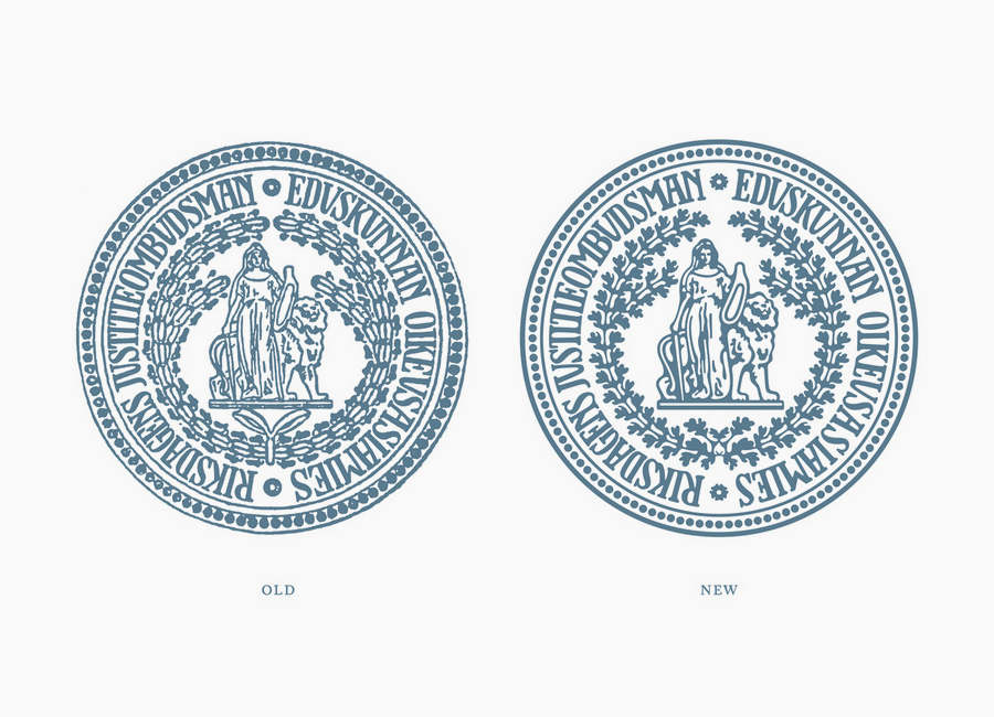
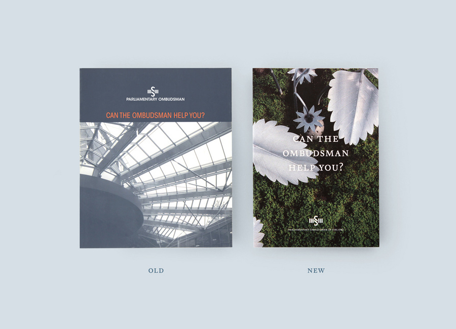
Design agency Werklig recently worked with The Parliamentary Ombudsman of Finland to renew its visual identity. Keeping in mind the significant heritage of a public advocate founded in 1920, Werklig’s approach is appropriately subtle in manner, with the intention of maintaining the “recognisable visual language of the Ombudsman.” Changes were carried out based on usability and legibility, with many being implemented to improve the quality of reproduction.

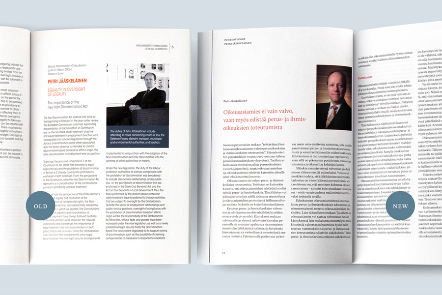
The result is a great example of a refresh rather than a complete revision. It manages to leverage the heritage, authority and integrity already associated with the traditional detail of the seal, the economy/modesty of a desaturated single colour logo, and the more recent sans-serif typography and symbol, neatens these up and revises the print layouts to meet contemporary expectations.
The introduction of art and public servant photography and keeping the conversational approach to print provides an important humanistic dimensionality, an accountability and perceived transparency now required from such offices.

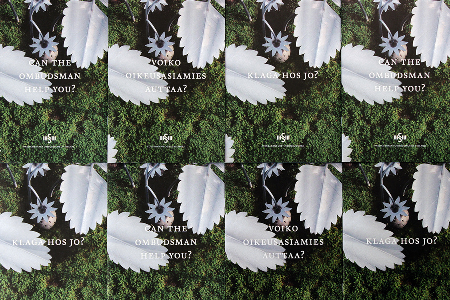
“Photo narrative was based on art objects that are in connection with the Ombudsman’s office. Aimo Katajamäki’s “Wood People” was used as an allegory, representing people of Finland. To lighten up the mood in brochures Jukka Lehtinen’s “Where the Strawberries Grow” was used as a pictorial motif (photo by Pertti Nisonen). New and more human photo style was introduced in personnel photos, too (all personnel photos taken by Tomas Whitehouse).” – Werklig
