Single Origin Roasters by Maud
Opinion by Richard Baird Posted 11 March 2014
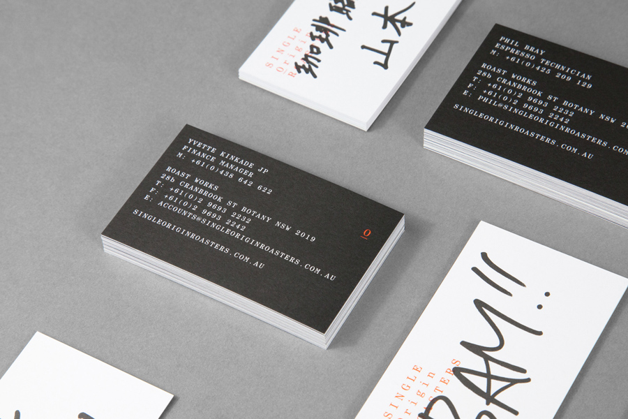
Single Origin is a Sydney-based coffee specialist with a roast works in Botany and a cafe in Surrey Hills. Single Origin approached Maud to create a brand identity solution—which included logo design, stationery and packaging—that would reflect the low-key nature of the brand, the founders’ desire to avoid any notion of commercialism and help them expand into new markets. In a ‘category rife with style over substance’, Single Origin is described by Maud as a ‘beacon of integrity’.
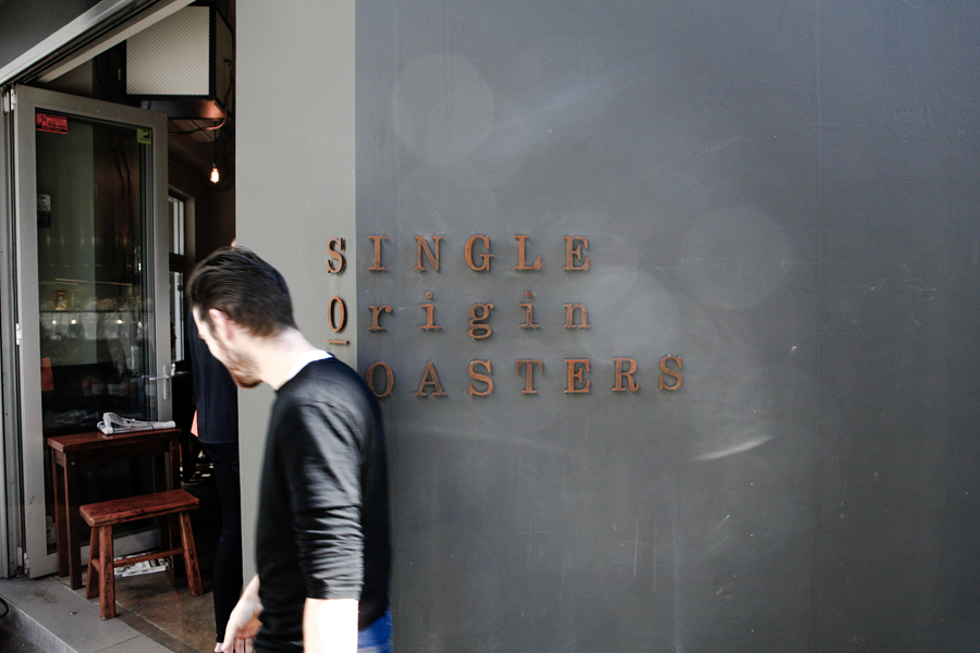
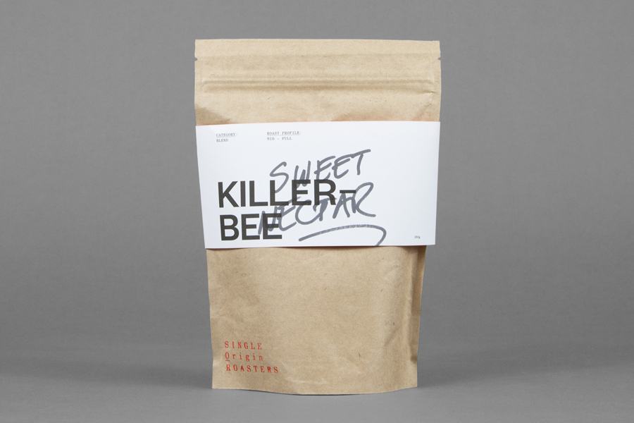
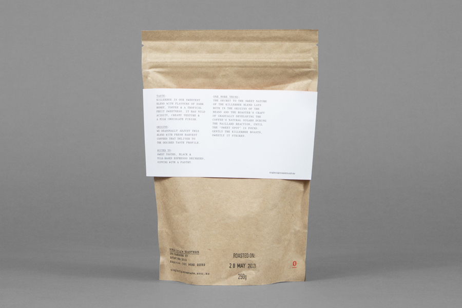
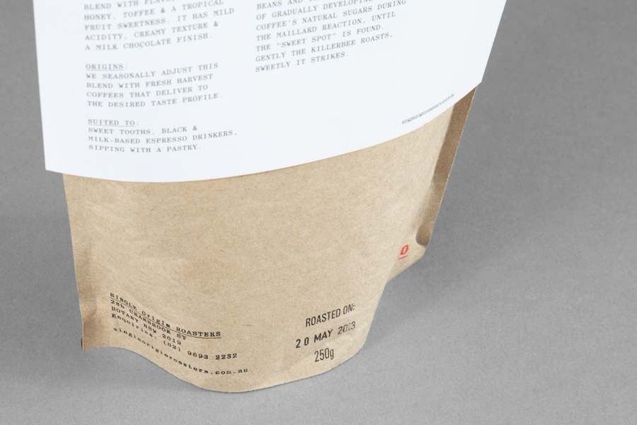
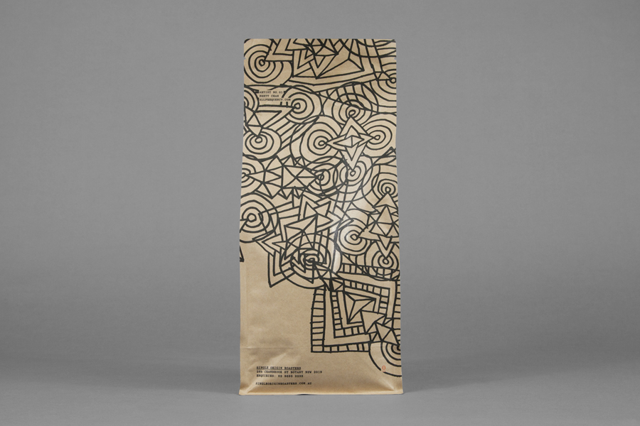
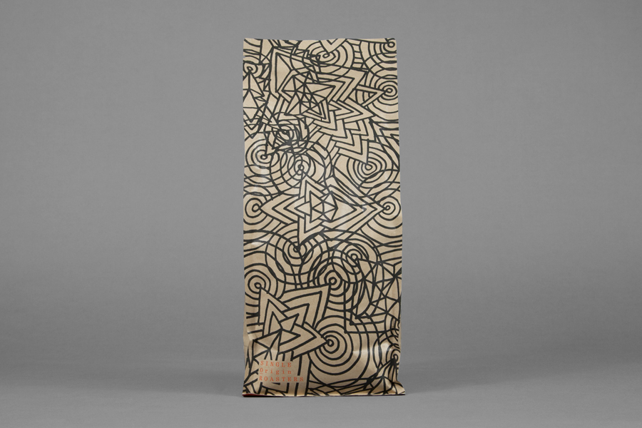
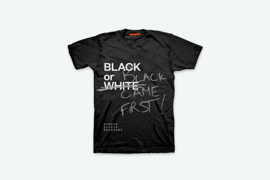
Through the contrast of generously spaced, uppercase and condensed serif characters, the utility of an off-the-shelf uncoated, unbleached structural choice, weathered signage and the individuality and energy of a handwritten script and illustrative detail, Maud’s design approach ’embraces the spontaneity and personal expression of the brand’ and “celebrates the relationship between ‘art’ and ‘science’ in coffee making.”
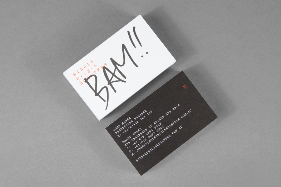
The small-scale nature and perceived locality of the solution is familiar but very well executed with a practicality that avoids appearing homemade. It has plenty of individuality and communicative value in the conversational and mixed language approach to script, the bold headline functionality of a sans-serif and the urban art of the illustrations, cohesive in their marker pen finish. It is a combination that could be easily expanded upon to accommodate a variety of styles and messages anchored by a consistent logotype and information layout that serve as a reminder of the reliable good quality that underpins a expressive personality.
The result is an interesting, well balanced and current fusion of urban industriousness, utility and art, quality, commodity and personal service.
