Slåke Møbelfabrikk by Ghost
Opinion by Richard Baird Posted 7 April 2014
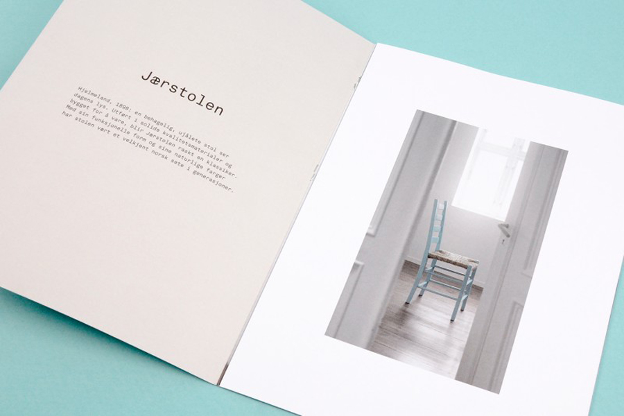
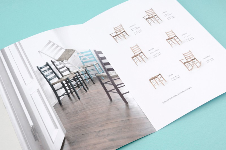
Slåke is a small furniture manufacturer, located in Norway’s Hjelmeland, with a heritage that dates back to 1938. Although it produces a variety of contemporary pieces it is also known throughout Scandinavia for making jærstol, a traditional, high quality, wood and reed chair.
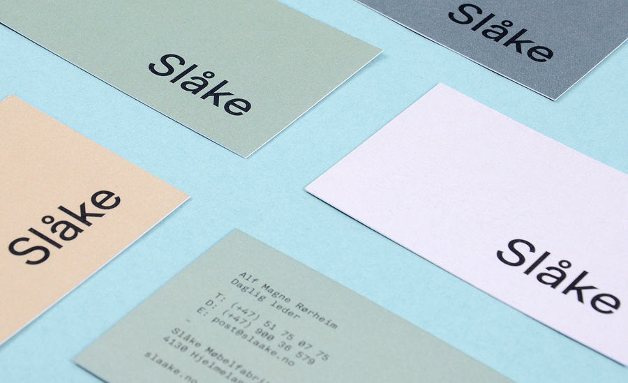
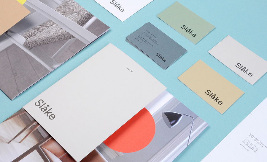
As part of its 75th anniversary Slåke commissioned Ghost to develop a new brand identity—which went on to include logotype, stationery, print and website design—that would reflect its continued commitment to the creation of new classics, influenced by the ‘Nordic design language’, and crafted by its team of ‘young, innovative designers’, and to safeguard its heritage whilst looking to the future.
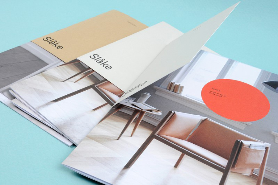
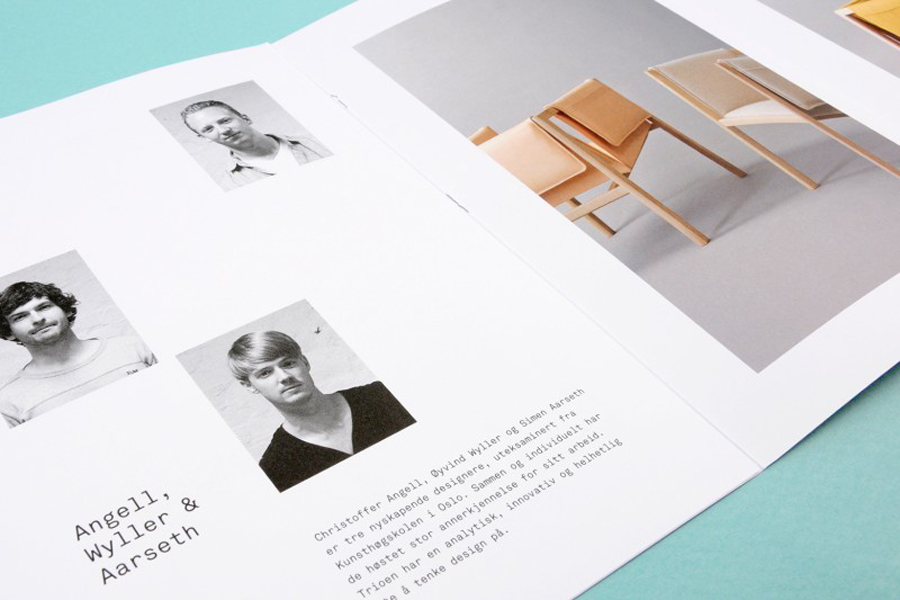
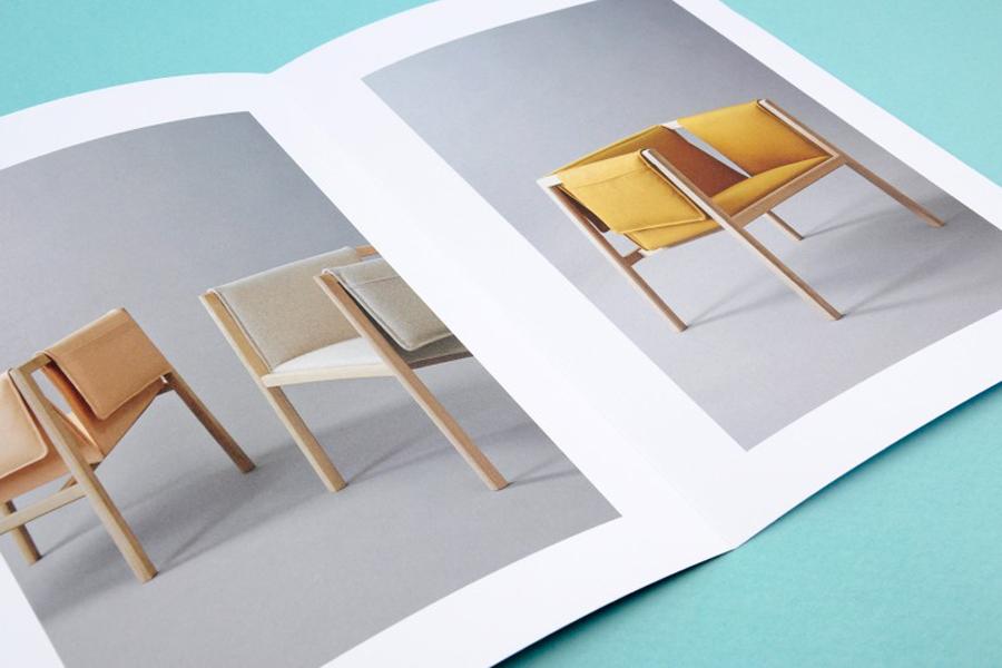
Inspired by Scandinavian design traditions Ghost chose a minimalist approach with a clear focus on products, appropriately leading with the communicative weight of photography in print and online. These images effectively unite traditional and contemporary furniture with well shot compositions and a good eye for material detail, form and lifestyle.
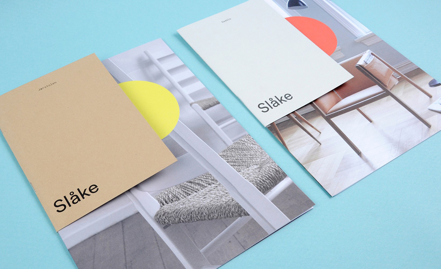
The flat colour palette, drawn from the sun, sky, mountains, farmland, grass, sand and sea of Hjelmeland, is relevant to the origins of the company and while perhaps slighted underserved by ink rather than dyed paper, appear warm and suitably reflective of natural material choices.
These earthy and slightly retrospective tones are juxtaposed alongside a bright neon ink circle motif, introducing a high contrast and statement detail. Ghost describe this as a playful counterbalance to an otherwise tight visual profile. In conjunction with an approach to print that draws attention to a new generation of Slåke designers, neatly mixes tradition with a clear view to the future.
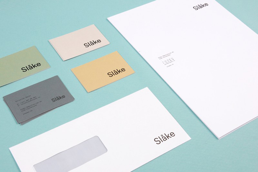
A simple generously spaced sans-serif logotype with very few character flourishes and the lighter technicality of Akkurat Mono across the stationery and print offer a straightforward functionality reflective of furniture, its manufacture and the Nordic design language, and sits comfortably and appropriately at the foot of the communication hierarchy.
Design: Ghost
Opinion: Richard Baird
Fonts Used: Akkurat
