Roberto Revilla London by Friends
Opinion by Richard Baird Posted 15 April 2014
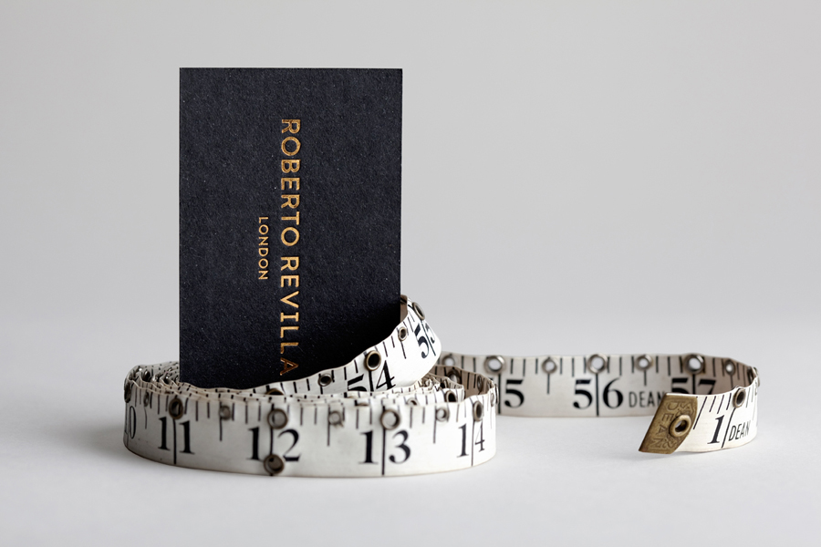
Roberto Revilla, working with his wife Carolina, provides luxury yet accessible custom tailoring services nationally and internationally from his premises not far from London’s Saville Row. As well as tailoring, Roberto also retails a range of high quality accessories online.
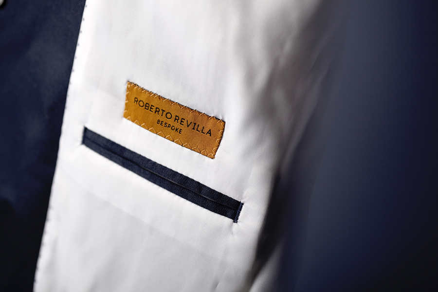
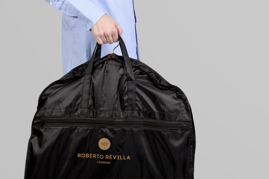
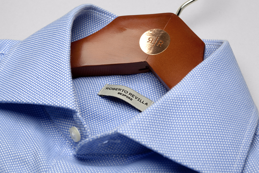
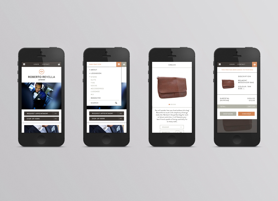
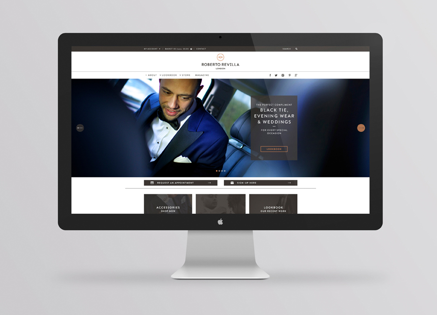
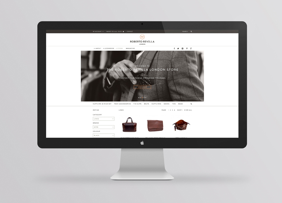
In response to a growing global client base and a desire to position the company alongside the “giants of luxury tailoring” such as Tom Ford, Armani, Canali and Zegna, Roberto worked with Friends to develop a new brand identity. Influenced by established fashion brands and global trends, Roberto’s own likes and dislikes, and unusually, the feedback of 40 of his clients, Friends delivered a solution that reflects a philosophy of accessible luxury, high standards, personal service and material craft delivered through logotype, monogram, stationery, stitched labels, suit bags and website design.
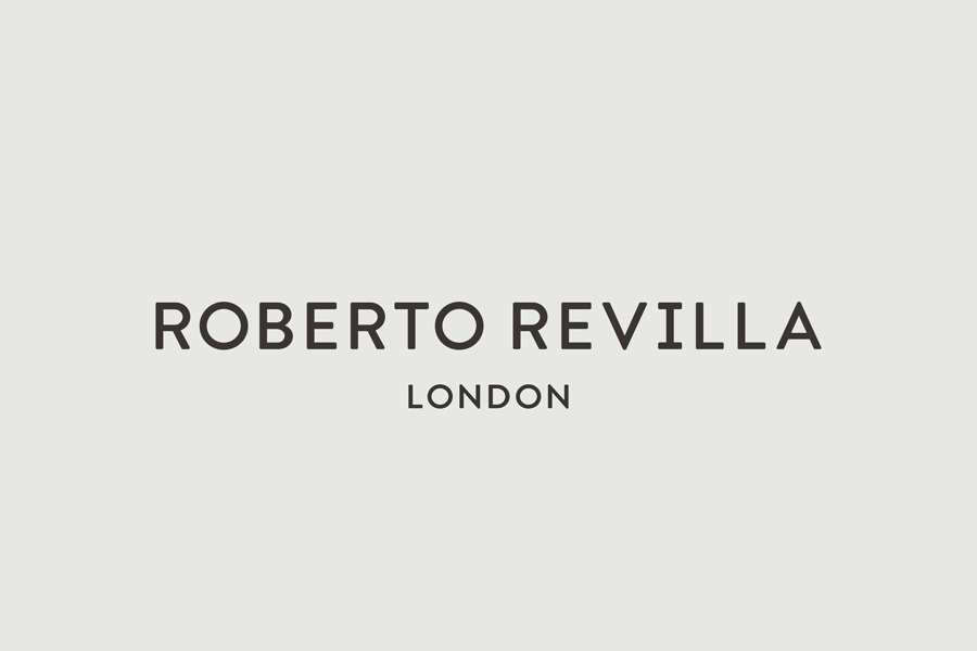
The functionality and accessibility of Roberto’s garments, service and new website is neatly conveyed through the well-spaced geometric characters of Brandon Grotesque. Its uppercase typesetting and soft corners, use of letterforms inspired by the 1920’s and 30’s, and a ubiquitous but necessary provincial second line, effectively resolve the traditional formality of tailoring services, a modern inclusivity and the perceived prestige of London. These are simple concepts delivered through a smart typographical selection with consideration for the more communicative weight of material choice and print finish.
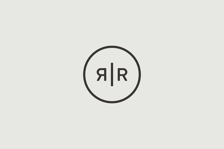
While I struggle to appreciate the aesthetic of mirrored characters—the approach never seems to be more than the most basic of attempts to derive distinction from simplicity—the monogram provides a familiar but clear contemporary twist on the traditional values of craft and individualised service practice. It is relevant and well rendered with a neat button-like resolution with a current weight and a good eye for internal space that allows it to assimilate the material its placed upon.
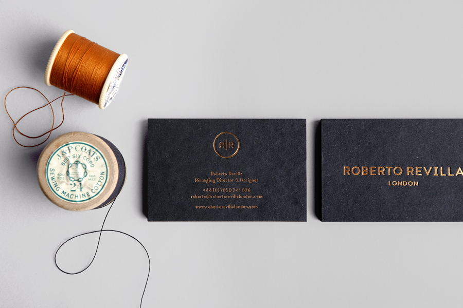
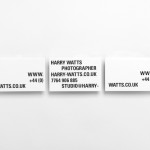
Friends’ use of dyed mixed-fibre board and copper foil print finish across the business cards and stationery give a restrained typographical approach communicative depth, high quality and aesthetic impact. It is appropriately reflective of an attention to detail, a passion for developing individual style, and the quality of the fabrics used in the tailoring of bespoke garments.
The increasingly ubiquitous adoption of foil and coloured paper in brand identity design has often felt disingenuous, superfluous and flashy, however, set with the context of a brand identity solution that also utilises photography, a solid web experience and resonates with the themes of fine detailing, this feels that it is underpinned by a solid rationale.
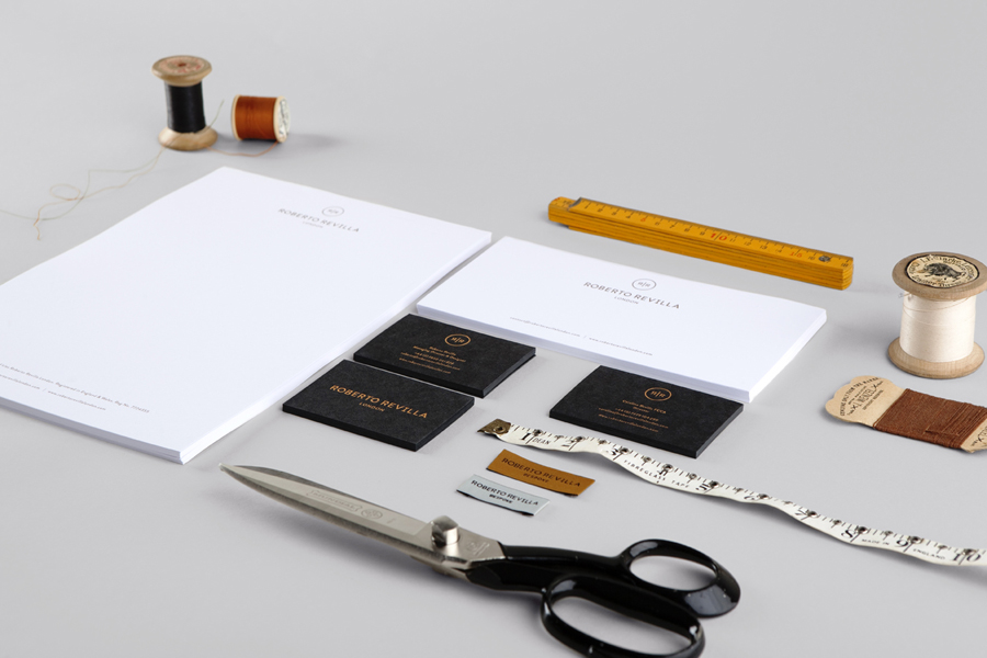
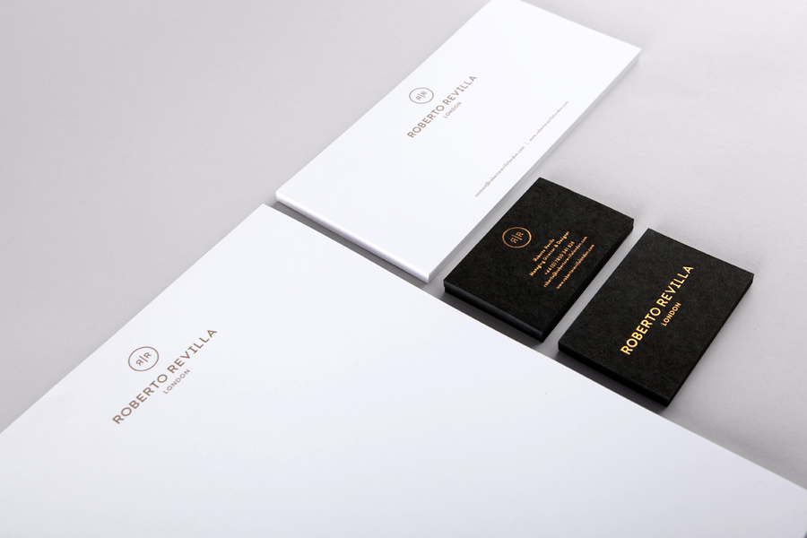

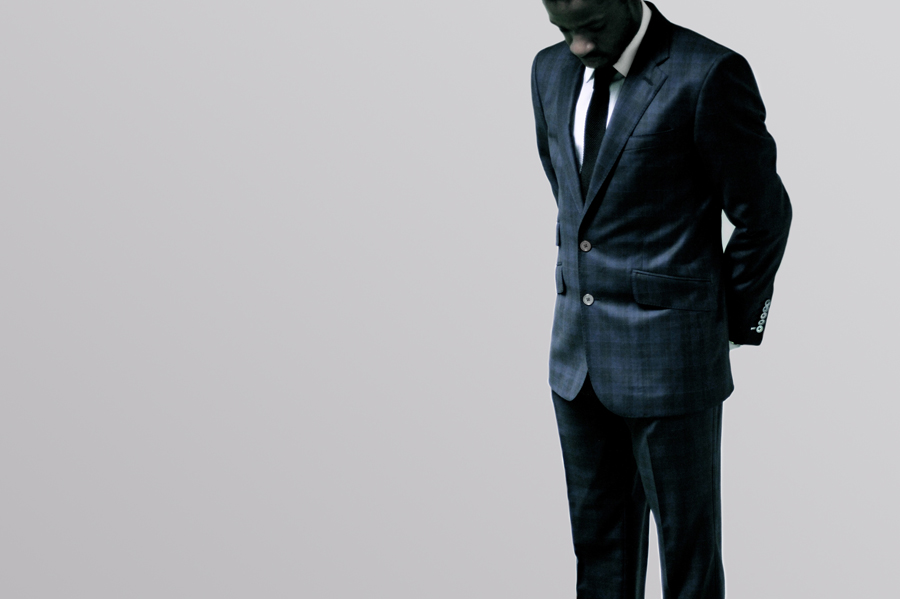
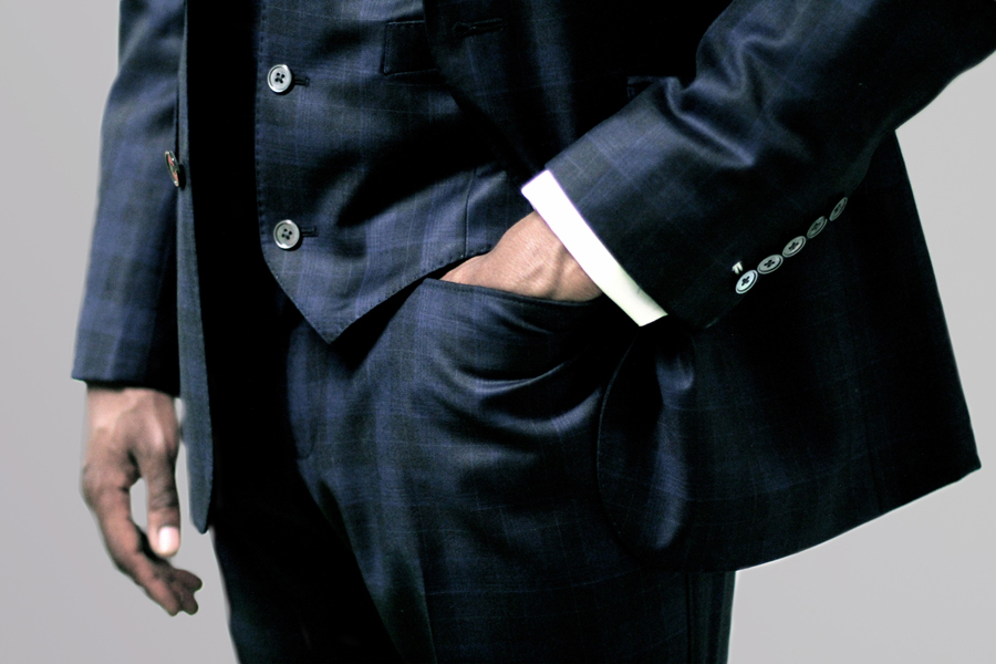
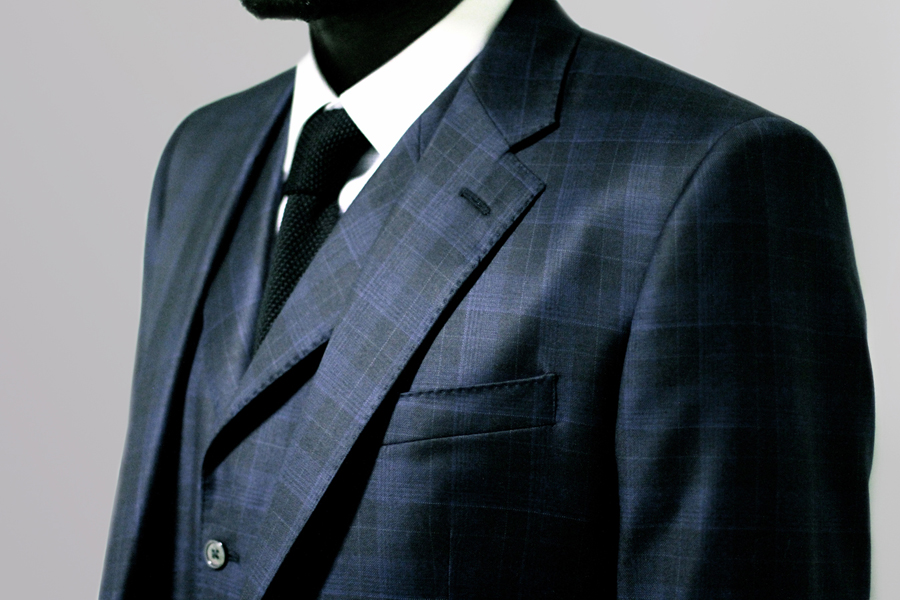
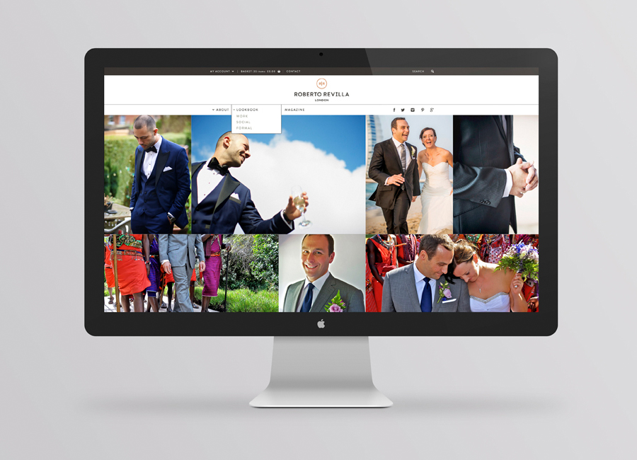
The brand identity benefits from the communicative diversity of fashion photography that utilises contemporary crops and flat grey backgrounds, a responsive and easily navigable website that draws on the accessibility of Roberto’s service, the high fashion sensibilities of an online lookbook, and the personal, informality of a fashion blog. The result is a great mix of process, client involvement and fashion design cues that successfully leverages established perceptions, balances luxury and accessibility, and delivers these through a cohesive union of material choice, print finish, typography, photography and online experience.
Thank you to Darren Friend for giving BP&O the opportunity to showcase this project first and to Nicola Smith for all the background information and images.
Design: Friends
Photography: Simon Burt
Opinion: Richard Baird
Fonts Used: Brandon Grotesque
