Le Naturel by Moruba
Opinion by Richard Baird Posted 18 April 2014
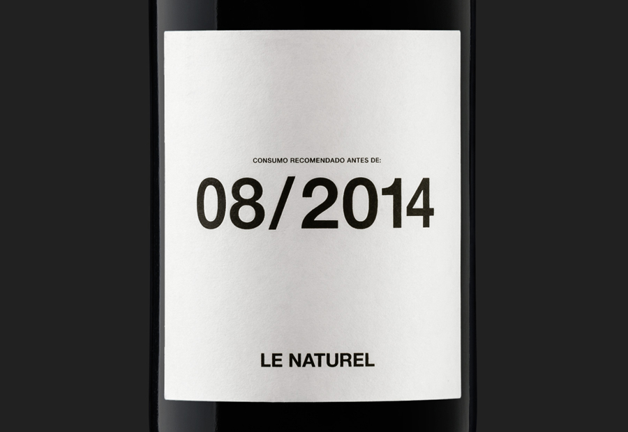
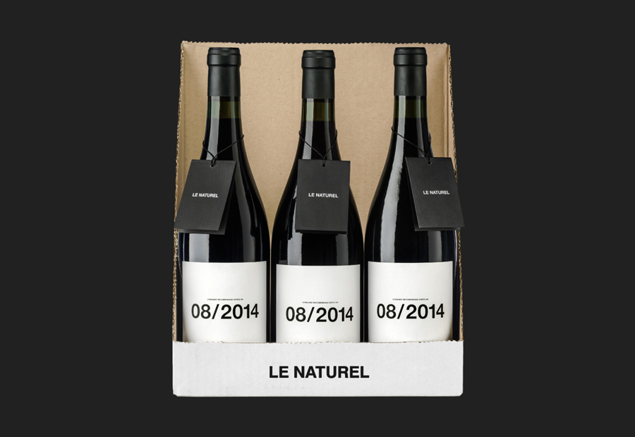
Le Naturel is an all-natural wine created without the use of sulphites by Spanish producer Vintae. Vintae describes itself as an innovative, young and dynamic enterprise, representing the avant-garde and revolutionising different aspects of the wine-growing industry.
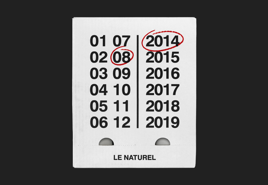
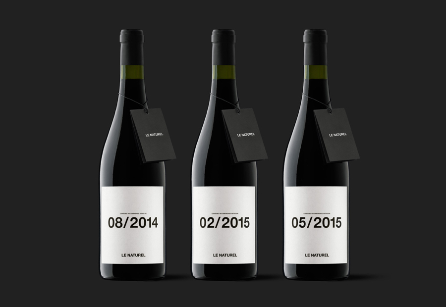
The wine’s packaging, developed by Moruba, embraces an unusual and distinctive change in communicative priorities, discarding the perceived high qualities of foil and tactile papers, verbose narrative, the themes of heritage, craft and provenance typically associated with the industry and instead leverages an increasing popularity for typographic and ink austerity. This approach places weight on a single piece of information—the established relationship between freshness and best-before dates—and utilises ubiquitous sans-serif typography to convey this with honesty and precision whilst reflecting the brand’s avant-garde approach.
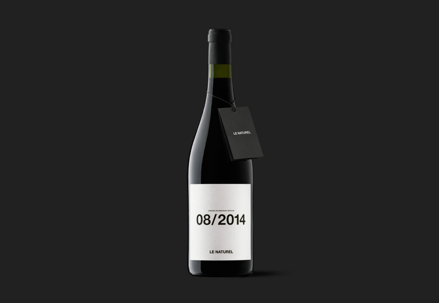
Without the recognised authority and experience Moruba has within the wine industry the solution could easily be perceived as conceptual and explorative rather than commercial. It is not an example of what might be described as traditionally good design (brand values and product character delivered cohesively through colour, form, image, language, type, material choice and print finish) but one that looks to reduce communicative goals to derive a new but understandable aesthetics.
Design: Moruba
Opinion: Richard Baird
