Galt Energy by Firmalt
Opinion by Richard Baird Posted 23 April 2014

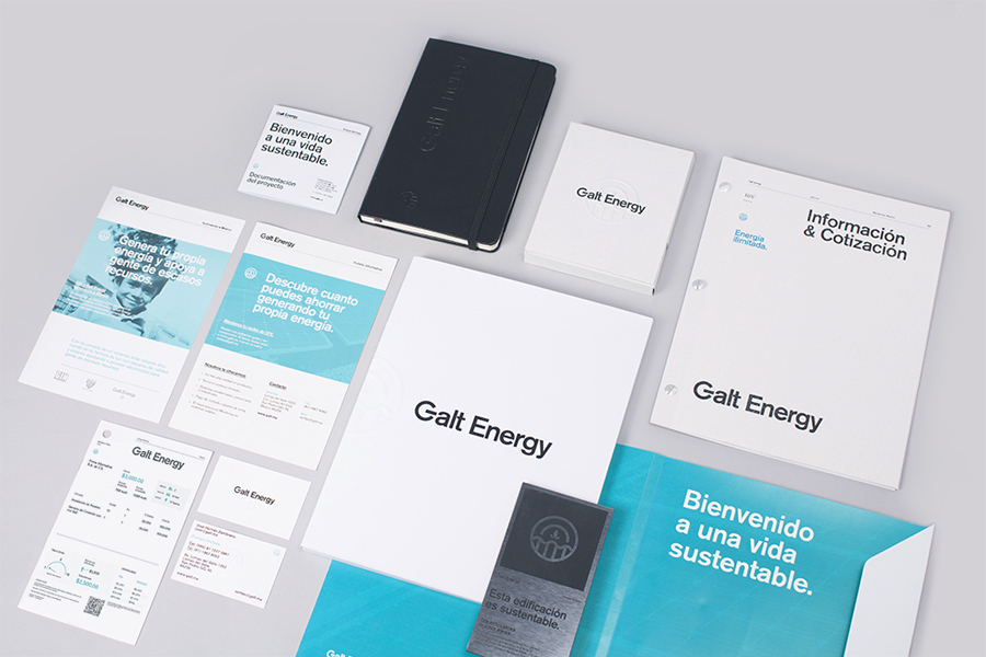
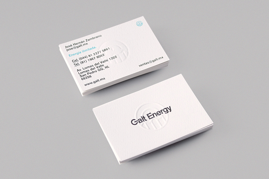
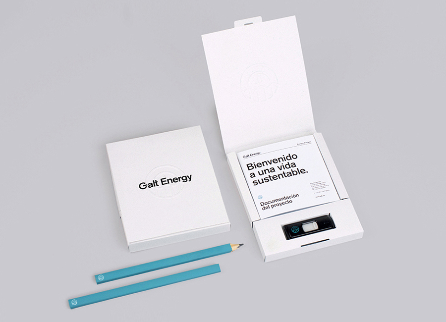
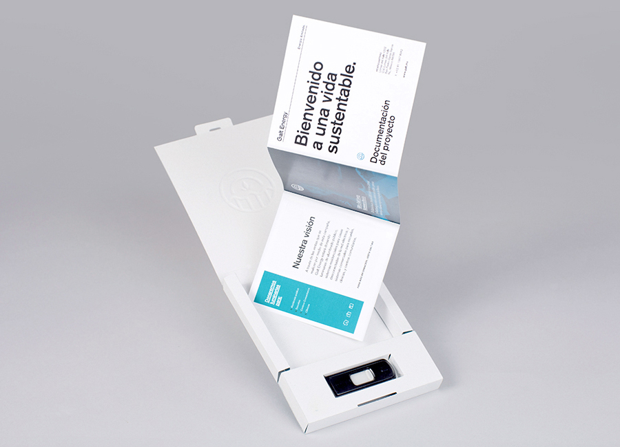
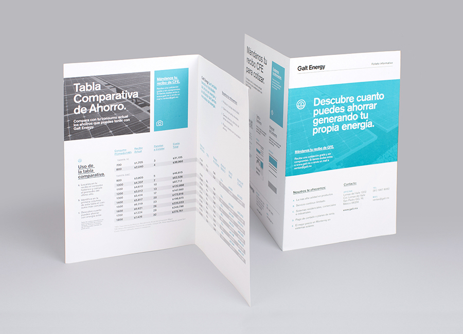
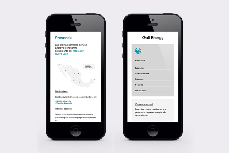
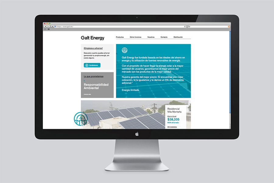
Galt Energy is a Mexican business that provides its customers with the ability to fund alternative energy solutions for commercial, residential and institutional projects using the money saved on bills through energy efficiency improvements. The company’s new visual identity, designed by Firmalt, juxtaposes the accessibility of a contemporary circular logomark, bright blue tinted photography, tactile paper and deep blind deboss print finish alongside the corporate reliability of sans-serif typography, white paper and black ink.
“The concept is inspired by energy; the company’s primary offering. When they approached us,they wanted their brand to represent their commitment to sustainability, but to differentiate itself from the common visual style of companies in their related field. The mark is created using elements from the six main renewable energy sources: wind, water, solar, biomass, geothermal and biofuel.”
“It was imperative to develop a cohesive aesthetic for the brand across their digital and collateral material. The vibrant blue in Galt Energy’s color palette lands perfectly between an electric blue and sustainable green. The fluid mark is complemented by a highly structured design that conveys their honest, clean, and intelligent approach to making alternative energy a viable option.”
– Firmalt
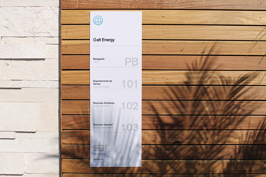
Although very on-the-nose, the logotype competently leverages the broadly understood corporate authority of Swiss sans-serif characters and the universal iconography of the power symbol. It is generally well executed, perhaps a little tight around the ‘lt’ and ‘rg’, and utilises a good weight to provide a robust foundation and communicative efficiency alongside the detail of other assets. This is reinforced by black ink, white board and the grid-based layouts in print and on-line.
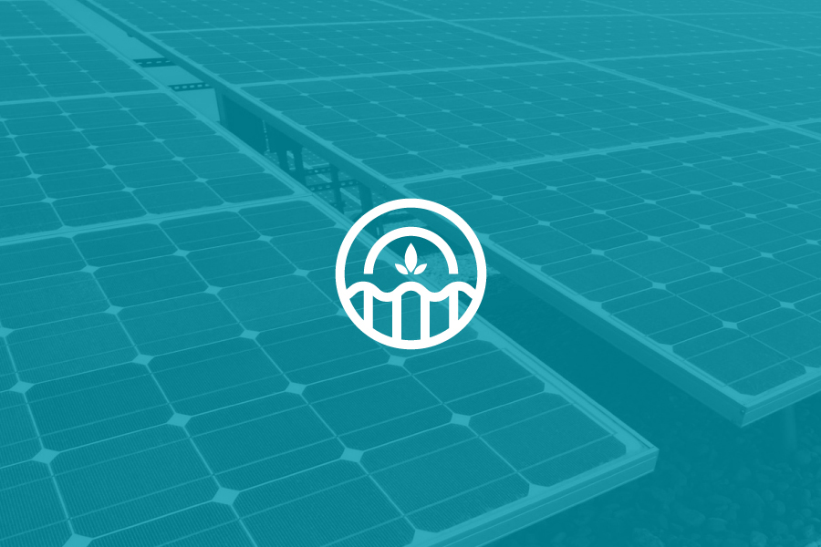
The formality and efficiency of type is tempered, but not undermined by, the detail, form and ideation of the logomark. Rendered with a contemporary single line weight with a good eye for internal space it resonates well with the logotype. Its fusion of renewable energy sources through abstraction is obvious but well handled but utilised a touch too frequently. The aesthetic is unmistakably current, one a designer might associate with self-directed work rather than of commercial origin, but should read as innovative and accessible by drawing on a familiar environmental visual language that exists within a variety of other categories. This accessibility also extends to a responsive website, bright tinted photography and the texture and detail of embossed papers, leather-bound notepad and blind embossed finishes. Expensive flourishes that neatly move it away from the more corporate expectations of energy.
Design: Firmalt
Opinion: Richard Baird
