The Franklin Boutique Hotel by Band
Opinion by Richard Baird Posted 12 May 2014

The Franklin Boutique Hotel provides seven room accommodation at the heart of the city of Adelaide. Rooms feature interior detail such as white tiles, exposed utilities, chipboard panels, high quality finishes and original artwork from local artists, as well as modern conveniences that include en suite bathrooms, Nespresso machine, ipod dock radios, refrigerators and irons. Following a successful reinvention of the attached pub, the owners addressed the accommodation above by hiring Adelaide based design studio Band to develop a new brand identity, which included logotype and printed collateral, that would reflect the urban edge of the hotel.

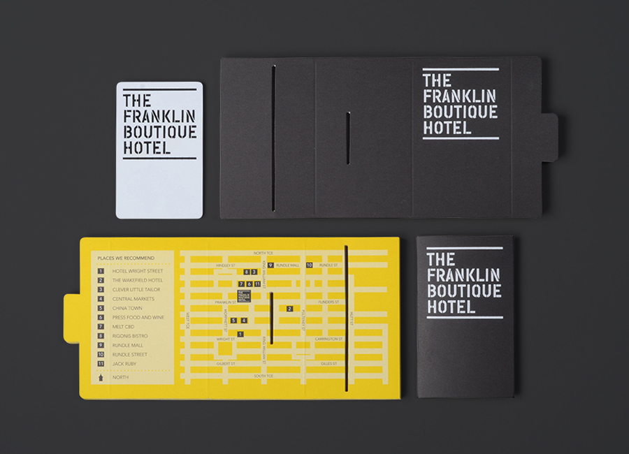
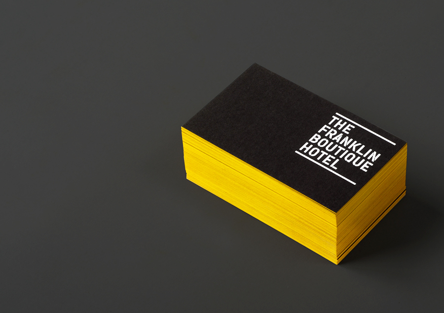
Band’s approach effectively utilises an industrial and urban utility. The familiarity of this aesthetic, its frequent misuse and poor execution means that it has to work far harder to achieve distinction and a communicative depth beyond the more obvious associations. This has been achieved by fusing the raw industrial sensibilities of the typography and colour palette with the high quality sensibilities of mixed paper and weighted boards, a white foil print finish and yellow edge painted detail.
The more conventional typographical elements are well handled. The condensed sans-serif could have perhaps done without the distressed edges or had its utility infused with a premium quality, perhaps a stencil cut serif would have been neat, but is compentently drawn and composed with the stencil cut detail cementing its industrial and urban influences.
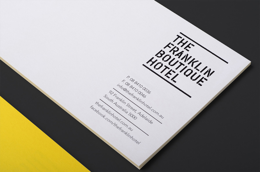
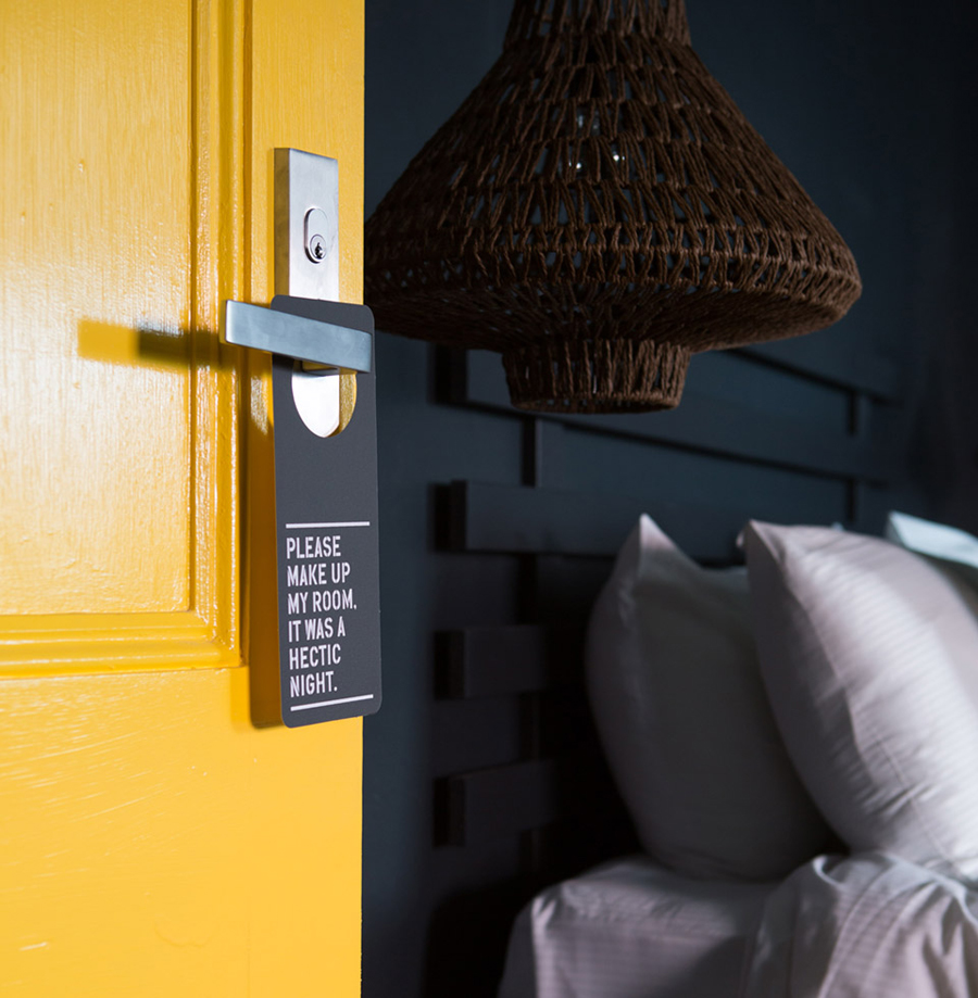
The use of heavy uncoated boards and the contrast of grey/black and high-vis yellow draw directly from the interior of the hotel, delivering an unusual visual economy alongside the cost of edge painting the business cards. There is not much variation aside from the door hangers which add a little personality through language, however, this is sensitive to the more compelling, tactile and experiential detail of each room.
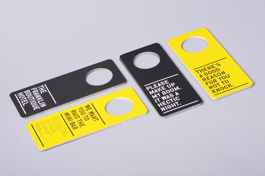
The solution is clearly and appropriately informed by the interior juxtaposition of functionality and high quality that exists within each room, and delivers this duality in an evident and well handled way that sets it apart from the one-dimensional identities of a similar ilk. It sits very well within the environment and likely to convey its values outside, while the use of language adds a little personality.
Design: Band
Opinion: Richard Baird
