Simone Handbag Museum by Charlie Smith Design
Opinion by Richard Baird Posted 20 May 2014
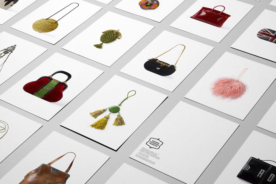
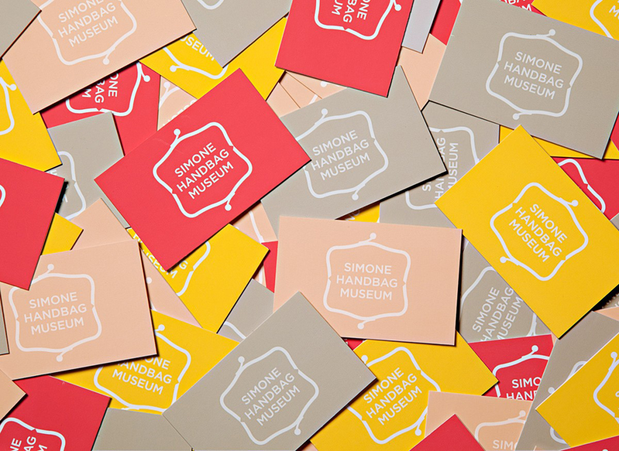
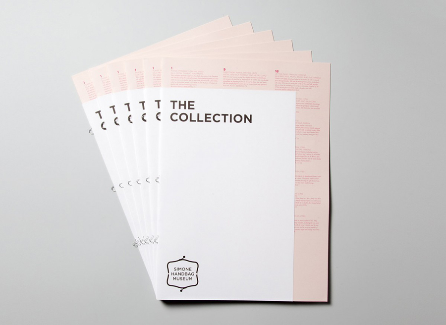
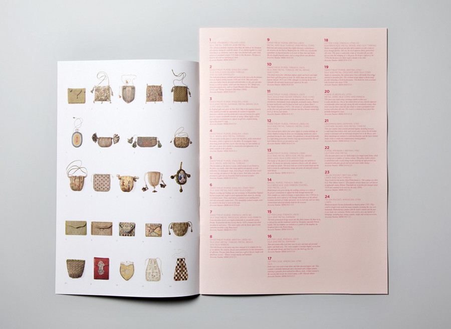
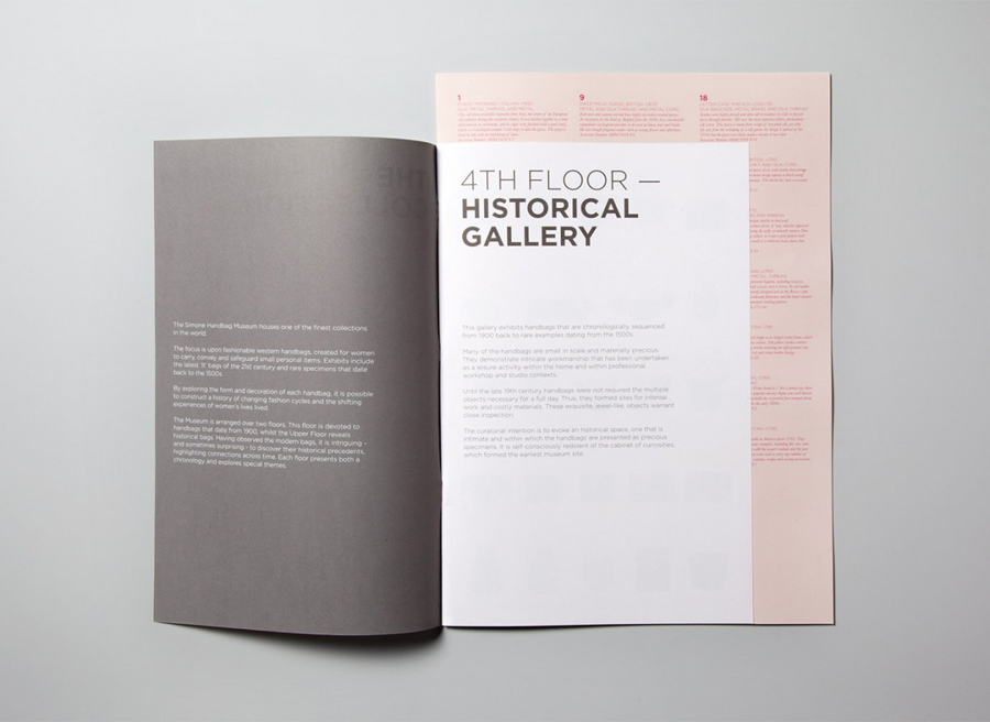
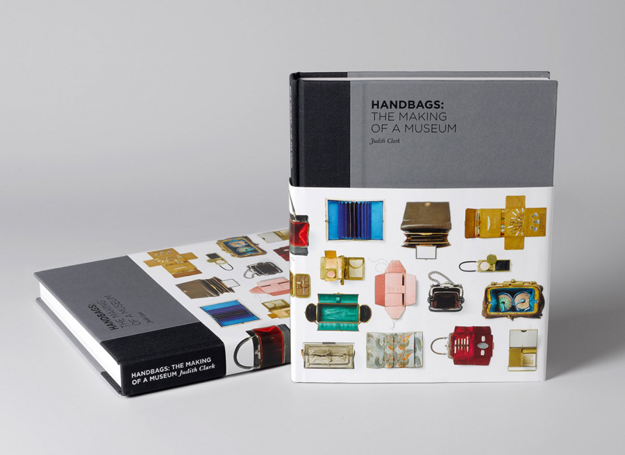
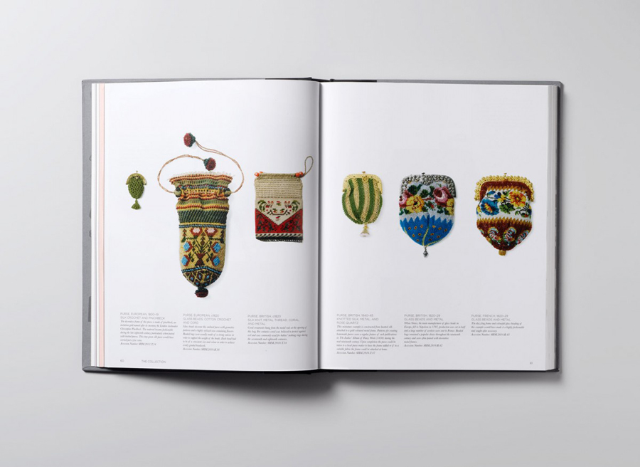
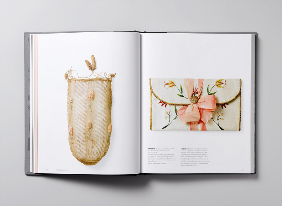
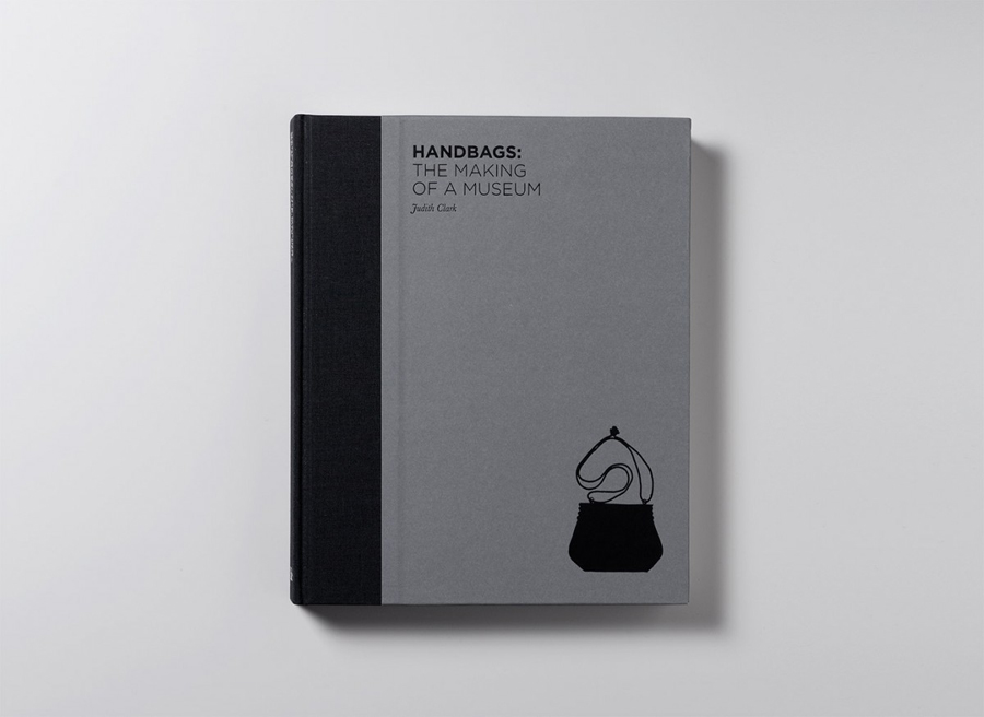
Simone Handbag Museum is dedicated to the history of handbags with ‘international significance’ and provides its visitors with a curated, contemporary and historical collection to explore over two floors at the centre of the South Korean city of Seoul. London based Charlie Smith Design were recently commissioned to develop a brand identity for the museum that would resonate with and unite its diverse collection across exhibition graphics, gallery guide, merchandise, posters, book, website, newsletters and temporary exhibition promotional material.
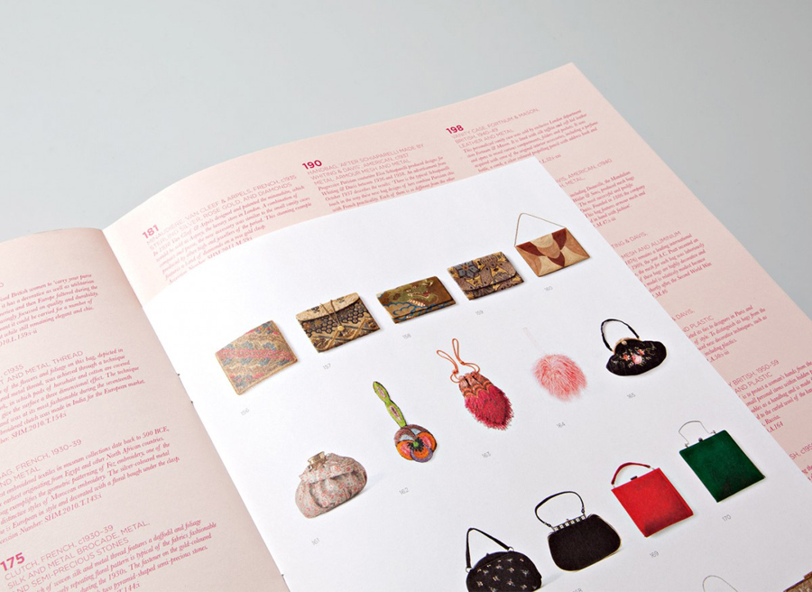
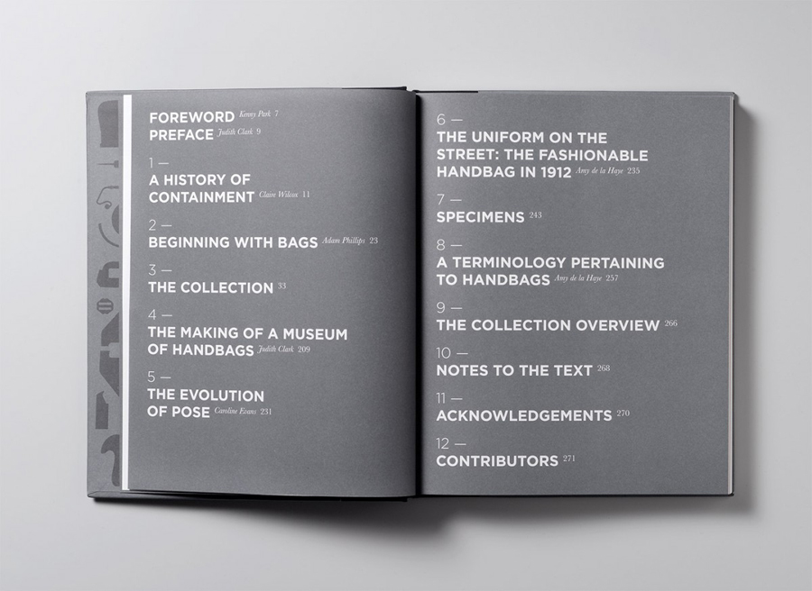
The solution provides the museum with a strong flexibility through a diversity of assets and a modular grid based nature in print and online that feels appropriately informed by the interior.
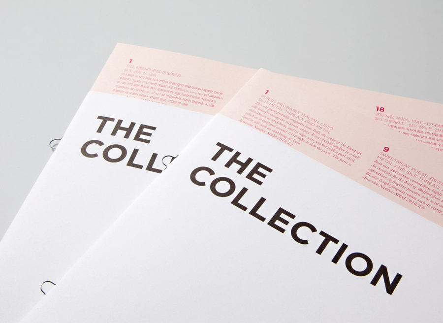
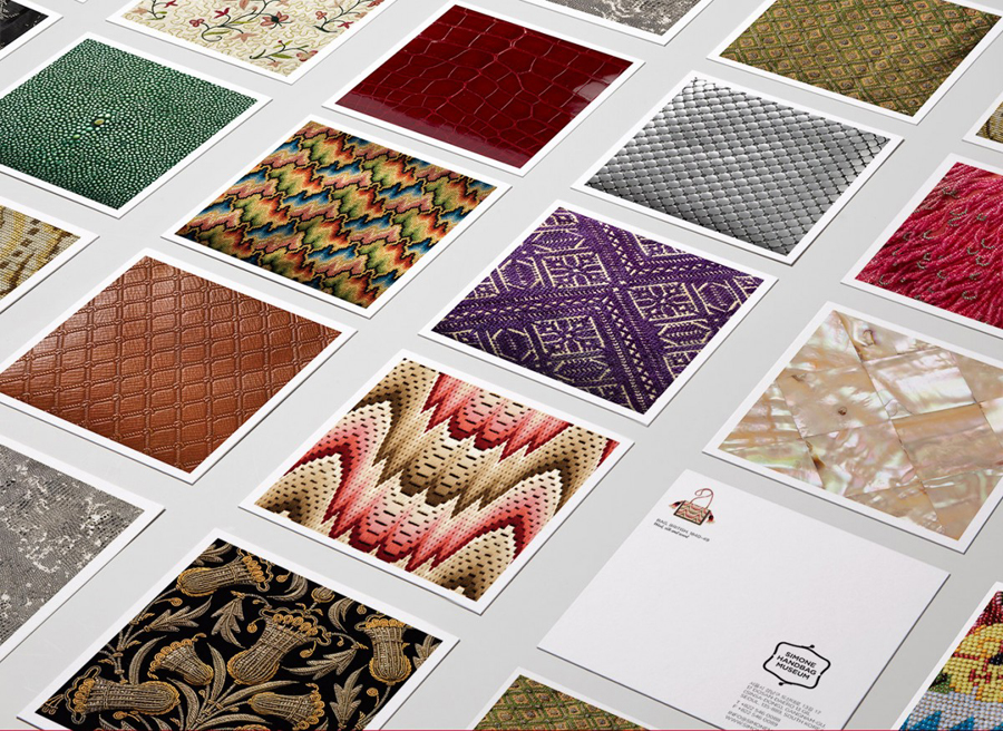
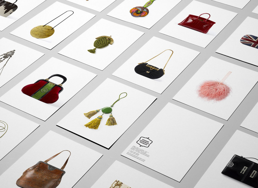
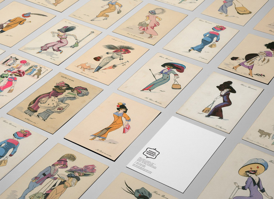
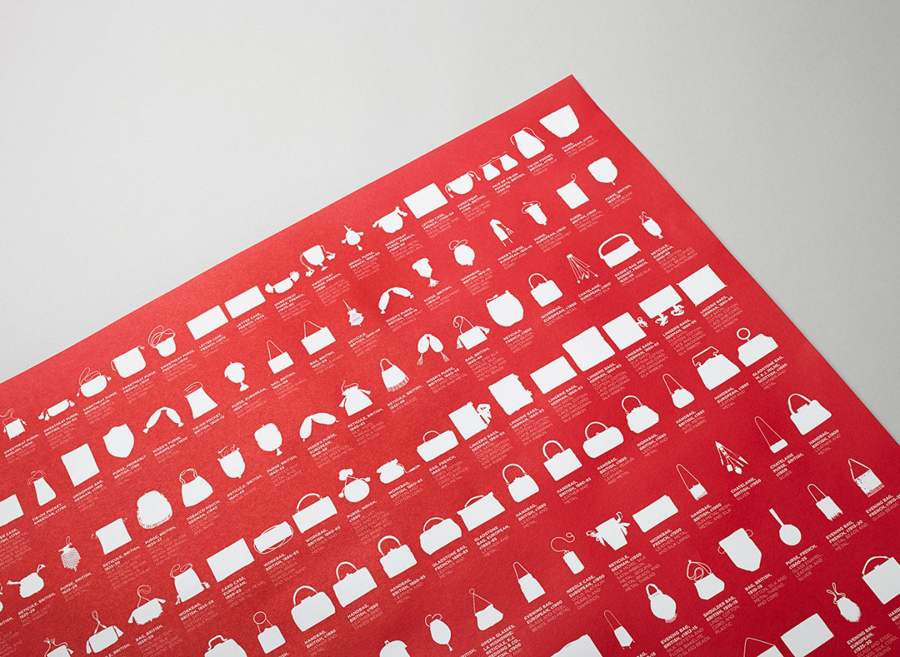
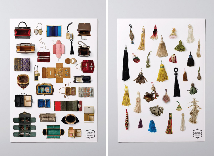
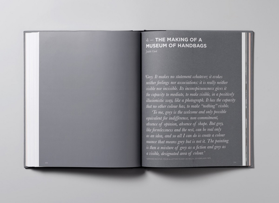
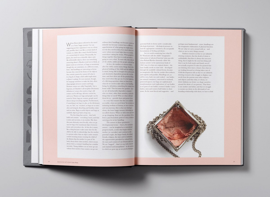
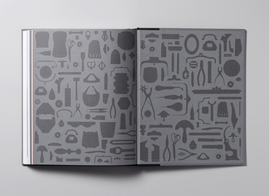
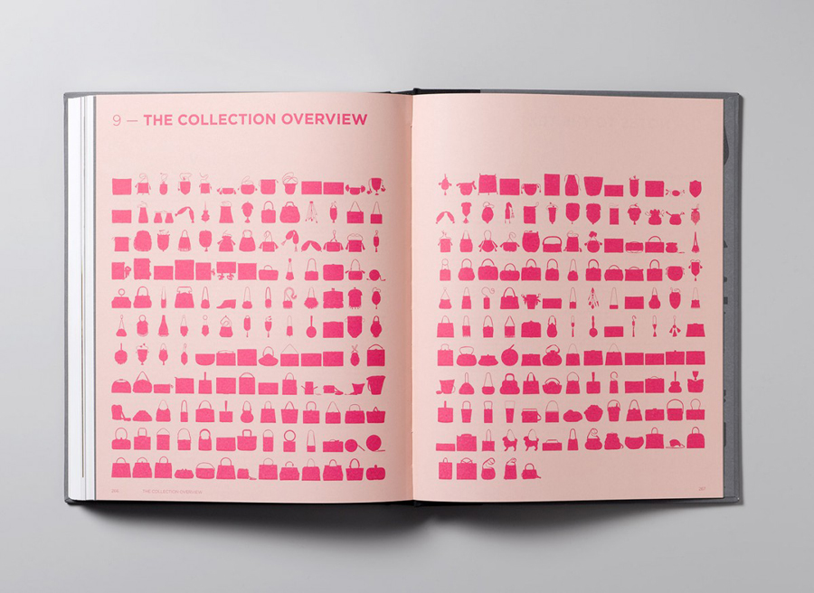
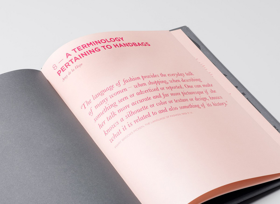
Contrast is used to great effect. Intelligently juxtaposing bright hues and pastel colours, the flourish of an italic and the functionality of a sans-serif, light and dark papers, a library of vintage illustration, modern vectors and well shot photography on white, the gloss of a foil finish and the matt of uncoated boards as well as detailed textile close ups and the large unprinted regions of the guide. These choices neatly reflect the themes of past and present, texture, finish, form and fine detail of handbag history and design in a rich, distinctive and multi-experiential way with subtle nod to fashion and art gallery convention.
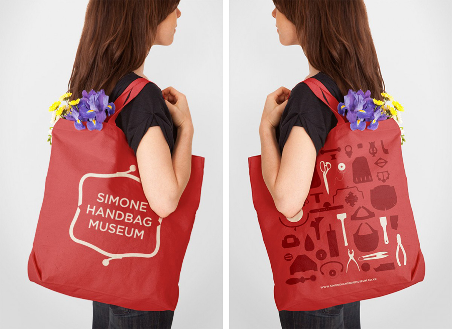
The logo is perhaps a little on the nose and the sans-serif obvious and ubiquitous in its contemporary values but is clearly reflective of the small role it plays within the context of more communicative assets that honour and bring together a variety of period handbag designs.
Design: Charlie Smith Design
Opinion: Richard Baird
