In Bed by Moffitt.Moffitt
Opinion by Richard Baird Posted 26 May 2014

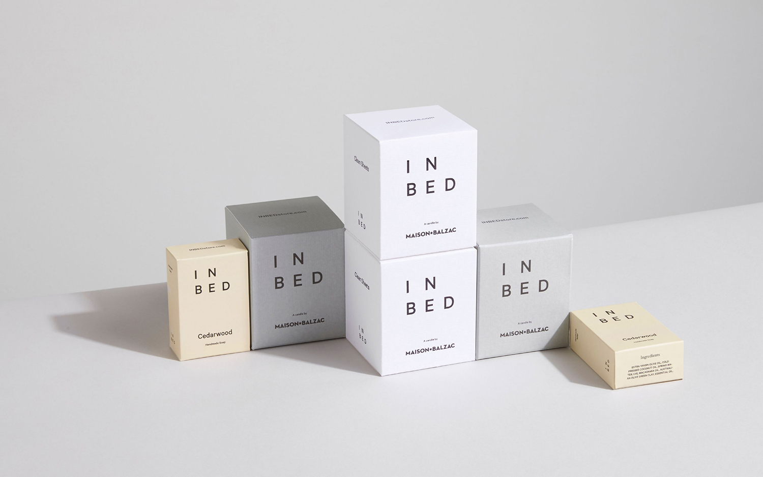
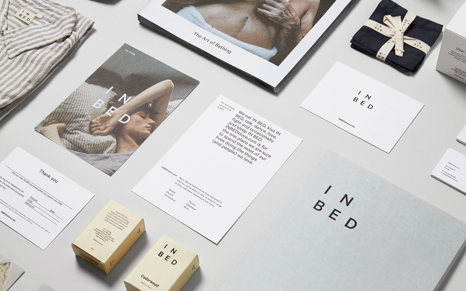
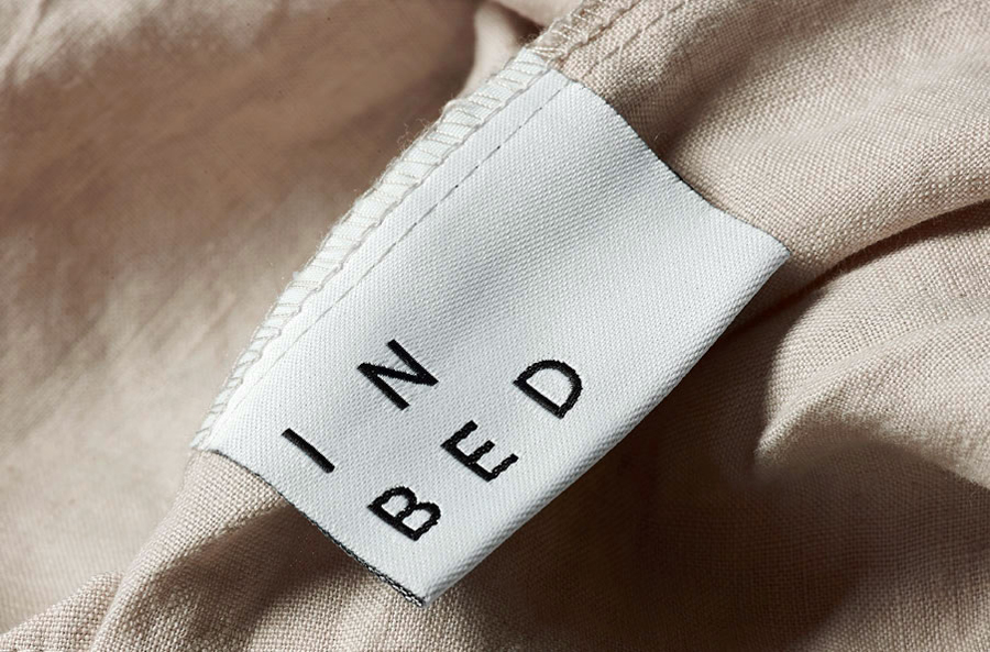
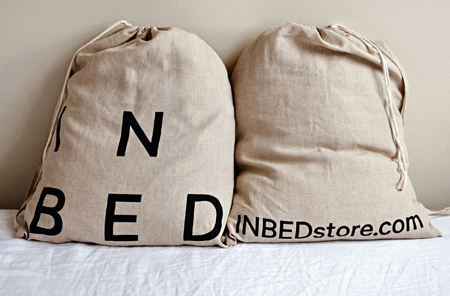
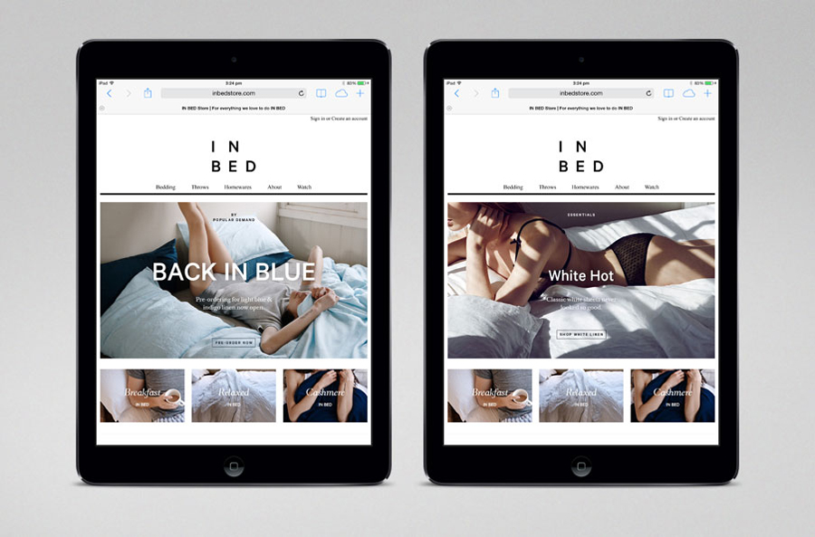
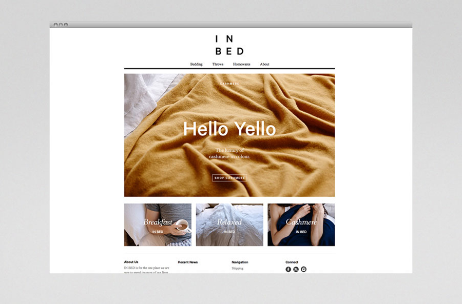
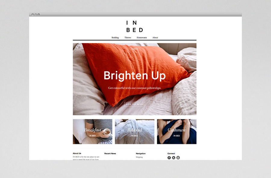
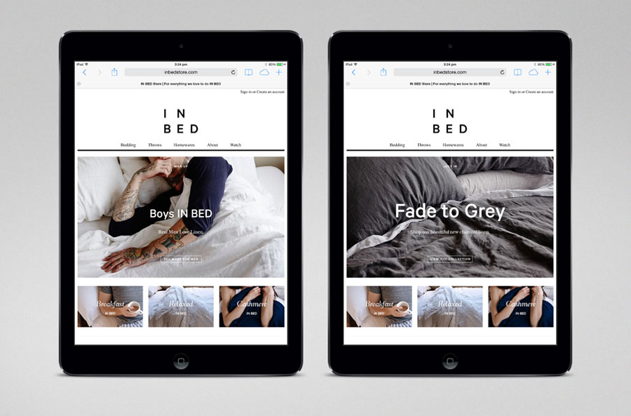
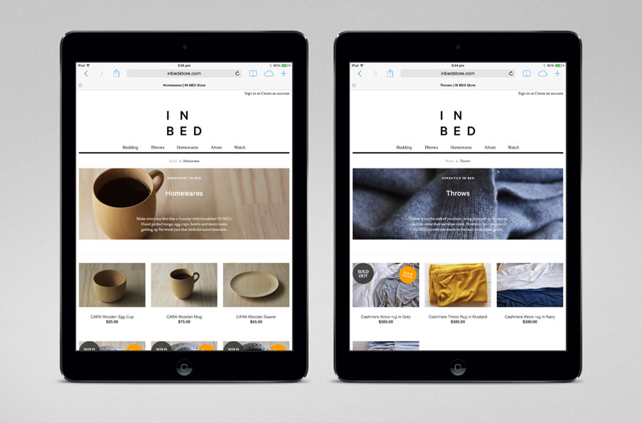
In Bed is an online store that is a celebration of almost everything we love to do in bed. It has a generous yet tightly curated collection of homeware items that include handmade ceramic and wood saucers, bowls and mugs created by Japanese and American designers, as well as a range of high-quality linens. In Bed worked with Australian design studio Moffitt.Moffitt to develop an identity that would reflect the effortless personality of the brand and its product range through a graphic, material and language system.
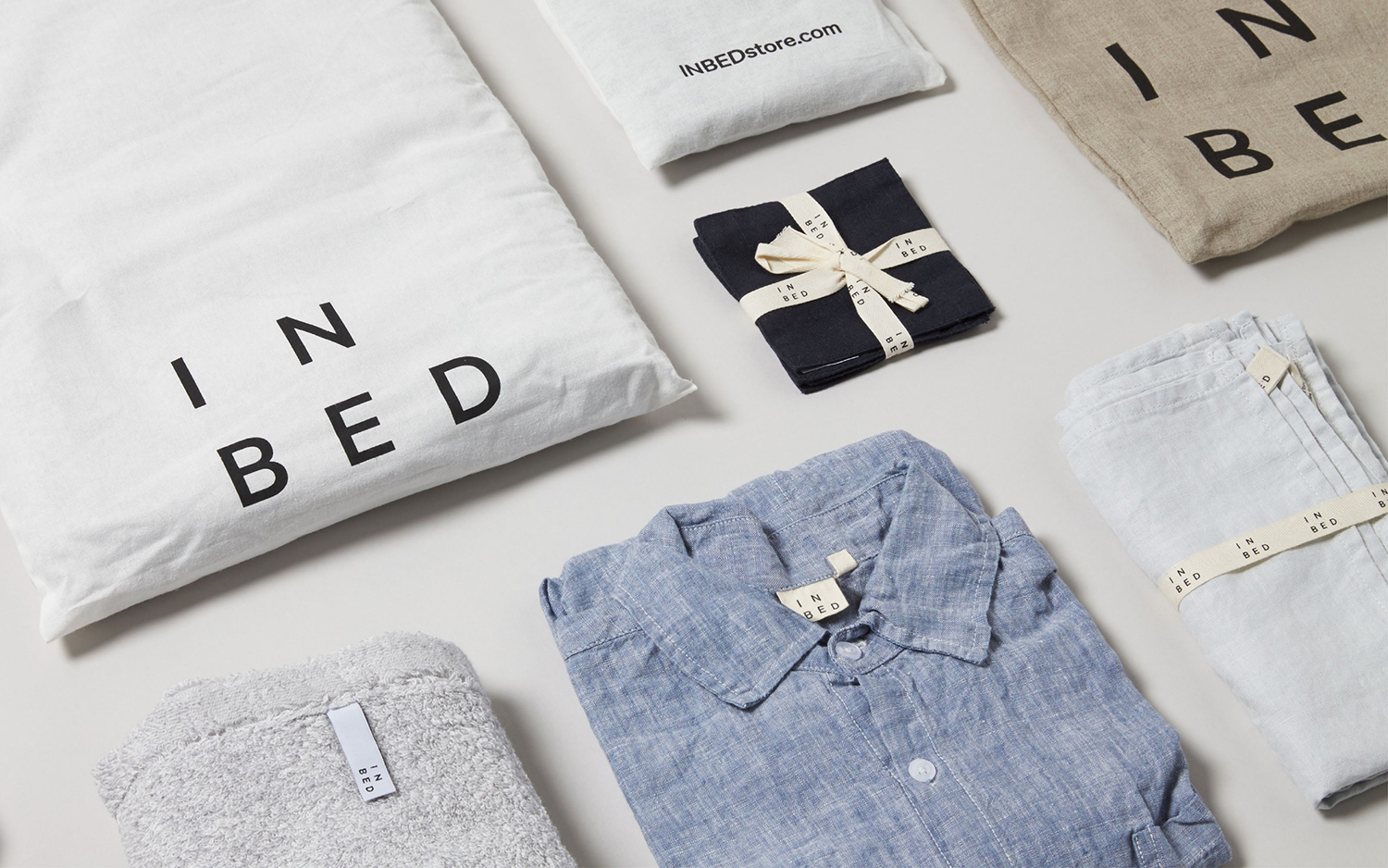
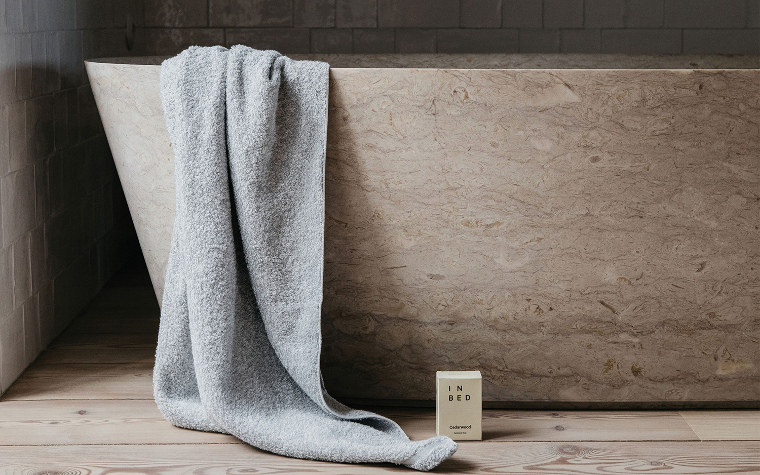
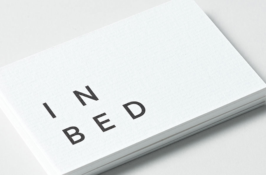
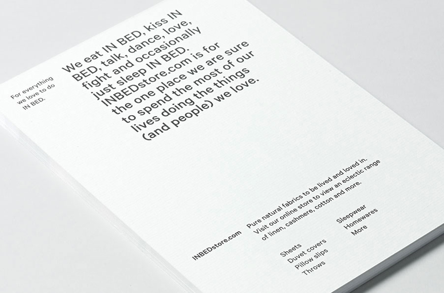
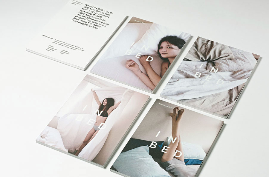
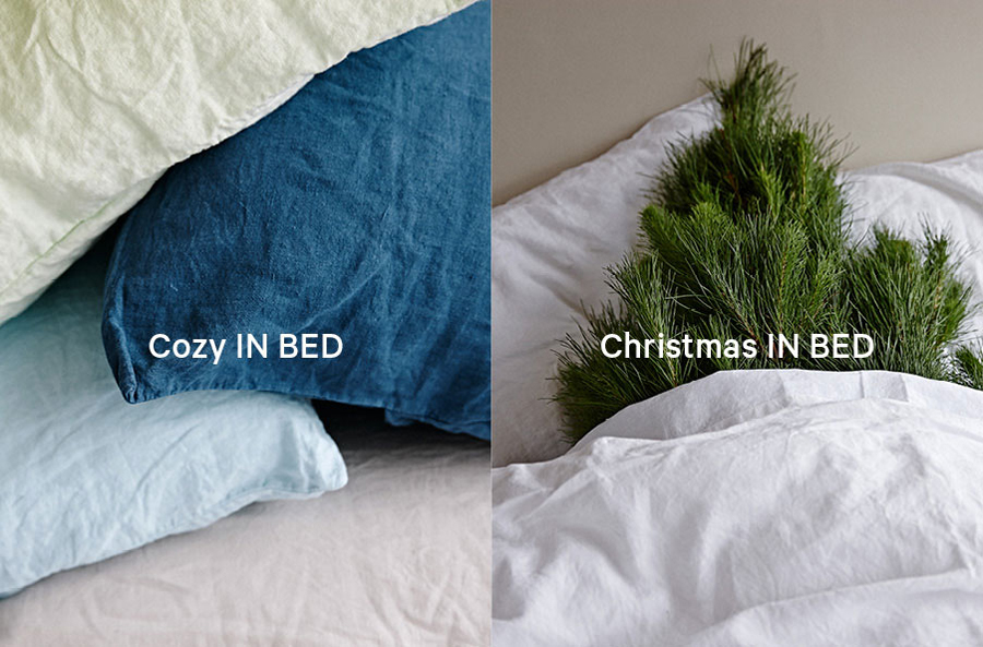
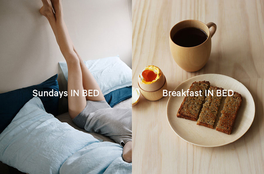
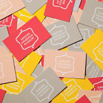
Moffitt.Moffitt’s visual identity for In Bed establishes a visual simplicity through undecorated type. It draws personality and the ability to reinvent itself within a narrow product range from this using emotive language choices. And neatly sets this within the context of strong personable photography that mixes texture and informal model shots, the tactile quality of a laid linen white paper, a website of editorial and product content, and a shopping experience that blends seasonal trends with accessible product browsing. The result is an interesting contrast of typographical austerity, premium fine detail and relaxation effectively delivered through tone of voice, image and materiality.
Design: Moffitt.Moffitt. Opinion: Richard Baird
