Alberto Senties Catering by Anagrama
Opinion by Richard Baird Posted 2 July 2014

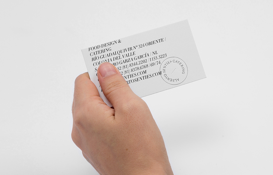
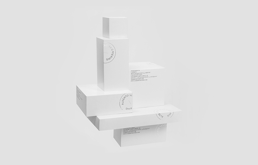
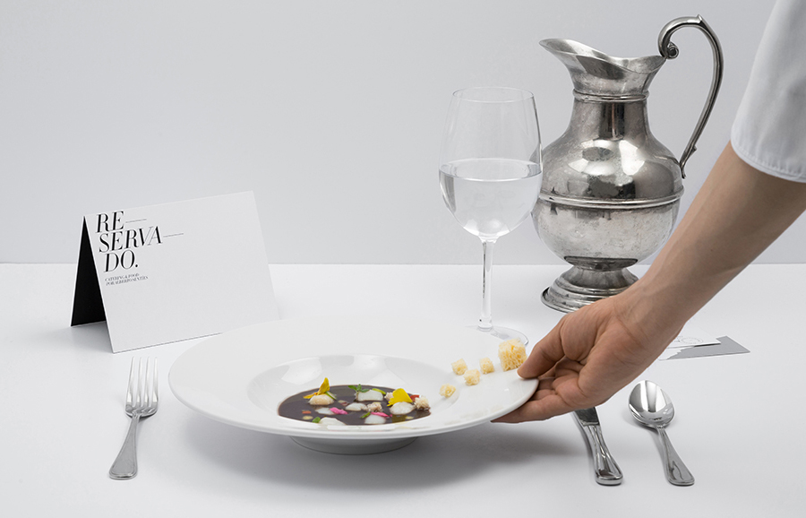
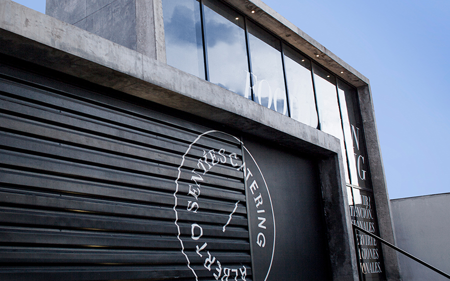
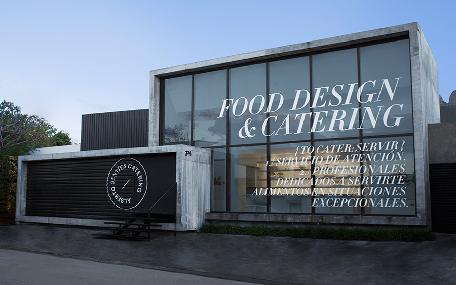
Alberto Senties Catering is a Mexican ‘food experience’ company established by chef Alberto Sentíes that designs and prepares large and small banquet menus, offers cooking classes, provides bar tending, equipment rental and consultation services, and has built up a reputation for culinary excellence over its ten years of business. Design studio Anagrama recently worked with Alberto Senties to develop a new brand identity, which went on to include logotype, signage, stationery and print, that would convey gastronomic mastery and experience in a surprising, elegant and modern way.
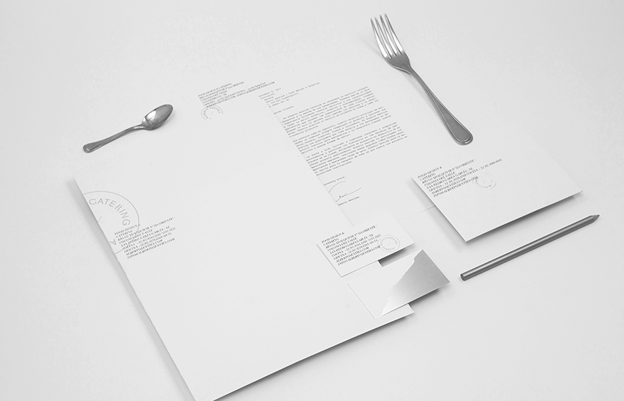
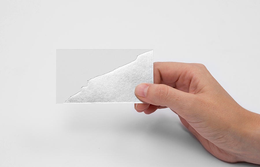
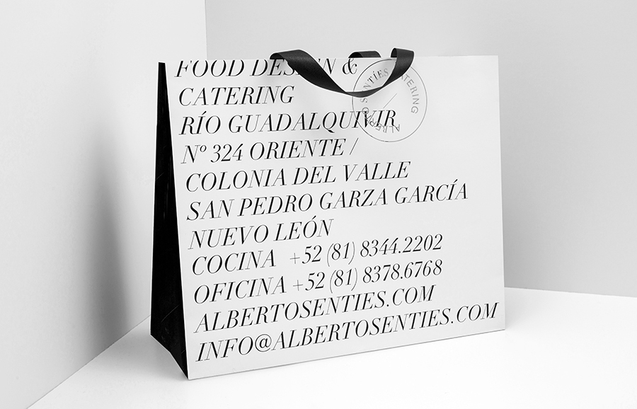
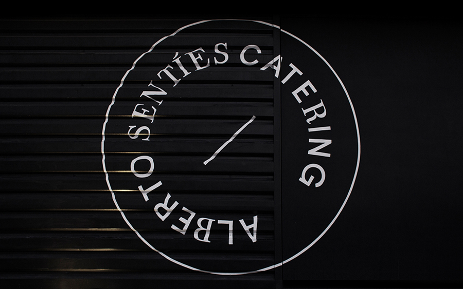
“The seal uses a typographical combination of Akzidenz Grotesk and Didot to to give it a surprising, elegant and modern touch. The vast play on typography found throughout the brand represents the chef’s creative and expansive use of texture in his culinary creations. His style is clinically clean, precise and loyal to its location, the northeastern city of Monterrey in northern Mexico. The business card’s odd foil patch is actually a piece of the city’s iconic Cerro de la Silla silhouette.”
– Anagrama
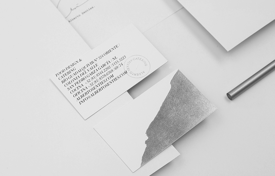
While Anagrama continue to indulge their fascination for foil —I have not seen a project absent such a finish recently — and again fall short on digital experience, their approach and leveraging of print finish here appears grounded, communicative, aesthetically interesting and appropriately restrained.
Contrast is used to good effect typographically, contrasting the reductionist sans-serif characters of Akzidenz Grotesk with the classic flourish of Didot, and through colour, using broad panels of what I would describe here as a professional kitchen white and the perceived high quality and steel-like shine of a silver foil.
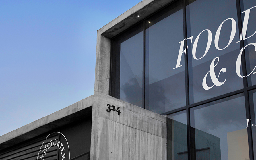
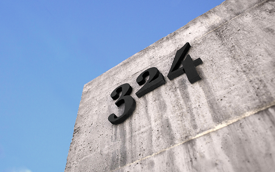
It is a contrast that effectively juxtaposes traditional craftsmanship and detail alongside the on-trend utility of the present, conveying cookery as an art form in a way you might associate with high fashion but also the reliable, functional nature of their catering and kitchen rental services. This is perhaps most effectively achieved through the characters of Didot running across the surface of the company’s brutalist / modernistic building. The rough bisection of the business card is an unexpected detail and highlight, drawing a neat aesthetic treatment from the provenance of the business.
Design: Anagrama
Opinion: Richard Baird
Fonts Used: Akzidenz Grotesk & Didot
