KVGD by Kerr Vernon
Opinion by Richard Baird Posted 8 July 2014

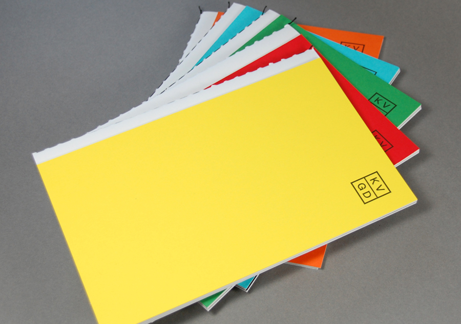
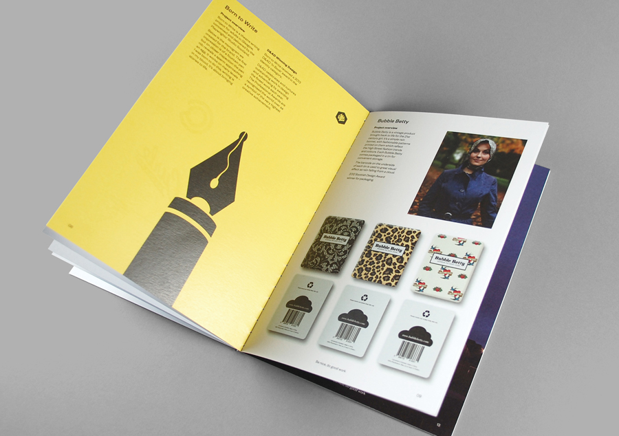
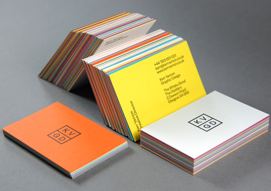
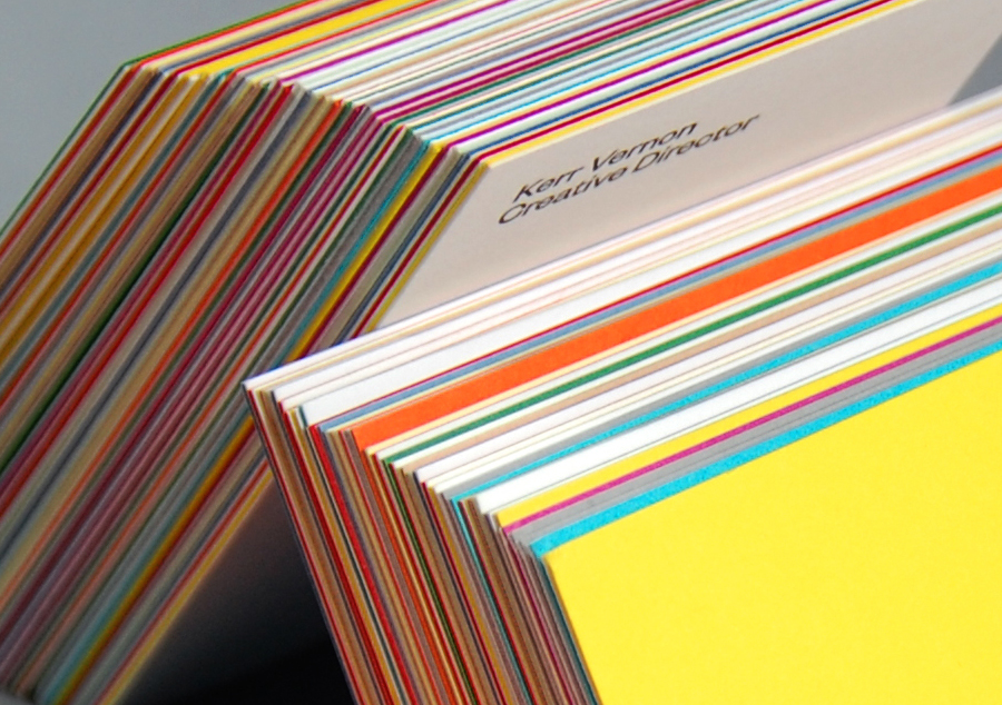
KVGD is a Glasgow based graphic design studio run by Kerr Vernon that works within the fields of brand identity design and print, has a ‘be nice, do good work’ philosophy, and a reputation for producing engaging, thoughtful and crafted projects. The studio’s client base is diverse, local and national, and includes businesses such as gallery, event and creative workspace The Whisky Bond, eco-friendly goods co-op Greencity Wholefoods and the restaurant Ox and Finch. KVGD recently implemented a new visual identity treatment which included logo, duplex business cards, promotional booklets and website that, through brightly coloured papers, type from New Zealand foundry Klim, letterpress print finish and open stitched detail, draws out the crafted nature of the the studio’s work.
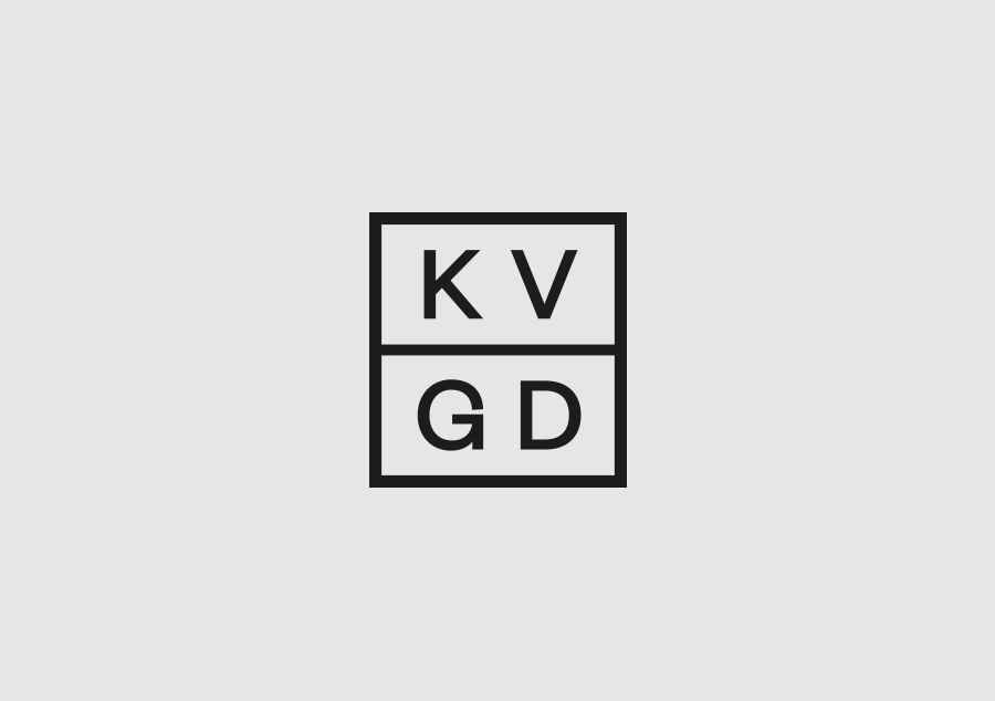
Built from the sans-serif characters of Founders Grotesk, the logo, an abbreviation of Kerr Vernon Graphic Design, appears as a contemporary interpretation of a traditional monogram or cypher. Although largely absent the individuality typically associated with monograms, this designer hopes that strategically the approach is informed by their craft origins and the individual service practice they historically came to represent.
The consistent line weight of the letters, similarly weighted border and bisecting line have been well structured with a consideration for internal space that allows it to pick up the colour of the substrate below and, as Kerr explained, influenced by the limitations of social media avatars. The tight aperture of the G is the only distinctive detail across what is an unfortunately neutral set of letters taken from a font with plenty of detail.
The reductionist approach to the logo extends across the reverse of the business cards with the continued use of Founders Grotesk set at a single point size. This shows off a lot more of the detail inherent to the font and while potential clients are unlikely to appreciate the nuances there is a credibility in leveraging the increasing popularity of type foundry Klim and its library within the design community. Typographically speaking, interest and hierarchy is derived from the use of both landscape and portrait orientations that while perhaps a little on-trend, effectively divides some of the content.
These assets and their execution is clearly informed by good aesthetic standards and an interest in current type foundries rather than a particular communicative agenda. As such the approach could be perceived as favouring convention and uniformity over self-expression in a way that appropriately frames the creativity of KVGD’s client work.
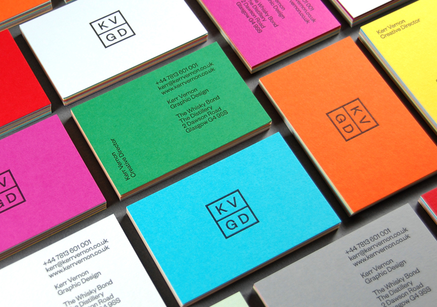
The use of a single font and the shared line weight of the logo’s characters and border has a confident restraint and forms a foundation from which to introduce the flourish and contrast of a variety of uncoated and duplexed boards. Unusually founded on opportunity rather than a predetermined communicative value, the colours are influenced by the availability of off-cuts and leftovers. Although not obvious, but easily shared in conversation, over social media or via blogs, the spontaneity of the approach, sensitivity to waste and the creative opportunistic mind that can secure the quality of G . F Smith Colorplan papers with an economy in mind is notable and largely accounts for the projects appearance on BP&O.
The ‘quality economy’ of the paper sourcing and the use of one crafted type choice, also resonates through the use of a single black ink debossed as a letterpress print finish, the open stitched detail of KVGD’s promotional booklets and Kerr’s own involvement in the construction of each piece, a process shared through social media.
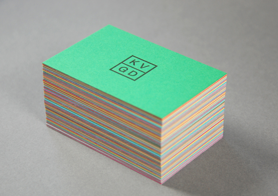
Although there are few assets there is enough crafted detail in the material choice, construction, print finish and type origin, intelligence in the paper sourcing, visual stimulus and character in the variation of colour and solid digital experience to deliver distinction alongside the restraint of the logo and layout of type. Each of these choices effectively touches upon the key competencies of a contemporary graphic designer without appearing superfluous.
Design: KVGD
Opinion: Richard Baird
Fonts Used: Founders Grotesk
