Dosatres by Comite Studio
Opinion by Richard Baird Posted 17 July 2014

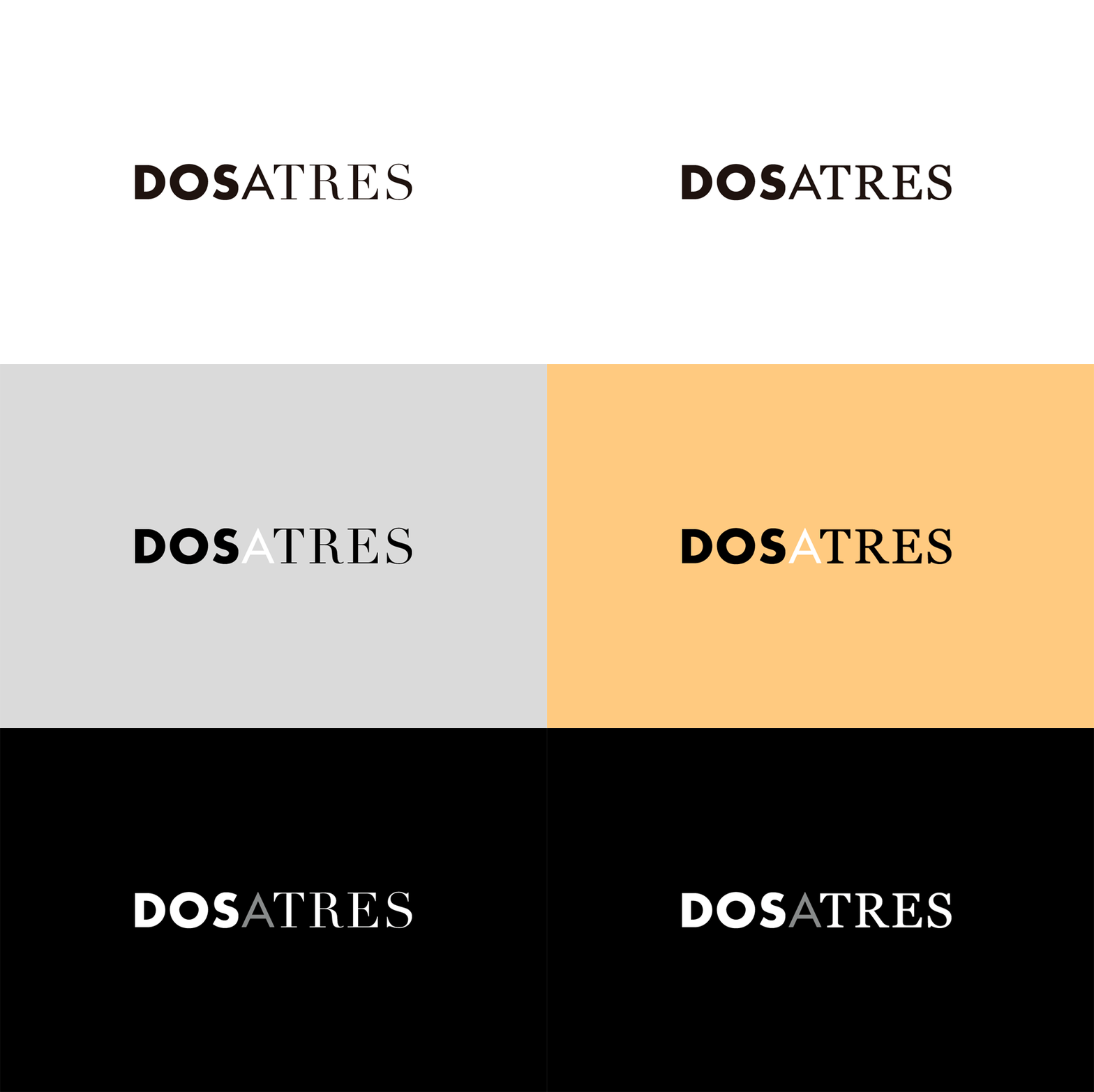
Dosatres is a Spanish company that connects and manages a wide network of creative and strategic business centres that help brands to discover the best way to grow and communicate. Created by design studio Comite and based around the name ‘two to three’ — informed by the company’s ability to broaden communicative opportunities and paths to growth, and the concept of moving from two to three-dimensional thinking — Dosatres’ visual identity acutely contrasts three typefaces, three coloured papers and a variety of images online.
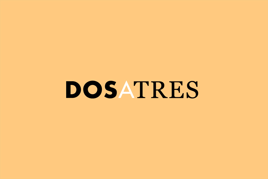
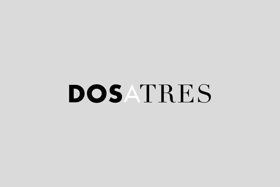
While perhaps a little abstract, the concept of two becoming three — moving away from the limitations of an ‘either or situation’ — provides a fairly robust foundation from which to build an aesthetic. The logotype’s serif, slab-serif and sans-serif fusion, the contrast of differing weights, flourishes and reduction, works sufficiently well to convey a multitude of ideas including, but certainly not limited to, traditional and contemporary approaches, an eye for detail and restraint, authority and subtlety. The characters could have benefitted from a little more distinctiveness, currently appearing a touch commonplace, but are generally well resolved.
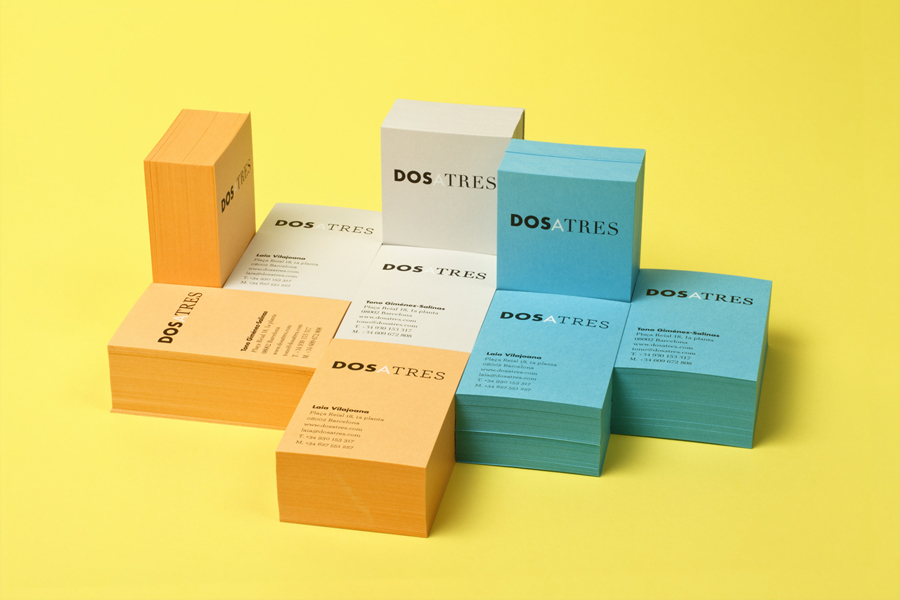
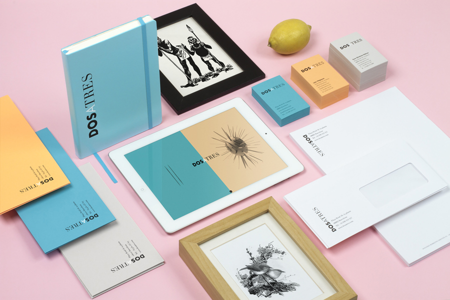
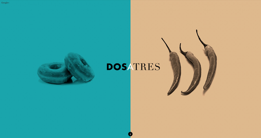
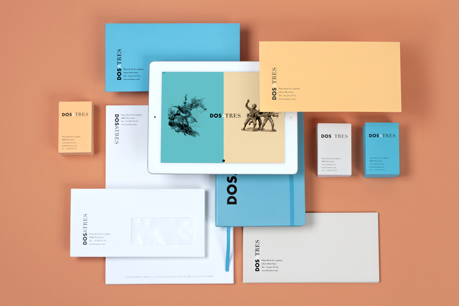
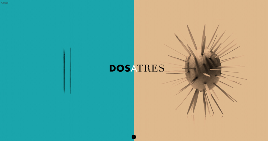
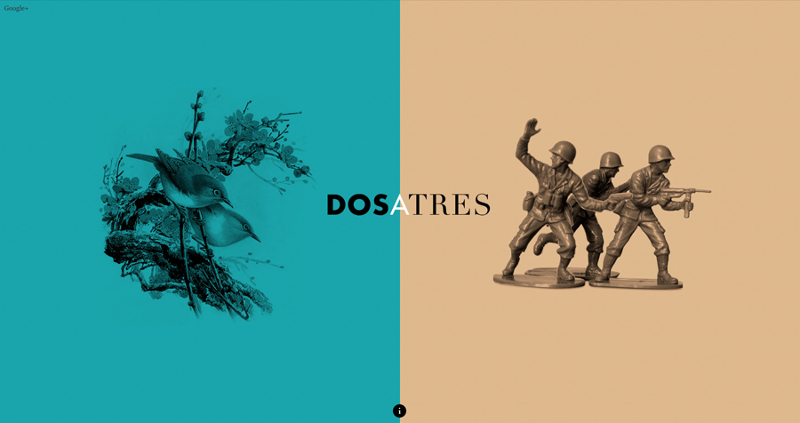
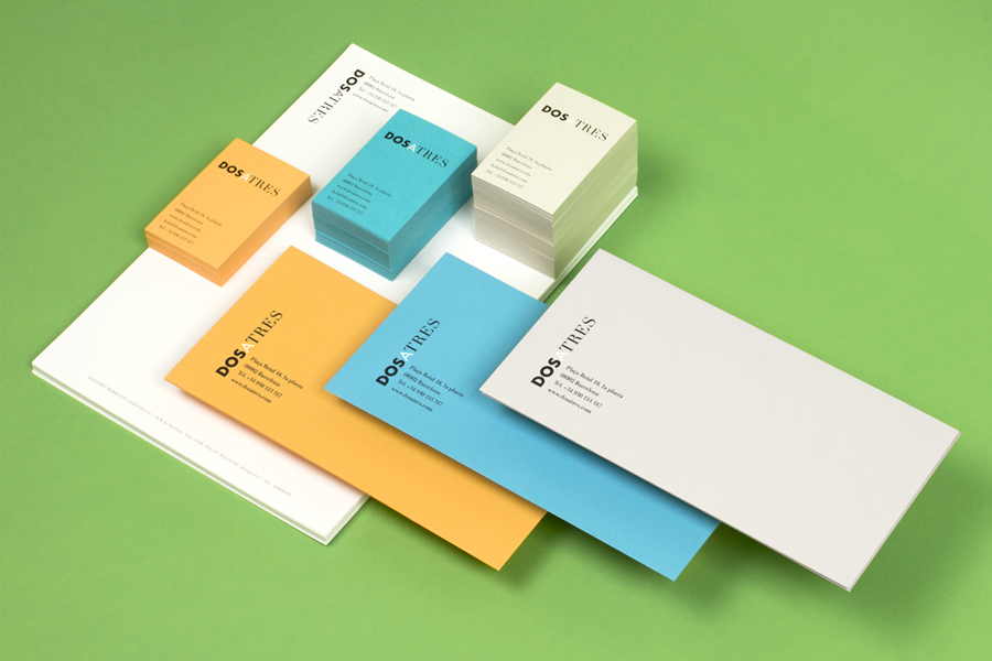
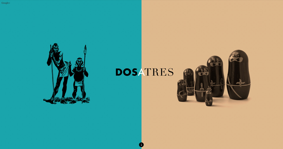
Contrast continues subtly through the material choices and more explicitly in the nature of imagery. A stationery set of business cards, compliment slips and notebooks made up of dyed papers brings together a formal grey, ‘innovation’ blue and warm orange with a current on-trend sensibility. Online a holding page of old and new photographic and illustrative images effectively juxtapose detail alongside simplicity, the abstract and playful, two dimensional sketches and three dimensional objects and draws on cultural references broadening the communicative scope established by the logotype and hinting a global mindset.
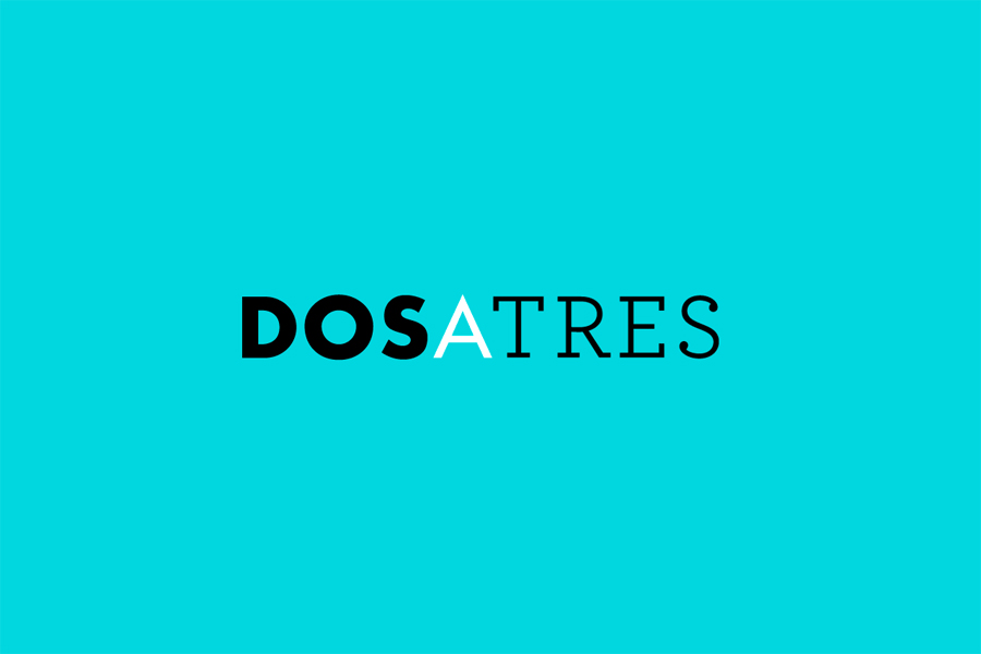
Comite’s direction appears as a straightforward mash-up that is intentionally aesthetically jarring, bold in its broad communicative agenda and effectively leverages contrast to convey understandable ideas with an visual interest. It could have been awkward but appears largely well resolved and appropriately uses a variety but consistency of colour, material, type and image, in print and online, to convey multiplicity, diversity and opportunity.
Design: Comite
Opinion: Richard Baird
Fonts Used: Futura, Solomon Sans, Didot, Archer & Georgia
