Ritualize by Shorthand
Opinion by Richard Baird Posted 7 August 2014

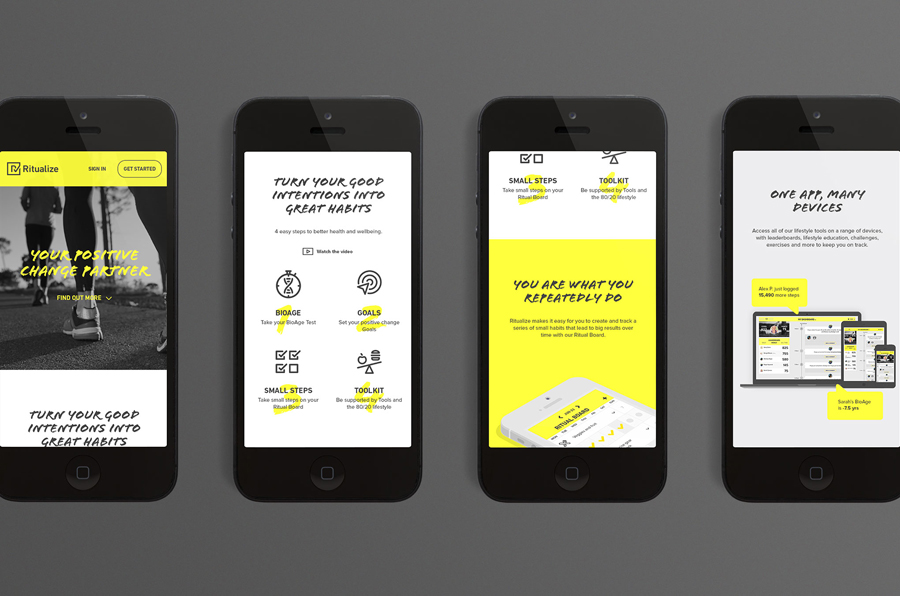
Ritualize is a cross-platform fitness and lifestyle app that utilises leaderboards, education, challenges and exercises to establish and track small habits that should lead to improved physical and mental health, and a sense of well-being over time. Shorthand, an independent brand identity and graphic design studio based in Newcastle, Australia, were recently commissioned to help bring the app to market. This included naming, visual identity, website and stationery design as well as establishing the look and feel of the app’s user interface.

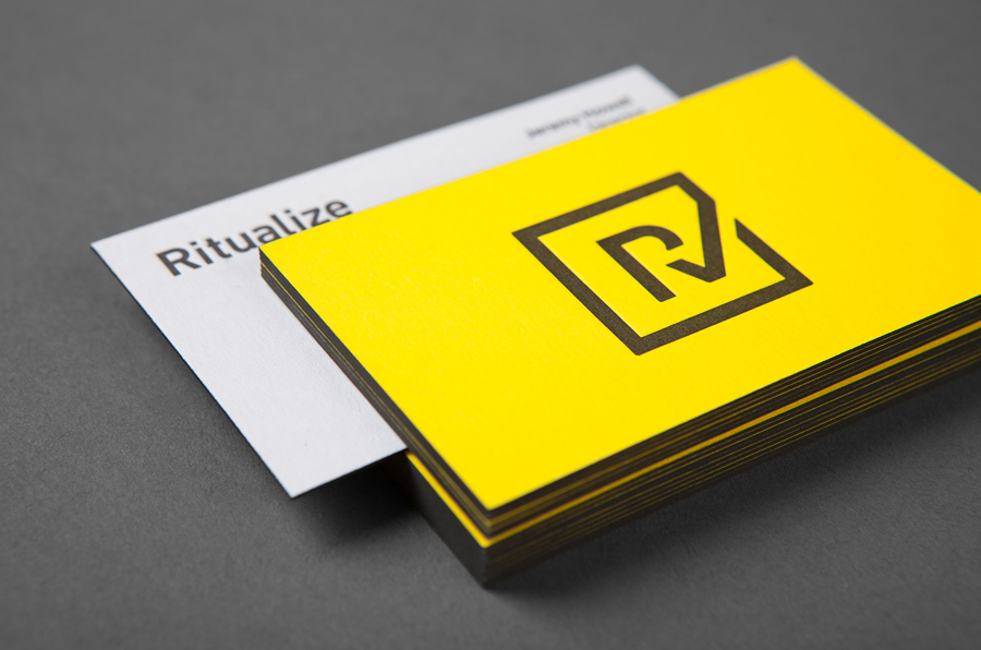
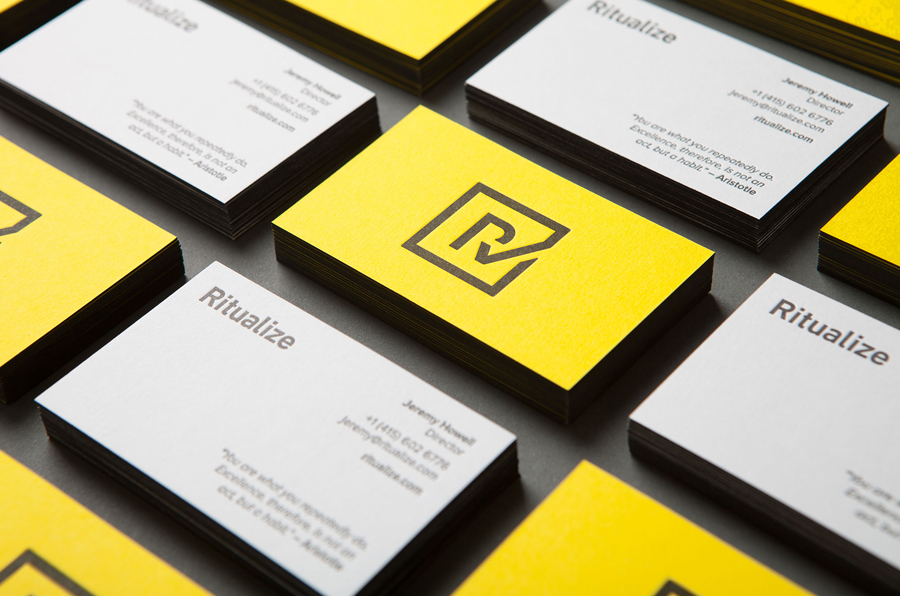
Based around a logo and a similarly weighted and well spaced sans-serif logotype built from DIN Next Medium, a bright yellow and grey colour palette, and the thickness, edge detail and deep print impression of a duplex business card, Shorthand’s approach shuns many of the cues of the fitness and lifestyle market, blue and green being one of these, in favour of what I perceive as a mix of corporate and almost industrial utility. The compounded nature of the logo, an attempt to draw distinction from the ubiquity but communicative impact of the checkmark, is clear and well resolved but may well have been done before.

The robust foundation of a sans-serif logo and two colour approach is appropriately broadened using the more familiar lifestyle sensibilities of the photography, the personal and individualised qualities of the brush script Flood, and the technological accessibility of a large icon set rendered with an on-trend single line weight. There is a slight economy in the repetitive rather than individually rendered nature of the script’s characters but this succeeds in introducing a bit of energy and motion into the website and app.
Together these assets feel like appropriate choices to frame a technology designed to help people meet their personal fitness goals through activity, and delivers enough contrast between the expected and unexpected, without undermining clear communicative requirements, to stand out within the category.
Design: Shorthand
Opinion: Richard Baird
Fonts Used: Flood, DIN & Proxima Nova
