Blue Baths by Ryan Romanes Design
Opinion by Richard Baird Posted 12 August 2014

Blue Baths is a renovated bath house originally opened in 1933 and located in Government Gardens, Rotorua, New Zealand. Blue Baths features geothermal heated pools and art deco detail, and has the distinction of being one of the first places in the country to have offered mixed sex bathing. The venue is open to the public and hosts private functions including weddings and conferences.
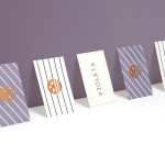
Untouched since its renovation back in 1996, Blue Bath’s brand identity was revised by Melbourne based freelance designer Ryan Romanes. By retaining the key bath house symbol but introducing a new restrained colour palette, a pattern of blue and white diamonds, a gold foil detail — informed by the interior — and adding a library of over 100 new icons, the treatment clearly conveys the wide variety of activities and services of the venue and hints at its period features. The work was announced as a finalist in this year’s Best Awards.
Although the largely unbroken panels of blue in print is perhaps a little intense — but clearly watery and likely to be punctuated by the environment these exist within — there is a very good sense of identity to this project. The icon set adds a communicative variety and character that is well rendered and effectively takes its stylistic cues from the ’96 symbol but introduces a little of its own. The fine lines and fills have a strong illustrative rather than iconographic influence but work in much the same way; effectively reinforcing text, neatly avoiding current trends and delivering a retrospective quality. These work better as large rather than small details across the front of the print work and are unusually utilised online in conjunction with an almost metro-like set of tiles. This makes for an odd contrast of past and present, rejecting convention in favour of a distinctive style but perhaps at the expense of usability.
Design: Ryan Romanes
Printing, Production & Binding: Design Bind
Photography: Vinesh Kumar
Opinion: Richard Baird
Fonts Used: P22 Underground & Numbers: Strasse