Adlin Inc. by Apartment One
Opinion by Richard Baird Posted 13 August 2014

Adlin Inc. is a consulting company that looks to help start-ups, and those that should behave like start-ups, to focus and act on customer-centric business decisions quickly and effectively. Adlin Inc. was founded by Tamara Adlin, a customer experience and e-commerce specialist who is described by Apartment One, the design studio behind the company’s brand identity, as having a bold and dynamic personal style. These qualities, as well as Tamar’s vibrancy and individuality, were the inspiration for her visual identity, which included logotype and business card design as well as a website informed by her ‘whiteboarding’ and post-it approach.

The logotype is well rendered and balanced with a good sense of motion and proportion through each of the characters, and the ligatures and overlaps that join them. The ‘n’ forming the title of the ‘i’, its extended leg and an ‘A’ that appears as a star, are small flourishes that draw further proprietary detail from what is clearly a rejection of corporate convention. The deterioration of a hand drawn marker, translated well digitally, gives the logotype an authentic enthusiasm; as though the ink cannot keep up with the ideas, and, through the aesthetic of correction and quick direction ties in well with business.
Like the logotype the website avoids convention. The post-it inspiration is perhaps not as explicit as it could have been, which is sensible, with more of a metro tile-like sensibility. The use of colour effectively divides services and content and takes the corporate edge off the profile pictures.


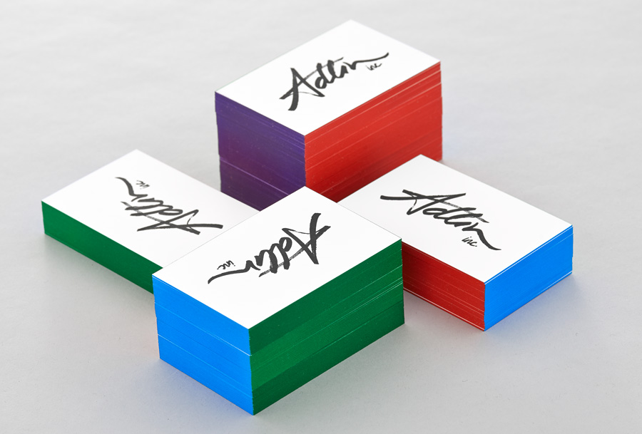
The business cards are largely logo-centric apart from a fairly plain and generously spaced sans-serif that offers contrast on the reverse, and the addition of an edge painted detail. The use of four different colours across each of the surfaces, an unusual and labour intensive direction, introduces further individuality, a youthful vibrancy and is a fair reflection of a creative mind.

The logotype it is far from expected, appearing as the antithesis of corporate visual vernacular in a bold and successful attempt to achieve difference, personality and convey an individual enthusiasm. This is appropriately backed up by a good use of language online that manages to resolve creative thought (bio), necessary but subtle corporate speak (services) and informality (blog).
Design: Apartment One
Opinion: Richard Baird
Fonts Used: Whitney