Cornershop by Cornershop
Opinion by Richard Baird Posted 15 August 2014

Cornershop, formerly known as Sage, is an award-winning Adelaide based design studio. Cornershop aims to tell unique stories, help their clients grow, have an old-fashioned service practice and create brand identity treatments that cohesively exists across print, packaging, environmental and digital design contexts. The studio explain that by asking the right questions, collaborating with clients, using strategic solutions that are emotionally engaging, inspiring and distinctive, and establishing brand stories that are clearly and consistently told, they deliver a competitive advantage to each of their clients.

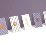
Following the change from Sage to Cornershop the studio recently launched a brand identity solution that reflects their new values and approach. Using black and white portrait photography in period costume, conversational language and long copy, and the finish of a gold foil and edge painted detail across their business cards, the identity effectively communicates the personal and old fashioned service and distinction they promise their clients as well as a sense of high quality and plenty of unique character.
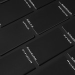
A contemporary logotype, built from uppercase characters with a single weight, rounded terminals and line breaks, much like those of a neon sign, offers a more recent contrast to the photography and draws small proprietary qualities from an increasingly common typographical approach through the flourish across the leg of the ‘R and the top of the C.

When prioritising profile pictures in print the line between vanity and play is always going to be a bit tight but the moustache and costumes definitely pushes the concept more towards the latter. These clearly deliver a personal quality and have a ‘whatever it takes mentality’ that is perhaps in the same vain, yet not as bold as, Sagmeister & Walsh, while the quality of the photography, straight faces, clothing detail and application very nearly delivers an authenticity. If I had not read the studio’s bio I would have perceived this approach as a touch gimmicky, however, as a communicative exercise it appears well-suited to the studio’s values. How this translates beyond the business cards, and especially online, will certainly be of interest.
Design: Cornershop
Opinion: Richard Baird
Fonts Used: Varela Round, Georgia & Domaine Text