Hay-Market by Foreign Policy
Opinion by Richard Baird Posted 21 August 2014
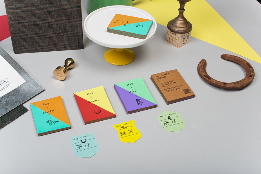
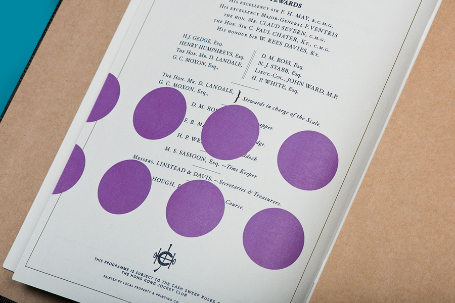
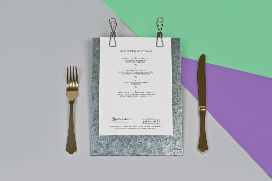
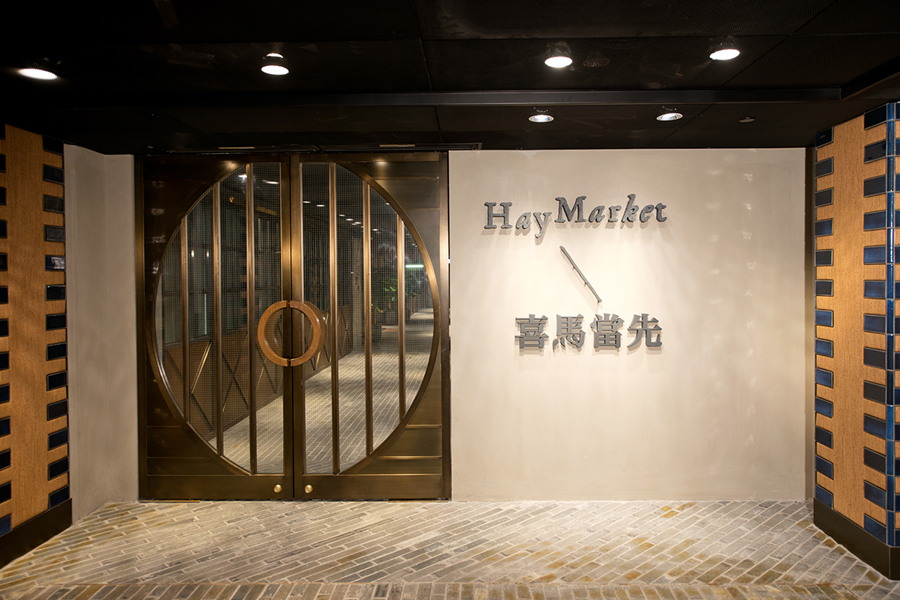
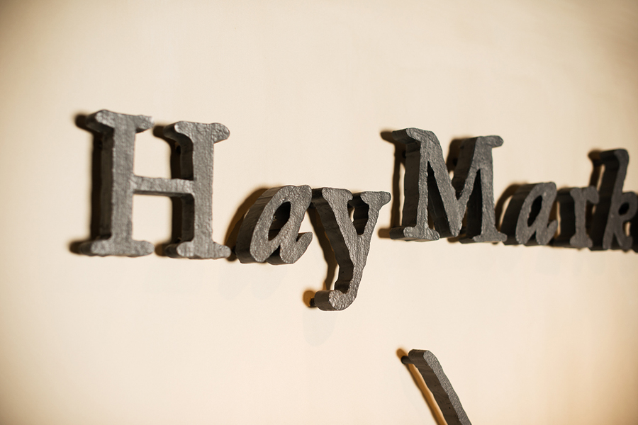
Hay Market is a restaurant set in the grounds of the Hong Kong Jockey Club with a distinctive interior of wood, leather, copper and exposed brick. The restaurant’s brand identity, designed by Singapore based Foreign Policy is inspired by British eccentricity, vibrant jockey silks and centuries of tradition and reflect the Jockey Club’s pedigree as a British Colonial entity. This is visualised as an eclectic juxtaposition of geometric shapes, bold colour contrast and material textures, vintage British typography and authentic Victorian illustrations. Foreign Policy explain that Hay-Market’s logo is a playful update on classic letterforms and also functions as a blank canvas, allowing for quirky permutations when combined with different illustrations. The project scope included uniforms, menu, interior design, animated logo, signage and wayfinding.
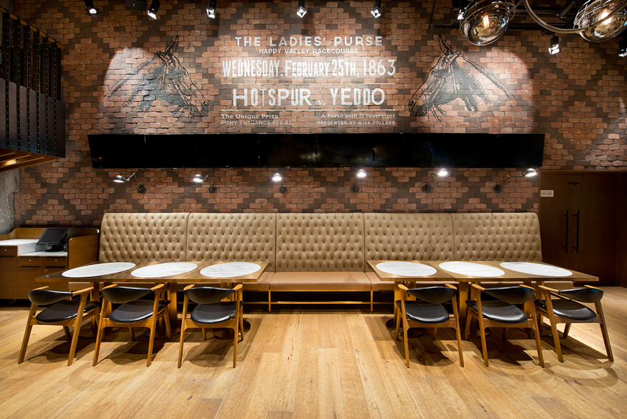
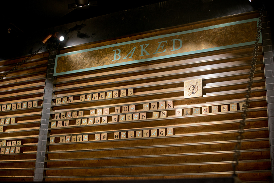
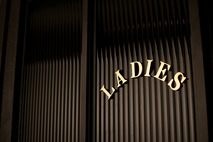
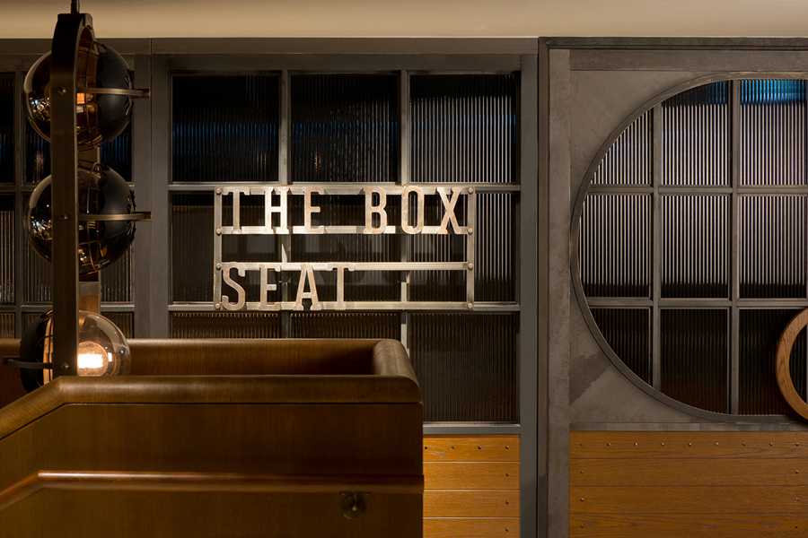
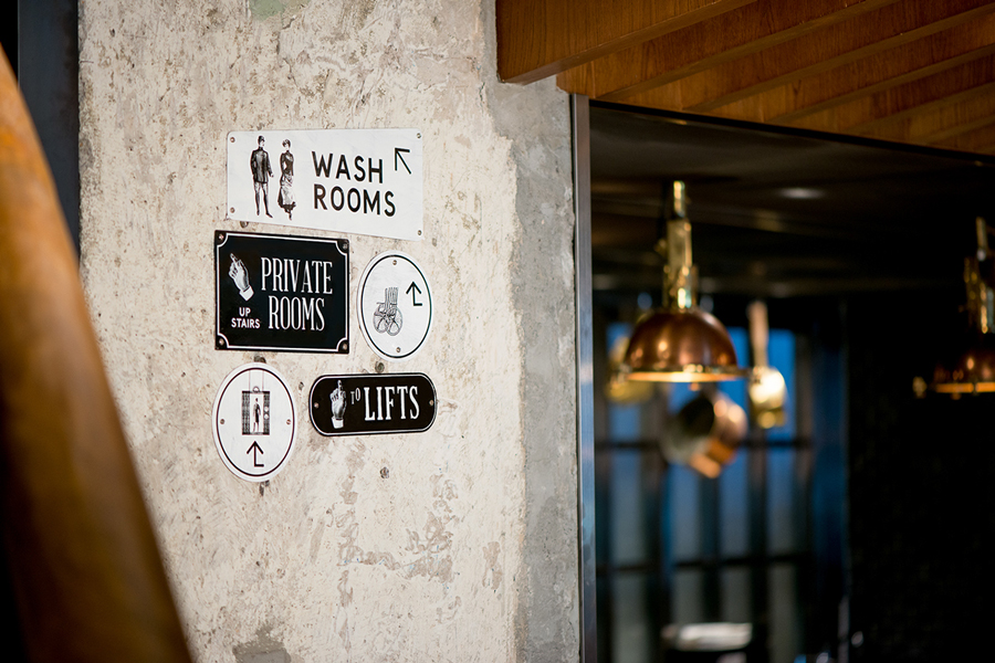
Like any good restaurant brand identity program this one leads with a very strong interior experience. Outside of furniture, fittings and fixtures, signage and way finding delivers an effective balance of British authenticity and eccentricity through the sheer variety of type choices and their execution, with a majority of these drawing reference from the racing nature of the venue. These include cast metal, cut and painted wood, old-fashioned score board tiles and tin street and amenity signs.
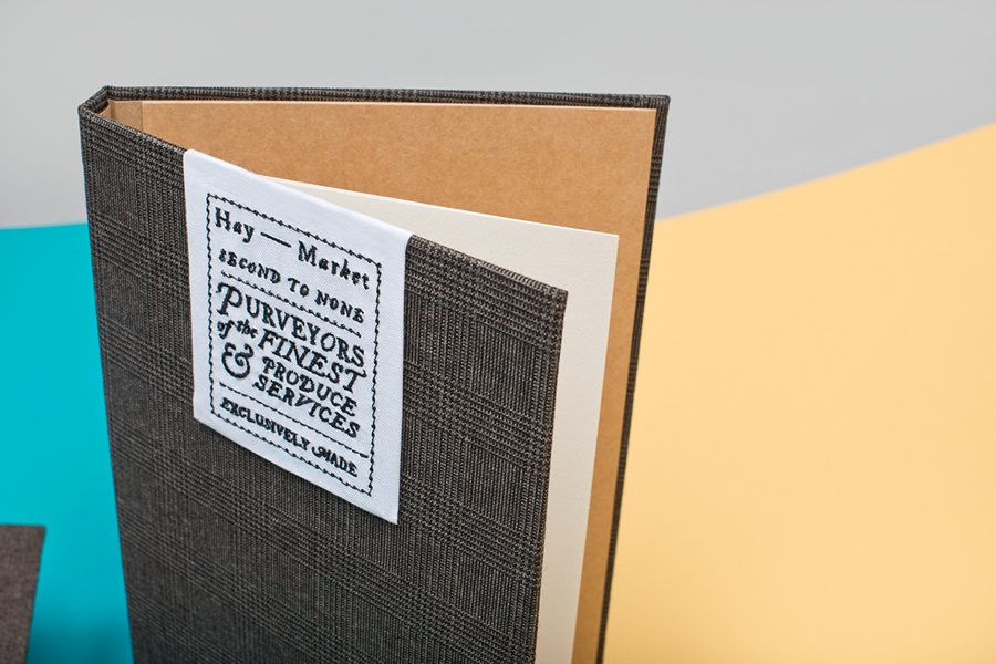
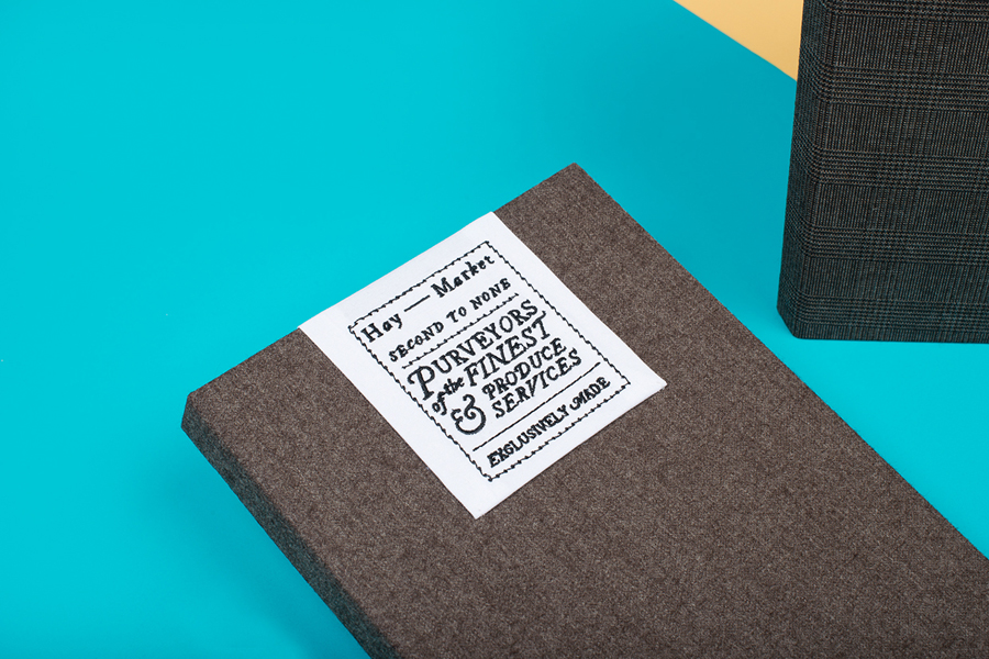
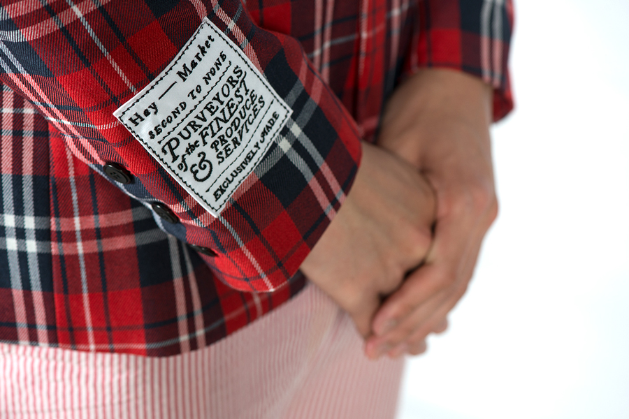
Clearly inspired by the British countryside and stereotype, and conveyed through tweed ties, tartan jackets, heavy shirts, wool cardigans and summertime stripes, the uniforms add a wealth of texture and personality. Any sense of gimmick is tempered by the quality of their design, material choice and cut, as well as the restaurant’s Hong Kong location. There is a lot of detail and variety to these, with the stitched patches being a particular highlight, so it is worth checking out Foreign Policy’s Behance project page to see more.



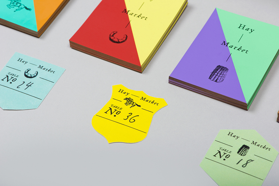
The logotype is perhaps the weakest asset but largely unimportant next to the impact of an rich interior experience and hopefully the word of mouth it should generate. Its mix of type and vintage illustration, changing to provide ‘quirkiness’, is clear in its period reference and communicative agenda. Isolated it is well executed and effectively draws together food and horse racing, however, its light type and fines lines are drowned out by a very adventurous use of colour and contrast.
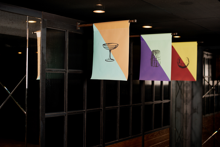
This colour, appearing across the business cards and as flags throughout the interior, introduce a brighter detail to what is a largely an earthy interior design of woods copper and leather. The combinations are perhaps a touch garish, high contrast yet unquestionably distinctive with a almost bunting like celebratory sensibility. A diagonal bisection under serves the diversity of form alongside colour used across jockey silks, so the reference is slightly more abstract or perhaps intentionally subtle. It is a strange consistency drawn from what was originally designed to create variety and individuality. The traditional material textures of the interior and uniforms make way for the more recent coated board of the business cards, this does add a tactile contrast but falls a little short in its sense of quality.


Design: Foreign Policy
Space Planning & Interior Design: Joyce Wang
Opinion: Richard Baird & Jill DiNicolantonio

