Taidehalli by Tsto
Opinion by Richard Baird Posted 9 September 2014

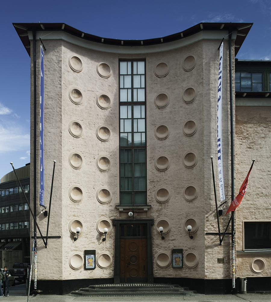
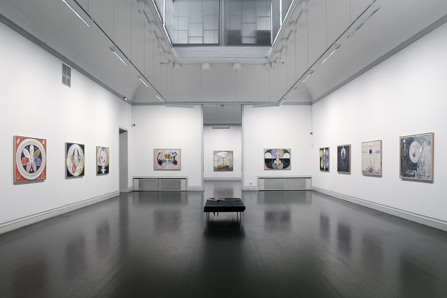
Taidehalli is an art gallery, also know as Helsinki Kunsthalle, with a significant 86-year history. It is set within the walls of a distinctive building created by Jarl Eklund and Hilding Ekelund, and during its lengthy residency has secured its place as a key space within Finland for the exhibition of contemporary artworks.
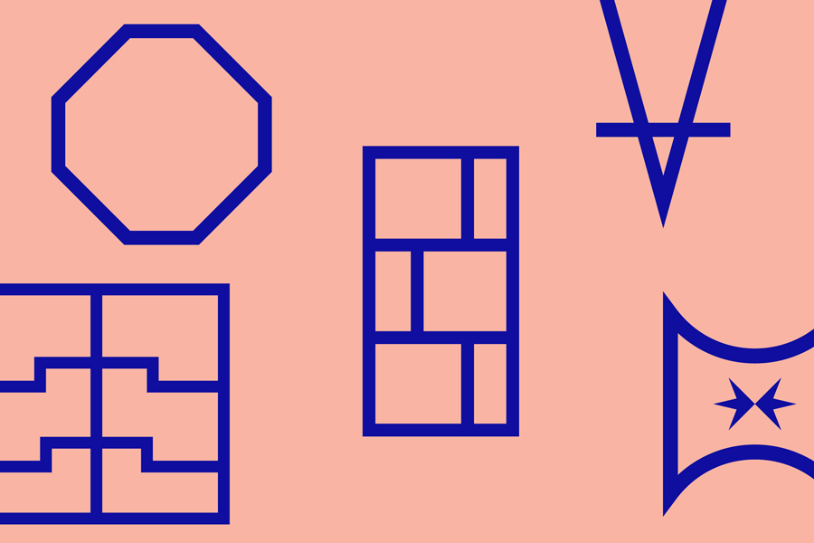
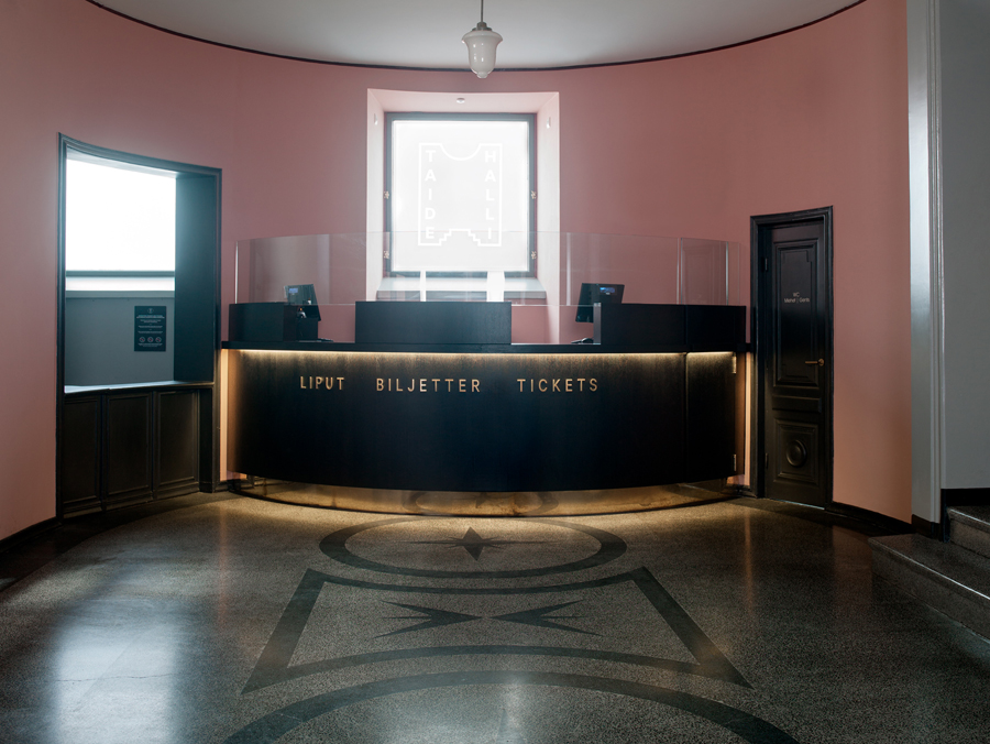
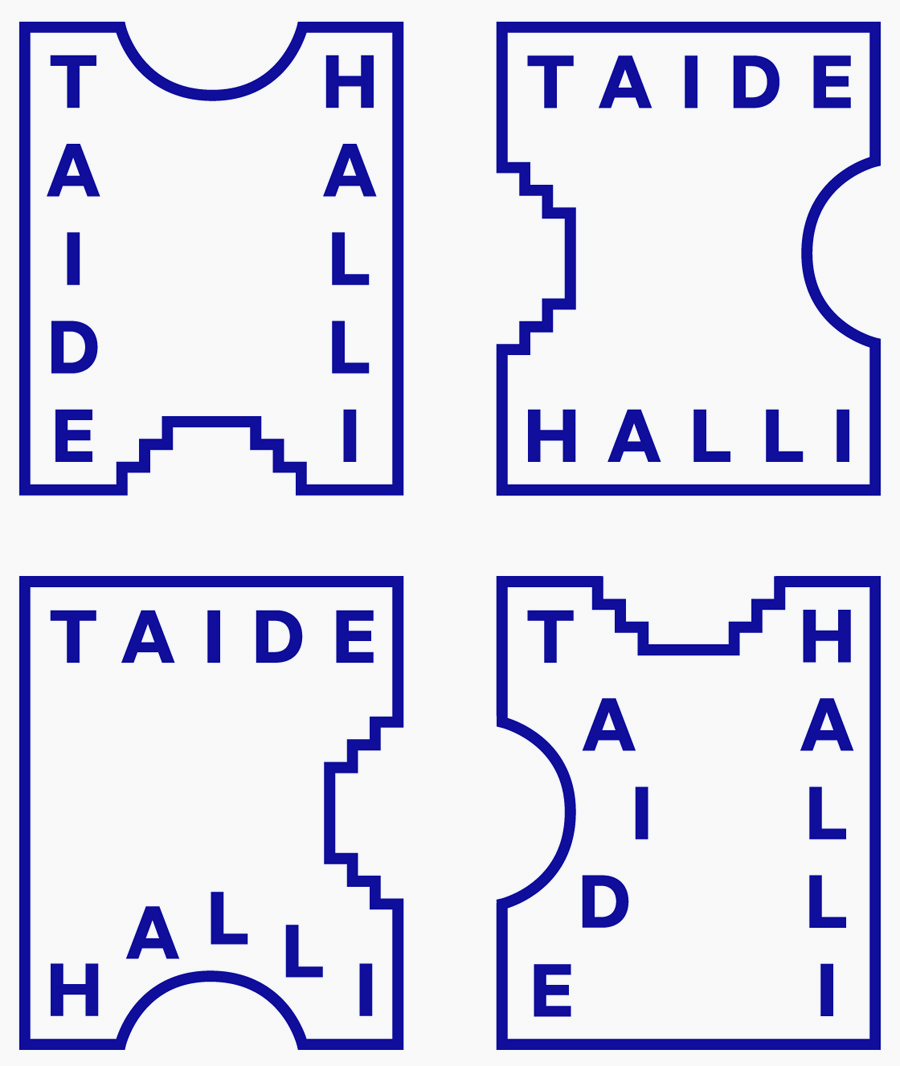
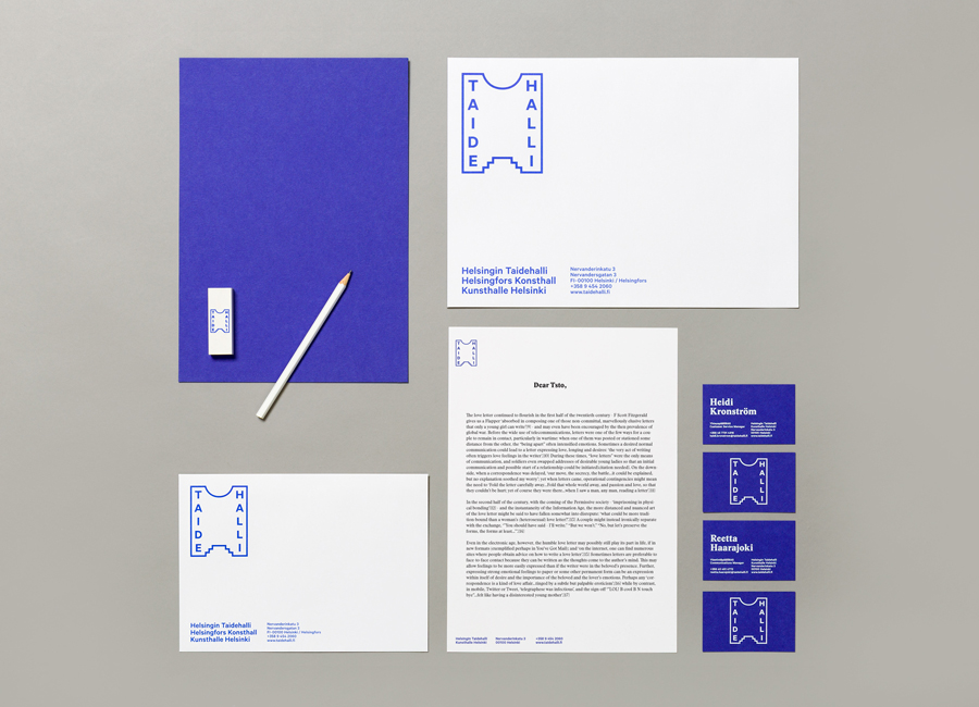
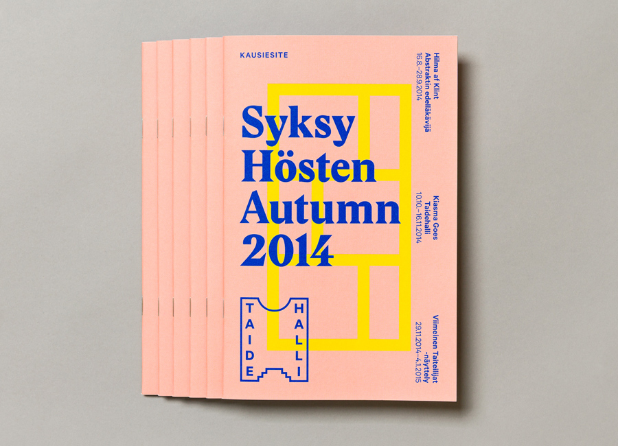
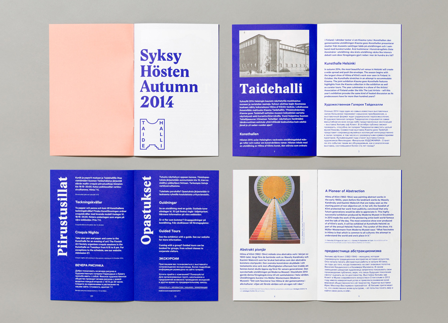
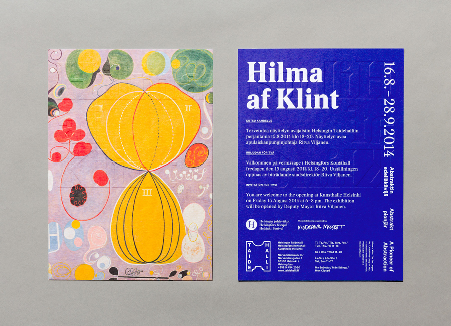
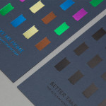
Taidehalli’s new brand identity, recently redesigned by Helsinki and New York based design studio Tsto, uses the architectural exterior and interior detail of the building to inform type, colour and a variety of shape, and effectively leverages artwork samples and print finish to communicate some of its heritage, contemporary remit and commitment to continual development.
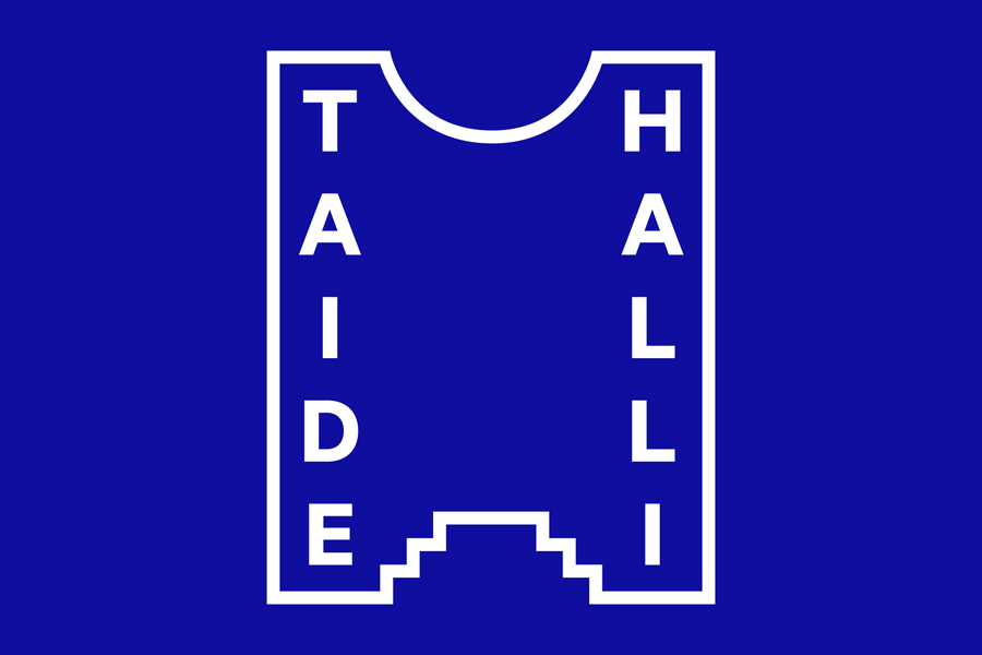
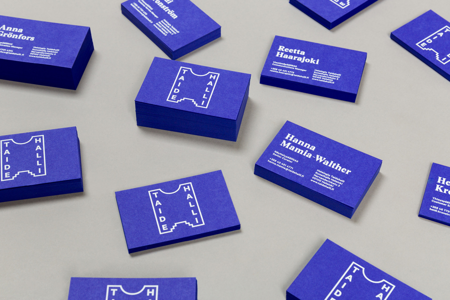
Informed by the gallery’s bold facade, windows and small interior ornamental flourishes, Taideahalli’s brand identity, primarily a mix of sans-serif logotype, frame and secondary geometric assets, while very simple, current and bound by a shared line weight, are effectively and exclusively tied to the gallery. The numerous nature of these provides an aesthetic variety and playful sensibility that Tsto describe as reflecting the constant and contemporary development of what is seen as an old and established institution, and the new ways it looks to approach modern art.
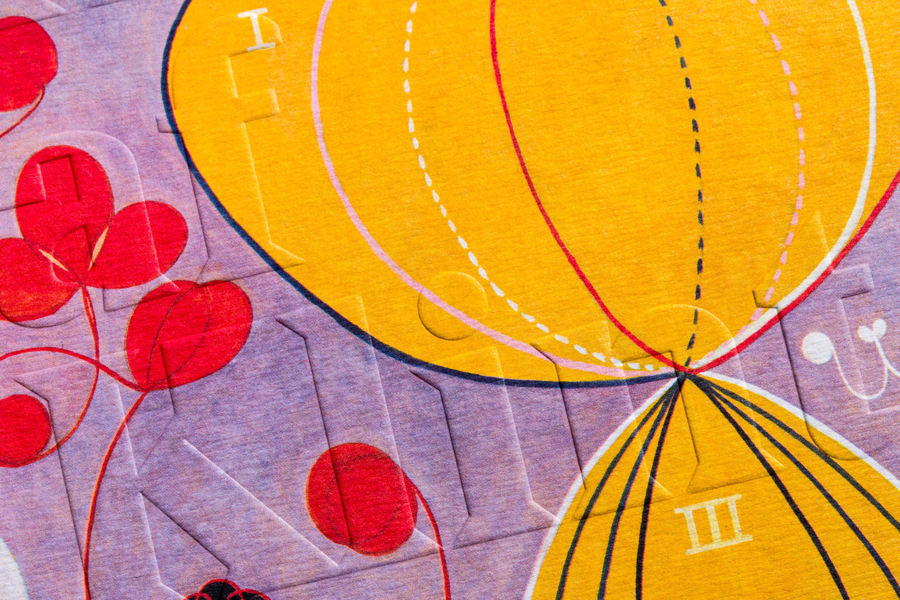
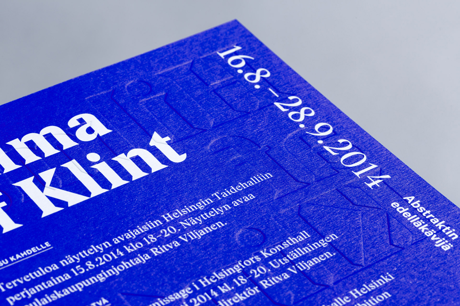
Contrast is used to good effect, drawing together and conveying the heritage of the gallery, its unique structure and the recent nature of the work inside. This comes through well in the use of basic shape and panels of flat bright colour alongside the rich, colourful and hand drawn detail of the artwork, the contrast of the heavy engraved letterforms of Stanley Poster next to the lighter sans-serif characters of Calibre, an on trend use of landscape and portrait orientation, and a mix of ink, blind emboss and dyed paper choices.
Design: Tsto
Photography: Patrik Rastenberger
Opinion: Richard Baird
Fonts Used: Stanley Poster & Calibre
