Skovin by Heydays
Opinion by Richard Baird Posted 8 September 2014

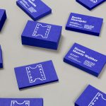
Skovin is Norwegian, high-end, solid wood floor specialist that combines ancient craftsmanship with modern technologies. By mixing a wood veneer business card and a traditional name drawn from the old word Skøyen, the area in Oslo where the company was founded, with geometric shapes and die cuts, panels of flat colour and sans-serif typography, Skovin’s identity, designed by Heydays, intends to express the company’s fusion of past and present process.

Inspired by floor plans, Heyday’s solution draws out the modular nature of Skovin’s products, the flexibility of their application, traditional materials, contemporary processes and high quality, using a combination of rich photographic detail, material choice, panels of flat bright colour and basic geometric forms.


These forms are intelligently leveraged as die cut brochure covers across lifestyle shots, headed paper and invoice detail, large store-front signage and picked out using red and white inks and boards. This approach effectively extracts strong aesthetic impact and communicative value from simple shape and is underpinned by an understandable concept that manifests itself in a number of interesting and cohesive ways.

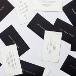
The use of cut paper, colour and form — a solid reflection of contemporary restraint and functionality, appropriately reinforced by generously spaced sans-serif typography — works very well to emphasise the traditional material detail within the images in print and online. Although the business cards are absent the floor plan concept, their wood veneer surfaces deliver a literal but clear and familiar reflection of product and proposition.
Design: Heydays
Opinion: Richard Baird
Fonts Used: Proxima Nova
Follow BP&O:
Feedly
Facebook
Twitter