Mitsuori Architects by Hunt &Co.
Opinion by Richard Baird Posted 18 September 2014
Mitsuori Architects is an architectural design studio that creates high quality structures and spaces that merge aesthetic beauty with careful planning and thoughtful detailing. Their large scale project experience is combined with the flexibility of a smaller practice allowing them to provide big clients with a personalised service.
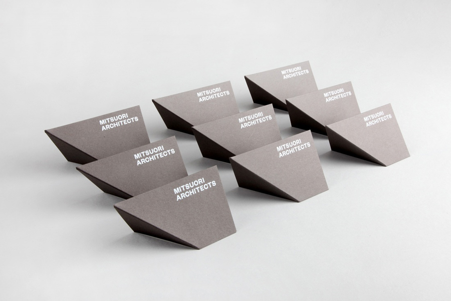
Mitsuori’s visual identity, designed by Melbourne based Hunt & Co. and informed by a name that translates from Japanese as three-fold, does not speak of individuality or differentiation, but of neutrality and common architectural principles and considerations such as light and shade, structure, materials, processes and form within three-dimensional space. These are effectively delivered through few but well designed assets that include type and material choice, fold and finish across the studio’s stationery, website and signage.
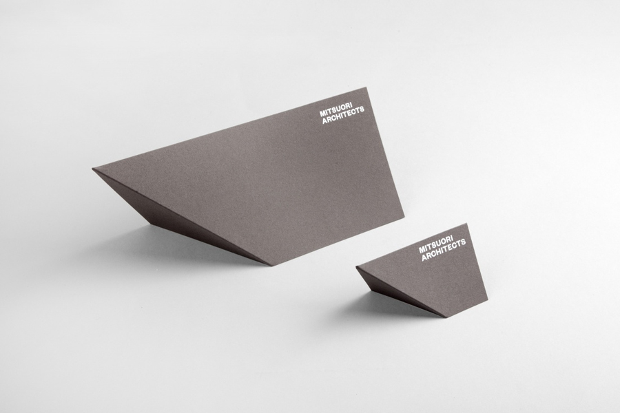
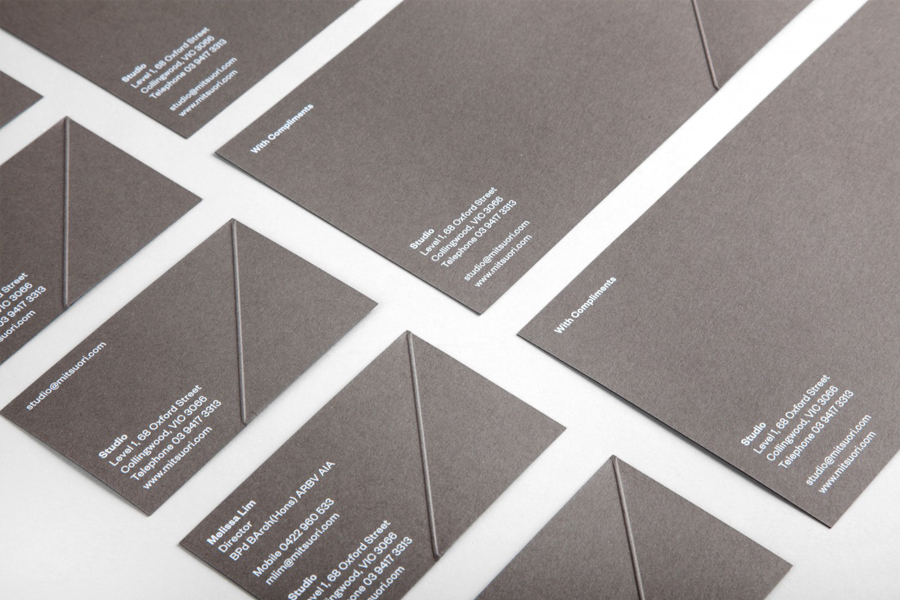
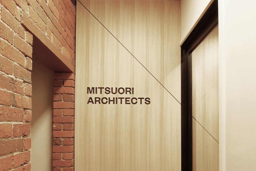
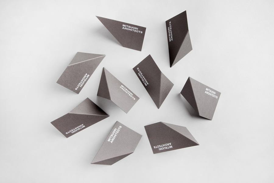
The themes of light and shade, structure, materials, processes and shape, as well as the three-fold translation of the name are neatly resolved across a stationery treatment with a simple 45 degree crease through an uncoated concrete grey board, a matt white print finish built up from six passes of ink using an HP Indigo printer, and diagonal lines through wood panels within the studio’s space.
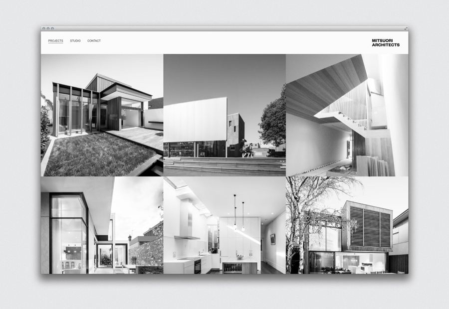
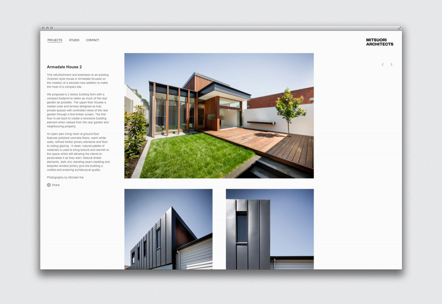
The website’s grid based layout, responsive nature, panels and columns of three, lots of white, a consistent use of Helvetica and a logotype built from the Founders Grotesk, hints at structure, space and modernistic ideals. Again, this borrows from what has become an architectural standard but is well suited to a small project such as this.
The stationery could very well be perceived as a gimmick, however, drawing so literally from the name, the architectural nature of the business and a process of paper experimentation, this detail appears well founded if perhaps a little familiar.
Design: Hunt & Co. Opinion: Richard Baird. Fonts: Helvetica & Founders Grotesk.
