Interior Architecture Symposium by AKU
Opinion by Richard Baird Posted 3 October 2014

SISU was a symposium that took place in the summer of 2014 in the city of Tallinn. Organised by The Estonian Society of Interior Architects it was a place were recognised theoreticians and practitioners from Europe, Australia and Estonia met to discuss Dynamics of Theory and Practice within the field of interior architecture. The symposium’s identity, designed by AKU, leverages many of the familiar and communicative conventions of the industry and the visual identities that have come to represent it, but uses light and the interior walls of the venue to give these a unique and distinctive quality.

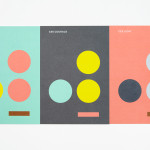
“Our perception of space is greatly dependent on light. Using fluorescent cardboard and simple folding, 2-dimensional objects suddenly create a space that invites the audience to enter. The design itself is kept intentionally flat, using only one font weight and colour. The name of the event is always framing the space from 4 corners.” – AKU


Although the identity draws on architectural brand identity conventions such as space, delivered through broad unprinted regions and a typographical framing device, structure using grid-based layouts, form through curved baselines, standardisation and economy conveyed with a consistent use of one typeface and a single ink, it is the use of indirect colour, light and white interior walls that really makes this piece stand out.

From my experience of writing up architectural brand identities for BP&O, blind embosses, gloss foils, uncoated/unreflective boards, and black and white colour palettes are an established shorthand for light and shade, the physics that give objects their three-dimensional characteristic. However, AKU’s use of folds and fluorescent board, hidden on the underside of posters and drawing on the white planes of the interior spaces on which these were mounted, is perhaps the most original approach to this I have seen. It is so effective I had initially perceived it as being electronically illuminated. I do recognise that these rely on good interior illumination and white walls but it shows an understanding of both the symposium’s theme and its location.

The concept’s translation across the event brochures, programmes and guides is equally effective and the colour choices introduce a contemporary and urban vibrancy to what is largely a solid typographical restraint and density and use of unprinted space. These colours are drawn out and enhanced by plenty of white, and while it does not translate as well on-line, as a symposium on physical rather than digital space, this feels largely irrelevant. The result draws a distinctive and original quality from the well established and expected.
Design: AKU
Fonts Used: Brown
Opinion: Richard Baird