Ceri Hand Gallery by Marcus McCabe
Opinion by Richard Baird Posted 9 October 2014
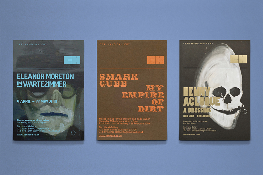
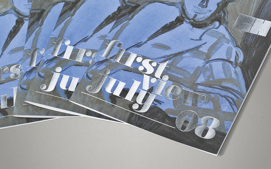
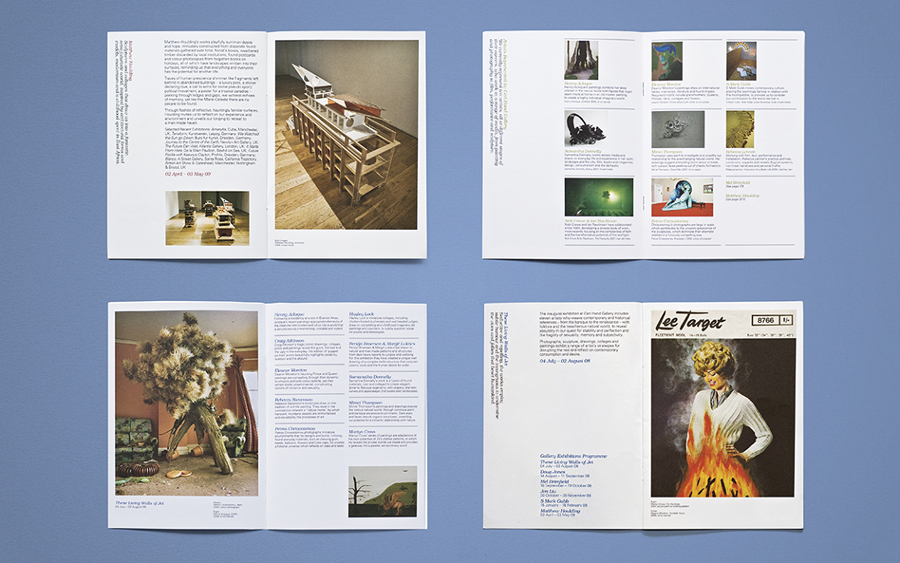
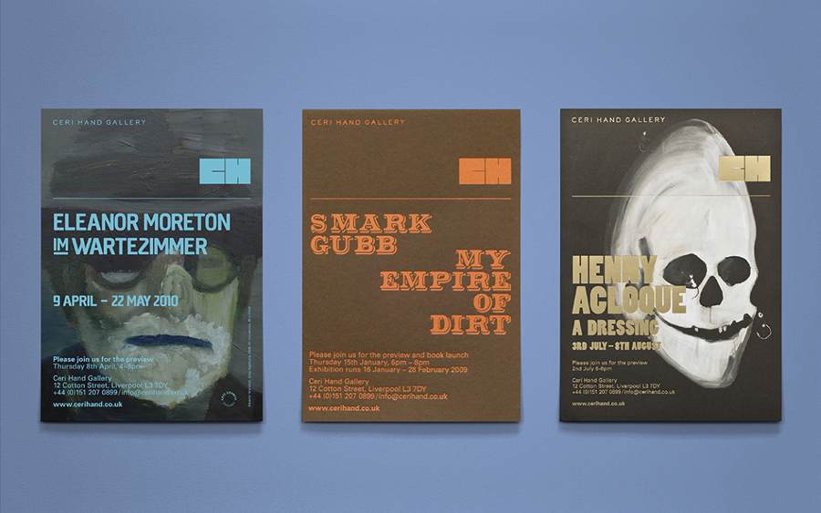
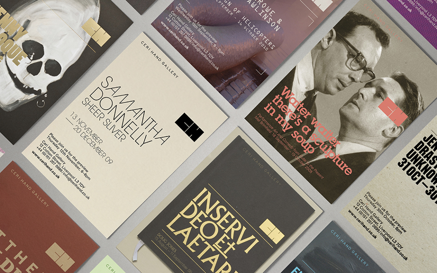
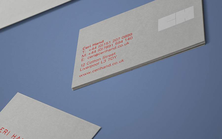
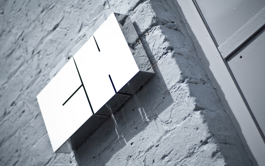
Ceri Hand was the largest, independent, commercial art gallery in the UK outside of the capital, and was located inside a converted warehouse on Liverpool’s northern dockyards. The gallery was founded in 2008 in response to a lack of commercial galleries in the city and with the intention of supporting artists through the promotion of new work and the staging of exhibitions. Created by Marcus McCabe while working at design studio Uniform, Ceri Hand’s brand identity, a bold geometric monogram intersected by fine lines and executed as foils, screen prints, embosses and signage, represents the gallery space and establishes a distinctive contrast to the detail of the artwork it sits over.
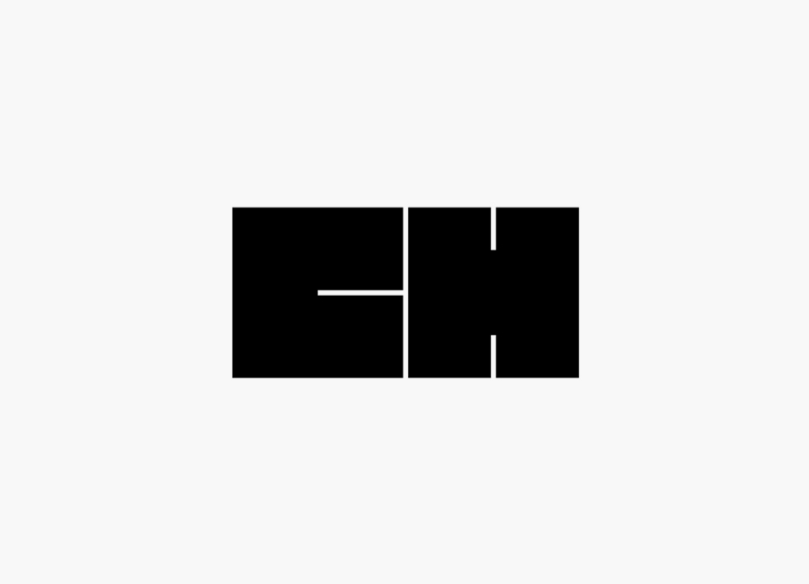
The weight and solid fill of the Ceri Hand monogram, something easily associated with businesses wanting to foster the perception of robustness, is unusually attributed to the large interior space of the gallery. It provides a strong anchor from which to ground a variety of imagery, print finish, and a typographic diversity that includes the reductive quality of sans-serifs, the impact of bold condensed characters and the flourishes of fine lines and ball terminals. Each of these is suited to the unique character of each exhibition, and like the monogram, provide contrast to the depth of colour and organic detail of the artworks.
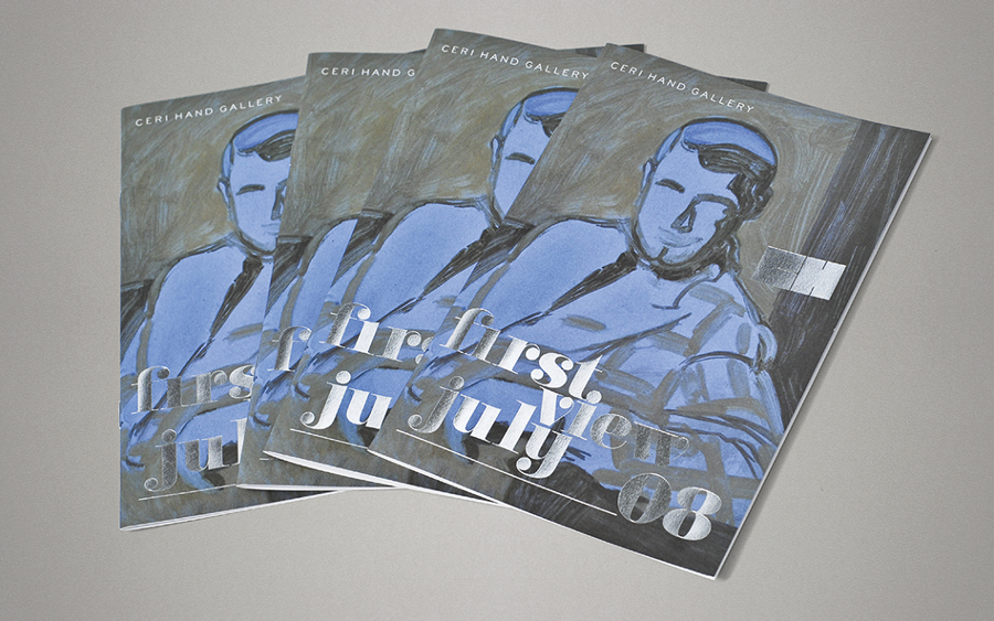
Where gallery identities are typically created with the intention of framing work, here it functions more as a signature. This is something that also resonates well through the logos monogrammatic origins and the themes of curation and craft associated with the showcasing of art. Within the context of a gallery, an experience of artistic detail and individual expression, its weight and reduction is unexpected and distinctive, within the context of a warehouse gallery located on a dockyard, it is bold and intelligent.
Design: Marcus McCabe & Uniform
Opinion: Richard Baird
