The Bone Line by Inhouse
Opinion by Richard Baird Posted 10 October 2014
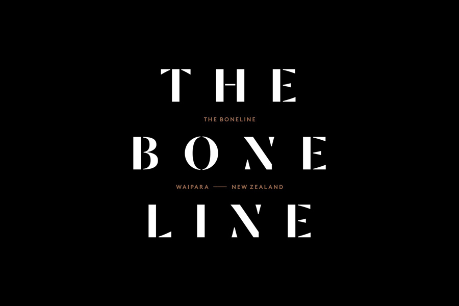
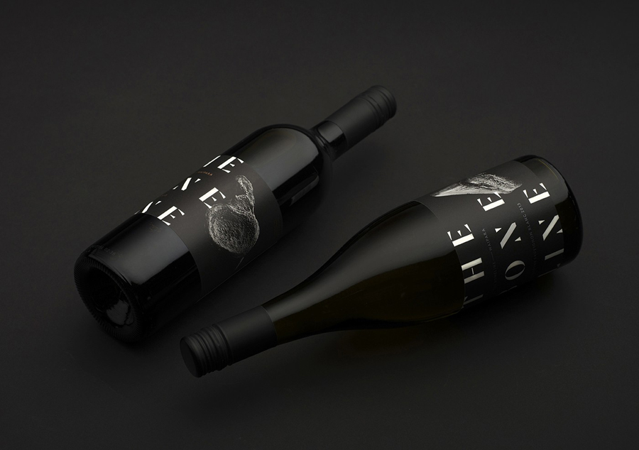
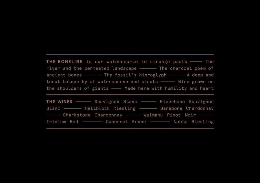
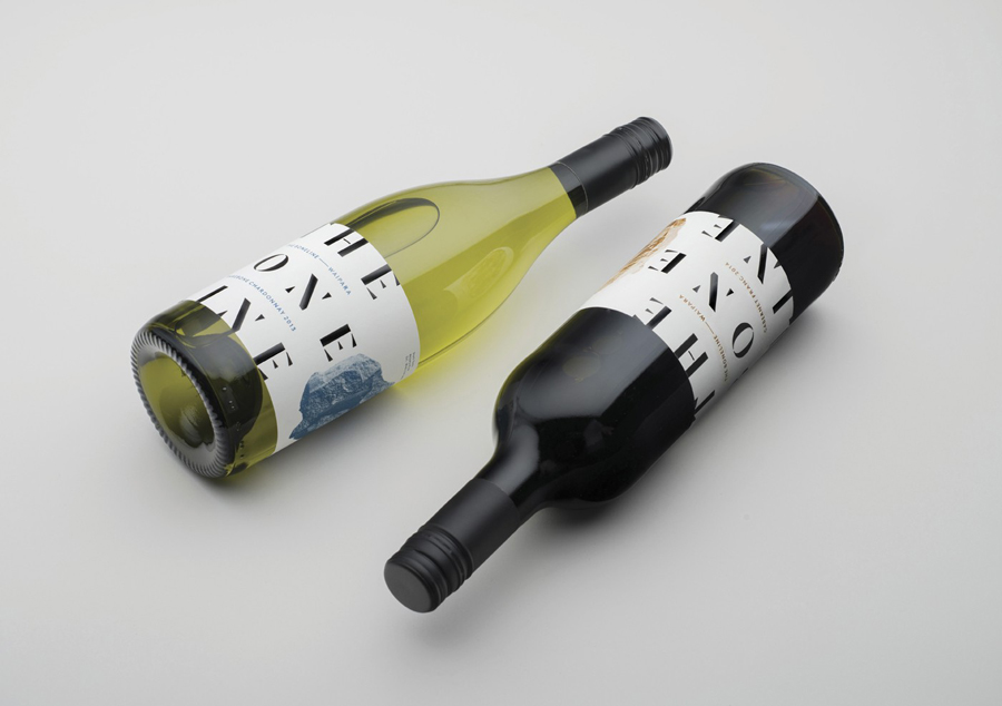
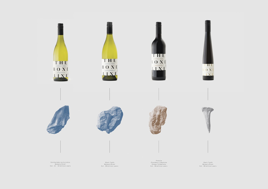
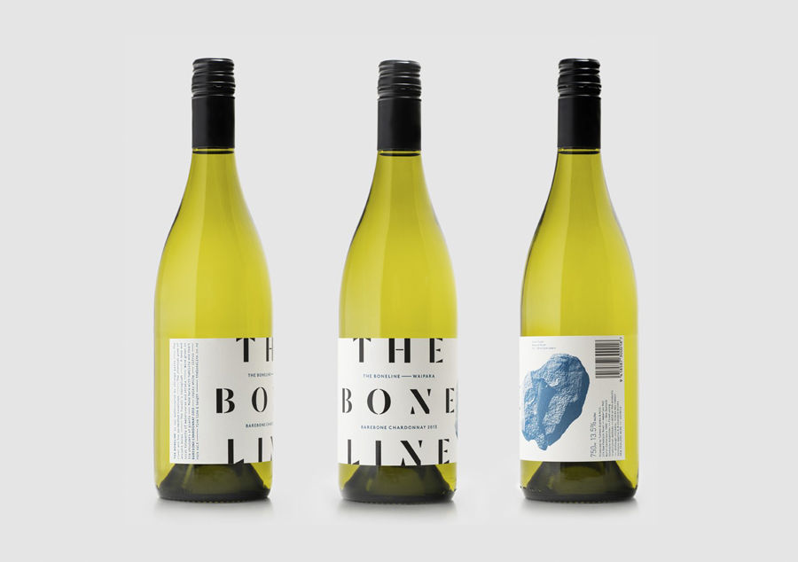
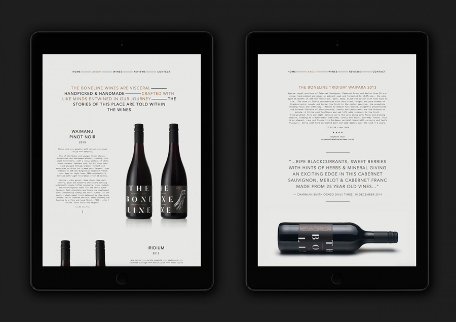
The Bone Line is a New Zealand winery with a name that references the K—T Boundary, a thin band that runs close to The Bone Line’s location in the Waipara Valley, and that marks the end of the Mesozoic Era and the extinction of the dinosaurs. Auckland based graphic design studio Inhouse worked with the winery to establish a distinctive packaging and identity treatment. Like many good wine label solutions, Inhouse have taken its cues from the provenance of the wine. While conventional, this approach benefits from a significant regional prehistory that ties in well with the themes of age and vintage, and is effectively visualised through a contrast of type reduction, the detailed texture of fossil photography and a black, white and copper colour palette.
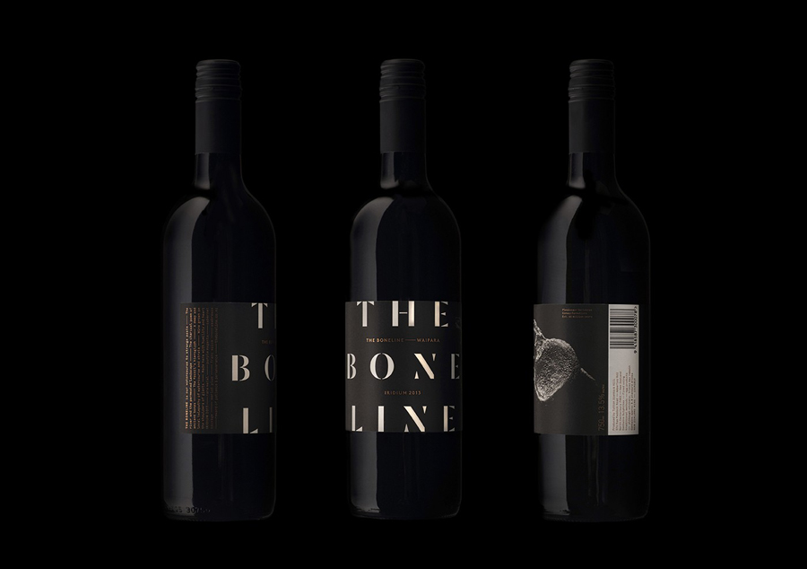
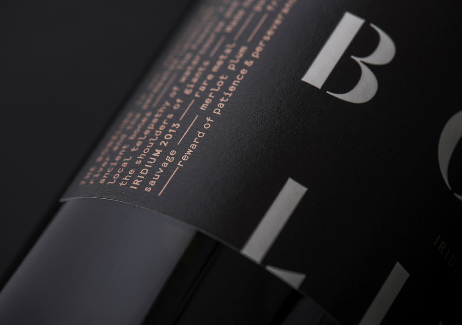
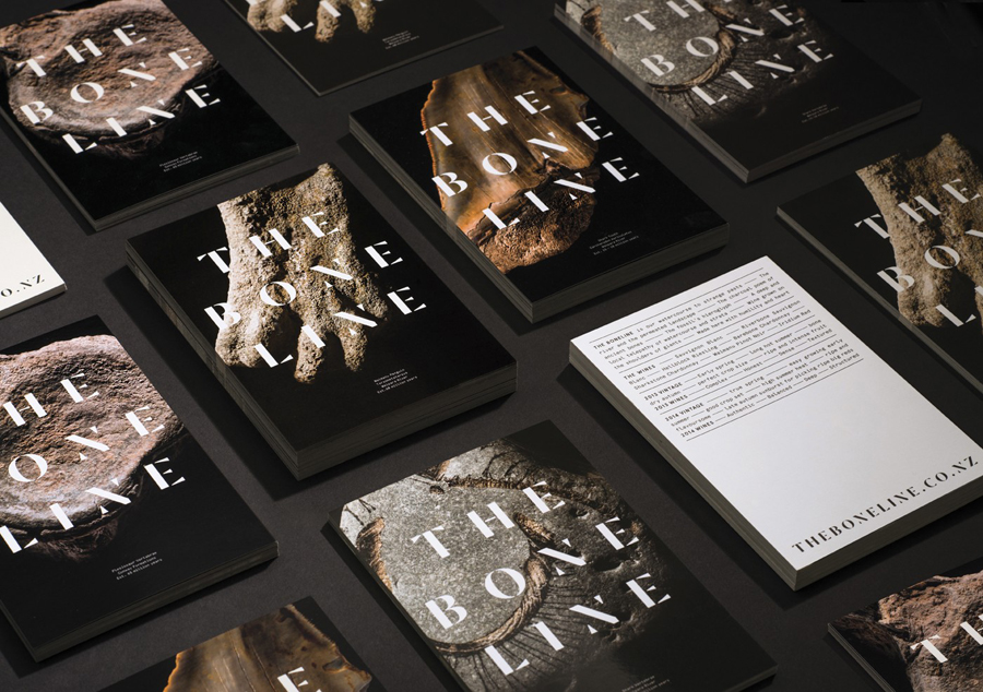
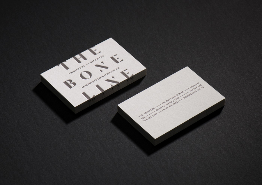
Although the history from which Inhouse’s work draws on is significantly older than most wineries choose to leverage, the aesthetic is contemporary and distinctive. The use of what looks like Commercial Type’s Dala Moa is a lovely choice. Its geometric serifs and worn detail mix traditional elements with age and a contemporary reduction whilst also having a very subtle bone-like quality, this is further enhanced by a bright white fill set against a black background.
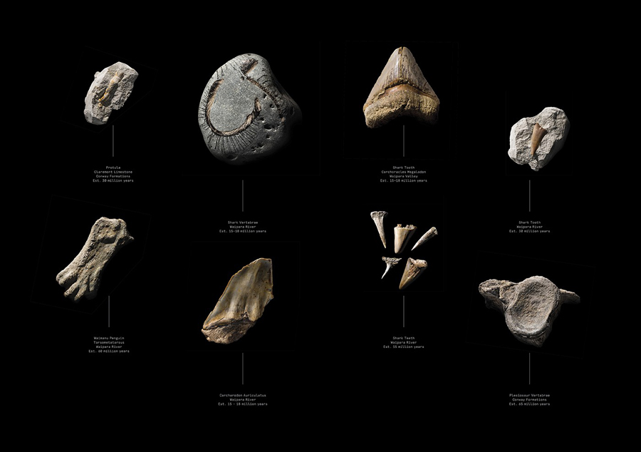
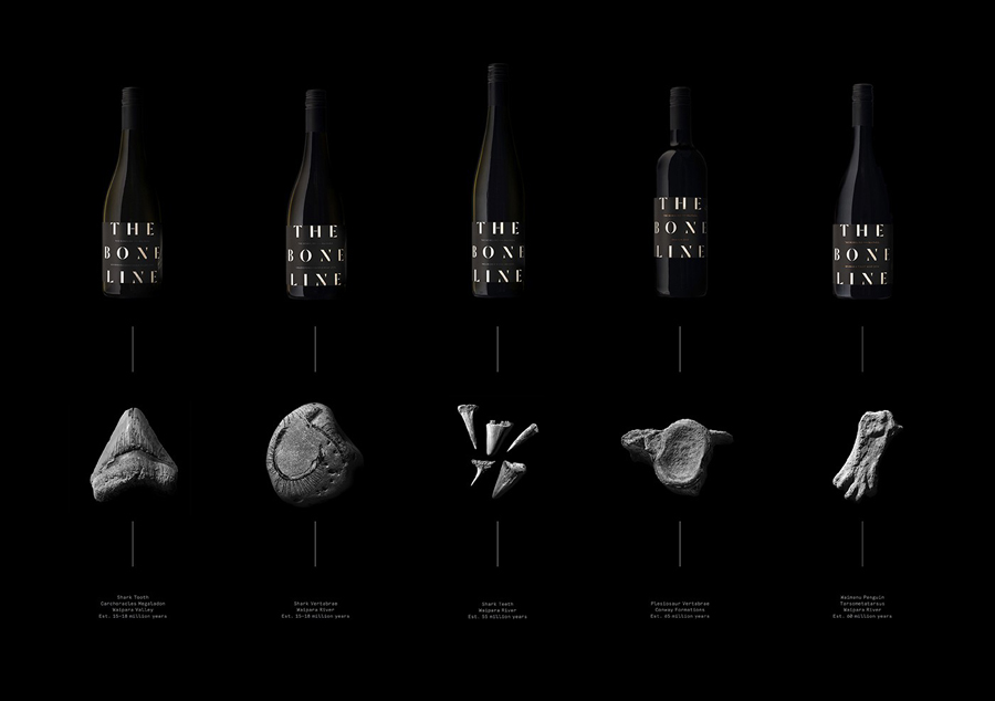
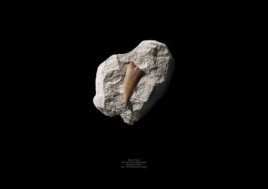
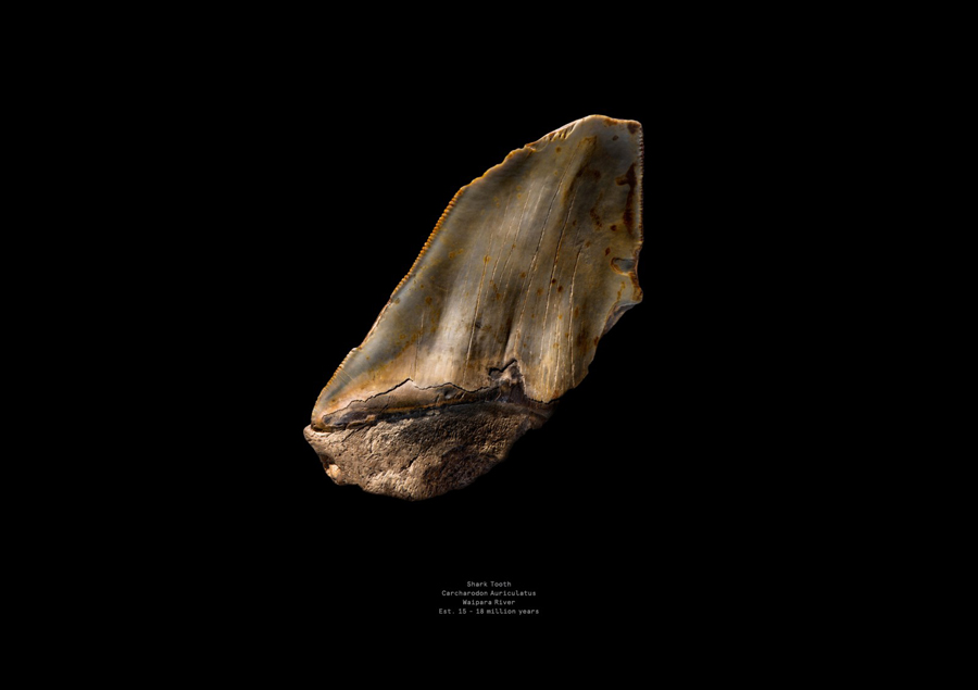
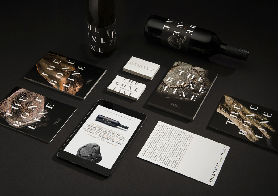
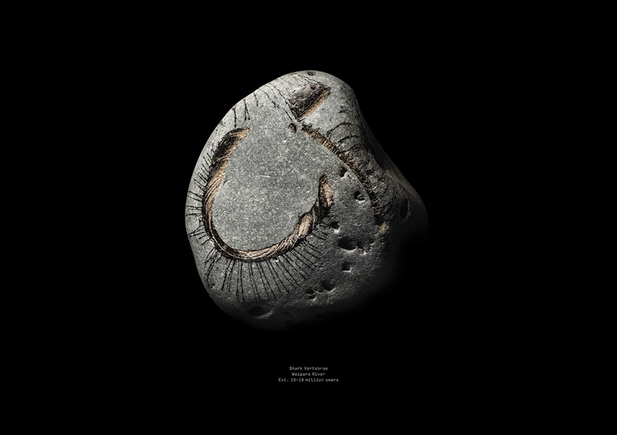
The simple shapes of the letterforms are juxtaposed alongside the very fine organic detail of rock beset with prehistoric fossils. These are incredibly well shot, are distinctive, and make for a unique aesthetic contrast alongside type, yet both of which feel like they have emerged from the one concept. There is an expense in the quality and variety of these images which have been effectively across postcards as well. A copper ink detail draws on the conventions of the industry without appearing superfluous or gratuitous in its presentation of good quality and heritage.
Design: Inhouse. Opinion: Richard Baird. Fonts Used: Dala Moa & Aperçu Mono
