Soma by Manual
Opinion by Richard Baird Posted 21 October 2014
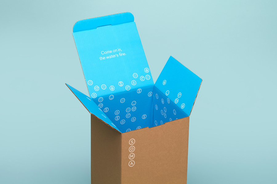
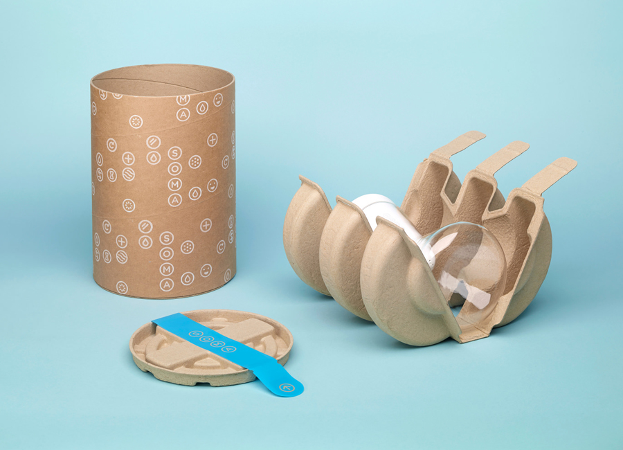
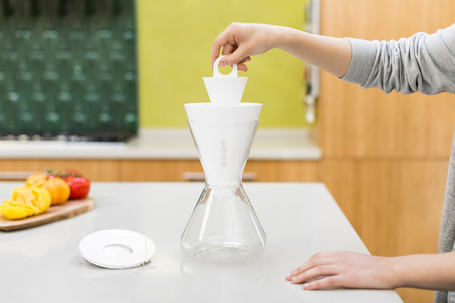
Soma is a water filtration brand that is described by Manual, the design studio behind its brand identity and packaging treatment, as bringing together sophisticated design, sustainability and charity. These values are evident within Soma’s first product, a glass water carafe that uses a 100% compostable filter, its packaging, and the commitment to charity donations that comes with each sale.
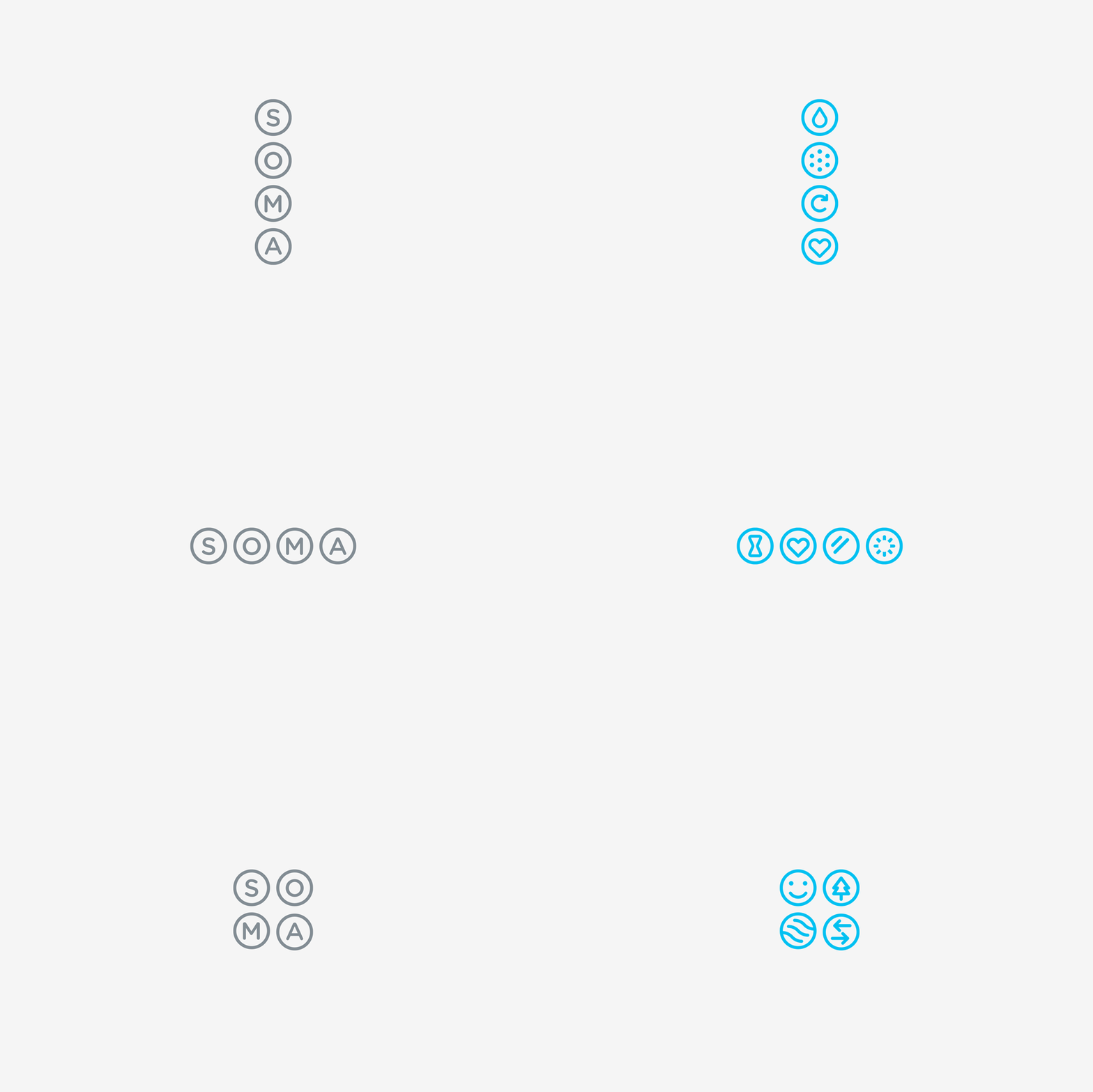
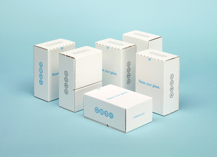
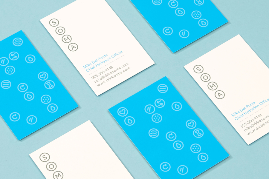
The single consistent line weight and rounded terminals of the logotype’s characters, its adaptable structure (as shown in the animated logo above), and similarly styled iconography executed as white inks, appropriately reflect the modular nature of modern filtration systems, the downward flow of water and purity in a contemporary and reductive manner.
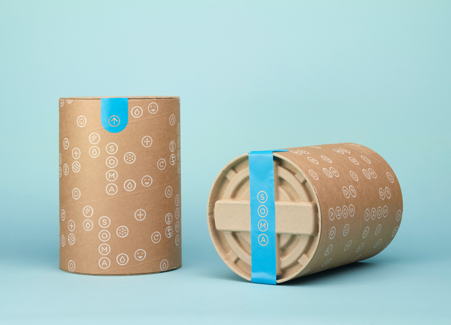
The iconography mixes environmental and instructional imagery well, some perhaps more clearly than others, whilst their bubble-like qualities, tying them to the logotype, mirroring the soft shapes of the carafe and enhanced by their coalescence in print, is playful and well utilised across the packaging. Individually their common forms and simple rendering are perhaps not as proprietary as you might expect, however, collectively as bubbles, begin to form more of a distinctive aesthetic that is clearly informed by product.
The uncoated and unbleached boards of the packaging — tones and textures you would expect from an brand with sustainable products — is a modest and familiar yet communicative choice while the flourish of bright blue interior walls and a unique cylindrical structure of recycled material, resonate well with the design-led and lifestyle nature of Soma and deliver aesthetic impact alongside functionality.
It is a well handled duality that avoids contradiction or undermining the ideas of style, conscience or utility, and effectively blends the well-established with the unexpected to achieve aesthetic distinction, surprise and communicative value without appearing frivolous.
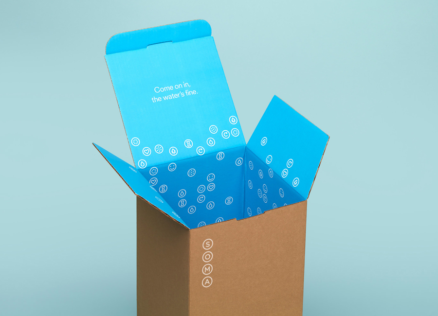
“Come on in, the water’s fine” and “Raise your glass” begin to establish some form of language based brand personality but currently appear limited, a little lost on pack and not really leveraged or expanded upon online. It would be good to see this aspect of the identity grow alongside future product launches and cohesively across other touch points.
Design: Manual
Photography: Dwight Eschliman & Michael O’Neal
Industrial Design: Moreless
Opinion: Richard Baird
