Bear Paws by B&B Studio
Opinion by Richard Baird Posted 28 October 2014
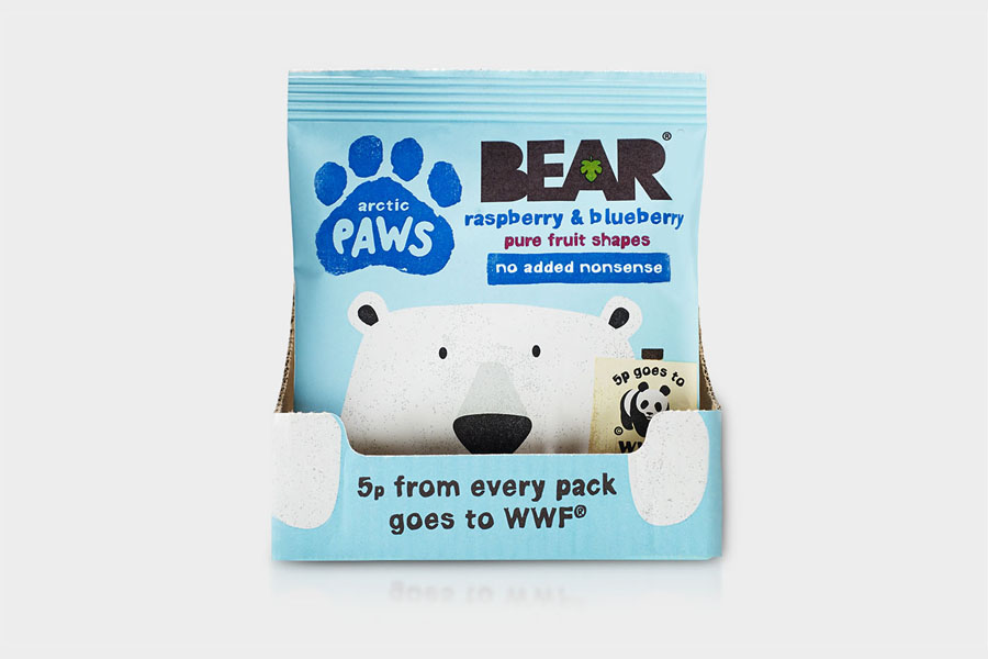
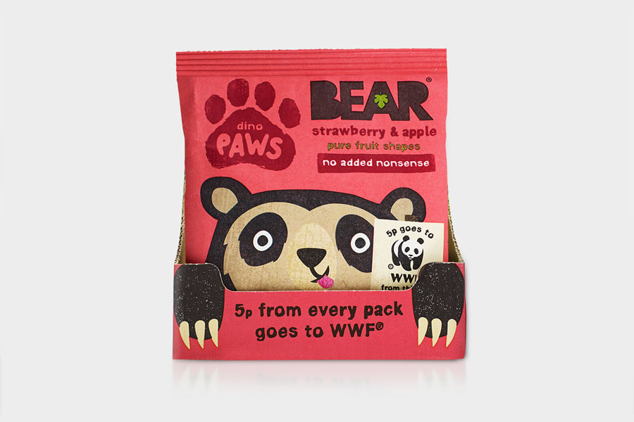
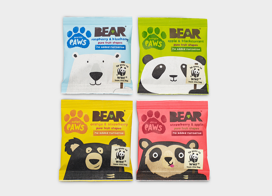
Bear Paws is a baked and shaped pure fruit snack range available in four distinct flavour combinations and produced by the British health food brand Bear Nibbles. To draw attention to endangered species such as pandas, polar and sun bears, the brand recently launched a limited edition pack design alongside a pledge to donate 5p per sale to the WWF. This limited edition packaging, which features illustrated character detail and Bear’s distinctive colour palette, was developed by B&B, a London-based design studio who have worked with Bear Nibble since its inception, establishing naming, developing identity and creating packaging treatments for its cereals and baked fruit products.
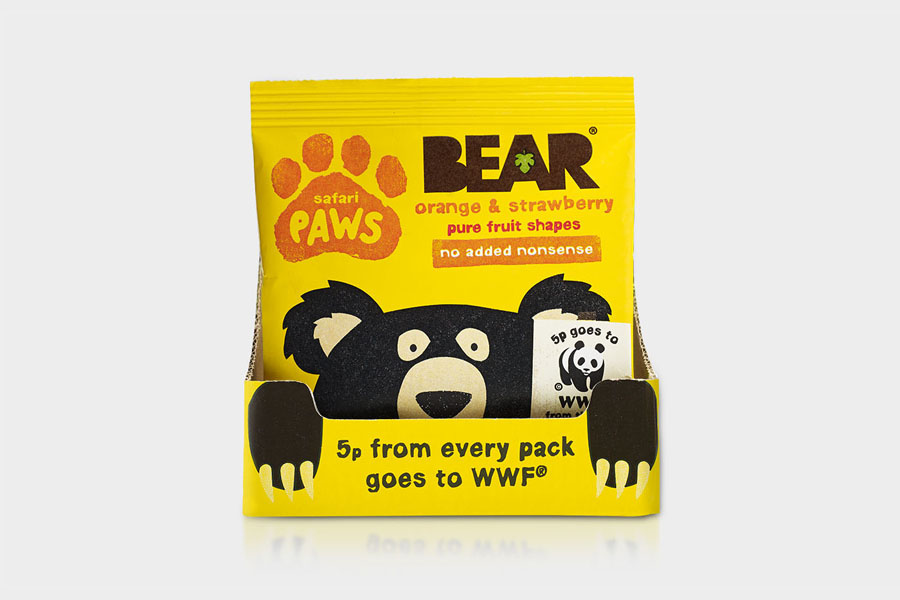
Much like their work for natural chewing gum brand Tingz, B&B’s execution secures broad appeal through an illustrative simplicity, stamp-like texture and almost rough paper cut edges. These appear unmistakably wholesome rather than synthetic, and although their size and detail is an unusual departure from the conventions of the brand, fit comfortably within and actually improves on the the established architecture and assets of the Bear Paws range and Bear Nibbles brand.
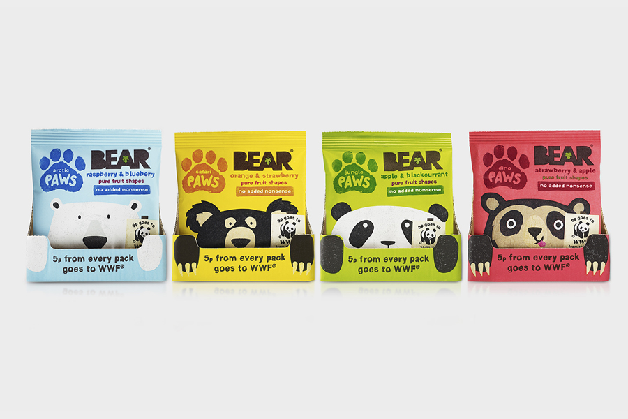
Each bear is individually very well-rendered with plenty of unique detail — a difficulty when working with similar animals — and have a good sense of positive and playful personality without becoming too cartoon-like and undermining the seriousness of the cause. While individually different there is a strong resonance between each through their width and placement, and the consistent layout and bright contemporary colour palette drawn from the original packs.
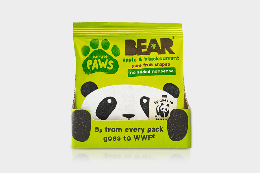
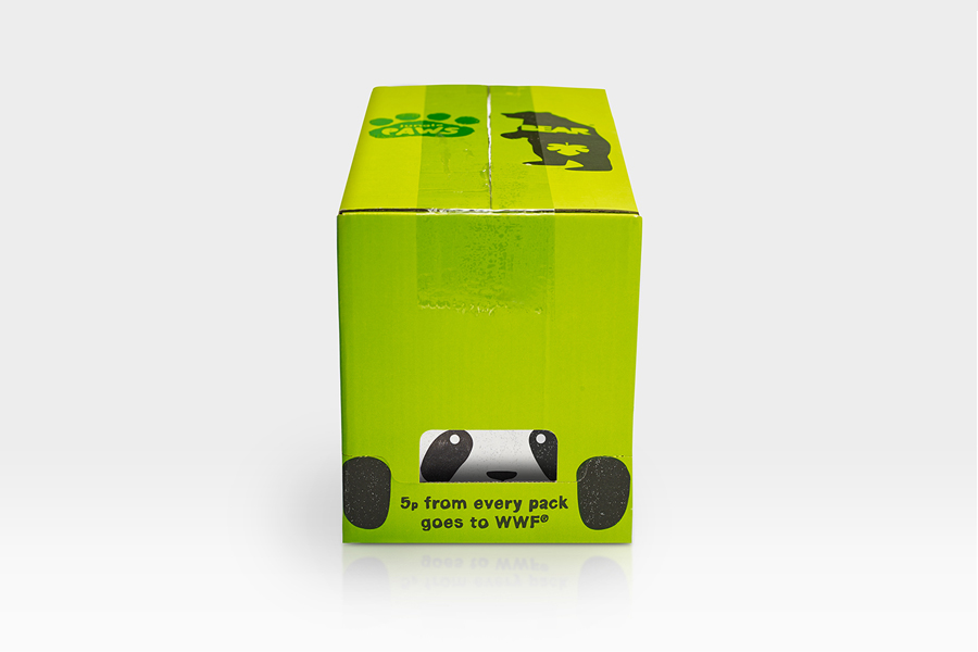
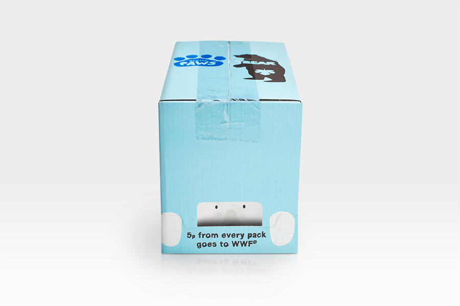
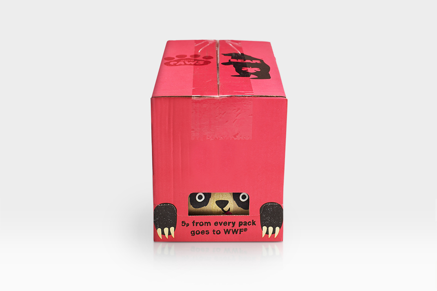
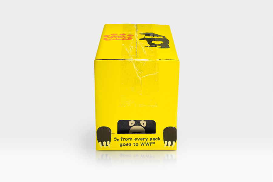
The highlight is the smart approach to structural design that, in the same vein as B&B’s work for Propercorn, leverages the frequently under-utilised utility of corrugated card travel packs to draw out the plight of the bears through a cage-like die cut element, and a commitment from Bear Nibbles to invest in printing these up, drawing aesthetic and communicative value from basic functionality.
The action of opening the box and “releasing” the bears is neat level of engagement but one that is perhaps only limited to retailer experience, which is a shame. However, when opened the box introduces a neat dimensionality to the illustrations and emphasises their vulnerability, by having their eyes peaking over the top. It is a very simple component but establishes a very intelligent and compelling relationship between graphic design, structure and cause.
Design: B&B Studio
Opinion: Richard Baird
