Café Royal by Pentagram
Opinion by Richard Baird Posted 13 November 2014

Once recognised as having the greatest wine cellar in the world and understood to have introduced French gourmet food to London, Café Royal, located on Regent Street, has been described as being the place for the avante garde to meet and dine for over a century. This year, to coincide with its reopening and reposition as a luxury five-star hotel and private members club, Pentagram, led by partner John Rushworth, was commissioned to develop a new brand identity that would reflect Café Royal’s history and its recent renovation by architect David Chipperfield. This went on to include packaging, menu design, stationery, bags and brochure.
David Chipperfield’s renovation, a testament to his modernist rigour and sensitive reinterpretation of historical material, ornamental features and colour, informed John Rushworth’s approach. The dual notion and disparate attitude of grandeur and history and a more recent architectural minimalism, is neatly resolved as five illustrations by contemporary graphic artist Kam Tang inspired by engravings and exterior architectural elements of Regent Street, and the Regency palette of Café Royal’s interior.

The illustrations, the foundation and defining character of Pentagram’s solution, are unmistakably retrospective in their reference and tie the identity very closely to the hotel’s local and environment, reflect its heritage and work well to foster and complement the perception of classic luxury. Yet these are executed with a sharp, vector-based contemporary polish. Drawn by Brixton-based graphic artist Kam Tang, a choice that in itself reflects a commitment to the more recent, these effectively utilise space and line density to introduce the perception of light, shadow and depth to flat artwork.
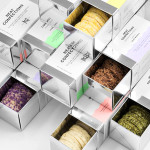
The traditional forms and ornamental flourish handle a computer generated line consistency and accuracy well and show an appreciation for the past but also a sensitivity to the contemporary expectations of refinement. The choice of reference delivers a mix of form, proportion and detail across all five illustrations which provide flexibility within the context of a variety of collateral shapes and sizes, from the square of the boxes to the slender frame of the door hangers.


Kim Tag’s work is enhanced by a good selection of high quality dyed papers that include subtle pastels and a brighter, confectionery appropriate pink across the boxes. Panels of flat colour, plenty of space, a good eye for layout and an interesting relationship and dissonance between type and illustration, sharing line weights yet differing significantly in size, have more of a current design sensibility.

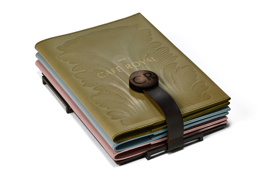
The logotype mirrors the fine lines of the illustrations, adds open and square terminals and decent character spacing. These light details take a gold foil very well and leverage the established perceptions of high quality without appearing gratuitous. The radiance of the gold foil looks particularly neat across the uncoated, none-reflective and tactile surfaces of dyed pastel papers, and alongside the embossed leather of the in-room dining, directory and stationery folders.

Redrawing historic three-dimensional architectural detail with a precise and contemporary two-dimensional rendering technique is not unusual but one difficult to pull off without undermining the authentic, period aesthetic or the understandable value that can be achieved by effectively resolving the two. This is not helped by the many years of misappropriation, saturation and poor execution of filigree and similar, and the subsequent reduction in their effectiveness as a communicative graphic asset, often appearing in kitsch or chintzy contexts. To re-establish a relationship with the craft and quality of its past within a saturated contemporary context is confident. Its success really lies in its rendering, execution over good paper choices, a restraint when it comes to print finish and a neat contrast and variation in size and proportion throughout its application.
Design: Pentagram
Partner-in-charge: John Rushworth
Associate: Jane Plüer
Illustrations: Kam Tang
Project Photography: Nick Turner
Opinion: Richard Baird