John Lewis Spectrum by Pentagram
Opinion by Richard Baird Posted 3 December 2014
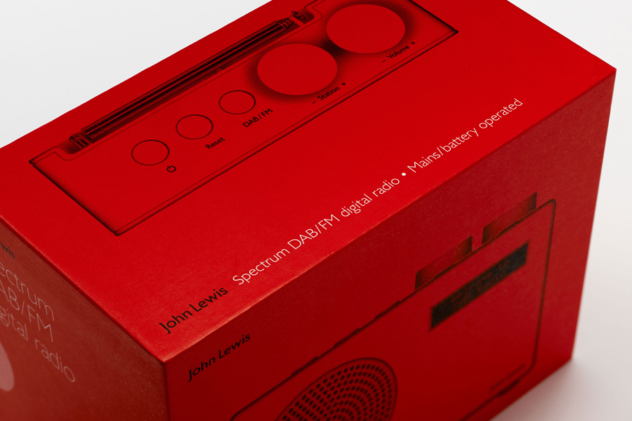
Spectrum is a recently redesigned consumer electronics range created by and sold through British department store John Lewis. The range includes DAB radios, alarm clocks, speakers and iPad covers. These are bound by a cohesive aesthetic of soft plastic, geometric forms, bright colours and a packaging treatment created by international design studio Pentagram, led by partner Harry Pearce.
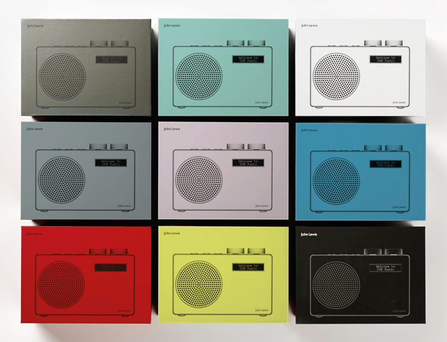
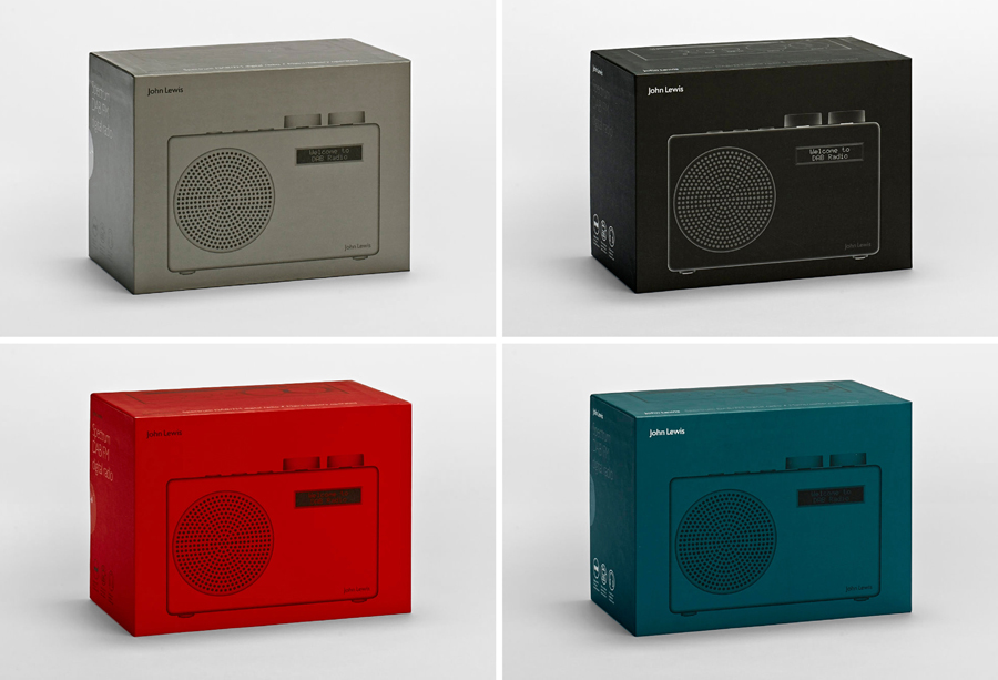
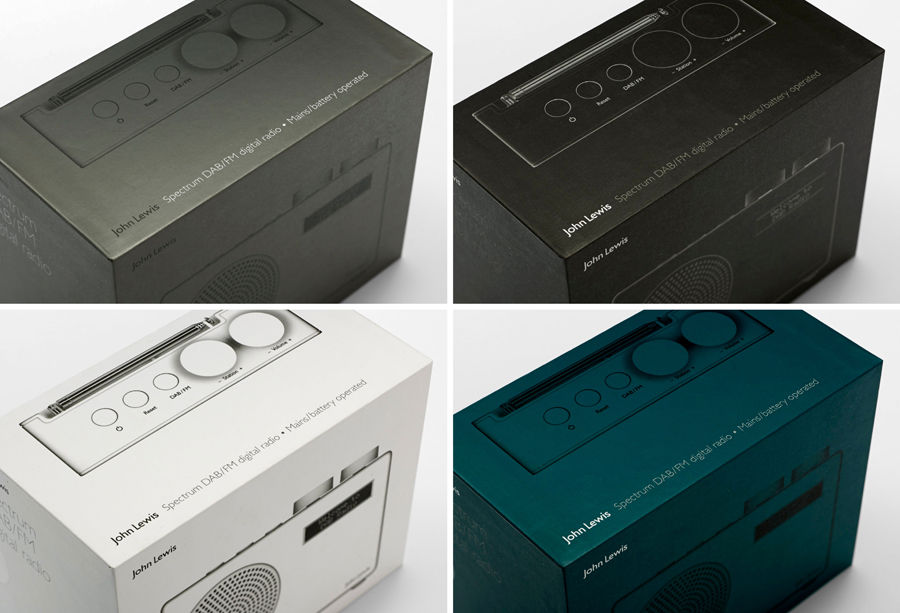
Taking their lead from Spectrum’s shared aesthetic, Pentagram’s treatment of the DAB/FM Digital Radio, an approach that continues throughout the range, dissolves the barrier between the utilitarian, protective and functional nature of packaging and the true rather than representational aesthetic nature of the product. This achieved through a straightforward concept that embraces a structural design only slightly larger than the product, three panels dedicated to the detail of the part beneath them, good quality actual size product photography and colour.
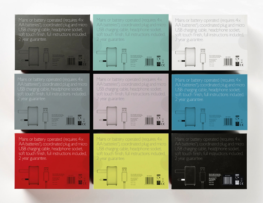
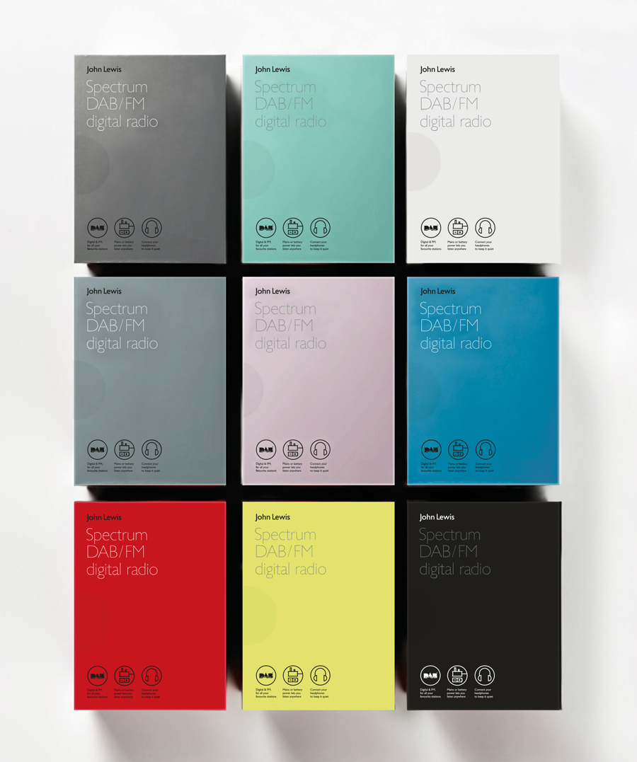
An unusually large typographical approach across the reverse, where often type is small and extensive, is a little less technical and far more accessible then typically expected of the category. The geometric characters, proportion within the context of the structure, fine lines, and brevity of copy feels contemporary and effectively leverages a little of the high quality, detail orientated associations built up by Apple.
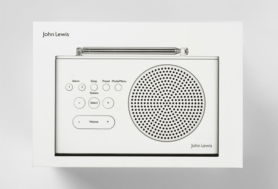
The straightforward approach to communication and choice of structure are infused with the more fashion-led and individual qualities of a seasonal colour palette drawn from the range. These choices are distinctive within the consumer electronics space, offer an unusual contrast to a largely practical treatment and consider both individual consumer taste and collective shelf impact.
The use and diversity of colour across the packaging, where own-branded products have, in the past, embraced uniformity in service of production costs, are still underpinned by a basic functionality, conveying quality and easing selection when a small sticker may have been the only clue as to what colour was inside.
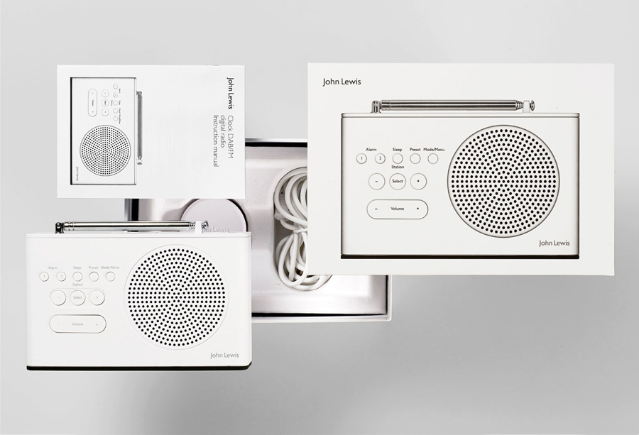
The relationship between product form and packaging is acute in a way that very nearly renders the solution invisible to the point of not requiring a display model or the investment needed to secure display space, whilst also managing and meeting expectations. So, although functionalist in its ideation, the type choice, copy and colour layers this intention with an aesthetic appeal, subtle fashion sensibilities and a broad accessibility without appearing contradictory, and is in the same spirit as the product design.
Design: Pentagram
Partner-in-charge: Harry Pearce
Project Photography: Adam Gault
Opinion: Richard Baird
