Mother Cold Pressed Juice by Mucho
Opinion by Richard Baird Posted 9 December 2014
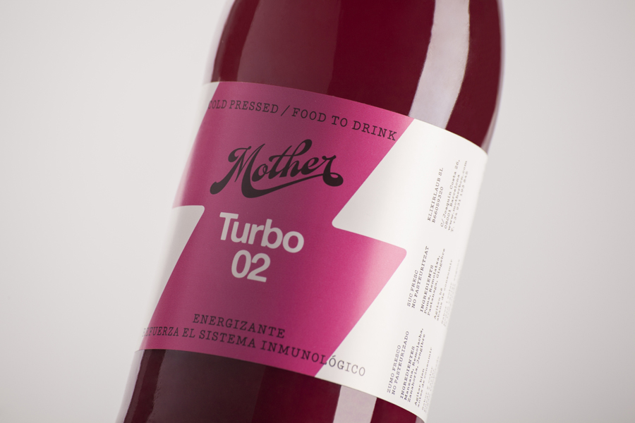
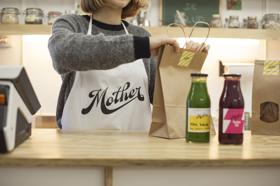
Mother creates fresh cold pressed juices, milks, smoothies, cereal bars, snacks and detox systems from its location at the centre of Barcelona. Mother recently commissioned design studio Mucho to develop a name, visual identity and packaging treatment that would help express the love and care they put into crafting their range and the technological and industrial processes required to produce them.
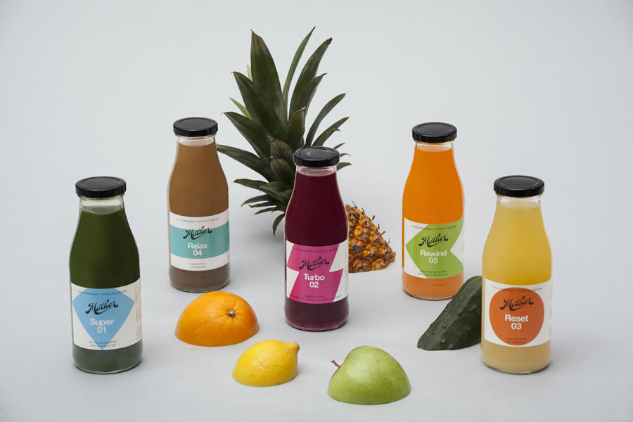
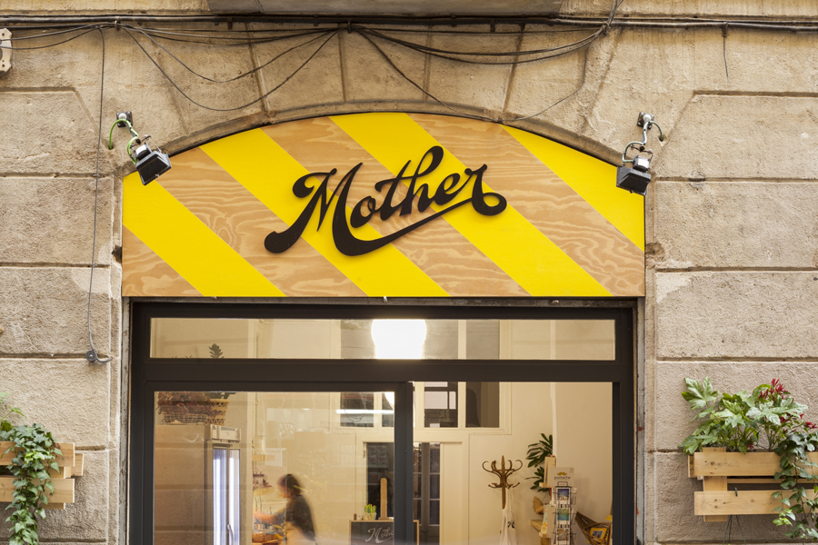
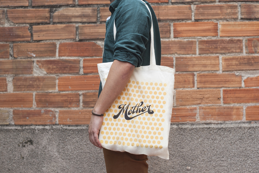
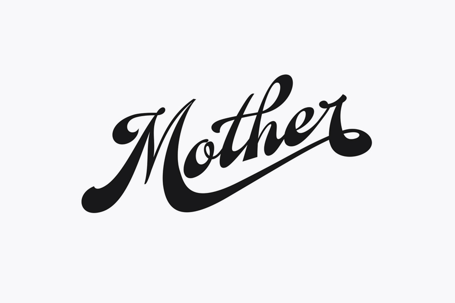
The perceived disparity between personal care and mechanical production is difficult to resolve but largely well-handled here. The enthusiasm conveyed through the fluidity and detail of the logotype’s loops and ligatures, the high contrast of its characters and clear hand drawn sensibilities, set alongside a bright but natural colour palette, heart shape, unbleached paper and wood of Mother’s interior, effectively convey individuality, suggest conscientiousness and leverage current craft conventions.
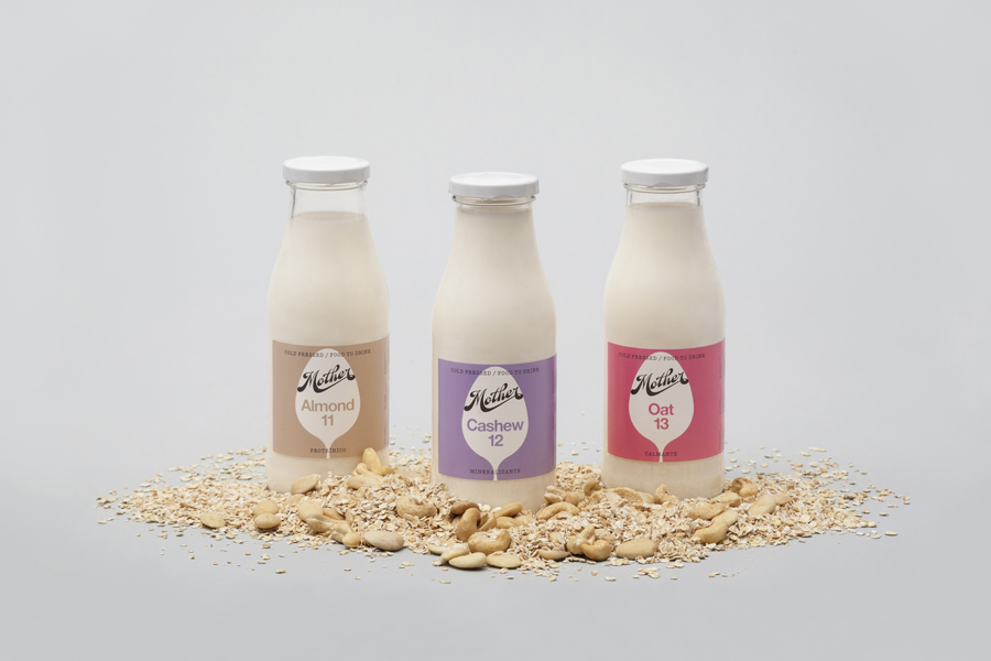
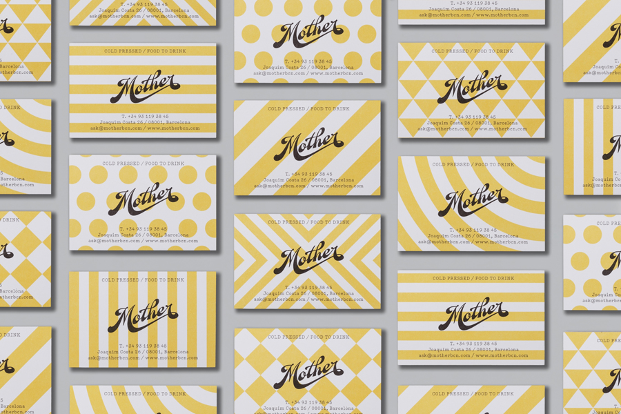
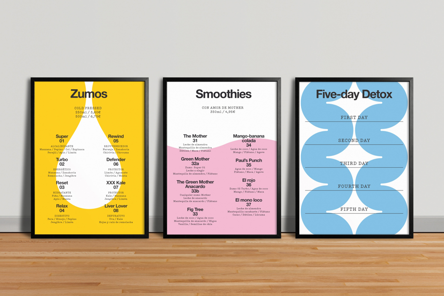
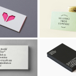
A monospaced utility, bold sans-serif, repetitive geometric forms across the business cards and a clinical white makes for an acute juxtaposition alongside the conviviality of the logotype and fruity colours, and accentuates communicative intention. Proportion and hierarchy do appear a little problematic across the packaging, however, form has been well utilised alongside the more familiar use of colour to distinguish, at a glance, individual products.
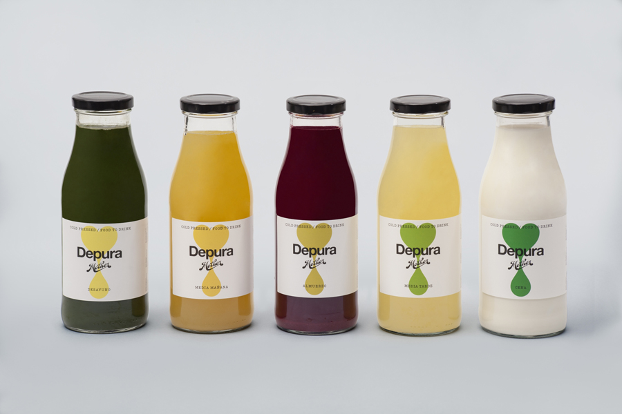
Mucho’s use of contrast is well-founded and makes for a bold and compelling aesthetic treatment that manages to resolve and reflect a mechanical production process operated with an individual care and consideration for natural flavour, and embraces a contemporary reduction and communicative clarity that appears neat, current and sufficiently small-scale but high quality in appearance.
Design: Mucho
Opinion: Richard Baird
