Estampaciones Fuerte by Hey, Spain
Opinion by Richard Baird Posted 15 December 2014
Estampaciones Fuerte is a Spanish cold metal stamping and pressing business with over forty years experience producing a variety of components for the automotive, domestic appliance and construction industries, as well as providing welding, finishing, threading and set assembling services. This year Hey worked with Estampaciones Fuerte to develop a new contemporary brand identity that would better reflect their industrial experience and professionalism.
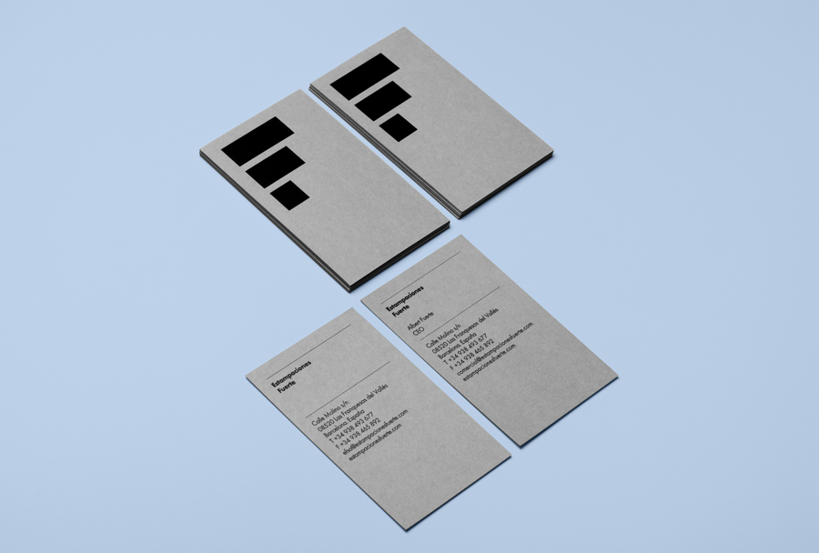
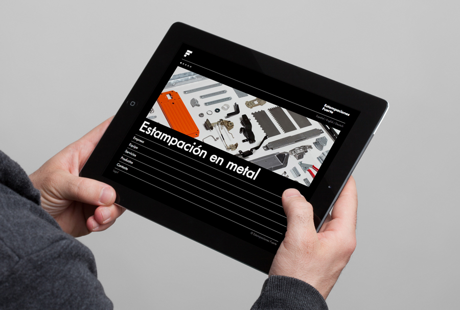
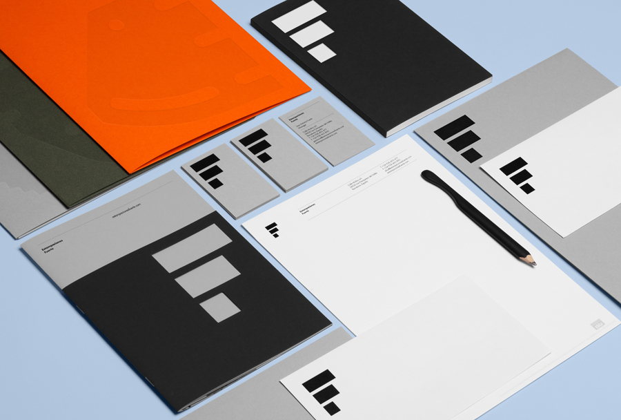
Hey’s enthusiasm for colour and coloured paper feels original and distinctive within this new and often underserved trade context. It takes the impersonal, mechanical uniformity of cold stamping and infuses it with a slightly convivial personality. This comes through not only in the tactile, uncoated, dyed boards, and the juxtaposition of bright orange alongside the industrial sensibilities of cool greys, but also in the oversized application of a reductive symbol and component iconography, Futura’s geometry but also its humanistic considerations, contemporary website, and the communicatively straightforward use of blind embosses and die cuts. Rarely have print finishes been so literal in their intention, serving both to reinforce the processes of Estampaciones Fuerte but also delivering a compelling aesthetic treatment.
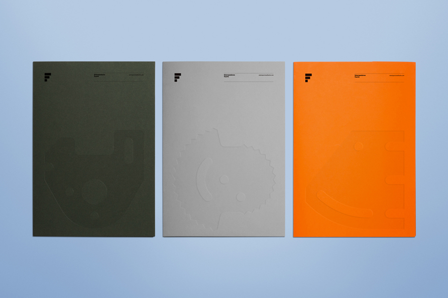
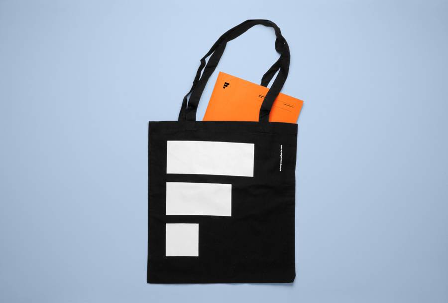
The three horizontal lines of the symbol, its reduction, weight and sequential nature, hint at process, functions well as an F and is simple enough to receive a die cut print finish that, like the embosses, reinforce the theme of stamping. The form is likely to draw comparison with a few other logos as it is by no means unique, however, this is clearly understood by Hey, as character and proprietary quality is derived from a combination of colour, paper, and the large application of form rather than a reliance on any one particular asset.
It is perhaps worth mentioning that the expensive of these and their strong aesthetic quality are what might be described as at odds with an industry of absolute functionality. One that can, at times, forget that there is a still a human interaction between production, purchase and implementation of components. Reduction and repetition while serving a familiar and genuine utilitarian purpose may well come at the expense of sustained human attention and engagement.
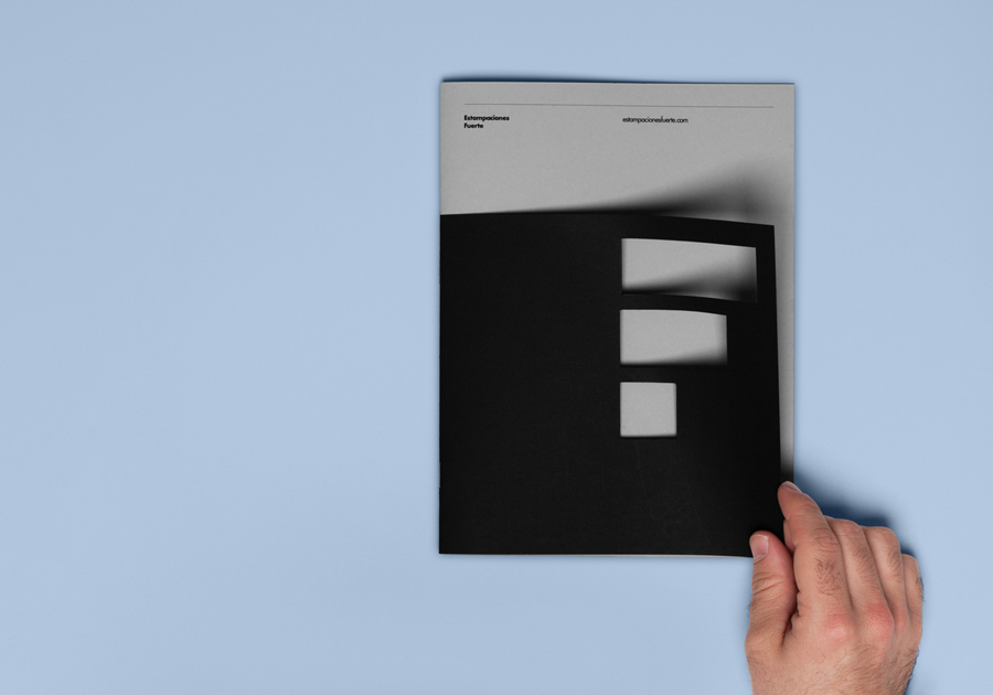
A contrast of paper size, full colour photography alongside the single black ink, sans-serif type and large iconography across coloured boards, effectively breaks up content across the brochures in a creative way likely to surprise, and hopefully delight, those working in the industry. It also offers a point of difference where little existed before and, presumably following research, is a more effective way of communicating the values and professionalism of the business and the quality of its components.
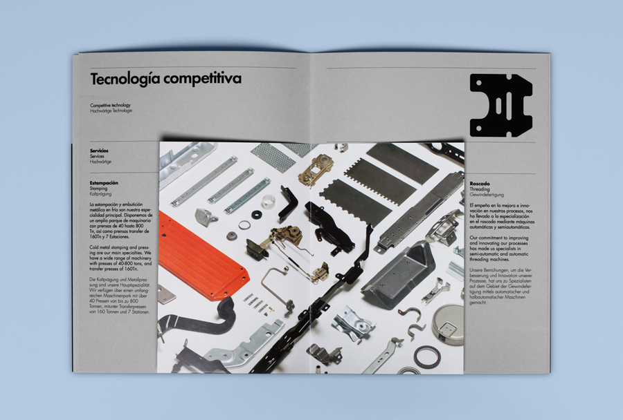
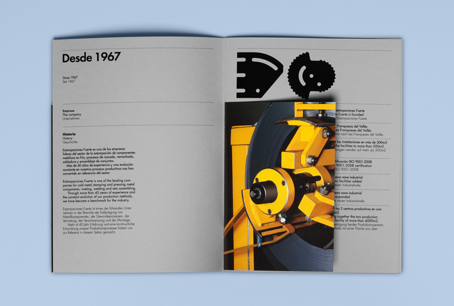
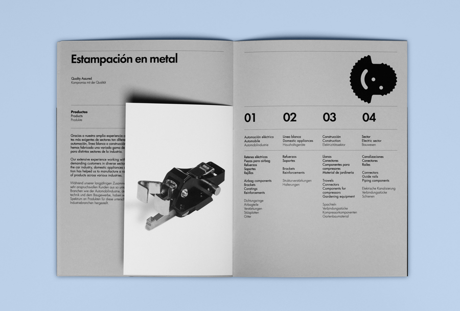
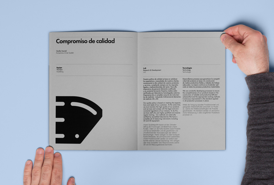
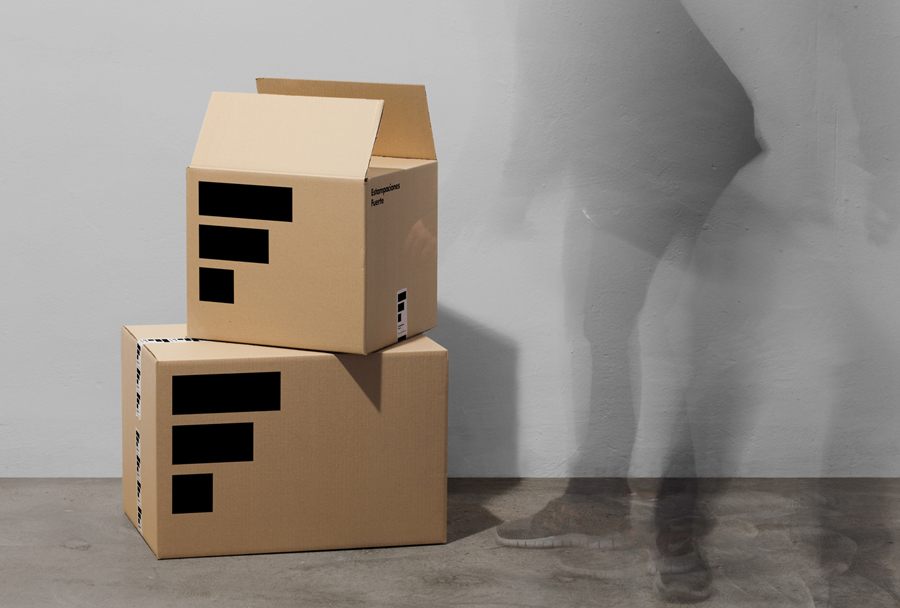
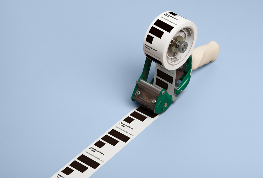
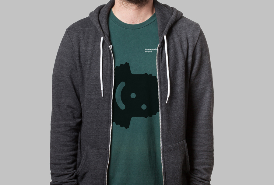
The result is a tactile and slightly more personable aesthetic treatment underpinned by functional and communicative intentions. It takes the expense and quality more likely to be associated with and spent on a commercial consumer endeavour — something that also manifests itself in the production of a tote bag, printed boxes, box tape and t-shirts — and applies them to what is a trade environment. It is not far off attributing a crafted mentality to mechanised processes.
Design: Hey
Photography: Roc Canals
Opinion: Richard Baird
Fonts Used: Futura
