The Best of BP&O — December 2014
Opinion by Richard Baird Posted 23 December 2014
December’s highlights included Pentagram’s packaging treatment for John Lewis’ rebranded consumer electronics range Spectrum, Bedow’s brand identity work for world renowned Swedish record store Record Mania, and Well Made Studio’s packaging solution for Pedlar’s luxury pencil range Signet. However, there were five projects that really stood out and have made it into the Top 5, a feature that brings together the most interesting and unusual projects published on BP&O each month for another opportunity to be seen and shared.

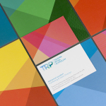
Arjowiggins Curious Matter x FIAC designed by The Bakery
FIAC is an annual contemporary arts fair where galleries from across the world gather and present work by the emerging artists they represent. The fair takes place at the Grand Palais in Paris and runs for four days during October. Paper merchant Arjowiggins, a longstanding partner, continued to support the event by providing material for FIAC’s catalogue and event guides. This year, these featured a distinctive bookmark created by Moscow-based design studio The Bakery and printed by Generation Press, as a way to further showcase the merchant’s Curious Matter range.
See more of this project here


The Stow Brothers designed by Build
The Stow Brothers is an estate agent working within the area of Walthamstow, a place where urban London meets the Epping Forest, and is described by the estate agent as a rapidly expanding community of like-minded people looking for a place with a strong sense of community, plenty of culture, good food and a decent pint.
Build worked with The Stow Brothers to develop a new brand identity—which went on to include monogram, stationery, website, copywriting, sale, sold and to let by boards, with assets created by local trade, craftsmen and artists—that reflected their love for the area and would distinguish them from the other estate agents operating in the same postcode. The identity was expanded upon later in the year to include a mini exhibition and a distinctive direct mail campaign in support of the nearby Wetlands project.
See more of this project here

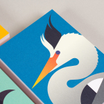
Swedish Handicraft Societies’ Association by Snask
Hemslöjden is a non-profit organisation that promotes craft across Sweden through courses, talks and activities. Set up in response to the advance of industrialisation, Hemslöjden has a significant 100 year history, fostering strong relationships between culture and industry to ensure the survival and development of handicraft. It is also a publisher, events organiser and acts as an umbrella for Sweden’s handicraft societies with the understanding that these, and their activities, contribute to a more sustainable way of life.
This year, design studio Snask worked with Hemslöjden to develop a new visual identity that would help unify a membership of over 17,000 individuals, 60 societies, 22 regional offices and 8 shops under one system, and broaden the perception of handicrafts from what the studio describe as old butter knifes and knitting to include everything made by hand.
See more of this project here

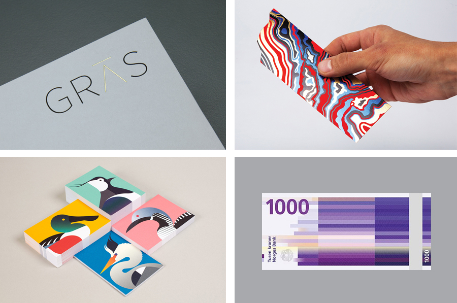
Norway’s Ambitious New Banknotes
If you consider all the tangible expressions of a country’s brand, money, with its essential function as a measure of value, could easily be considered one of the most important touchpoints. In this sense a country’s banknote is often the first point of physical contact with that place prior to travel. The shape, feel, colour, language, security features, artwork and heritage of currency informs the senses and begins to build perceptions. Norway understands this, and is about to show us all a little more of their personality, history and cultural identity through their new banknotes.
Read more of this article here

Gras & Groves-Raines Architects by Graphical House
Gras and Groves-Raines Architects are Edinburgh based architectural practices, and two branches of the same organisation. Gras explores experimental routes and works within commercial, public and private developments as well as exhibitions, while Groves-Raines Architects takes a more traditional approach, specialising in the conservation and restoration of existing buildings. Although their fields of expertise differ, both are bound by the shared values of a high quality holistic approach from design through to execution, and favour craftsmanship and fine detail. These values informed the development of a new cohesive brand identity for both practices, managed by design studio Graphical House, and which included logotypes, stationery and guidelines.
See more of this project here