Theatre Royal Plymouth by Spy
Opinion by Richard Baird Posted 7 January 2015
Theatre Royal Plymouth (TRP) is the largest and best attended regional producing theatre in the UK and leading promoter of theatre in the South West. It runs a diverse programme of performances, activities and events, and has a 1300 seat auditorium capable of delivering West End musicals, opera and ballet, as well as a smaller 175 seat theatre for experimental productions. The building, located on Plymouth’s Royal Parade, also houses a café, restaurant and community performance space.
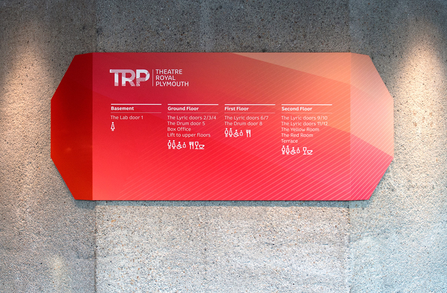
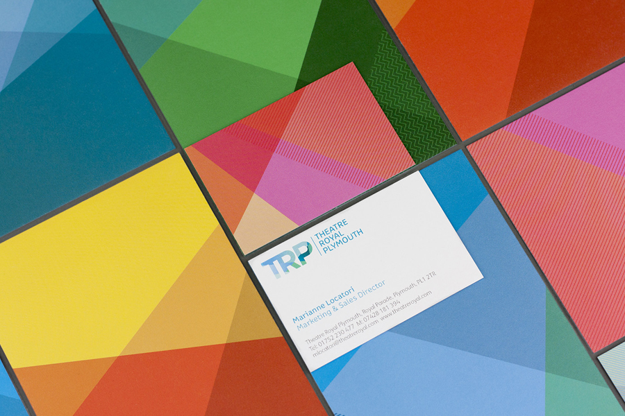
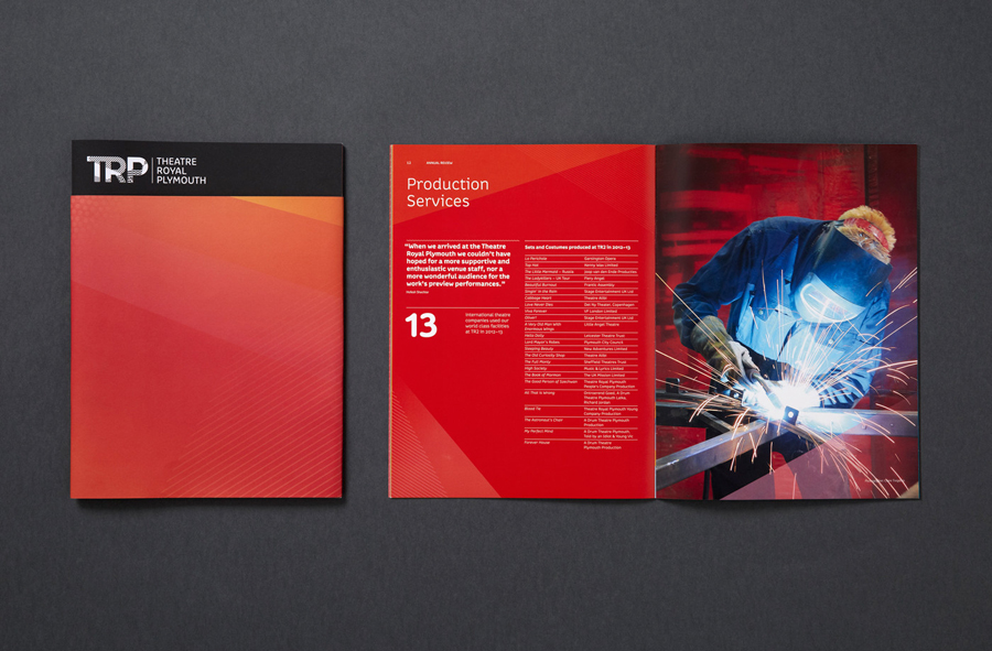
In response to increased competition TRP looked to diversify its audience, retain current visitors and to improve the uptake of its outreach programmes through a new visual identity system as part of a wider regeneration project. Developed by London based Spy, the visual identity system was created to reflect the dynamic nature and joy of experiencing live performance and to connect with a broader audience. This was achieved through a vibrant colour palette of shifting planes, patterns and light, and a holistic approach that, alongside logo and print, included animation, signage and wayfinding.
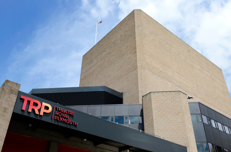
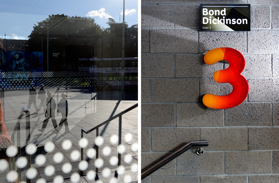
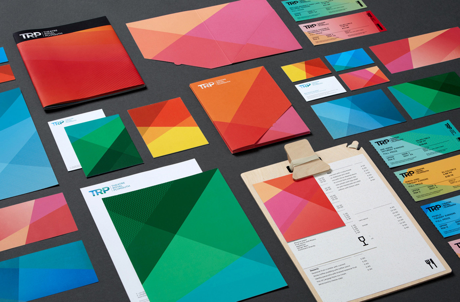
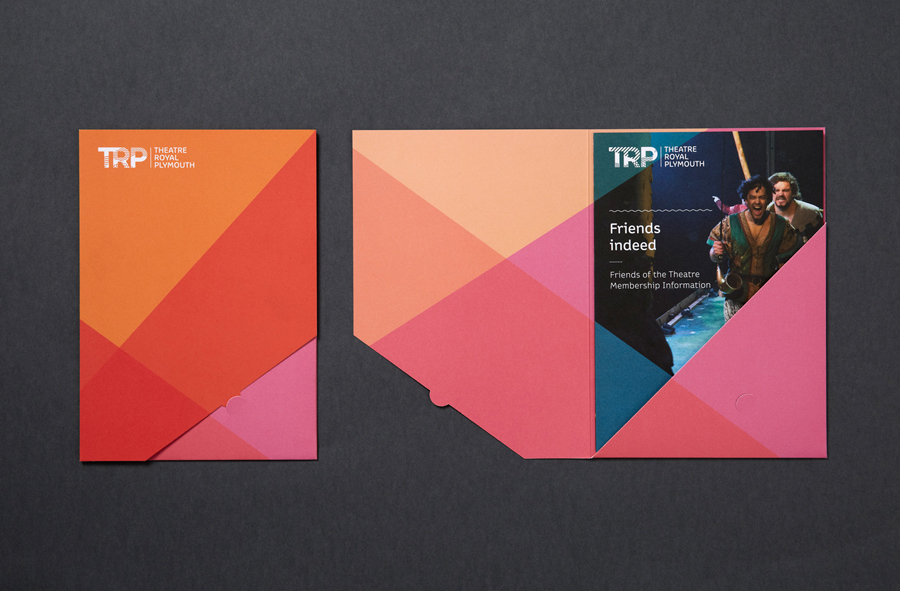
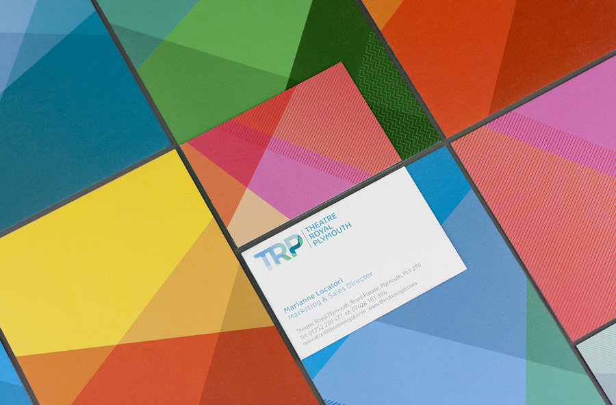
The brutalist forms and robust brick and concrete of the building make way for, yet still inform, the more decorative elements of the identity, interrupting what could be perceived as a dominant and perhaps impersonal but distinctive structure and space with a more inclusive and playful set of graphic assets. The edge-to-edge panels of bright colour and intersecting geometric shapes of the stationery and interior wall panels are bold and impactful while the addition of fine lines and dots, also used across glass surfaces of the interior, add a layer of ornamental texture and detail.
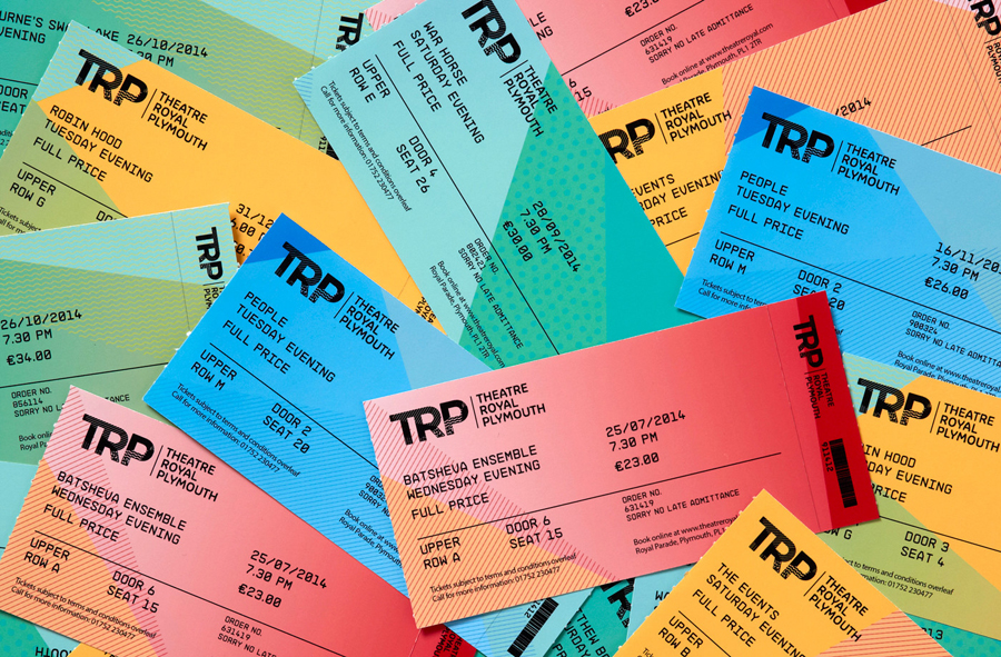
The graphic style of facets, planes and bright colours are abstract enough to draw a variety of communicative conclusions — this is evident in its frequent use in identity design — however, within context of the theatre, reveal a clearer sense intention, be it a reflection of the dominant forms of the building, the crossing of stage lights or the energy and motion of performance. Unusual cuts across folders and the expense of coloured tickets, as well as the approach to signage (see further down the page) draw a more proprietary quality from this familiar aesthetic.
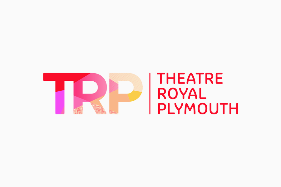
The contrast of formidable architectural presence and the bright, contemporary inclusivity and conviviality of the patterns makes its way into the logotype, albeit in a far subtler but equally evident manner through a contrast of Colette’s light monolinear letterforms, curves and the softness of rounded terminals, and the heavier weight of the initials used to trap patterns.
The TR ligature feels a little much and the shorthand of the initials, reducing down a long name, appears unnecessary when it appears to be consistently paired with the logotype. However, both are largely well resolved, feature some neat animation work that give it life and founded on some clear ideas that tie them to theatre’s exterior and its interior space, the motion of performance and the intention of attracting a wider audience.
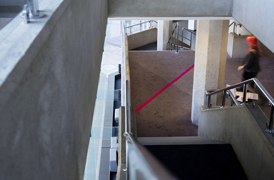
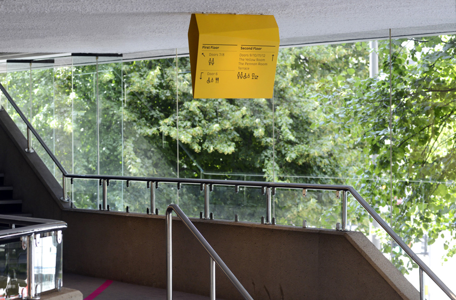
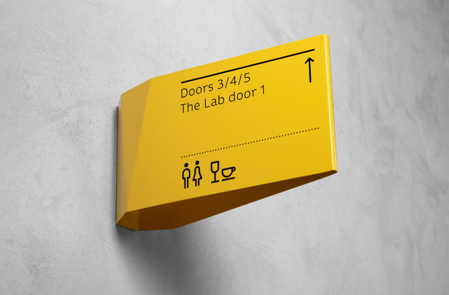
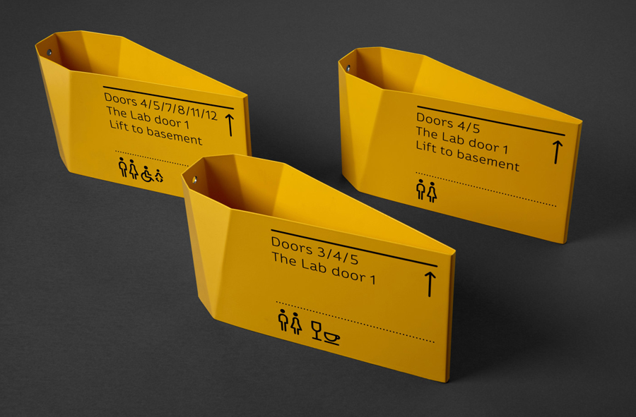
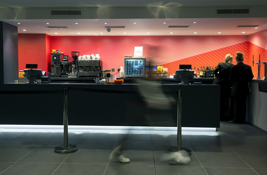
A diverse colour palette has been well utilised within the theatre’s interior space, punctuating walls of cool concrete grey, adding a warmth and character where there is a cold period practicality and effectively leveraging contrast to deliver impact. The patterns take on a three-dimensional quality as part of the way finding system, the real highlight of this project. Folded metal sheets shaped to accommodate the unusual planes of the theatre’s lobby and halls, or as faceted forms with an industrial quality hanging from the ceiling, the signage and graphic treatment manage to bridge the immovable form of the building and the dynamic and varied nature of the performance within.
Design: Spy
Opinion: Richard Baird
Fonts Used: Colette
