University Church by Spy
Opinion by Richard Baird Posted 8 January 2015

Located at the heart of Oxford, University Church of St Mary the Virgin, abbreviated to University Church, has been a site of worship and debate for over 700 years and is the “spiritual home” of the oldest university in Britain. The church recently received a grant from the Heritage Lottery Fund to raise awareness of the historical nature of the site and to further enhance its potential as a tourist destination beyond the 300,000 visitors it already attracts per year. As part of this new remit, London based graphic design studio Spy were appointed by University Church to develop a new and more contemporary brand identity that could exist both on and off-line.

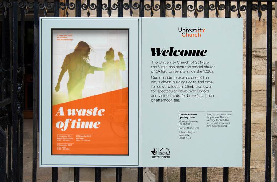
The identity, outside of the photography, is modern, vibrant and refreshingly devoid of historic or religious symbolism, recognising the shared appreciation a tourist and worshipper may have for artistic and architectural detail regardless of subject matter.
A slant is the primary characteristic of the identity. This is used through the word mark as a static and animated asset and across print and website as striking graphic device. Its ideation or symbolic value is unclear, however, it could easily be understood as being representative of the site’s divergent function as both tourist attraction and as a historical site of worship, or simply functioning as an impactful aesthetic detail. This tension and duality also runs throughout the rest of identity’s elements.


The sans-serif used in the wordmark and as a primary typeface for body copy is the clean, modern and monolienar sans-serif LL Brown from Swiss foundry Lineto but based on the quintessentially British Johnston. Its contemporary functionality is juxtaposed alongside the detail, heavier weight, high contrast and personality of Commercial Type’s Publico, which is used as headlines.

The colour scheme is bright, youthful and verges on the fluorescent which is then enhanced by plenty of white in print or dark grey online. Its flat panels of colour effectively establish a strong contrast alongside, and work well to draw out, the detail of cropped photography of stained glass windows, elements of architectural ornament and stone masonry.

The slanted graphic device works really well in application and throughout the layouts, there are moments of disconnect, and the slant is perhaps a touch arbitrary, but the devision and duality it creates, and the extent to which this is explored through image and typography contributes to an ownable, inclusive and distinctive brand identity treatment.
Design: Spy
Opinion: Robert Holmkvist
Fonts Used: Brown & Publico