Austin Fraser by Felt
Opinion by Richard Baird Posted 12 January 2015
Austin Fraser is a UK information technology and engineering recruitment specialist with an open and transparent business practice. Established in 2007 it has gone on to win a variety of awards and recently opened its first international office in Munich with another office planned for Austin Texas this year.
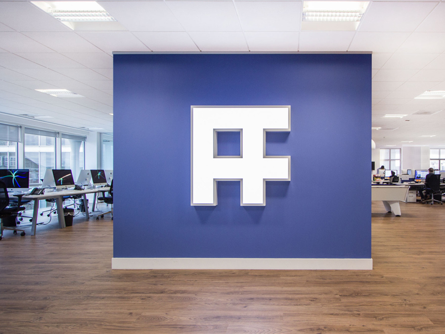
Described as dated, parochial and not reflective of Austin Fraser’s ability or ambition, London based design studio Felt Branding were commissioned to develop a new brand identity and to sort out the company’s marketing and communication problems both internally and externally. This went on to include a monogram, logotype, brand guidelines, website, interior graphics and employee handbook.

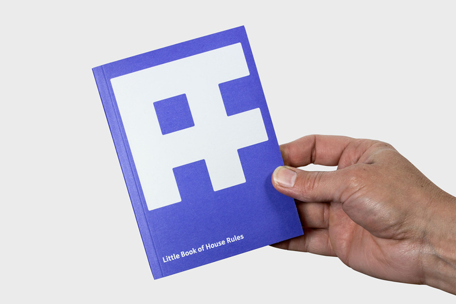
The AF monogram and the accompanying logotype, constructed from FS Me – a font specifically designed to improve legibility for people with learning disabilities – has a practical, slightly technical and bold structural sensibility with an inclusive second layer that together may well be informed by Austin Fraser’s engineering and IT specialisation as well as the people-centric nature of the industry. So, while not particularly unusual or adventurous, it does, to some degree, find a good middle ground between recruitment and the two areas of expertise, and been effectively leveraged in print.
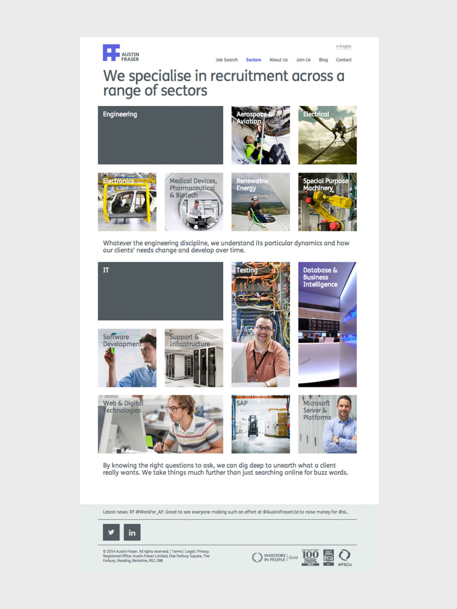
These practical forms are softened slightly with rounded corners, a feature that also runs throughout the secondary type choice of Calbri, further fostering a perception of accessibility and inclusivity. This is expanded upon online through a grid-based layout, large type, plenty of white space and blocks of colour. Although this appears a touch rough around the edges this is perhaps largely in service of readability.
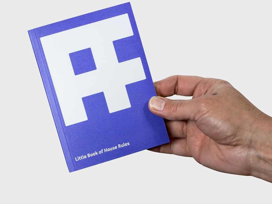
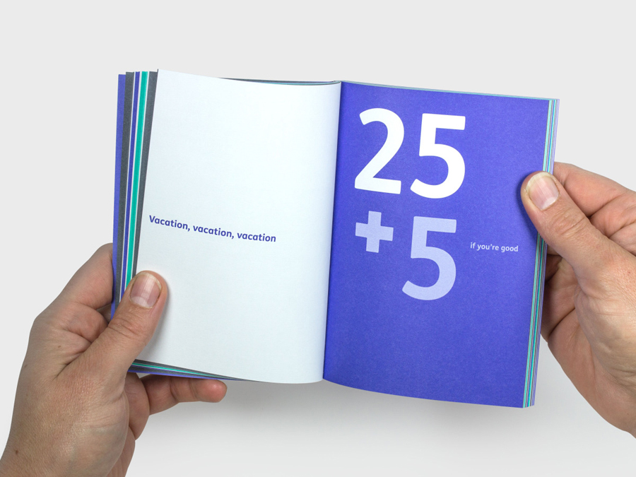
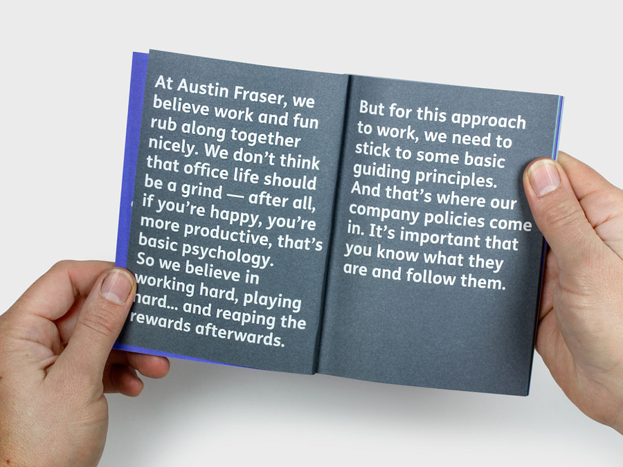
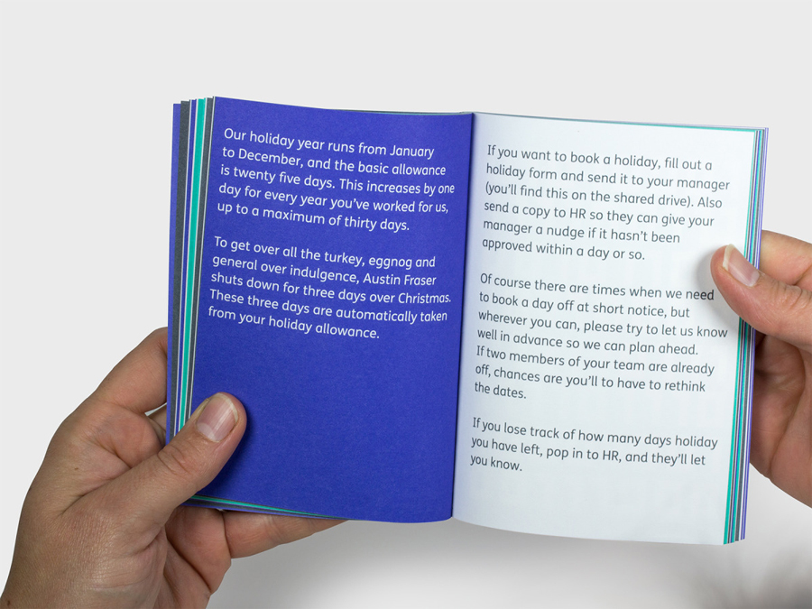
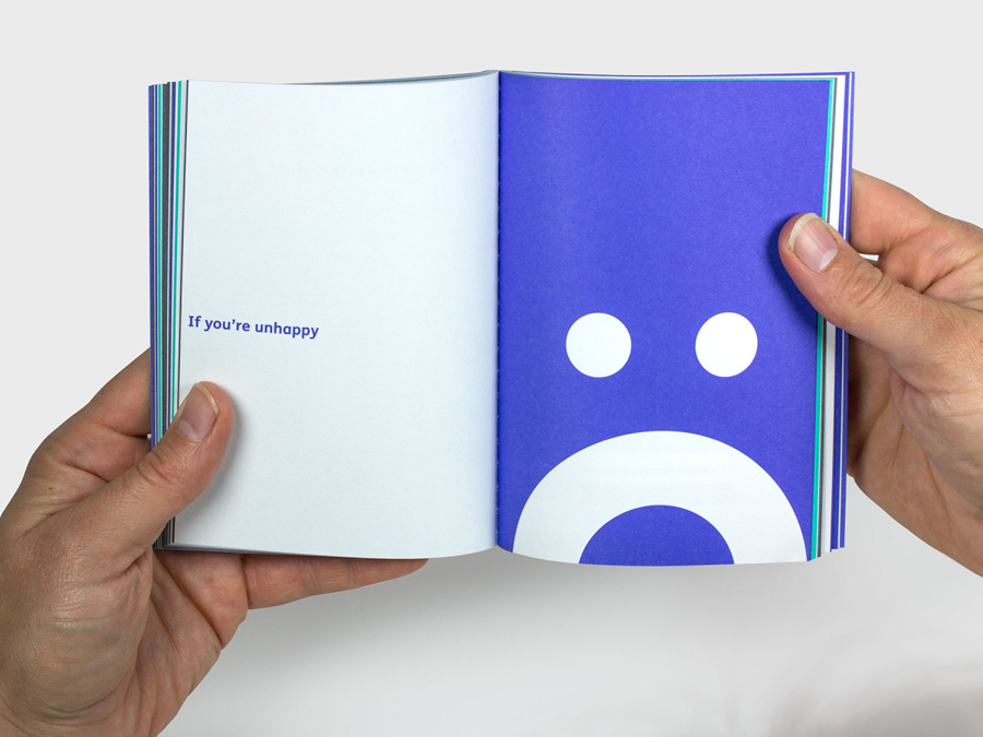
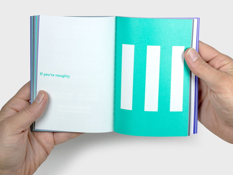
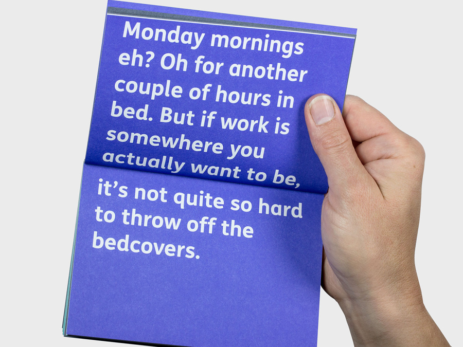
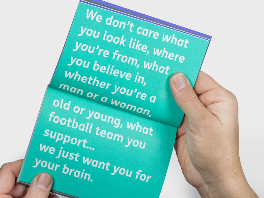
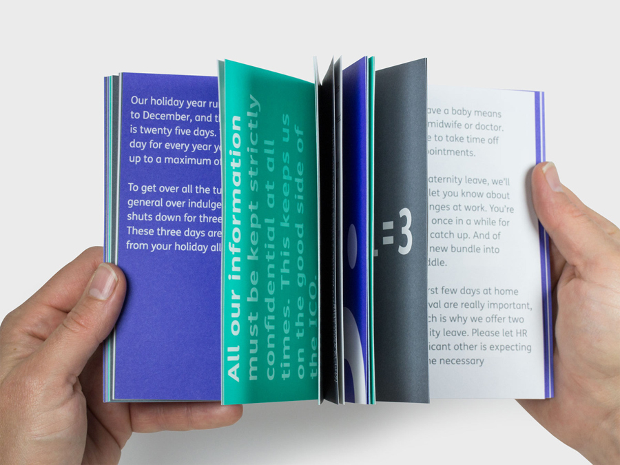
Proportion and contrast are used to good effect across the employee handbook through an oversized monogram set alongside a small title size, bold flat panels of colour and large but simple iconography and typography knocked out in white. A friendly informal copywriting style is reassuring and personable, more explicit in its conveyance of an accessible and inclusive internal corporate culture, and expanding on the subtleties of type choice.
The absence of photography and glossy papers in favour of uncoated textures is notable, avoiding corporate cliches and those perceived as stock and having a tactile quality that is again in service of the people it works with rather than relaying upon corporate convention. There are layout issues, however, it serves as a quick reference and is designed in a way that might be kept at hand.
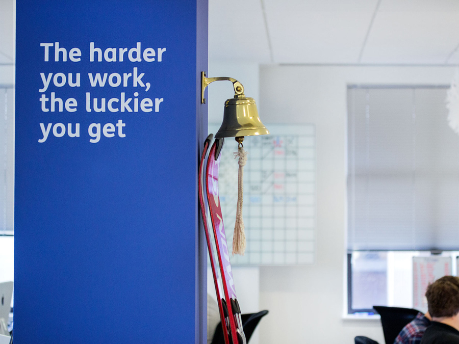
It is not surprising to see large monolinear illustrations as white environmental graphic detail. Their themes, rendering and large size appears as the current go to for contemporary informality and the diffusion of a corporate office environment but one that resonates well with the intentions and assets of the new identity.
Design: Felt Branding
Opinion: Richard Baird
Fonts Used: FS Me & Calbri
