30 Park Place New York by Mother Design
Opinion by Richard Baird Posted 9 January 2015
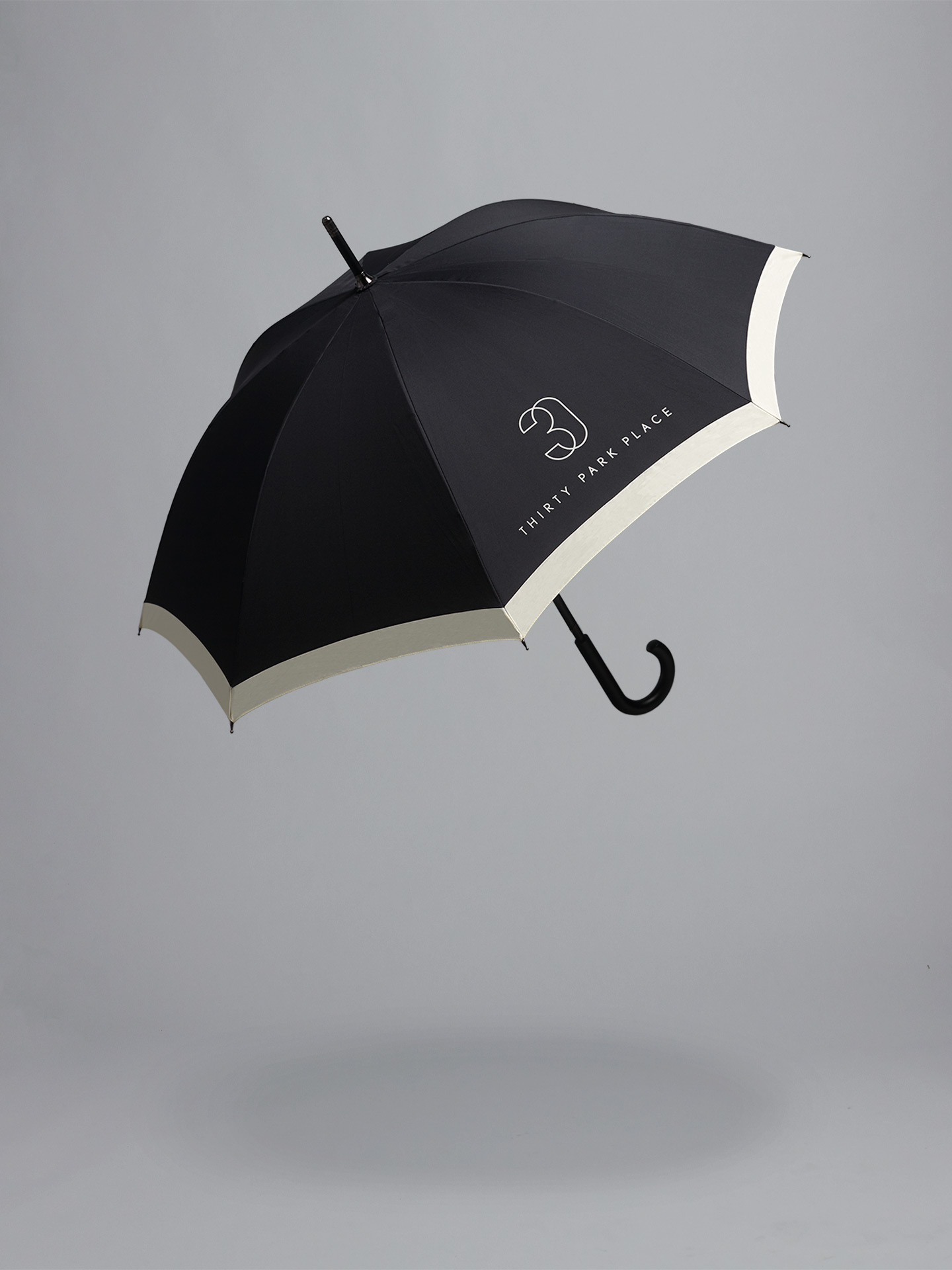
30 Park Place is a private residence with 82 floors and 157 apartments created by the internationally renowned luxury hotel and resort management chain Four Seasons. Located in Tribeca, New York, the residences are described as having breathtaking views, soaring ceilings, multiple exposures, and warm details, as well as five-star hotel level services and amenities that include swimming pool, fitness centre, private dinning experience and children’s playroom. The brand identity for 30 Park Place, which included symbol, business cards, stationery, brochure and insiders guide, was developed by American studio Mother Design.
The sans-serif characters of Nobel, which share some of the architectural influences of Gotham when set in uppercase, and letter shapes described as offering personal variations on strict Bauhaus geometry, dips into the past, blending mid-twentieth century modernism and a nostalgia for NY building signage with a sense of authority and structure. This is enhanced by its broad spacing, the use of columns and heavy horizontal stokes in print. It balances period references with current luxury trends likely to be picked up instinctually rather than explicitly understood.

Nobel’s small point size is juxtaposed alongside a much larger symbol. This is well rendered with a nice three-dimensional wireframe and current monolinear quality which also perhaps takes some of its cues from the hand painted door numbers of older residential properties. It is ever-so slightly undermined by the clunky but understandably reassuring nature of the Four Season logotype across the business card and online, however, like the choice of Nobel, appears as a good mix of past and present.

Plenty of gold foil, off-white substrates and a consistent glossy black bar, as well as the copper edges of the brochure, cover texture and a good use of unprinted space leverage well established high quality finishes, tactile material detail and restraint, cues that continue to be associated with luxury brands and services. Alongside details such as the pattern on the inside pages of the brochure, the newsprint-like insiders guide with a significant gold foil coverage and both formal and informal content structures, layer the visual identity with further period detail.
The result is far from unfamiliar but very well handled, remaining compelling and understandably in its intention, and effectively using a contrast of proportion, colour and finish, as well as period references, to draw distinction and communicative value from a few assets and established luxury conventions.
Design: Mother
Opinion: Richard Baird
Fonts Used: Nobel