Costèllo + Hellerstein by Robot Food
Opinion by Richard Baird Posted 30 January 2015

Yvonne Costello and Ori Hellerstein are a husband and wife team making artisanal chocolate truffles using high quality ingredients and the processes acquired by Ori working as a pastry chef at well-respected restaurants. These skills were then refined whilst running his business The Artisan Bakery creating and supplying fine patisserie and chocolates to trade. Costello + Hellerstein’s philosophy is built around the complete sensory experience, one that goes beyond taste to include aroma, touch and visual appeal. This extends to their brand identity and packaging treatment, designed by Leeds based Robot Food, which went on to help them secure a spot at London department store Harrods.
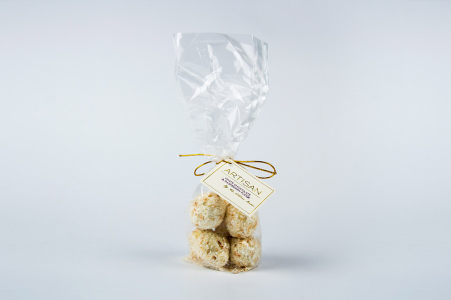
The original packaging is expected but to some degree informed. A clear bag places product detail and texture at the forefront, the use of a dyed cream substrate and gold block foil suggest traditional experience and high quality, while a script and oversized Artisan makes sure that it is understood to be a product of hand craft. Clear bags, gold string and block foils, however, are saturated visual cues, existing across a number of catagories and occasionally disingenuously used, as such they offer little in the way of differentiation or particularly good at conveying a true authenticity.
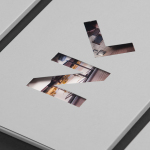
Drawing on the values, technical and craft processes, partnership and collaborative nature of the business, and allowing these to inform each decision, Robot Food’s packaging and identity treatment secures an original aesthetic impact underpinned by clear communicative intentions. Simple ideas, conveyed through few components, effectively emphasised using contrast alongside an appreciation for subtext.


Created by hand, the ribbons of colour, produced by swirling ink over water and overlaying cartridge paper, have come out well. The process is recognisable and clearly associated with craft, many may well be familiar with such a process from school. The colour choice, while conforming to gender stereotypes, is appropriately informed by the male and female aspect of the partnership and, like the nature of the process, is understandable. Close up the ribbons have plenty of texture and a variation of shade that appears to have been reproduced well across the packaging and are drawn out by regions of unprinted space, what I have often described as a professional kitchen white within the context of foods and confectionery. This neatly links back to Ori’s experience, contemporary perceptions of high quality and the increasing design intelligence of consumers.

The character shapes, uppercase typesetting, monolinear qualities, generous spacing and black ink offer a strong stagnant contrast to the organic lines, motion and craft origins of the imagery, amplifying both. Robot Food attribute a subtle science subtext to the choice of Niveau Grotesk, and presumably the use of plus (+). This is perhaps not as explicit as the themes of partnership and craft but it does, to some degree add an element of the pragmatic which feels current and appropriate within a practical and skills based business. The unfussy nature of the monogram, an H set inside a C, is legible with enough detail to be ownable, mixing the simple forms of the type with the more traditional craft based associations and origins of a monogram.

The contrast of craft and functionality established by type and image also plays out across the structural design. Although not necessarily off-the-shelf, the single box for multiple products is sensible and economical, effectively mixing protection with the gift-like nature it makes of the products. It is far less candy store and more of a artisanal purchase but still with some of the conviviality. The gold foil leverages perceptions of quality but feels like a more considered ornamental flourish than its use across the original packaging, adding a glossy and warm finish to a clinical matt white surface while stickers keep it flexible and feeling batch based.

At its most basic and superficial level it is very pretty and well executed with a current favour for crafty detail and foils. These are distinctive and appealing, founded on some relevant business values that are understandable while not being heavy handed. It is unfussy, clearly modern and created in a way that reflects the craft of the confectionery it contains, and a level of subtext a designer can appreciate but can also be picked up on instinctually by a customer. More from Robot Food on BP&O.
Design: Robot Food. Opinion: Richard Baird. Fonts Used: Niveau Grotesk.