Lycka designed by BVD
| Author: Richard Baird | Filed under: Food and Drink, Logo Reviews, Packaging Reviews | Tags: Best Packaging Designs, Brand Identity, Brand Identity Reviews, Branding, Branding Blog, Branding News, Colour in Use: Orange, Creative Packaging, Design For Print, Design News, Design Opinion, Design Reviews, Designed by BVD, Food Logos and Packaging Design, Food Packaging, From Scandinavia, Frozen Yoghurt & Ice Cream, Geometric Pattern, Graphic Design Blog, Logo Design & Branding Blog, Logo Design Inspiration, Logo Design Resource, Logo News, Logo Opinion, Logotypes, New Logo, Packaging Company, Packaging Design, Packaging Design Blog, Packaging Design Resource, Packaging News, Sans-serif Logotypes, Snack Packaging Design, The Best Brand Identities of 2015, The Best Logo Designs of 2015, The Best Packaging of 2015, The Very Best of 2015, Visual Identity Design Blog |Opinion by Richard Baird.
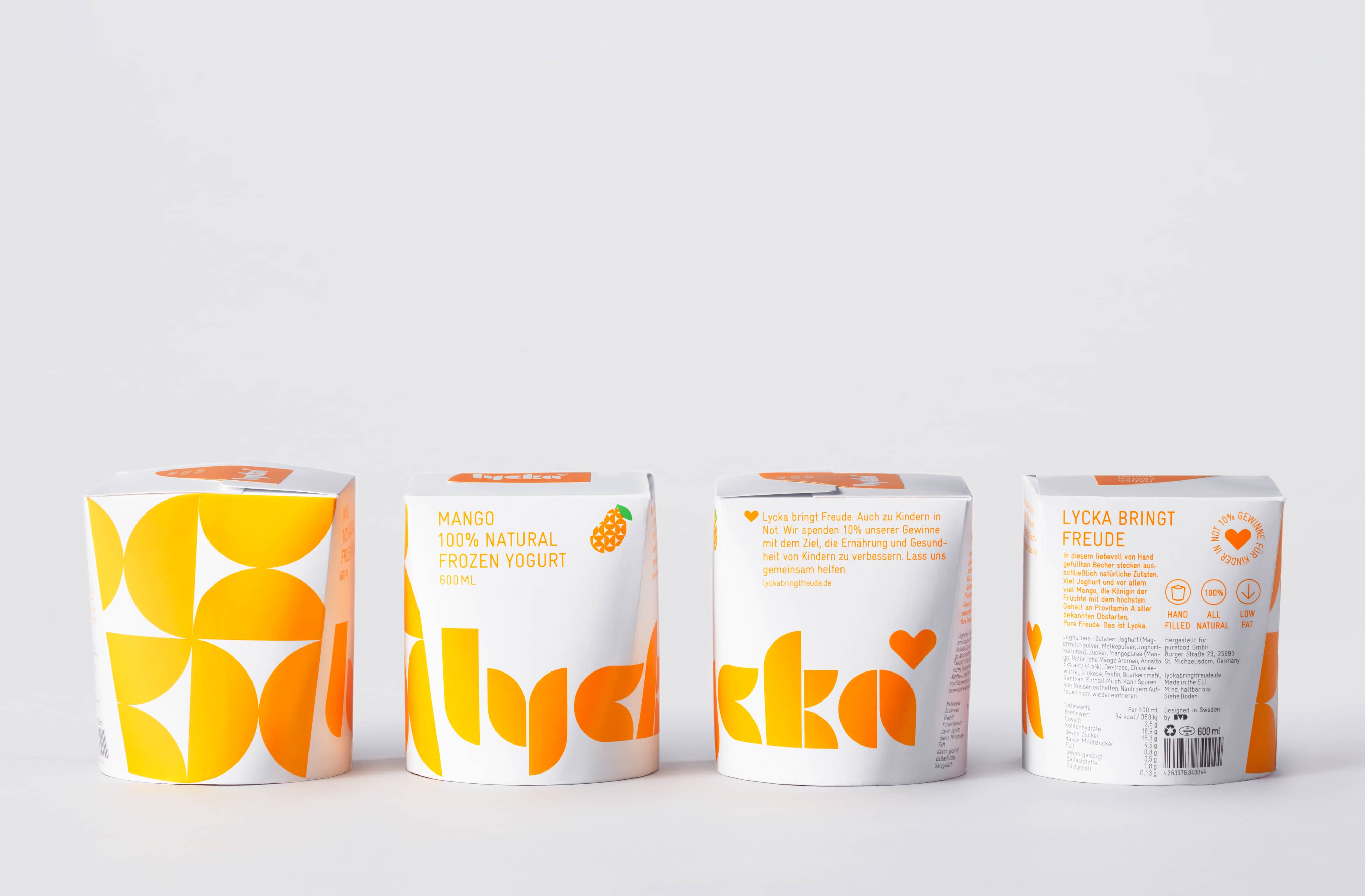
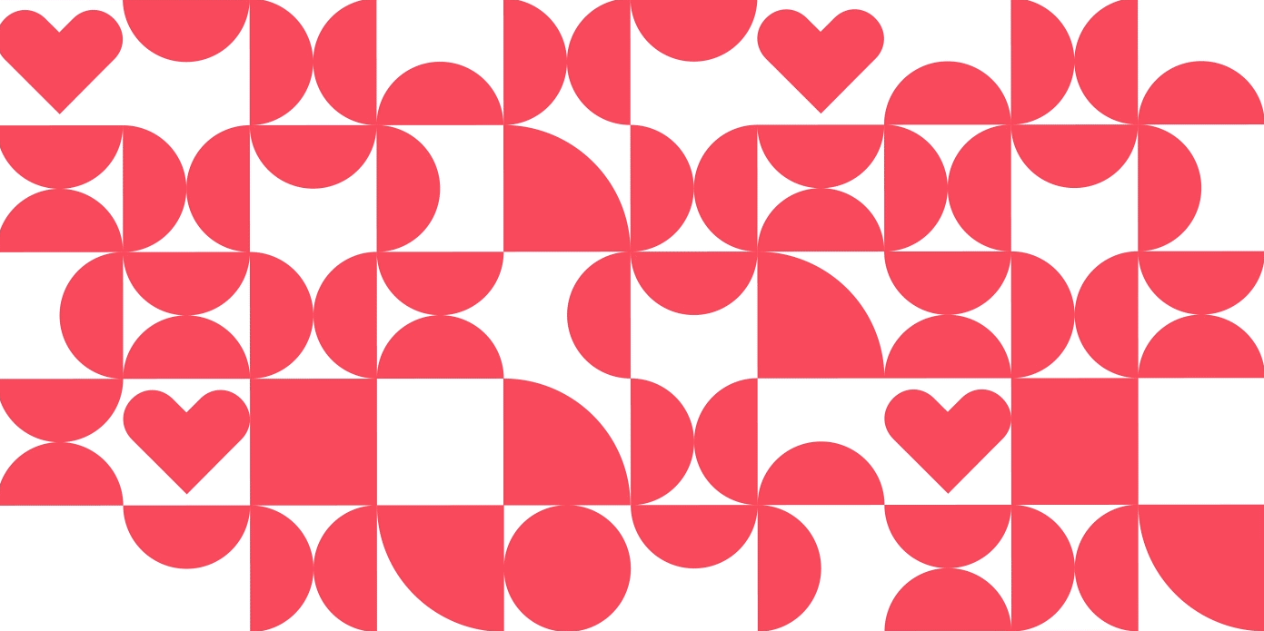
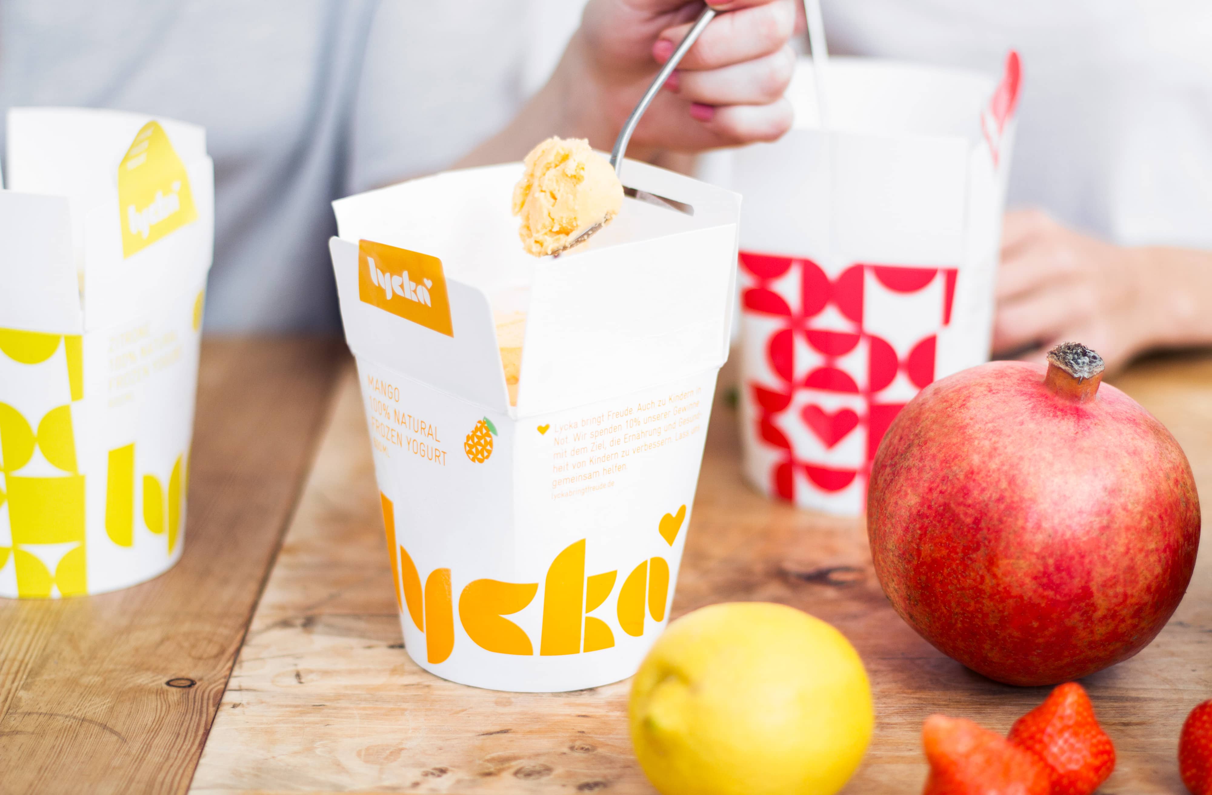
Lycka is a 100% natural hand filled frozen yoghurt brand from Germany that donates 11 cents from each sale to Welthungerhilfe, a humanitarian aid project tackling issues such as world hunger, land grabbing in Cambodia and displacement across Syria and Iraq, amongst many other issues. Lycka’s brand identity and packaging, a mix of bright geometric forms which appears to draw some of its visual cues from the Welthungerhilfe logo, was created by Swedish graphic design studio BVD.
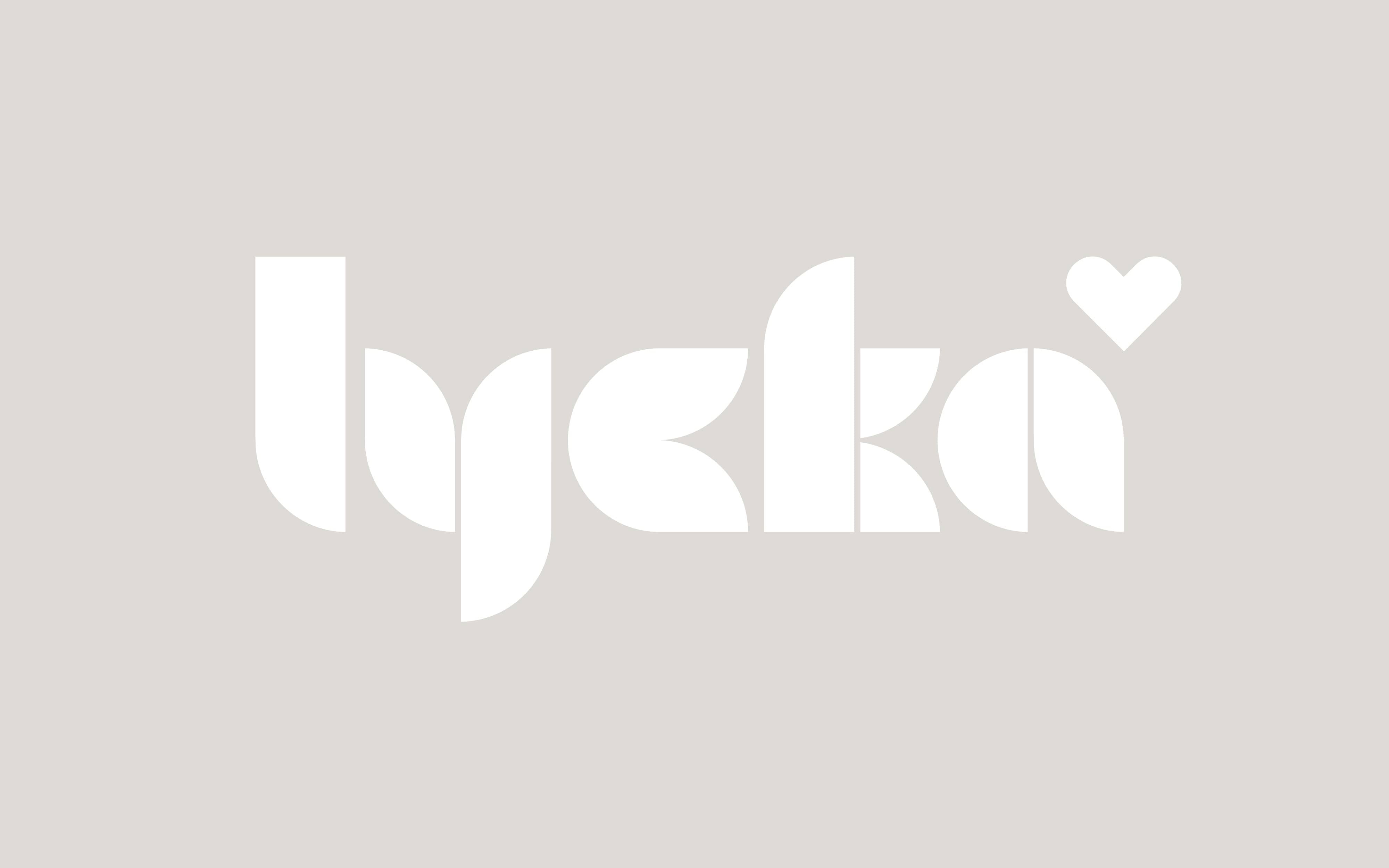
The large coverage heavy geometric patterns, a similarly styled logotype and fruit iconography, a distinctive and unusual structural choice – one that you might associate more with noodles – and a bright but limited colour palette enhanced by plenty of white space secures a strong aesthetic impact that mixes the familiar fresh and fruity cues of the frozen yogurt category with a bold and current sense of reduction. This expanded upon online with a compelling and informative mix of iconography, animation and information.
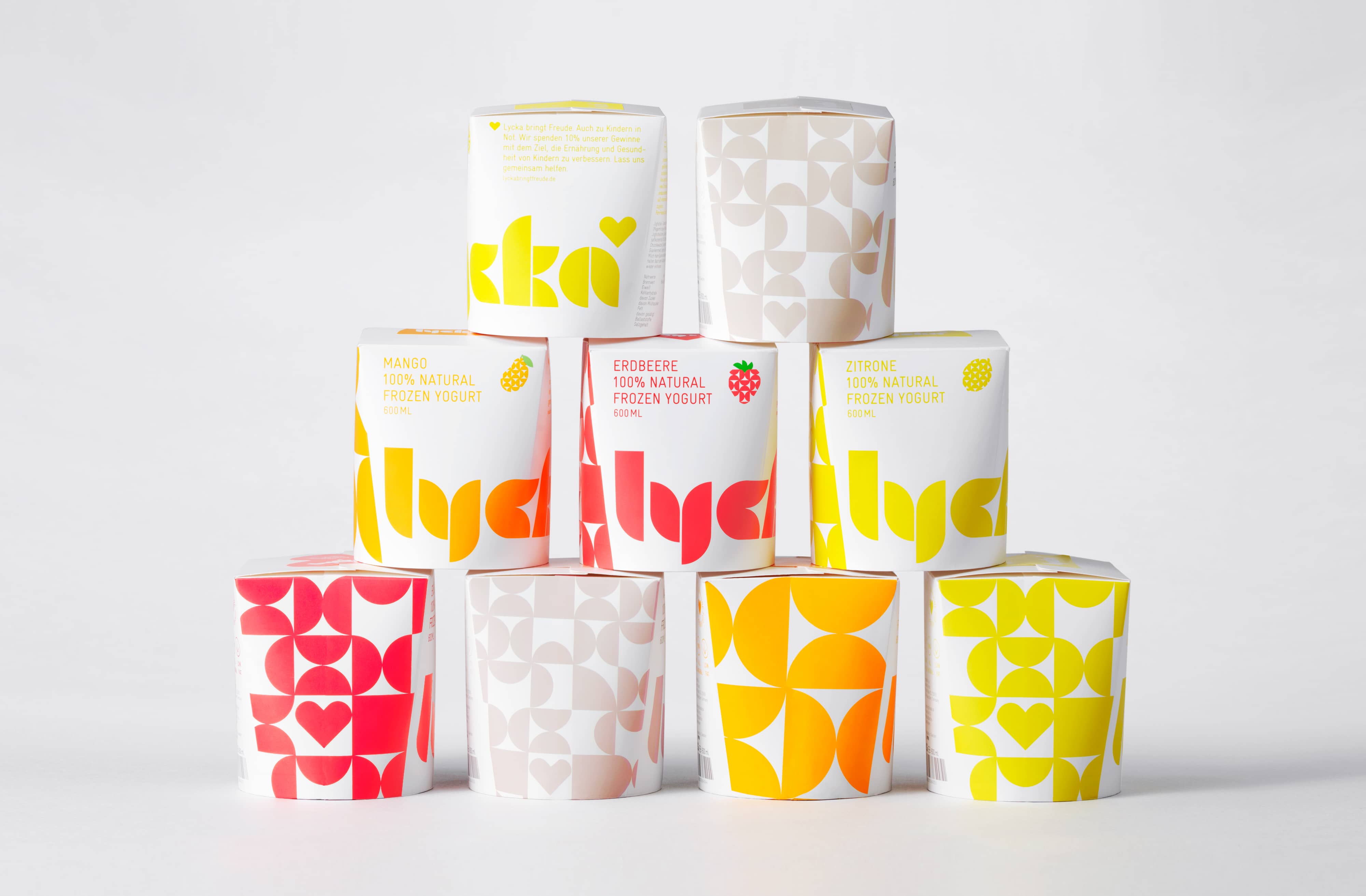
The relationship between product and charity – letterforms presumably informed by the Welthungerhilfe logo, the use of hearts, the structural and supportive nature of the patterns backed up by copy – are subtle yet well intentioned, adding a layer to what might have otherwise have been perceived as a striking but simple surface level approach.
Design: BVD
Opinion: Richard Baird
Follow BP&O:
Feedly
Facebook
Twitter
If you liked this then you may also like:

Support BP&O
Thank you to everyone who has visited BP&O since its beginning in 2011. As many of you know, BP&O has always been a free-to-access design blog that seeks to offer extended opinion on brand identity work. It has sought to be the antithesis of the social media platform that often disentangles form, context and content. Writing articles can take 2-4hrs and are carefully researched.
I am passionate about design writing and believe that spending time to write about work, rather than just posting images, furthers design discourse. If you have enjoyed this article, have been with the site from its early days and would like to help contribute to its future, please consider supporting the site with a small PayPal donation. This will go towards the costs of hosting, CDN (to make the site quick to load) and Mailchimp, and cover some of the time it takes to research, write-up, format and share posts.