Swedish Design
Dirty Vegan by Jens Nilsson
Having been a vegan for almost 20 years now, various tropes have come and gone. In the early days, for the health conscious it was pretty much all about brown paper packaged Holland and Barrett goods, and references to the Young Ones cooking lentils. For the not so health conscious (hello!) it was ketchup sandwiches. Gradually the Quorn contingent came...
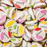
Bimmi by Bedow
When it comes to pre-packaged, semi-liquid meals and snacks, it’s easy to cite the infamous examples that are now stand-ins for whole demographics – I’m talking about SlimFast, the epitome of 90s diet culture; biohacker fuel Soylent; and, more recently, the US-based celeb-backed Daily Harvest, which made headlines due to product recall over food poisoning incidents. But there’s perhaps no...
Frank Penny by Bedow
Frank Penny is a consultancy specialising in AML – anti-money laundering. Knowing next to nothing about financial matters, I had no idea such companies existed. But like pretty much any other business, to succeed and stand out against their competitors, at some point or another anti-AML consultants need to think about their brand identity. Stockholm studio Bedow was recently tasked...
Tugg by Kurppa Hosk
The hamburger is an American icon. It conjures associations with all-American diners and drive-thrus, backyard cookouts and family gatherings; American values, such as entrepreneurship, as well as less positive attributes of Western countries, like obesity. The burger’s visual identity is inseparable from its history and has been solidified time and time again as the big fast food franchises conquered the...
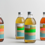
Swee Kombucha by Bedow
Although its recent rise to popularity has been rapid, running a quick search on ‘kombucha’ reveals that until the 21st century it had seen little category growth since its creation, more than 2000 years ago. For the uninitiated, kombucha is a fermented, non-alcoholic sweetened tea containing vitamins, amino acids and nutrients. This mix of familiarity (as a tea), its sweetness...
Omaka by Stockholm Design Lab
According to Sweden’s travel and tourism website, craft beer enthusiasts will discover a ‘smorgasbord’ of artisanal, eco-friendly and organic things to drink there, with more microbreweries per capita than any other country (apart from the UK). Omaka joined the scene in September 2020, at the height of the pandemic, and with a slogan to match its fearless attitude: ‘taste before...

Erik Berglin: The Bird Project by Lundgren+Lindqvist
Erik Berglin is Stockholm-based contemporary artist. His work is flows from his understanding that some people find the art gallery uninviting and uncomfortable, and the artworks displayed as requiring insight to really appreciate. He himself has said that he dislikes 90% of the exhibitions he visits but adores the 10%. This clearly informs his work, which often brings the unexpected into...
Avo Consulting by Bleed
Avo is a Nordic technology and management consultancy with offices in Norway and Sweden. Since its founding in 2016 it has seen rapid growth, expanding from 5 to 85 employees in three years. It has done this through a strategic rethinking of the way in which consultancy services are delivered, removing the buzz words associated with the industry, solving business problems...
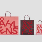
Åhléns by Happy FB
Åhléns began in 1899 as a small mail-order business. Aside from it being one of the oldest it has also grown to become one of the largest retail chains in Sweden. By carefully collating a variety of items across brands and price categories, the retailer maintains its relevance today, understanding and responding to the many ways in which its customers...

Strandgut – Vasas Flora Och Fauna by Bedow
Vasas Flora Och Fauna is a Finnish indie pop-group and trio of musicians. Their new album Strandgut is made up from eleven songs taken from the band’s first two albums, which were then re-recorded in German. This was released on both LP and CD by the record label Startracks. Swedish design studio Bedow worked with Vasas Flora Och Fauna to create...
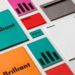
Brilliant by The Studio
Swedish employee engagement consultancy Netsurvey and Bright, experts in customer surveys, have been merged and rebranded as Brilliant by The Studio. This merger and rebranding intended to create a new platform capable of encapsulating the skills and corporate cultures of both companies and develop a visual expression that people from each could identify with and stand behind. In the same spirit as The Studio’s...
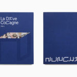
Nunchi by Bedow
Nunchi is an Italian startup and the vision of Cedric Naudon, a self-confessed gastronome. This follows his ambitious project to create an entirely new creative neighbourhood of restaurants, fashion boutiques and design stores in Le Marais, Paris. Nunchi intends to frame and connect all of Cedric Naudon’s gastronomic projects. The first of which is a reimagining of Edouard Nignon’s classic cookbook L’Heptameron des Gourmets,...