Teahouse Exclusives by Peter Schmidt Group
Opinion by Richard Baird Posted 26 February 2015

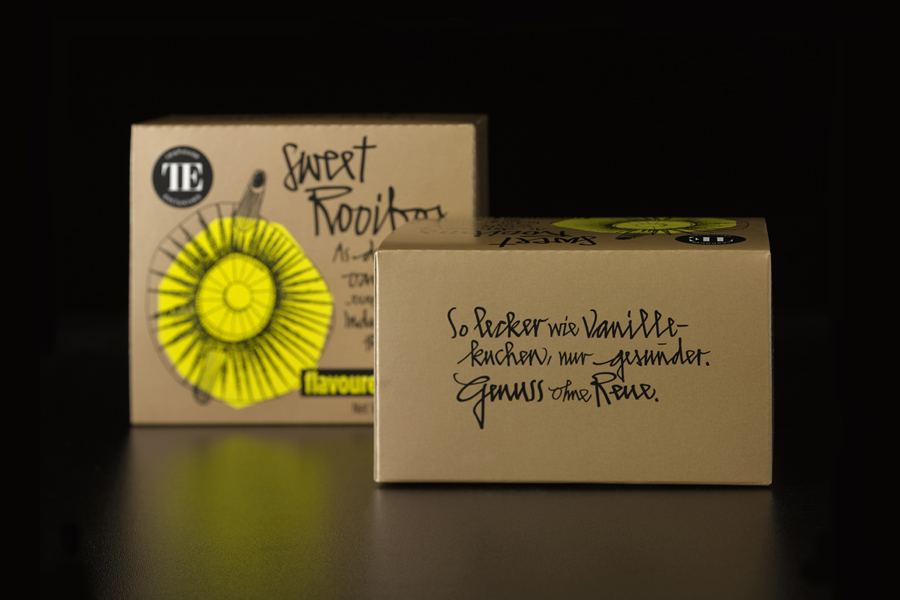
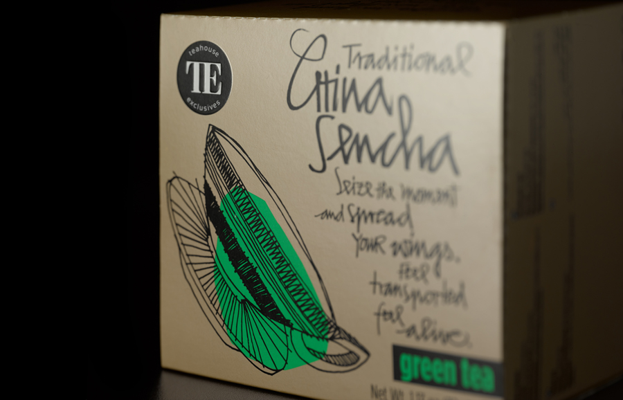
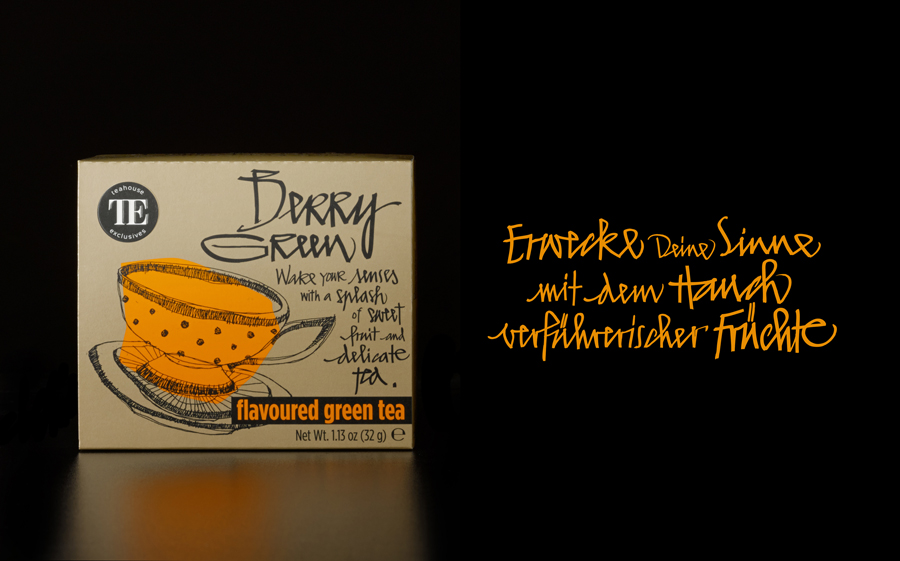
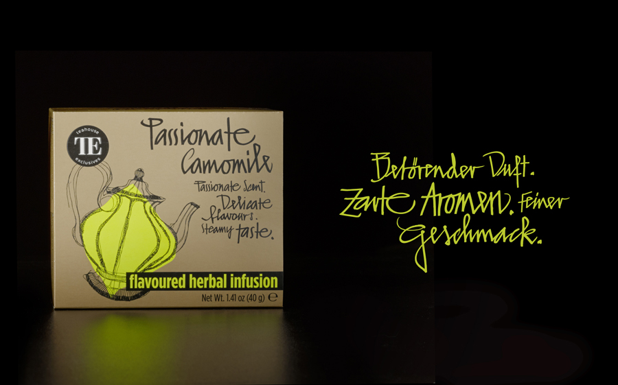
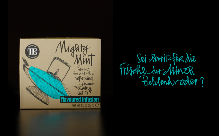
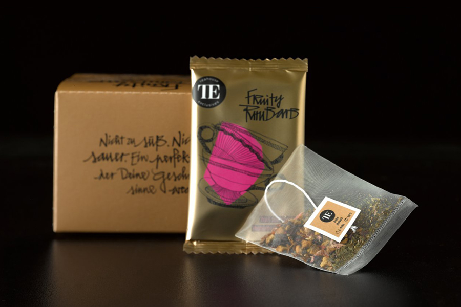
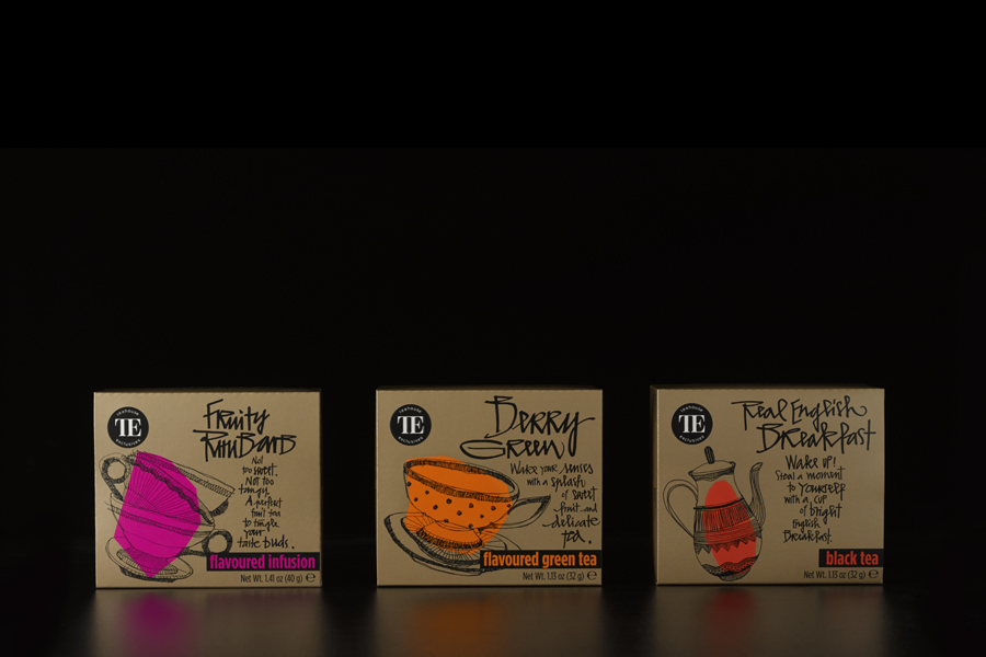
Teahouse Exclusives is a German company with a portfolio of high-quality black, green, fruit, and herbal teas, a philosophy that revolves around sophistication, quality and modern lifestyle values, and describes itself online as being trend-conscious. Based around the concept of individuality and strong character, integrated brand consulting business Peter Schmidt Group worked with Teahouse Exclusives to develop a new packaging treatment for its everyday range. These feature original illustrative and custom typographic detail and a contrast of bronze metallic and fluorescent spot colours.
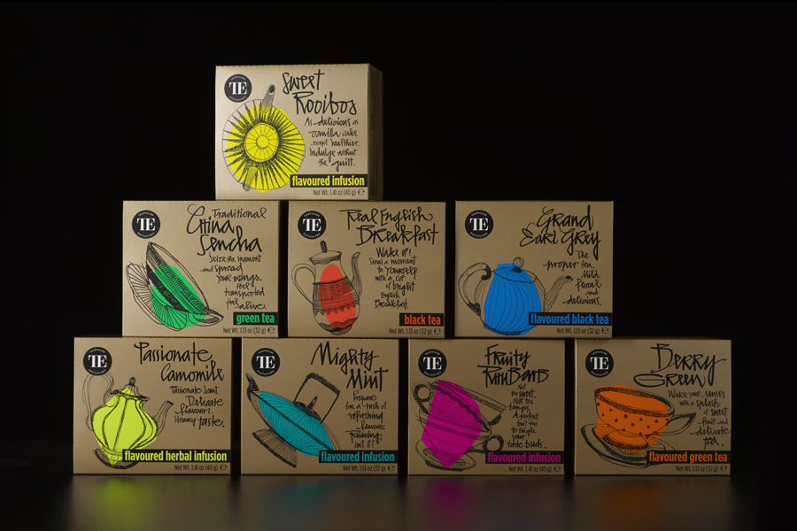
The approach leverages many of the well-established and current communicative design cues of the tea category, in keeping with the company’s trend-conscious philosophy, but proves that distinction and originality can still be drawn from these.
Craft and individuality, the tea drinking traditions of Europe and the Eastern origin of tea are well-resolved through the forms, loose hand drawn pen work and detail of teapots and teacups, and the lines, loops and ligatures of custom typography. The absence of typographical repetition is to be commended, as is the balance of communicative intention and striking aesthetic treatment, and the way that these contribute to a sense of quality and brand character.
The haphazard but considered layout of each asset, their rendering, and an enthusiastic and varied choice of language – in contrast to Teahouse Exclusives’ website – effectively implies an authenticity and accessibility well-suited to the personable nature and everyday positioning of the range.
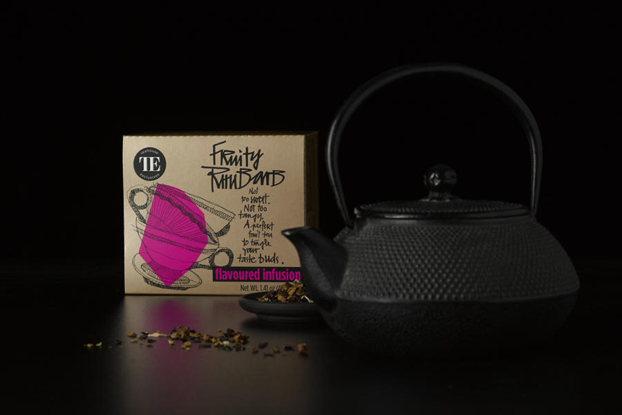
The full coverage of a bronze metallic spot and a shot of fluorescent ink mixes tradition – much like the choice of cups and teapots – modernity and an element of creative flair in an compelling, well-intentioned and functional way, dividing varieties, uniting the range and securing visual impact.
It is good to see that although the slightly awkward TE monogram remains, a lot of the twee that previously surrounded it is gone. Whether this is in service of the everyday nature of this particular range or reflective of a forthcoming brand-wide change remains to be seen, but its revised contemporary simplicity anchors the more expressive and dynamic nature of the typography and imagery.
Design: Peter Schmidt Group
Opinion: Richard Baird
