Belle Epoque by Mind Design
Opinion by Richard Baird Posted 4 March 2015

Belle Epoque is a French patisserie, located on Islington’s Upper Street, crafting cakes, chocolates, breads, viennoseries, tarts and quiches from high-quality ingredients in a kitchen designed to complement the unrivalled expertise of their chef.
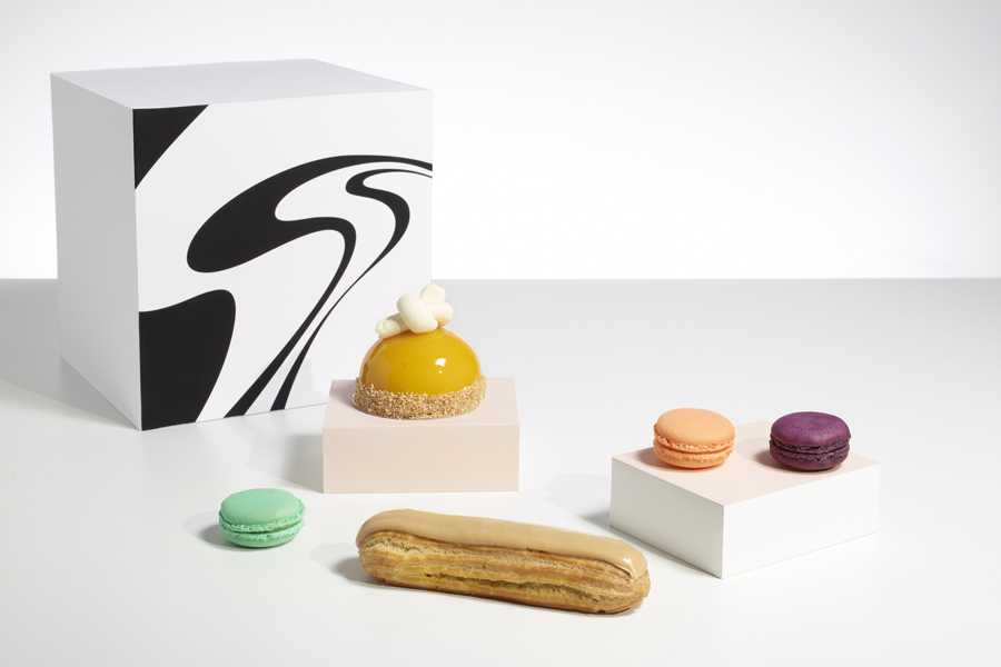
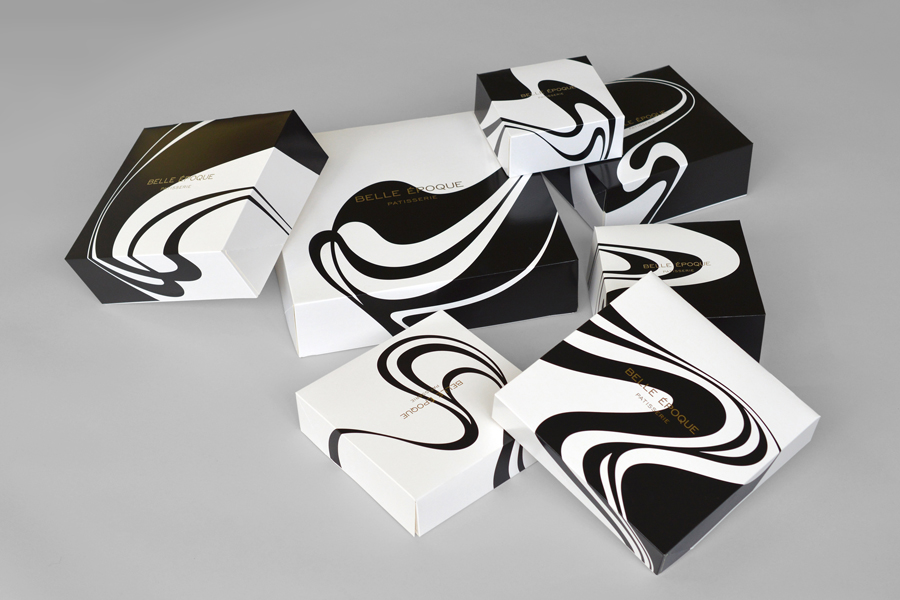
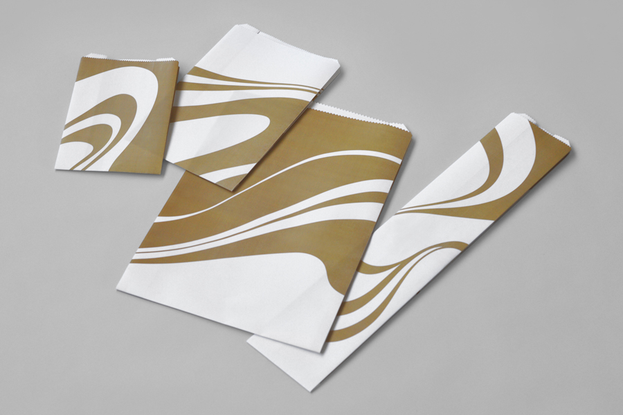
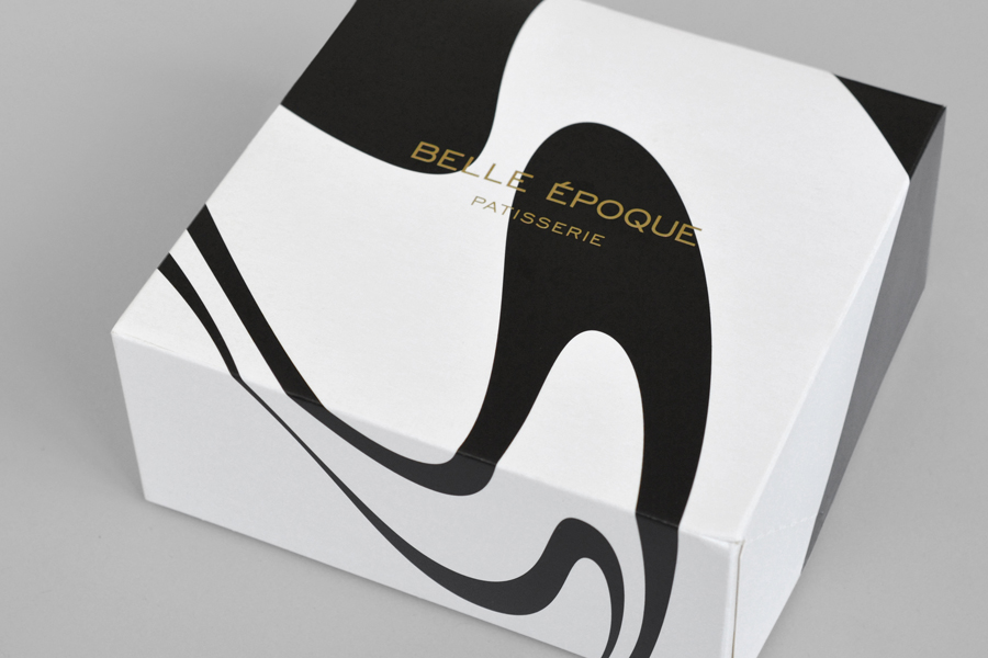
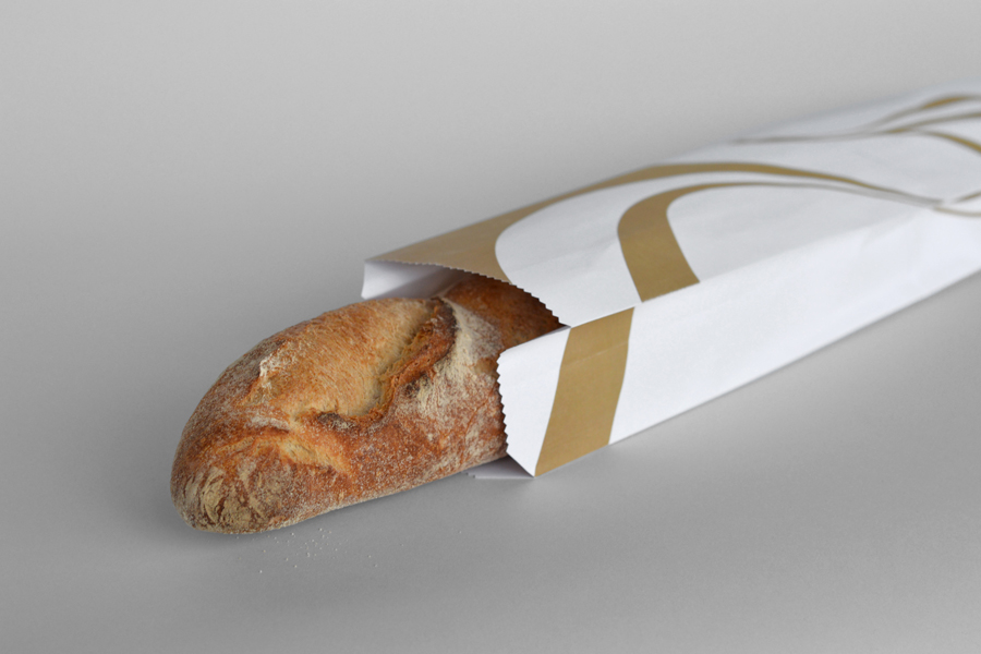
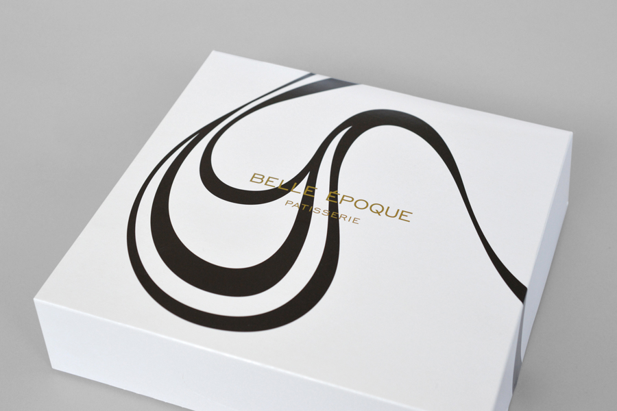
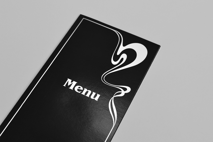
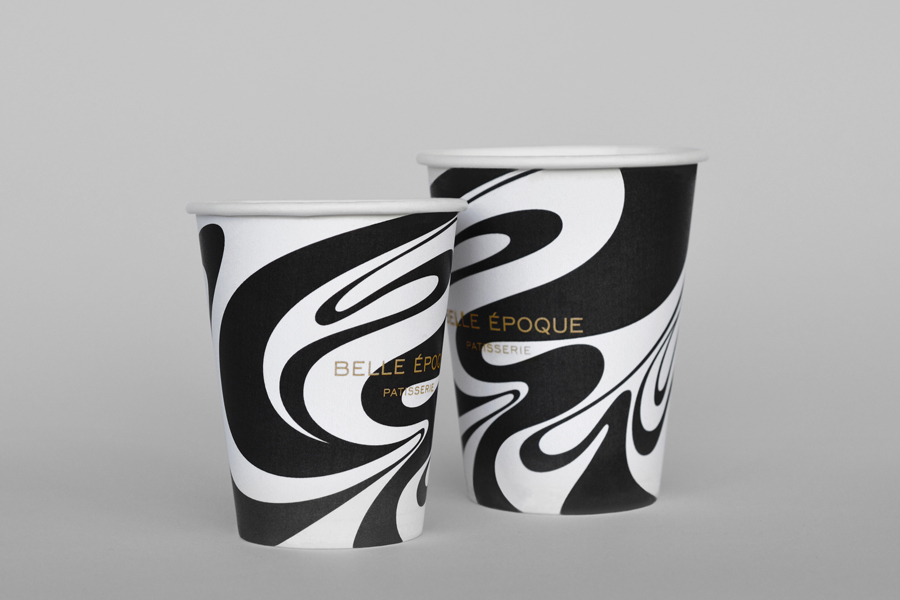
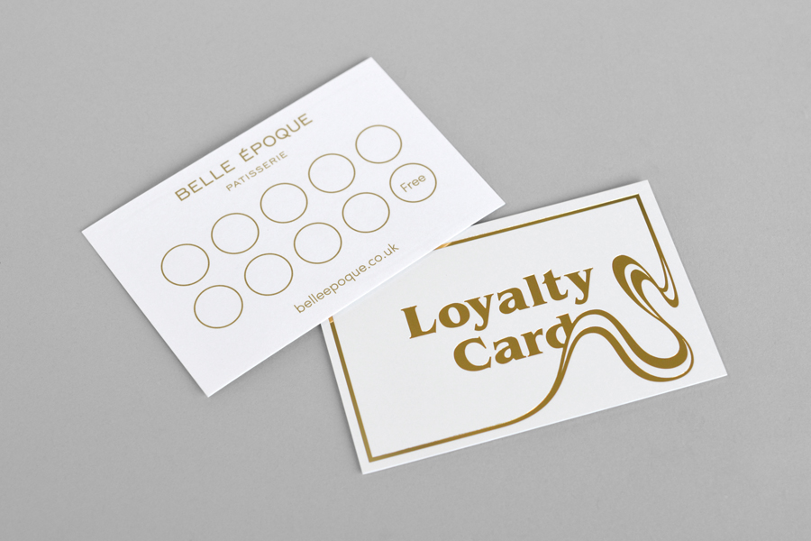
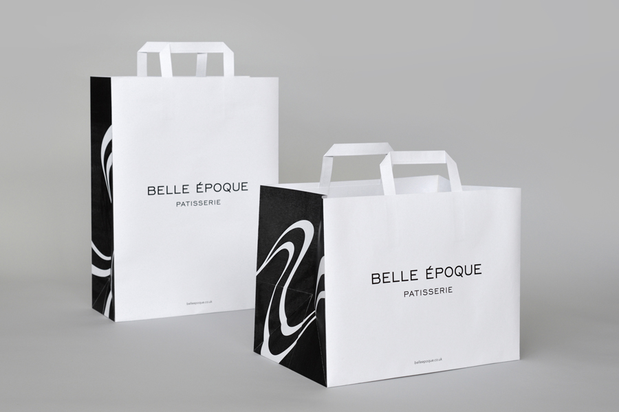
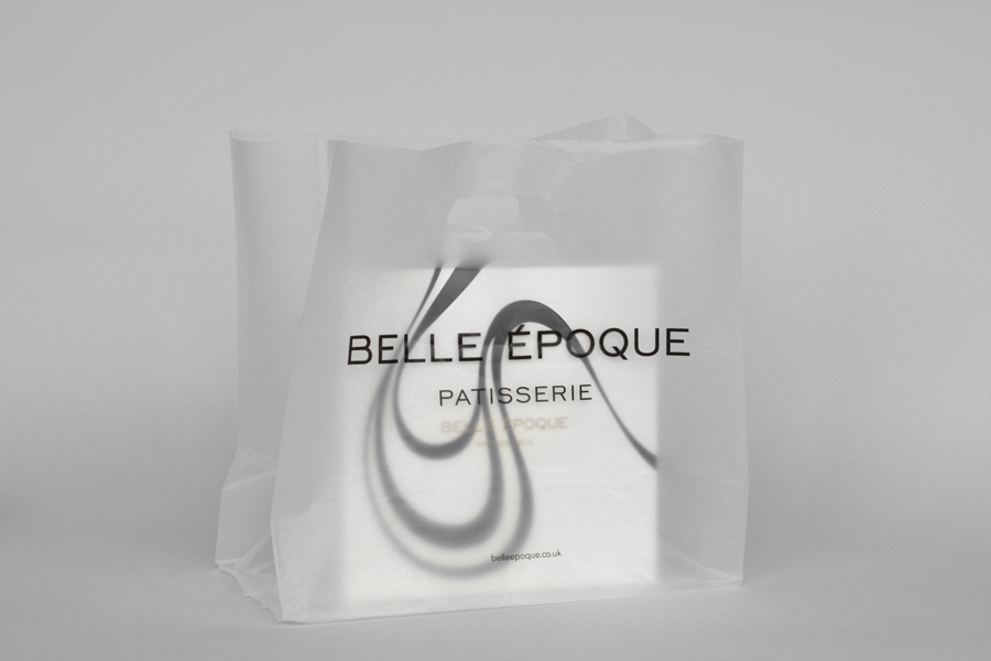
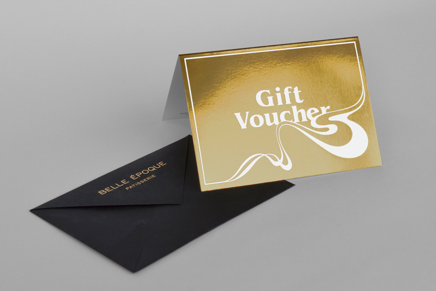
Originally commissioned to develop Belle Epoque’s website, Mind Design managed to expand the scope of the project into a full brand identity exercise that went on to include still life photography, stationery, business cards, packaging, menu design and website. Inspired by the drawings of English Art Nouveau artist Aubrey Beardsley, Belle Epoque’s new brand identity is built around a bold swirling black and white motif, the flourishes of a gold ink and block foil print finish, and images that draw out the colour, artistry and detail of the pastry work through colour and form contrast.
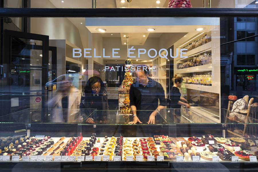
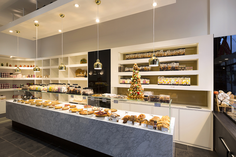
An interior of white matt walls, polished black panels, rectangular marble counter, slate floor, geometric shelving, suspended ceiling, warm recessed and low hanging polished gold lights mix classic and contemporary French and English detail with an art nouveau quality. Simple shapes, limited palette and good quality materials and furnishings help to pick out the hand crafted, organic forms and colour of the products, and contribute to the perceptions of accessible luxury and authentic expertise, and lives up to contemporary retailing expectations.
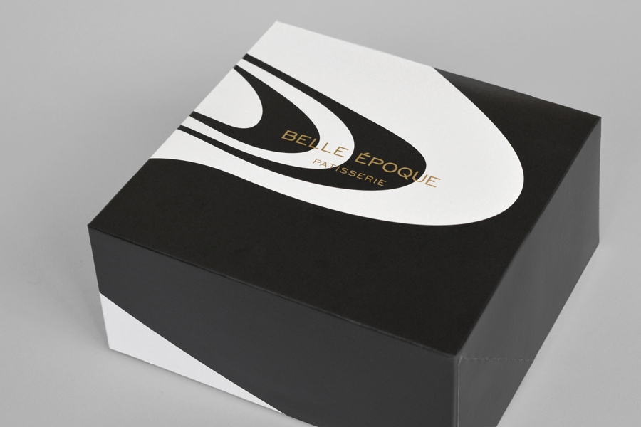
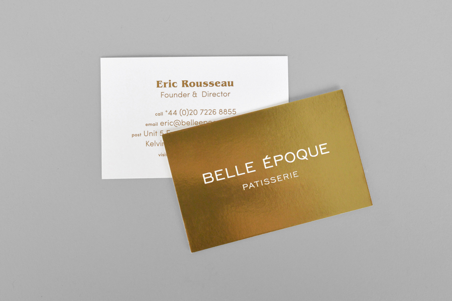
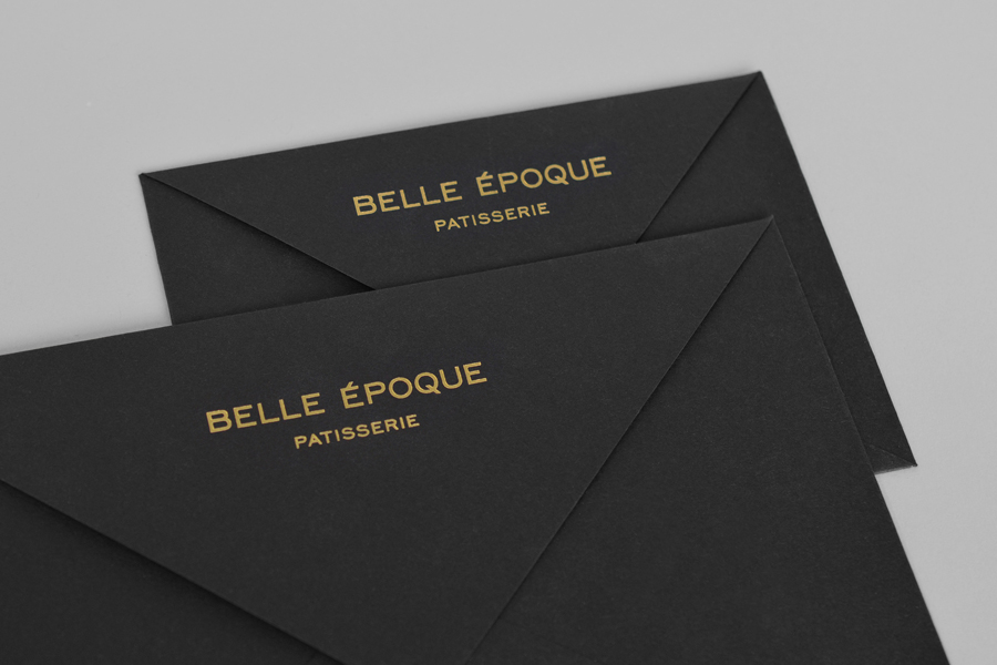
The identity appears to take some of its cues from the intentions and aesthetics of the interior, and leverages some familiar industry conventions, through the contemporary uppercase sans-serif characters of Sofia, the retrospective sensibilities of Benguiat, a restrained colour palette of white and dyed black papers, plenty of space, and the timeless warmth of a gold metallic ink and block foil print finishes.
The organic lines of the patterns, well-rendered with a vector precision and great sense of fluidity, mixes elements of marble craft, milk in coffee and Art Nouveau, are inspired by Aubrey Beardsley’s work and recognised to have some of the qualities you might associate with hippie culture, a detail that ties in the choice of 70’s type. The references are abstract but the aesthetic is compelling in its reduction, and impactful in its implementation.
While the illustrations and their colour secure a sense of consistency, the variation in shape, detail and weight, and a change in the proportion of black to white throughout the boxes and bags secures diversity and visual interest.
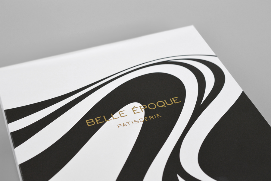
When presented within the context of this blog there is an element of repetition, however, it is worth contemplating the simplicity, dynamic and ownable qualities—founded on similar themes of art, quality and craft—these add to a rich but fixed retail experience, ensuring that a strong and identifiable brand identity leaves the store and exists online.
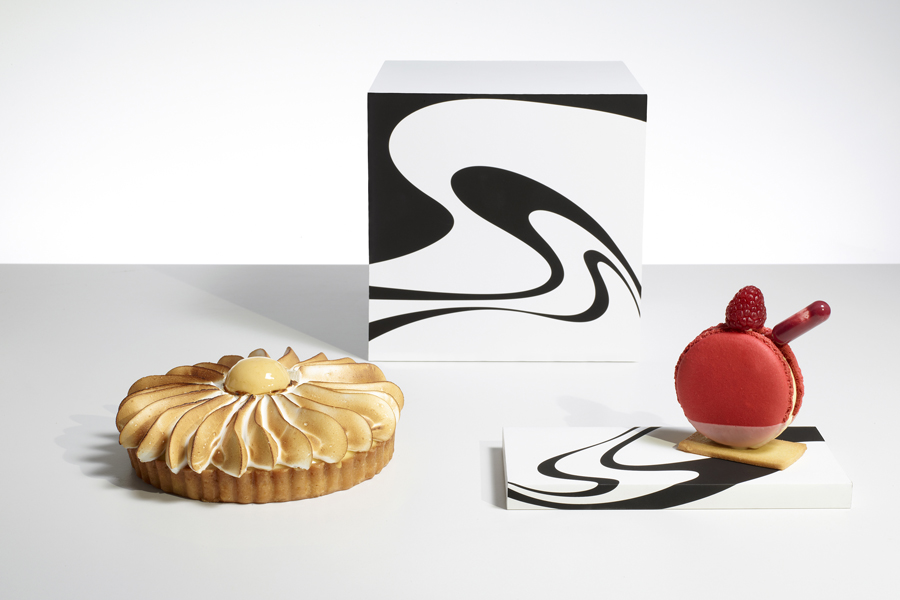
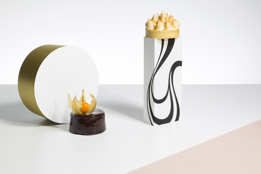
Identity and product are effectively tied together through still life photography, a particular highlight and unique asset within the context of the project, and given prominence and setting tone online. These effectively draw attention to the sculptural and artistic qualities of pastry craft using basic geometric forms that hold the organic swirls and gold detailing of the identity, making for a acute and ordered contrast alongside the pastry’s detail. More from Mind Design on BP&O.
Design: Mind Design
Photography: Metz+Racine & Ed Reeve
Opinion: Richard Baird
Fonts Used: Sofia & Benguiat
