Ona by Mucho
Opinion by Richard Baird Posted 6 March 2015

Ona is a Spanish boutique travel agent providing its clients with personal, unique and private tours, day trips and stays in Barcelona and Catalonia. Its experienced guides offer professional insight into local culture, gastronomy, history, architecture, art and design, and provide round-the-clock assistance. Ona’s brand identity, designed by Mucho and based around the tagline “Tailored travel experiences”, is an unusual and distinctive mix of interactive monogram, business cards with light marble and green block foil detail, a website of light and then tinted photography, and monolinear iconography.
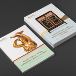
The logo is subtle in its combination of characters yet clear in their formation of a compass. Slight in its line weight and heavy on internal space, it is its interactive implementation online that really gives its memorable quality, and conceptually, loosely hints at the ability for travellers to define their True North; the route and experiences they want to live, a key component of Ona’s business. This dynamic element is lost in print but made up for with directional variations across business cards, picked out using gold, and the logo’s bold oversized application.


Much like the interactive and monogrammatic qualities of the logo, the business cards are unusual and unexpected. A green and gold foil across a marble board conjures up retrospective associations, but works rather well, benefiting from the quality associated with foil and the stone craft and the traditional architectural and ornamental qualities of marble texture. Together these choices appear distinctive, unique and, although it might be a bit of a reach, brings to mind images of Mies van der Rohe’s pavilion for the International Expo of 1929.

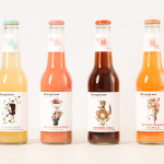
It may be the cut and polished crystal in Mucho’s project photography, however, the texture of the business card, its green block foil, the rendering and placement of the icons around the edge of the website (although absent from the live site), the theme of direction in the logo and discovery and exploration in the photography online (gates, doors, windows and stairs) hint at some for of spiritual self-discovery subtext. This is largely in tone and not explicit but adds a layer of detail that is in keeping with themes of the identity and activities of the business. More from Mucho on BP&O.
Design: Mucho
Photography: Roc Canals
Opinion: Richard Baird
Fonts Used: Libre Baskerville