Designed by Mucho
IAAC by Mucho
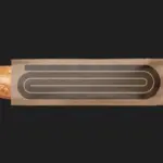
The IAAC (Institute for Advanced Architecture of Catalonia) is an organisation which boasts a remit that feels both nigh-on impossibly wide but also hyperspecific. Based in Barcelona and founded in 2001 as a hub for innovation in architecture and design, IAAC describes itself as ‘a platform for producing knowledge to shape the future of cities, buildings and society’. The long...

Ultraderp by Mucho
The name Ultraderp seeks to combine all things extreme (think ‘ultrafast’, or ‘ultra marathon’) with ‘derp’, which is, apparently, the face a dog makes when they don’t know what’s happening. The product that bears this name is an ultra-light, easily-packable dog leash that can be worn on the collar and deployed when needed, simply by pulling the tongue-like tab. This...
Antara 128 by Mucho
GT Alpina is described by type foundry and BP&O regular GrilliType as a workhorse serif that also delights in playing with the very meaning of concept, reaching into the ‘grab bag of typographic history to resurrect shapes some may falsely see as too expressive’. This feels an apt description for Antara 128, and the visual identity created by Mucho that...
Ostro by Mucho
Ostro isn’t the easiest of companies to make sense of. Billed as a ‘life science software company’, it straddles a number of different services that are both consumer and clinician-facing. In simple terms, though, it looks to help consumers and healthcare providers alike to navigate the complex, labyrinthine ins and outs of the complex US healthcare system; using software to...
BrewBird by Mucho
Global strategy, branding, packaging, and graphic design studio Mucho created this colourful new identity for coffee tech startup BrewBird, working with Scottish artist Craig Black. Mucho was appointed to create a new brand identity and ‘memorable’ packaging system to help BrewBird communicate its story around uniting cutting-edge tech, taste, and ‘the artisanal craft of coffee roasters’. According to Mucho, drip...
Big C Charters by Mucho
Big C Charters is a premier charter service located in the San Francisco Bay Area, offering hands-on fishing trips and excursions. The company gets its name from Christian Cavanaugh, captain, founder and former professional basketball player. With a growing fanbase and fleet, Mucho was commissioned to create a new logo, colour palette and custom typeface for the brand, as well...
The Art Gallery of New South Wales by Mucho
The Art Gallery of New South Wales, founded in 1872 as the New South Wales Academy of Art, suffered from a fragmented brand architecture. Addressing this through a rationalised and simplified system, and reinforcing the master brand across all Gallery collateral became a central part of developing of a new brand identity which would support a repositioning strategy that moved...
Piedmont Art Walk by Mucho
Piedmont is a small city in California named after the European region in the shadow of the Alps (from the Italian piemonte, meaning ‘foothill’). Surrounded on all sides by Oakland, the neighbourhood has a population of roughly 10,000 people and an active charity scene. This includes the Piedmont Arts Fund, a nonprofit group that promotes and supports visual and performing...

Schubertíada Vilabertran by Mucho
Schubertíada is an annual festival run by Associació Franz Schubert that celebrates the works of the 19th-century Austrian Romantic composer Franz Schubert. This takes place in the Spanish municipality of Vilabertran in July. The festival includes a programme of chamber concerts, lied recitals, instrumental solos and lectures. Schubert is known, not just for his compositions, but for his contribution to Lieder; German poetry...
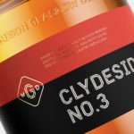
The Clydeside Distillery by Manual
The Clydeside Distillery was set up in 2014 with the intention of reviving distilling in Glasgow and telling the story of Scottish Whisky through a visitor’s centre. The distillery was set up by the Morrison’s, a family with a century-long history within the Scottish Whisky industry as both owners and operators. San Francisco based Manual travelled to Glasgow to work closely with founders, architects...
Feroz by Mucho
Feroz, located on Barcelona’s Carrer Tuset, is described as being a fashionable destination that transitions from evening restaurant into late-night club. It features a distinctive interior design created by Pablo Peyra Studio. This exists in the grey area between something close to period colonialism, moments of kitsch and modern luxury. It has an undeniable character and specificity, one that is fully committed...

Doméstico Shop & Doméstico Market by Mucho
Doméstico Shop is online retailer of designer homeware which has grown to become the leader in the Spanish market. It stocks an array of items, from furniture and kitchenwear to textiles and lighting. To coincide with the launch of Doméstico’s concept store Doméstico Market, and the opening of a new flagship store in Barcelona, the retailer worked with Mucho to...