Stone Way Cafe by Shore
Opinion by Richard Baird Posted 18 March 2015
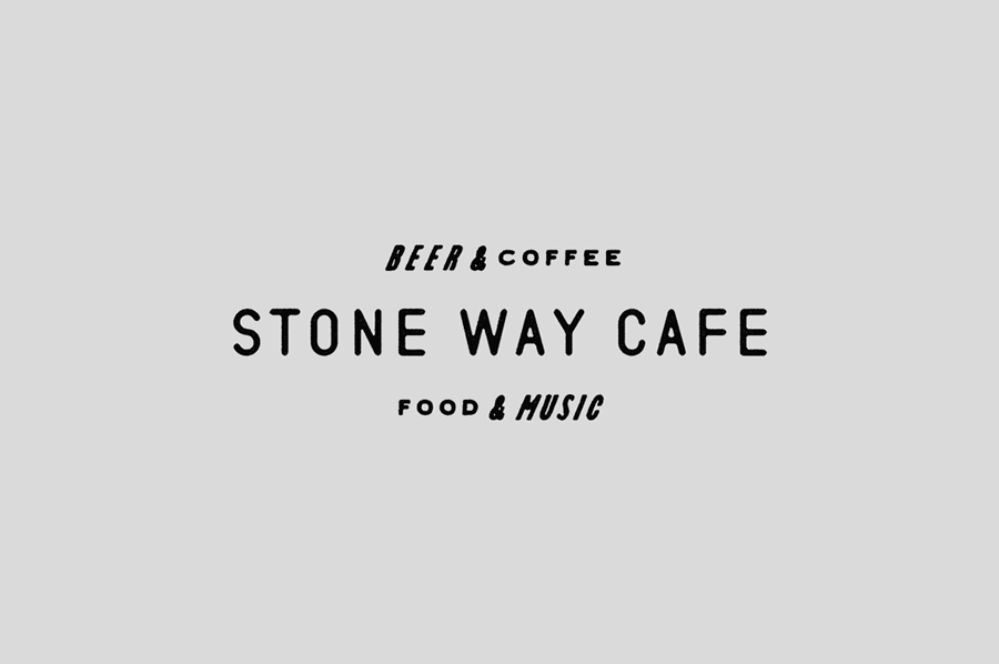
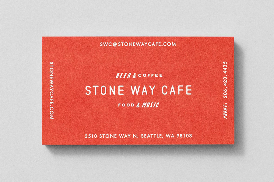
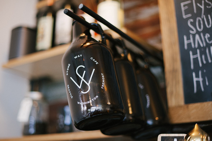
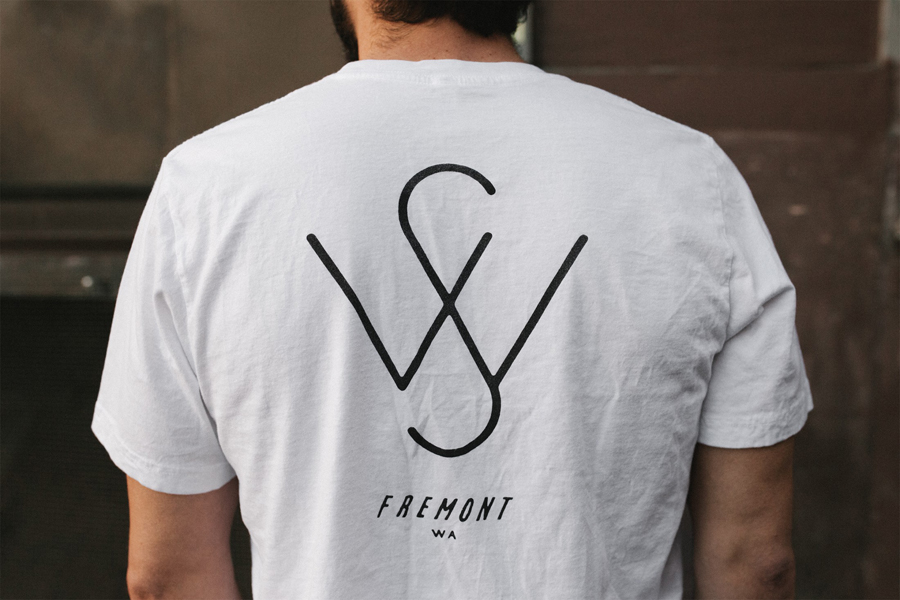
Stone Way Cafe, formerly the Tiny Ninja Cafe, is a Seattle based neighbourhood meeting point, music venue and internet cafe, in the area of Fremont, with a formidable, geometric, concrete exterior structure and a warmer interior of wood surfaces created by goCstudio. Design studio Shore, working closely with signwriters and fabricators, created a brand identity treatment for the cafe, which included a variety of typographical assets, signage and business cards, that takes its inspiration from the industry and personality of the neighbourhood.
Fremont is an unusual mash-up of industrial and countercultural past. A place of ship canals and artists, home to a statue of Lenin, brought over from Slovakia, and a giant concrete troll, yet more recently has faced gentrification. Stone Way Cafe, in many ways, represents this meeting point through community events, functional architectural structure, and gentrification in the building’s repurposing, moving from all that is associated with industry—mechanisation, consistent reproduction, and uniformity—to that of individuality and expression.
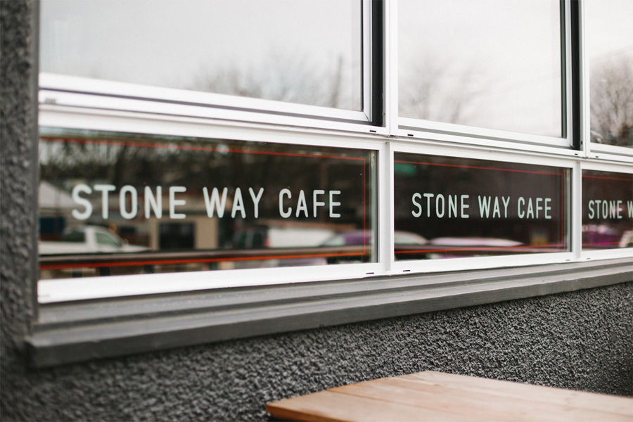
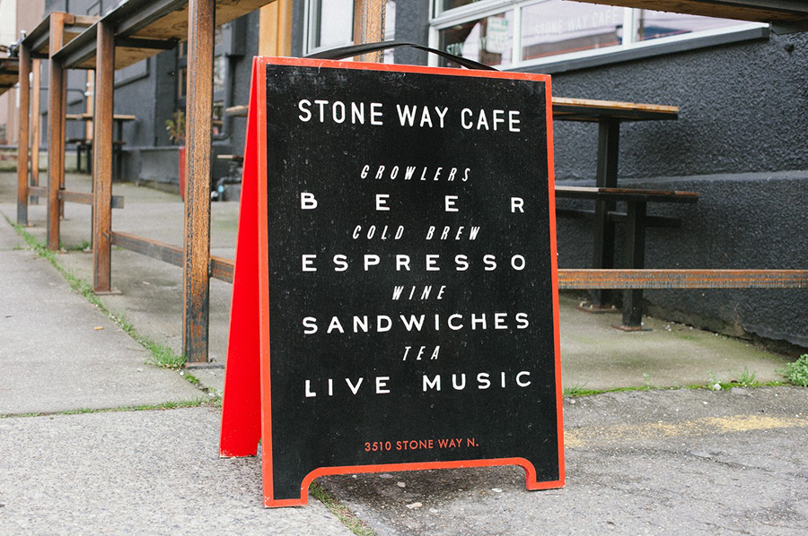
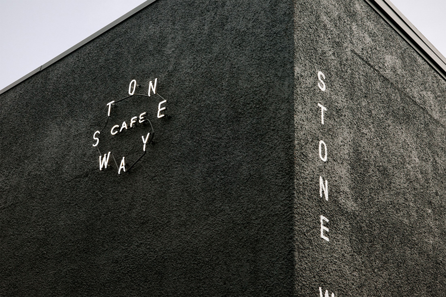
A lot of the character rightly comes from the experience of the structure and space. Its bold, practical, geometric exterior of stippled concrete, enhanced by its new coat of dark grey, imposes its functional industrial characteristics on the neighbourhood as a proud monument to the past. Shore take good advantage of this with the utility of condensed, vertically stacked monolinear sans-serif characters along the edge of the building and horizontal detail across the windows. The neon signage deviates slightly in its radial form and in the craft of its making, functioning well as an on-trend reminder of the building’s new purpose.
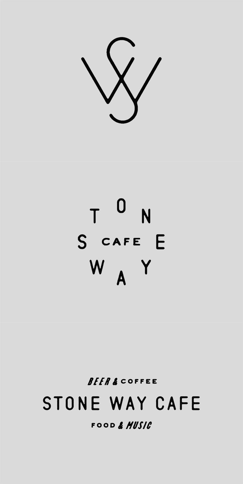
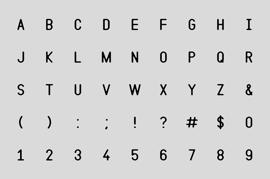
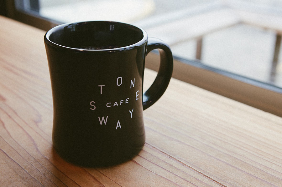
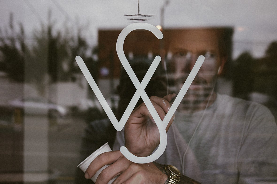
Like the building and exterior signage, Shore’s logotypes and monogram effectively mix a current favour for industry, retrospection and simplicity, both in character choice and typesetting. The loose edges, a result of their reclaimed origins as part of the FoundFont project, have a worn and vintage quality while their hand painted application across windows draws an individual and crafted sensibility from what was a product of practicality in mechanical reproduction. This aesthetic runs throughout a variety of small assets that, through language, mix industry, coffee, beer, music, food, community and locality in a straightforward manner in keeping with the utility of the space with only the smallest of flourishes giving each a proprietary and visually interesting dimension.
An interior of extensive wood-panelling across floors, counters, beams and tables, as well and low hanging lighting, introduces a surprising warmth and contrast to the cold exterior structure and typographical treatment but in many ways remains true to the utility of the building. This warmth makes its way into the visual identity through a bright red ink.
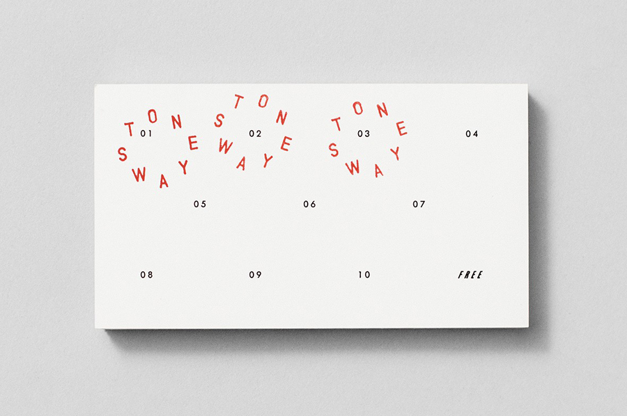
As an isolated identity piece its reductive, restrained and on-trend, with enough bits and pieces, bound by a similar worn sensibility, and shot of red to keep it interesting. Within the context of the building, however, it draws together the robust and practical exterior shell and its utilitarian but more welcoming interior, and comfortably mixes industry with craft through type and its application. More from Shore on BP&O.
Design: Shore
Architecture: goCstudio
Sign Painting: Sean Barton
Signage: Western Neon
Opinion: Richard Baird
Fonts Used: Various FoundFonts
