Karuizawa 1984 by The Metric System
Opinion by Richard Baird Posted 19 March 2015
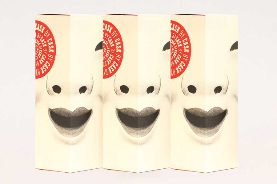
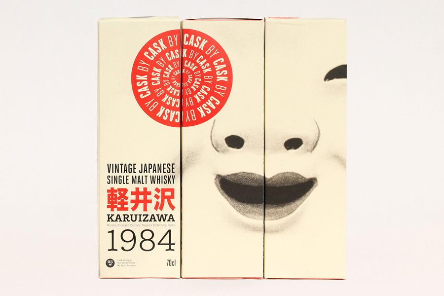
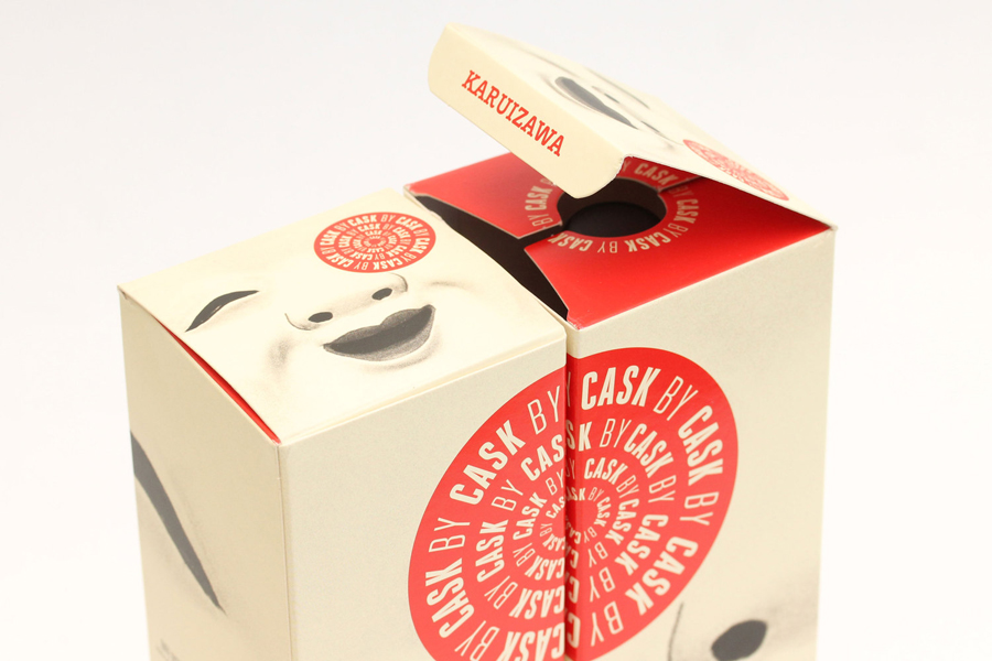
Karuizawa 1984 is a vintage Japanese single malt and single cask whisky imported and bottled exclusively for the Norwegian market. The first batch, a run of 577 bottles, sold out immediately. Karuizawa’s packaging, created by Scandinavian graphic design studio Metric Design, effectively conveys the age and provenance of the whisky, is sensitive to the Western market, and aware of and largely disregards category conventions, through the juxtaposition of a simple box design and iconic imagery, alongside an information rich and typographically dense label treatment.
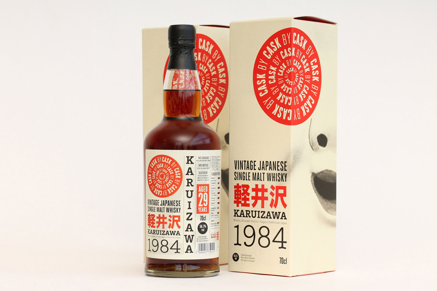
In contrast to the whisky’s of Europe–think rolling hills, wild animals, foils, signatures and stories–and Japanese whiskys that favour brush strokes, aged papers and similarly foils, The Metric System embraces sharp Japanese characters, solid colour, geometric form and iconic imagery that borrows more widely from Japanese culture rather than limiting itself to those deeply engrained within the spirit markets of both east and west.
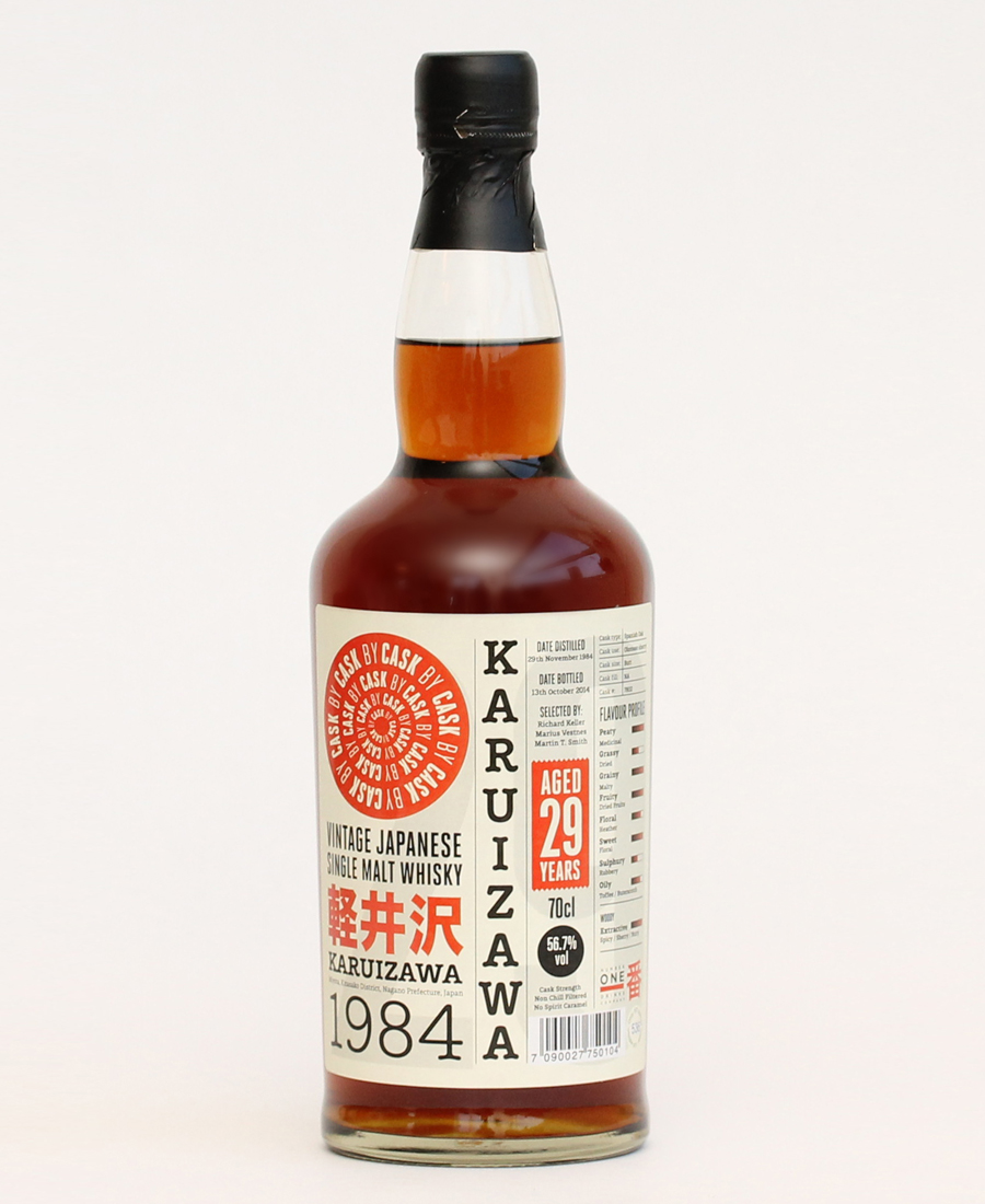
The approach makes the most of those aesthetics Europeans less familiar with the country might associate with Japan, and although it perhaps lacks nuance, it emphasises cultural difference where Japanese and European whisky markets leverage similar aesthetic cues, securing distinction and playing up provenance as perceived from the outside. These motifs include the iconic qualities of a Kyogen mask–drawn from what looks like historic stock that shares some of the aged qualities of the product–the use of vertical stacked typography and the tall slim columns of Japanese newspapers and texts, a rising sun motif, and a classic cream, black and red colour palette.
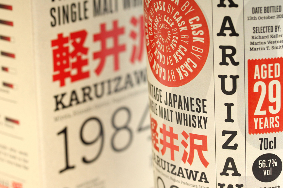
Contrast has been used to good effect through a mix of column widths, shapes, font weights, styles and detail, stroke thickness and the space and typographic density of box and label. While the label is busy, type weight, size and colour, fills and negative space, horizontal and vertically stacked text work well to break up information and set hierarchy, with age, provenance and distillery clearly positioned visually rather that a more formal top down approach. More from The Metric System on BP&O.
Design: The Metric System. Opinion: Richard Baird.
