Room Essentials by Collins
Opinion by Richard Baird Posted 6 April 2015
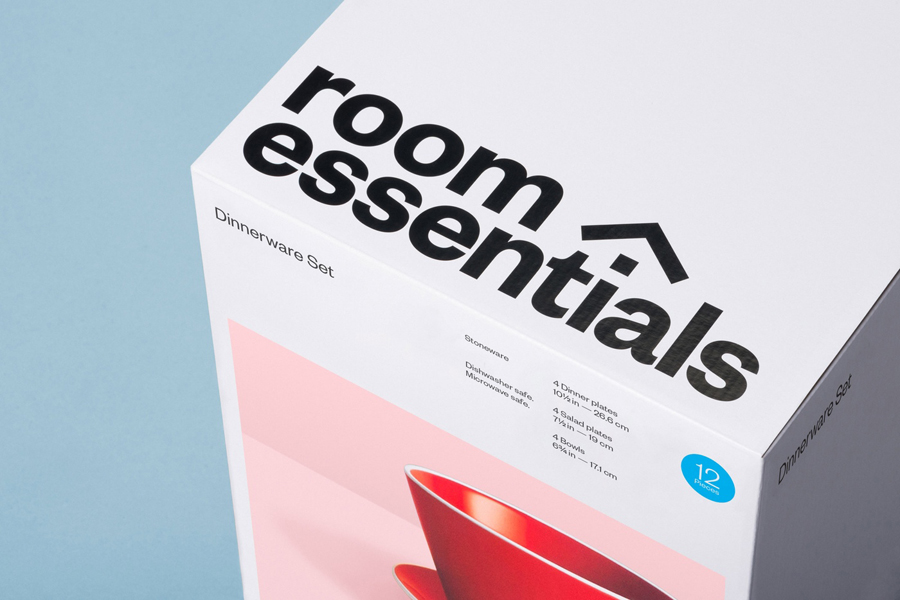
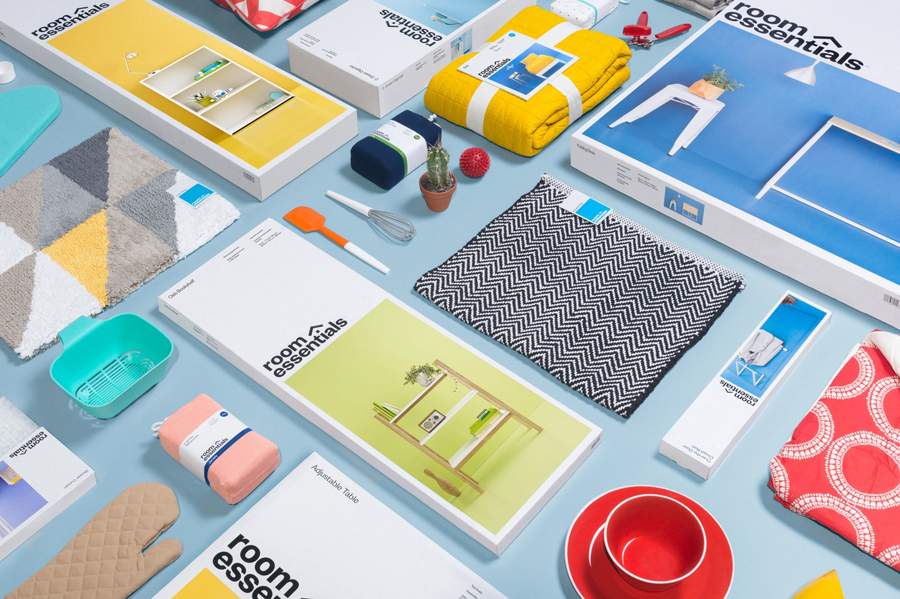
Room Essentials is a line of modernist home furnishings created and sold by American retailer Target. The range covers over 2,000 products across 60 categories, and includes items such as blankets, lighting, chairs, tables and tableware.
While securing significant revenue for the retailer, the range has, over the last five years, experienced a downturn in sales generated by its Millennial demographic. With this in mind, and with the intention of recapturing the enthusiasm for and interest in the range, Target commissioned New York based Collins to reimagine Room Essential’s brand identity.
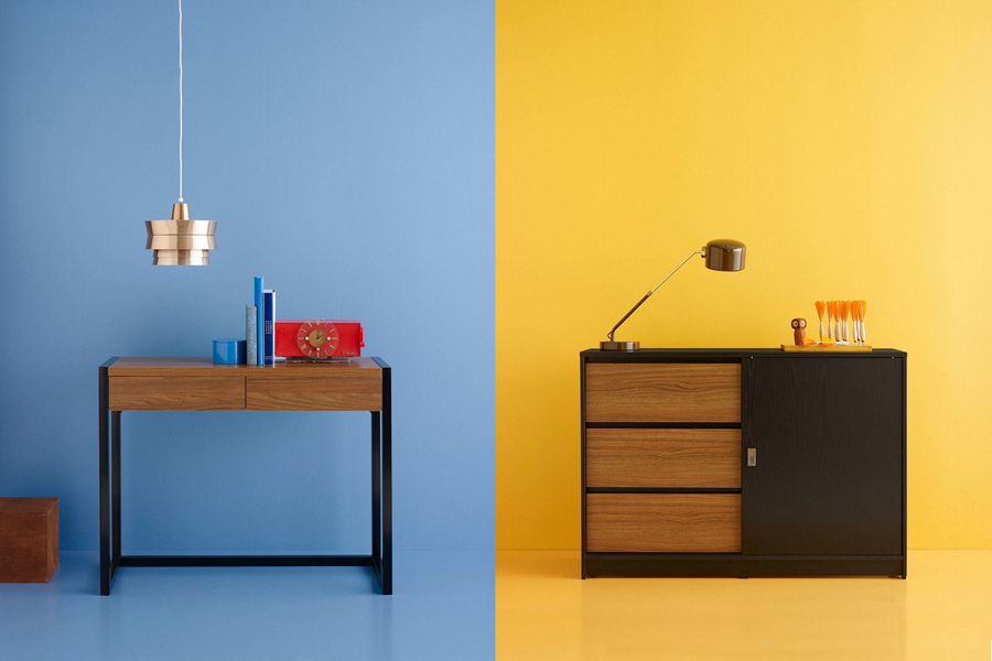
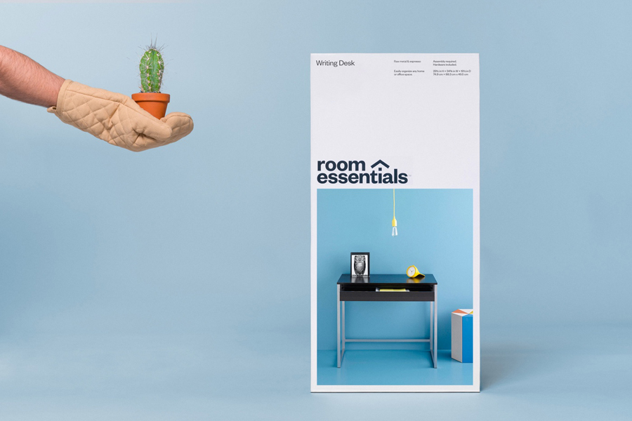
Collins’ approach blurs the line between brand identity, packaging and digital campaign, and leverages the functionality, accessibility and viral potential of Pinterest through compelling pin-able photography with a current colour palette and a sensitivity to the range’s modernist values.
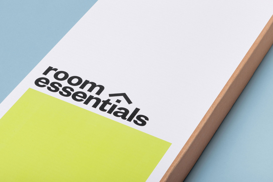
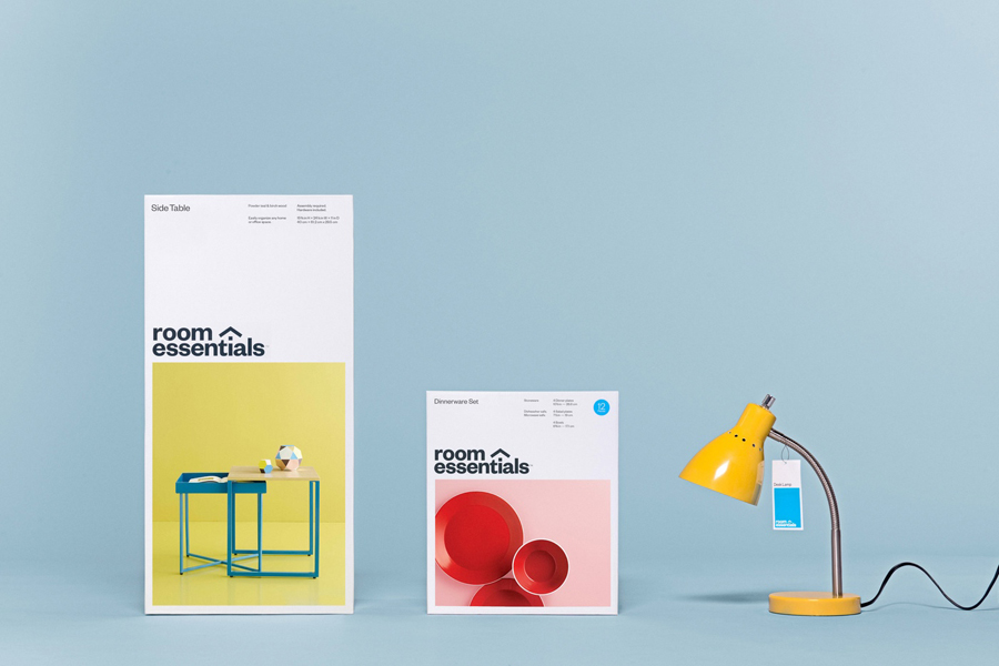
Although brand identity conventions have been addressed through a heavy sans-serif logotype, a mix of reduction, impact and a small communicative flourish, Collins solution appropriately leads with product photography and places communicative weight on Pinterest as a way to better engage with the brand’s demographic. Allowing social media to define the stylistic and communicative conditions of the photography gives the project an interesting and unusual social-media first strategic foundation from the outset.
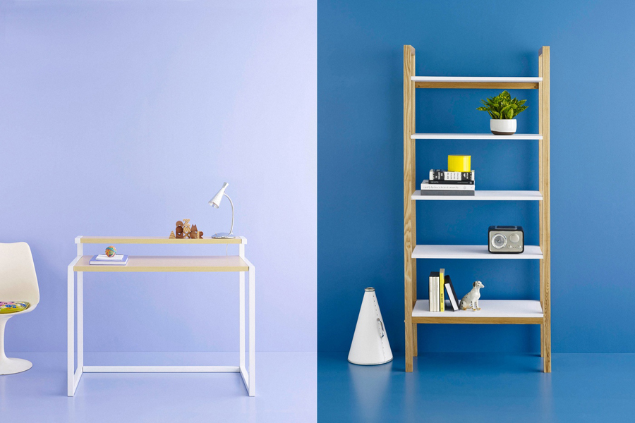
Quality, design and the modernistic principles that underpin the range are well-served by Collins’ approach to photography and forms the most compelling visual and communicative component within Room Essential’s overall brand identity strategy. The colour, composition, modest dressing and straightforward shooting style balances utility with an aesthetic that functions to draw out the form, colour, material and surface texture of the products and enhance their period qualities. The single colour choices feels both contemporary and retrospective, a testament to the cyclical nature of design, that mixes a post-war vibrancy with a current favour for pastels.
The images are aspirational without being inaccessible, and while there is an element of ornament in the detailing, the images avoid an excess that might undermine the modernistic foundations of the range.
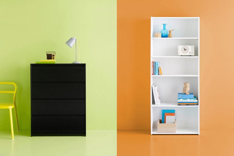
The photography works well as large panels across the packaging and as small tiles within the context of Pinterest, linking digital world and physical items. These are individually distinctive but collectively cohesive, likely to encourage multiple pins, pinning in groups and the creation of boards of the same brand. With the advent of Pinterest’s reorder functionality, the platform is leveraged as a smart tool for inspiration and experimentation. While being a popular and growing network with which to reach a Millennial demographic, Pinterest’s egalitarian nature also feels like a comfortable fit for modernistic furniture.

A bold sans-serif logotype built from Klim’s Founders Grotesk, lighter sans-serif copy, grid-based layouts, plenty of white space, black ink and full colour photography, drawing on the aesthetic and functionality of post-war catalogues, as well as a contrast of colour, proportion, detail and reduction, takes advantage of the continued and current favour for the modernistic.
Pinterest and modernistic furniture feel complimentary. Both are founded on principles of accessibility and functionality, both with social ideologies and both having contributed to the improvement of societies’ overall design intelligence. There are of course moments of opposition, Pinterest can be superficial, heavy on the stylistic and ornamental, and modernistic furniture can often be perceived as impersonal and absent character, however, the images find a comfortable meeting point and avoid contradiction.
Collins’ describes itself as a consultancy for the Convergence Era, and this is very much reflected in their approach to Room Essentials, leading with the most compelling and communicative tool, informed by digital trends yet linked to physical experience without undermining the brand’s modernistic ideals.
Design: Collins. Opinion: Richard Baird. Fonts Used: Founders Grotesk.
