Designed in New York
Goofy, playful and knowingly a bit silly
Design systems are often spoken about in terms of those moments of ‘surprise and delight’, but often, there’s little either surprising or delightful to be found. Blurr Bureau’s new brand identity for Yes! Apples, however, is so brimming with surprise and delight that those moments become the entire timeframe here: the Easter Eggs absolutely abound here, for the brand design...

Tigre by Triboro
LES Tigre – not to be confused with seminal electroclash/riot grrrl combo Le Tigre – is a cocktail lounge in Manhattan’s Lower East Side area, which opened at the end of last year and apparently combines ‘sophistication and refinement in drink, sound and ambiance’ with an entrance that boasts ‘an original graffiti-worn door’. So far, so hip, amirite? It all...
Lunge by Porto Rocha
With trend-forecasting agency WGSN identifying ‘multi-species homes’ as one of the ‘top trends of 2024’, the global market for pet products is project to hit £28.75 billion by 2025 – and this excludes the food category. Even furniture design is increasingly influenced by the penchants of our four-legged friends. Catering to this pet-first design movement, Liberty London, Prada, Louis Vuitton...

Kindred Black by Ania et Lucie
There has always been something borderline magical about the fields of beauty, makeup and skincare – a hint of esoteric or mystical knowledge. When it comes to visual storytelling, this association offers plenty of rich inspiration, along with established style signifiers that are easy to follow. Nods to old-school apothecaries abound in the likes of Typology Paris and Le Labo,...
PAC NYC by Porto Rocha
There have been some brilliant logo designs inspired by the very buildings they represent. The Centre Pompidou, for instance, bears a powerfully stark logo that’s been largely unchanged since it was first created in the 1970s: six black stripes crossed by two zigzags representing the site’s ‘caterpillar’ escalator, one of the most famous parts of Renzo Piano and Richard Rogers’...
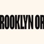
Brooklyn Org by Mother and Mother Design
Mother New York and Mother Design (Fhirst, Brooklyn Org, Peerspace) have overseen the rebirth of Brooklyn Community Foundation as the commandingly named Brooklyn Org. The sea change arose from a desire to distance the organisation from ‘notions of traditional philanthropy, seen largely today as elitist, dysfunctional, and detached’. If that sounds like a solution to a problem that shouldn’t exist...
Quality Experience (QX) by &Walsh
Even the most fleeting scan through &Walsh’s portfolio makes it wholly unsurprising how Jessica Walsh’s semi-eponymous studio has achieved such a brilliant reputation. While Walsh herself has garnered countless design press column inches – as partner at Sagmeister & Walsh; one half of the 40 Days of Dating project; a creative conference regular; and an advocate for women in design...
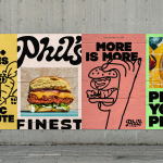
Phil’s Finest by Gander
It’s a moot point now that the last few years have seen an explosion in all things vegan and ‘plant-based’ (a term arguably used lightly, when you consider the ingredients in many no-meat, no-dairy, no-animal product alternatives). There’s vegan cheese that actually tastes nice, there’s mushroom and hemp ‘magic mince’, even vegan tuna. I’m writing this while eating a vegan...

Graza by Gander
Using olive oil has never been so squ-easy. That’s how Andrew Benin, founder of Graza, would like us to feel. As Kelsey McClellan reports for the Wall Street Journal, Benin knew the last thing the world needed was another snobby olive oil and the key goal was finding ‘the sweet spot between flavor and affordability’. This product does feel different...

Eadem by Lotta Nieminen
The skincare industry is a varied visual landscape. At one end of the spectrum, brands like Glossier and Soft Services (reviewed July 2022) have found balance in softness and understated minimalism. At the other Dr.Jart+ (reviewed Jan. 2018) and Malin+Goetz bring pharmacy-chic with functional, type-led packaging. And then we have our classic, heritage brands – like Kiehl’s and Elizabeth Arden – which...
Jupiter by Triboro
Triboro worked on its first restaurant branding project over a decade ago, at a time when the folklore was that if you were a restaurant serving traditional food the visual language should evoke the region and time period of the cuisine. This was intuitive and, as Triboro founder David Heasty recounts, led to some well-crafted and beautiful results but often leaned...
Skateyogi by Order
The skateboarding learning curve is really defined by the individual. There are lessons (passed down or shared online), but much of it is practice (and patience). Further, and perhaps more importantly, skateboarding is expressive, it’s fused with personal style. Timeless tricks are given an individual twist that keep it evolving and competitive. Iconic skateboarding brands have grown out of the...