Kate Wallich by Shore
Opinion by Richard Baird Posted 13 April 2015

Kate Wallich is an American award-winning choreographer, dancer and director whose work has been commissioned and presented nationally and internationally by arts organisations such as On The Boards, The Frye Art Museum and Northwest Dance Project, amongst many others. Alongside Lavinia Vago, Kate Wallich is also founder of Seattle based contemporary dance company The YC, and teaches her own brand of movement classes from her studio in Seattle, Washington.
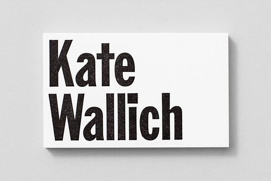
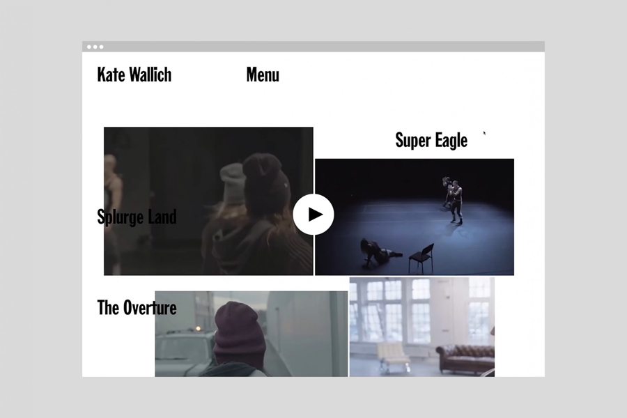
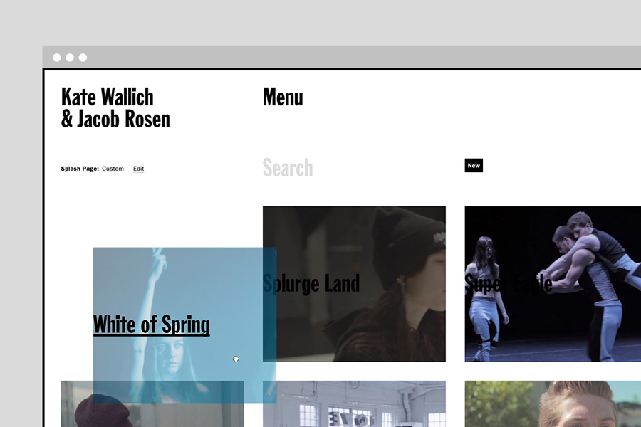
Kate’s personal brand identity, developed by graphic design studio Shore, and which included business cards and website, utilises bold custom typography as a way to explore the physicality of dance, establish a personal and distinctive tone of voice, and capture some of the unique aesthetic qualities that permeate all of Kate’s activities and ventures.
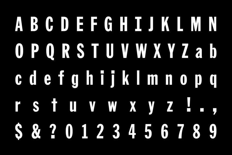
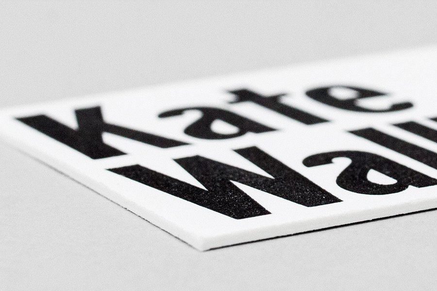
Based upon the heavy characters of Franklin Gothic Extra Condensed, Kate Wallich’s visual identity is unmistakably rooted in the physical, confident and robust. Modifications such as oversized tittles and punctuation, slabs across the ‘I’, reductive ’t’, and a distinctive ‘a’ further these themes whilst also introducing moments of character and individuality. Although many of these are subtle amendments to an iconic American typeface, the titles and punctuation are evident without undermining the original typeface.
The bold, condensed, sans-serif letterforms acknowledge a little of the conventions of theatre signage and communication without being tired, and are simple enough to unite a variety of business ventures, while weight and customisation neatly draw together both the expressive and personal nature of the brief.
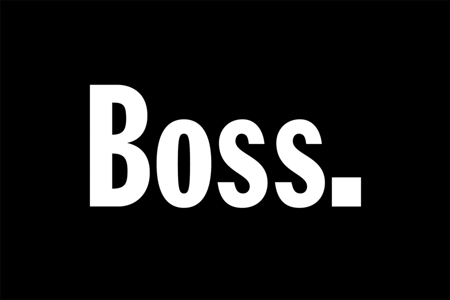
The custom detail and impact of type is effectively enhanced using a black and white colour palette, its oversized application online and across business cards and complimented by a weighty board. Snappy transitions, menu animation, auto-play video and the layout of type and image across Kate’s website add a dynamic contrast to what is a robust and structured visual identity treatment. More from Shore on BP&O.
Design: Shore. Opinion: Richard Baird. Fonts In Use: Franklin Gothic
