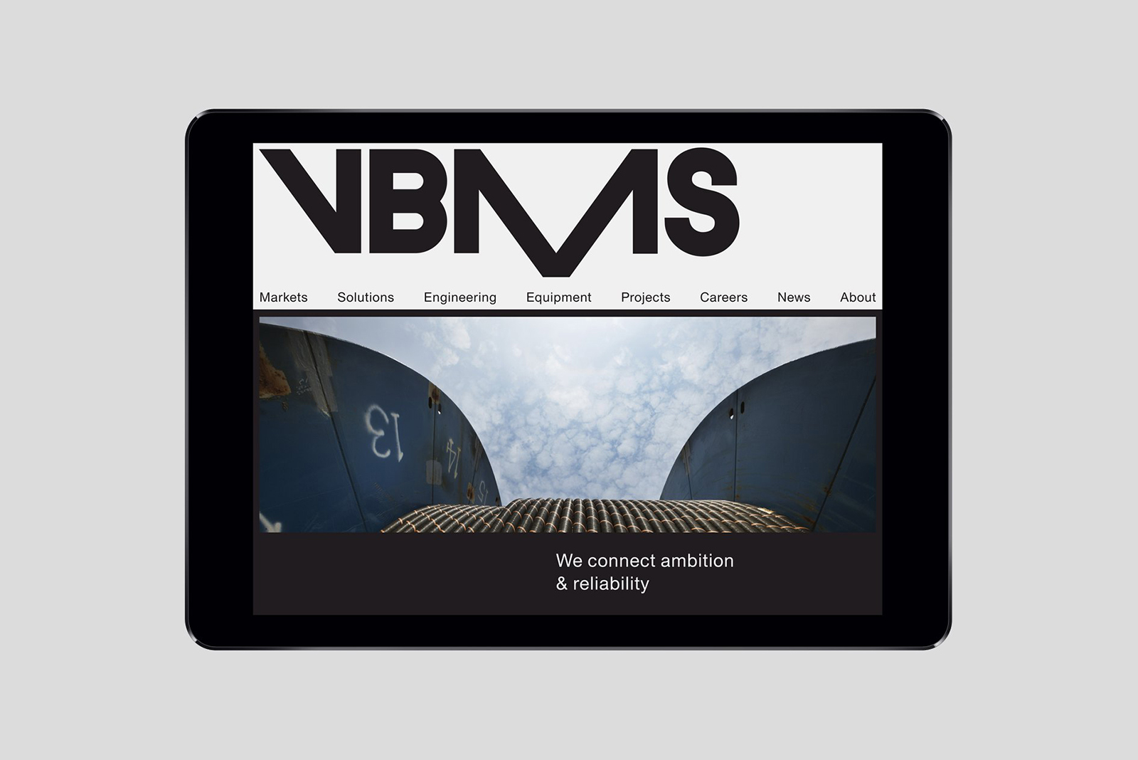
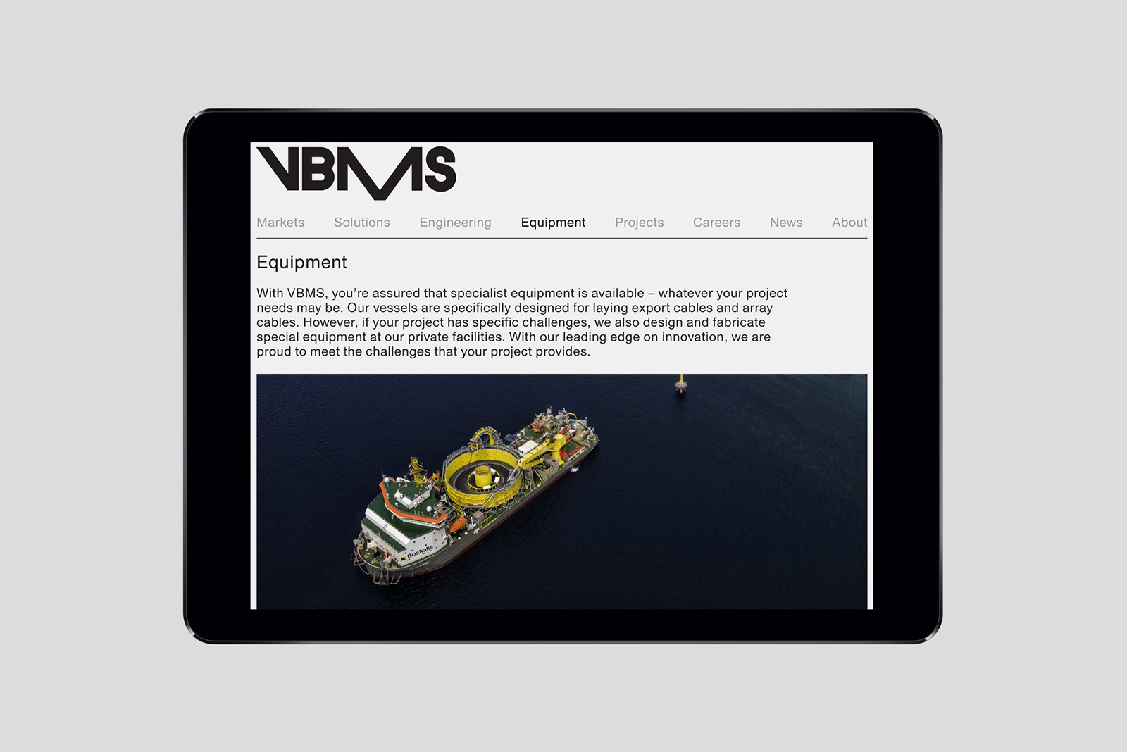
VBMS by Studio Dumbar
Opinion by Richard Baird Posted 4 May 2015
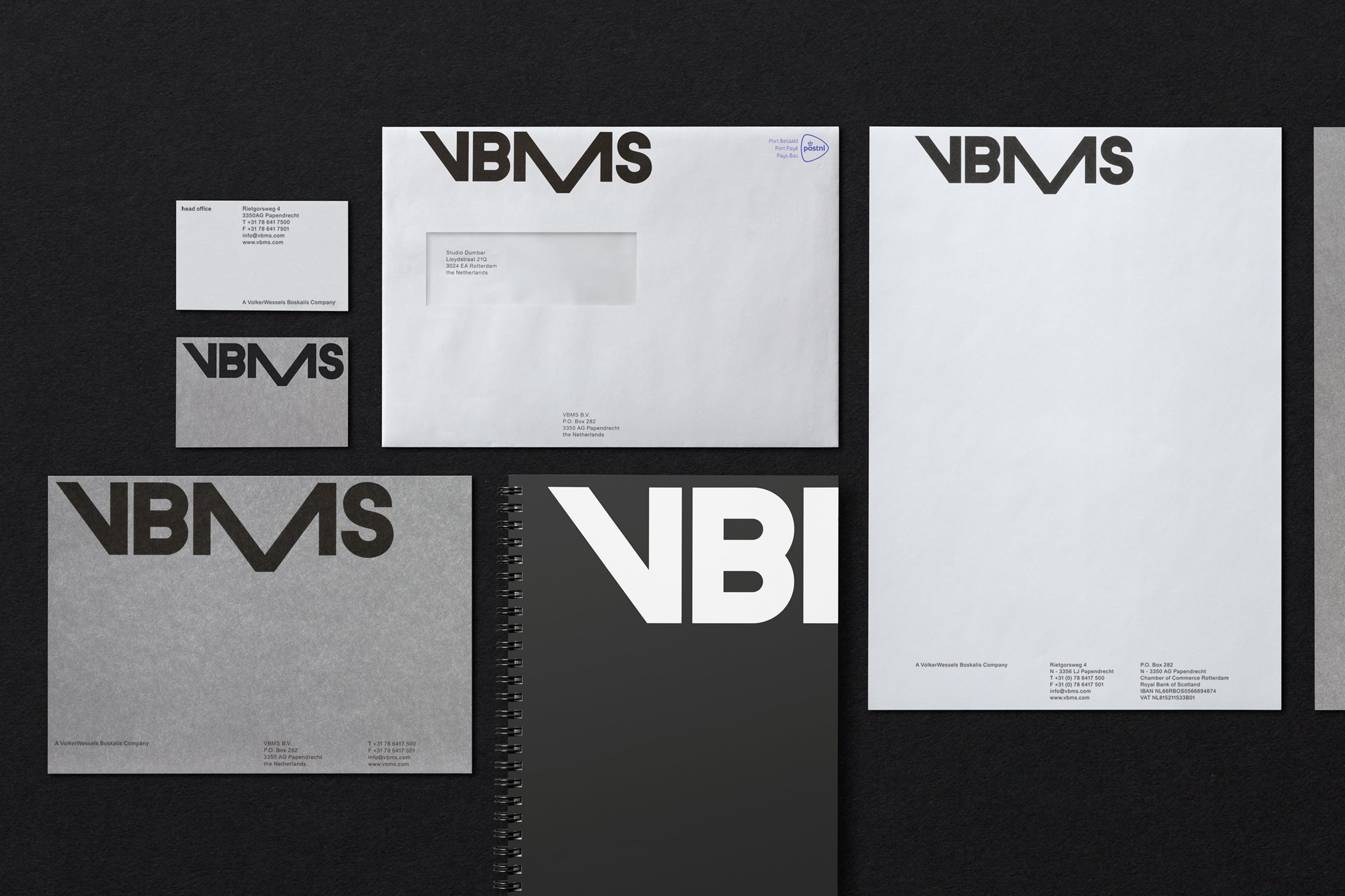
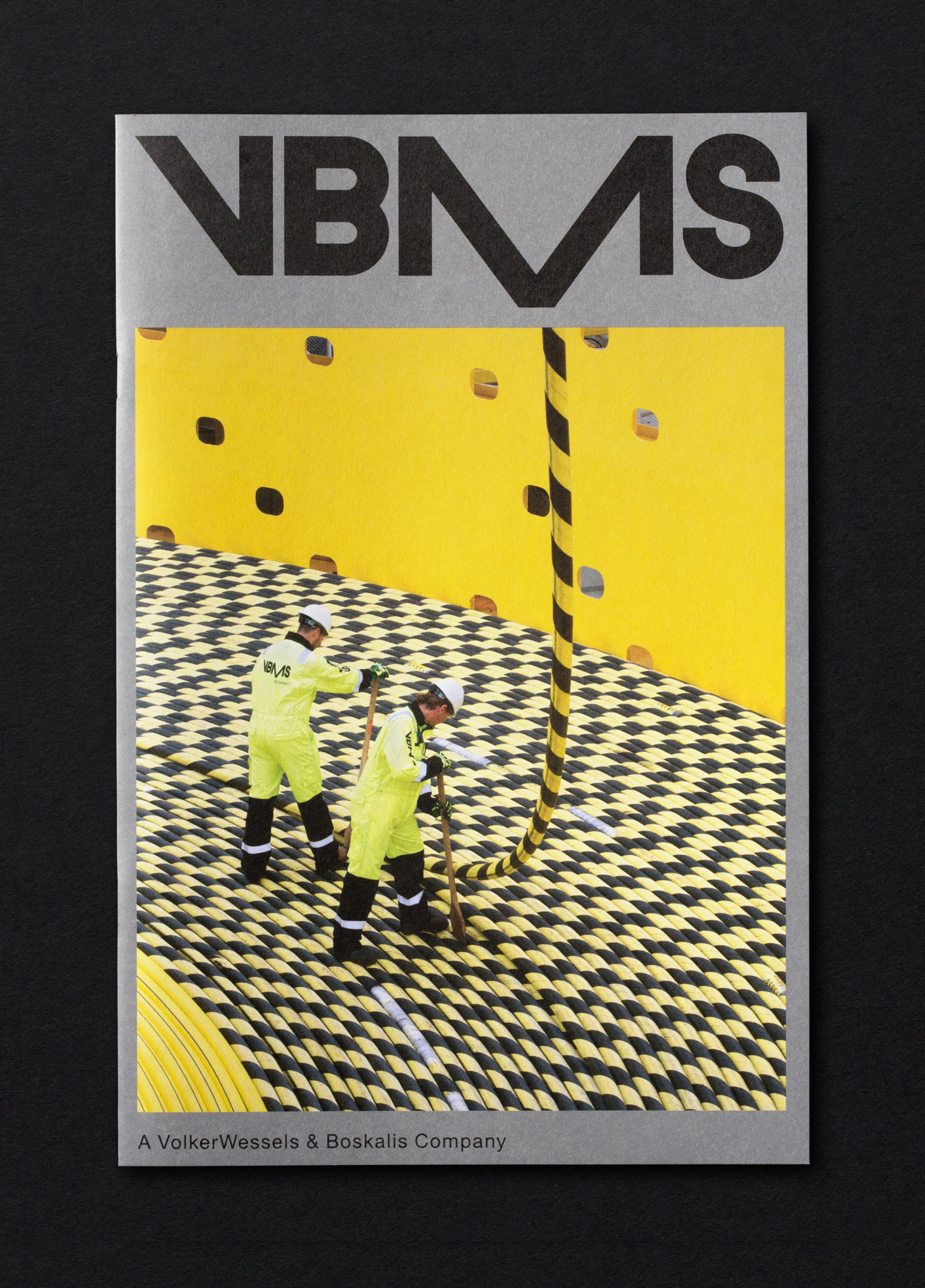
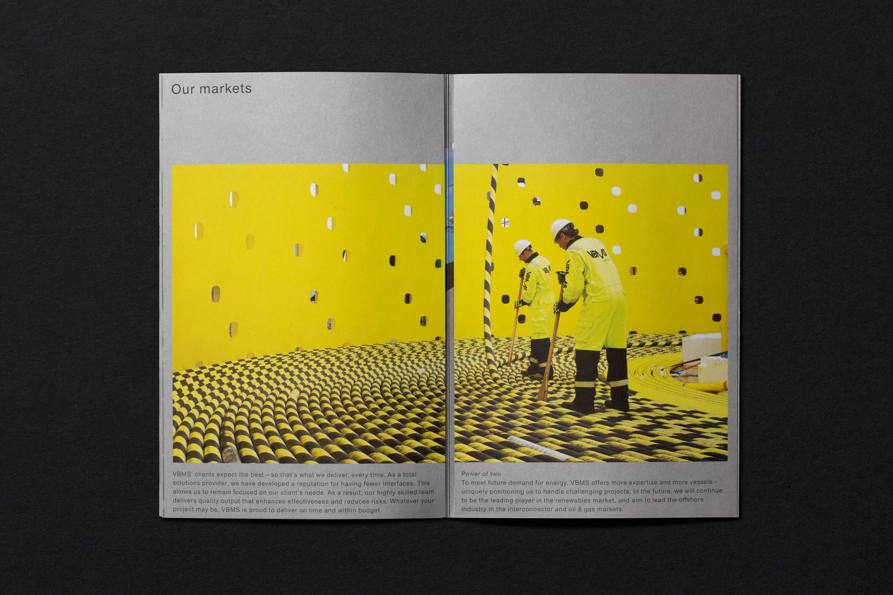
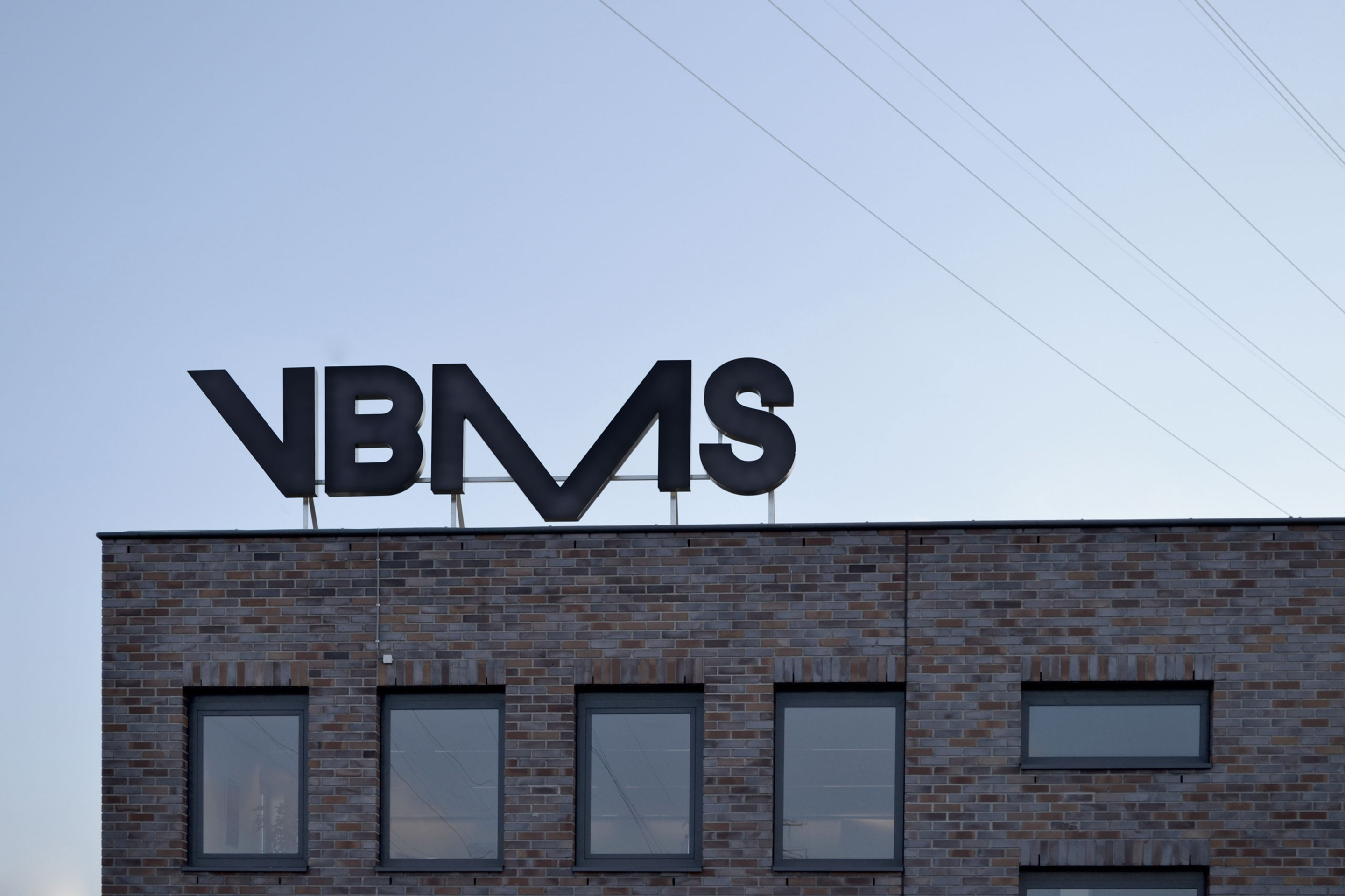
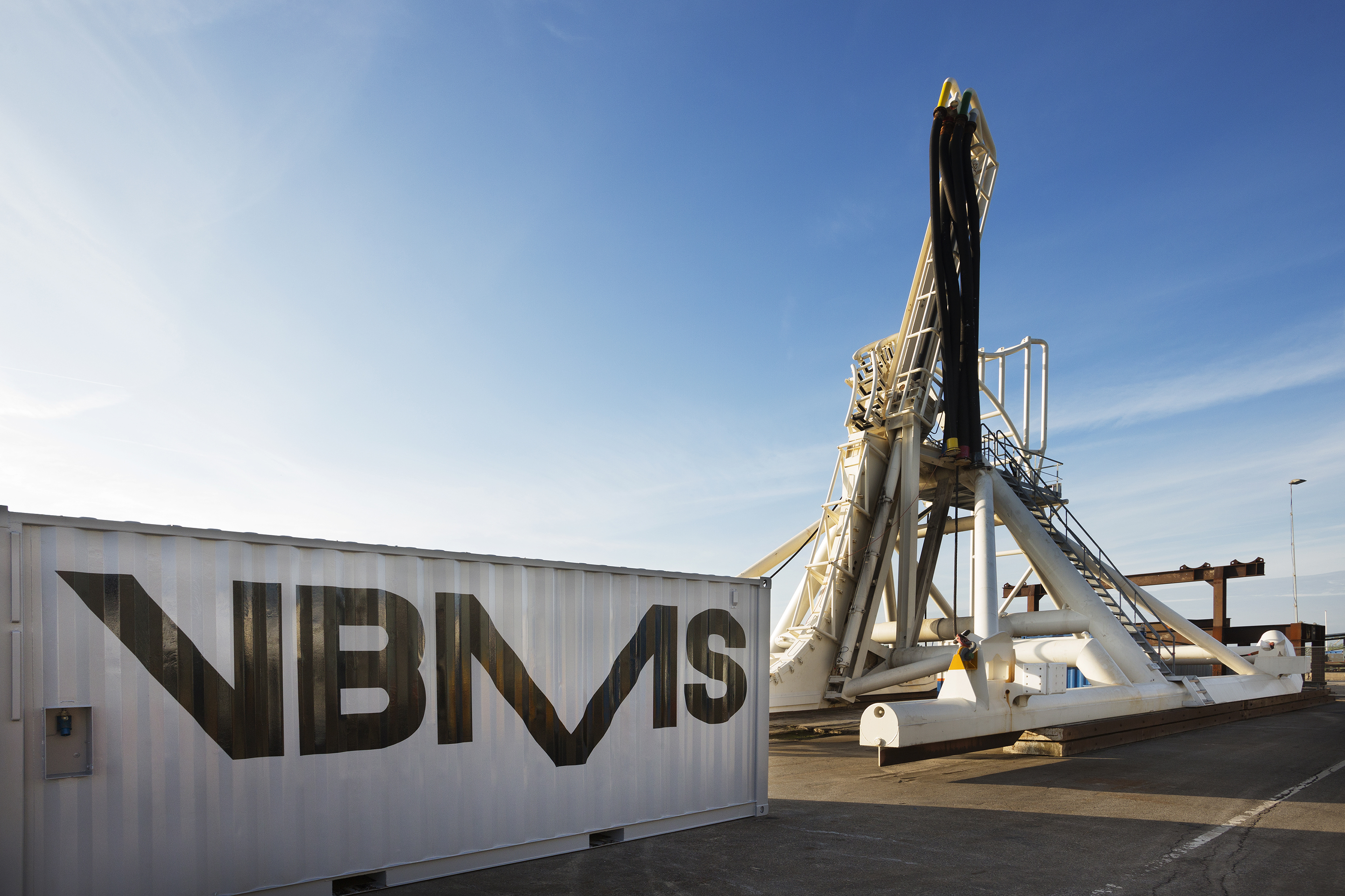
Visser & Smith Marine Contracting is the market leader for subsea power cable installation in Europe. It provides and lays grid-to-grid connections for offshore wind farms and similar facilities. Following investment from and partnership with dredging and marine experts Boskalis, Studio Dumbar worked with VMSC, now named VBMS (VolkerWessels Boskalis Marine Solutions) to provide strategy, brand identity and creative direction that would help launch this new partnership onto the international market place. This included brochures, business cards, stationery and signage.
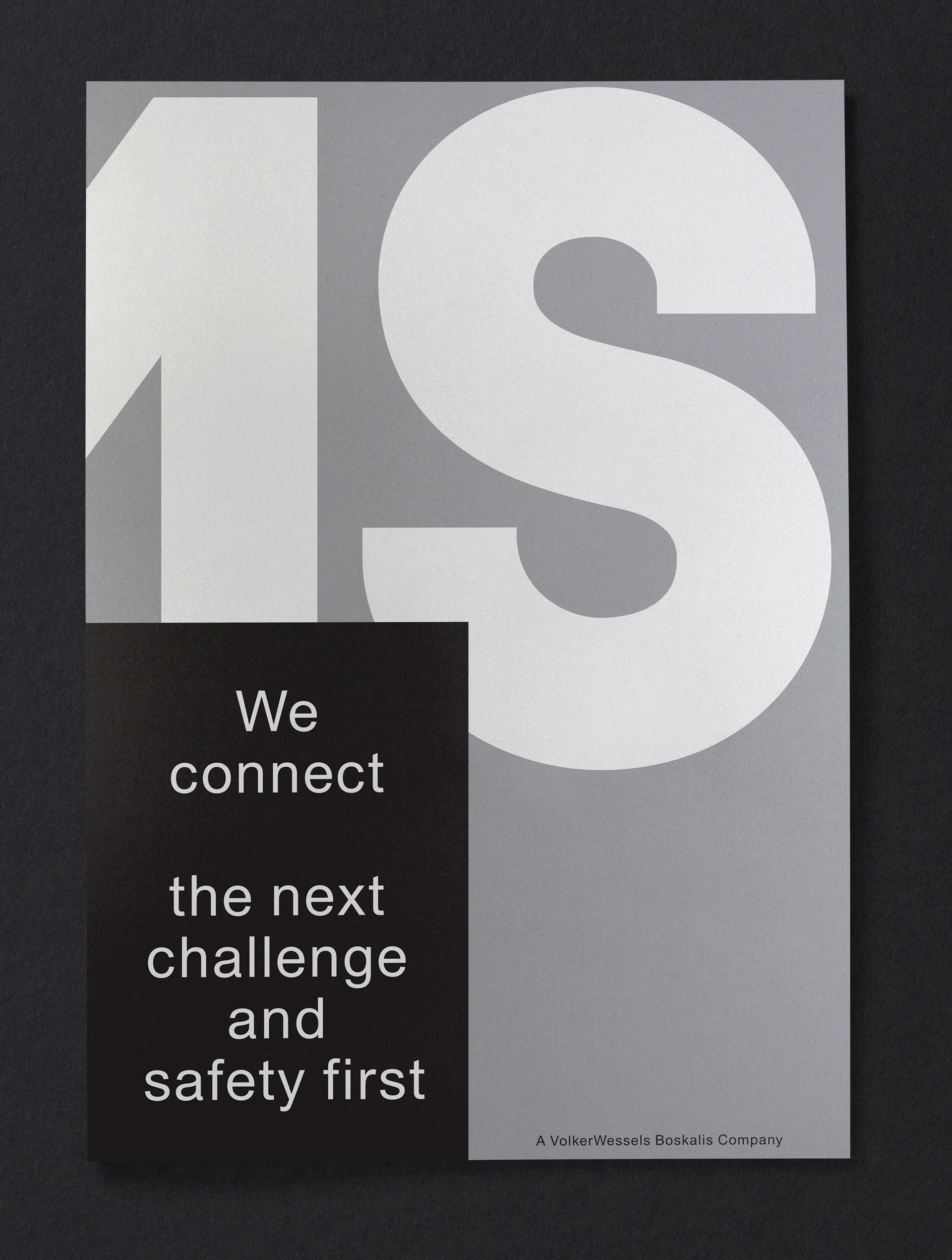
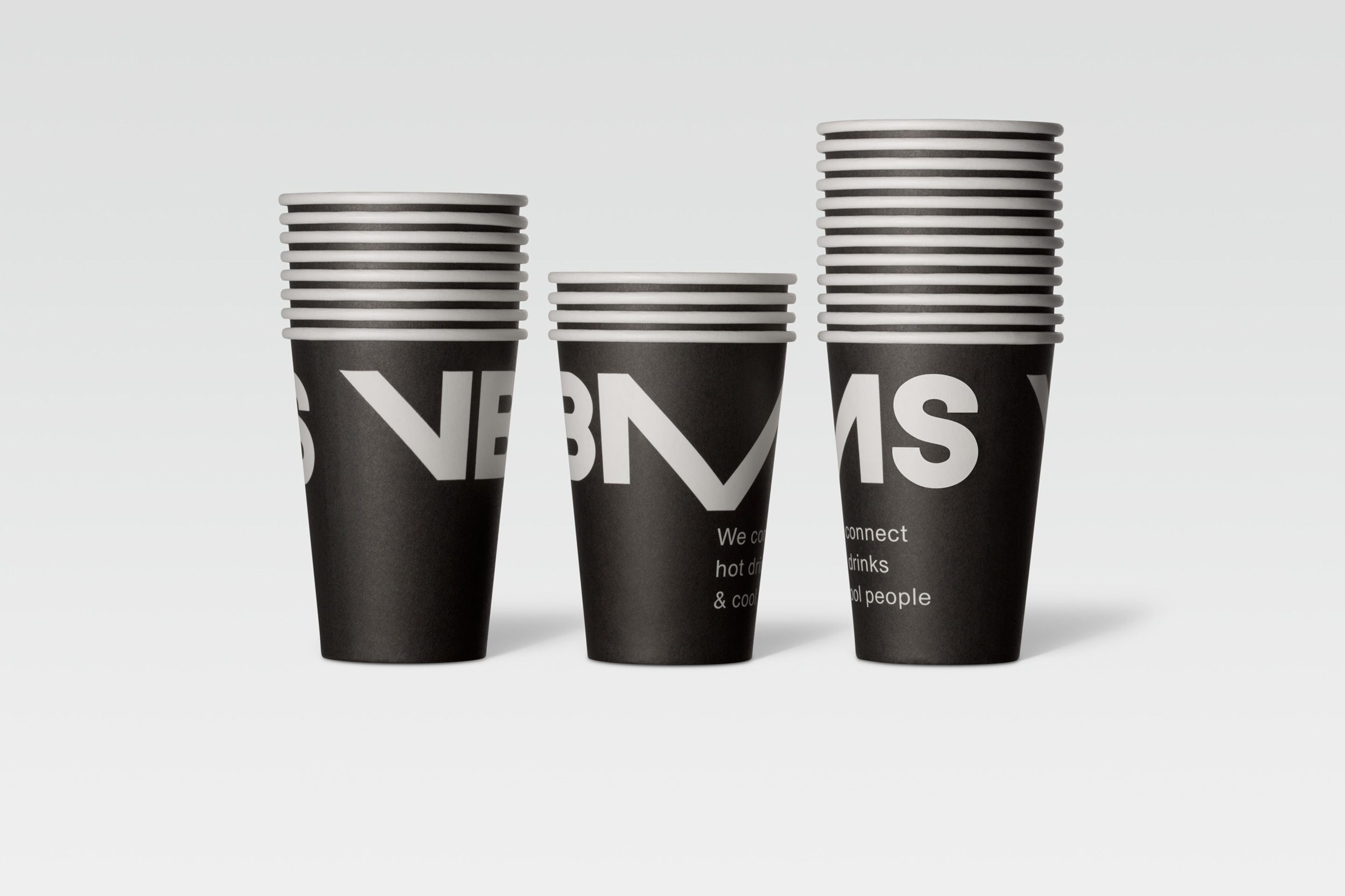
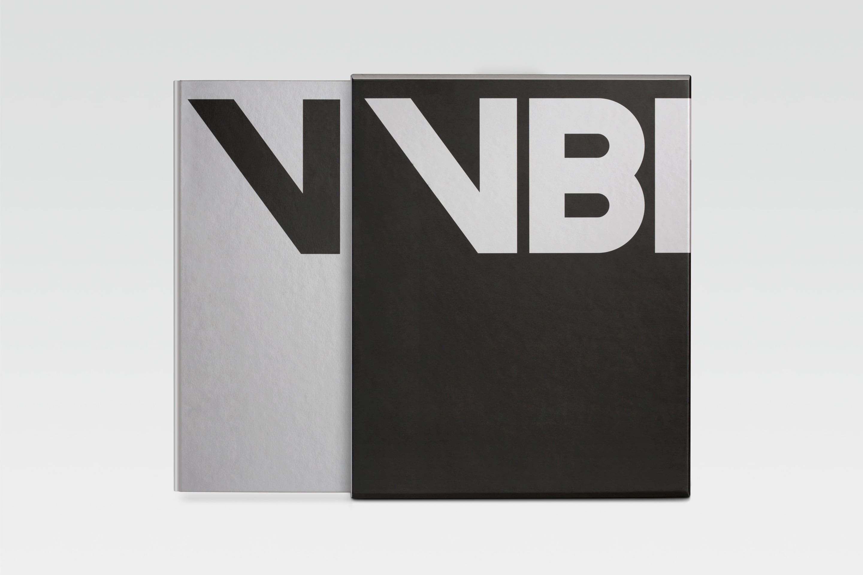
Based around a monolinear, uppercase, sans-serif logotype built from simple geometric shapes, and a distinctive M that dips below the baseline—founded on the theme of subsea connectivity—its oversized and cropped use in print, and a palette of a steely silver, white and black ink, Studio Dumbar’s brand identity for VBMS secures a bold, industrious and robust aesthetic.
Although reductive in form, slightly abstract in its ideation and perhaps a little awkward, the logotype, and its application in print, appears distinctive without ornament and effectively draws out an element of continuity through repetitive shapes and a single line weight that ties in well with the theme of cables and connectivity.

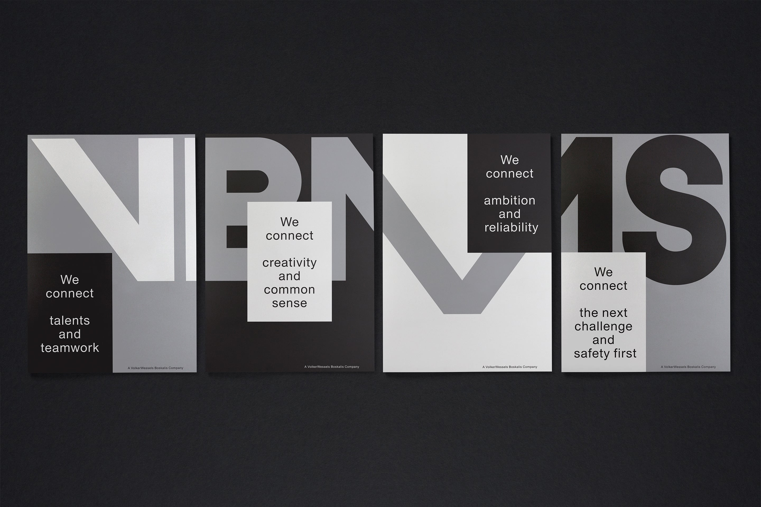
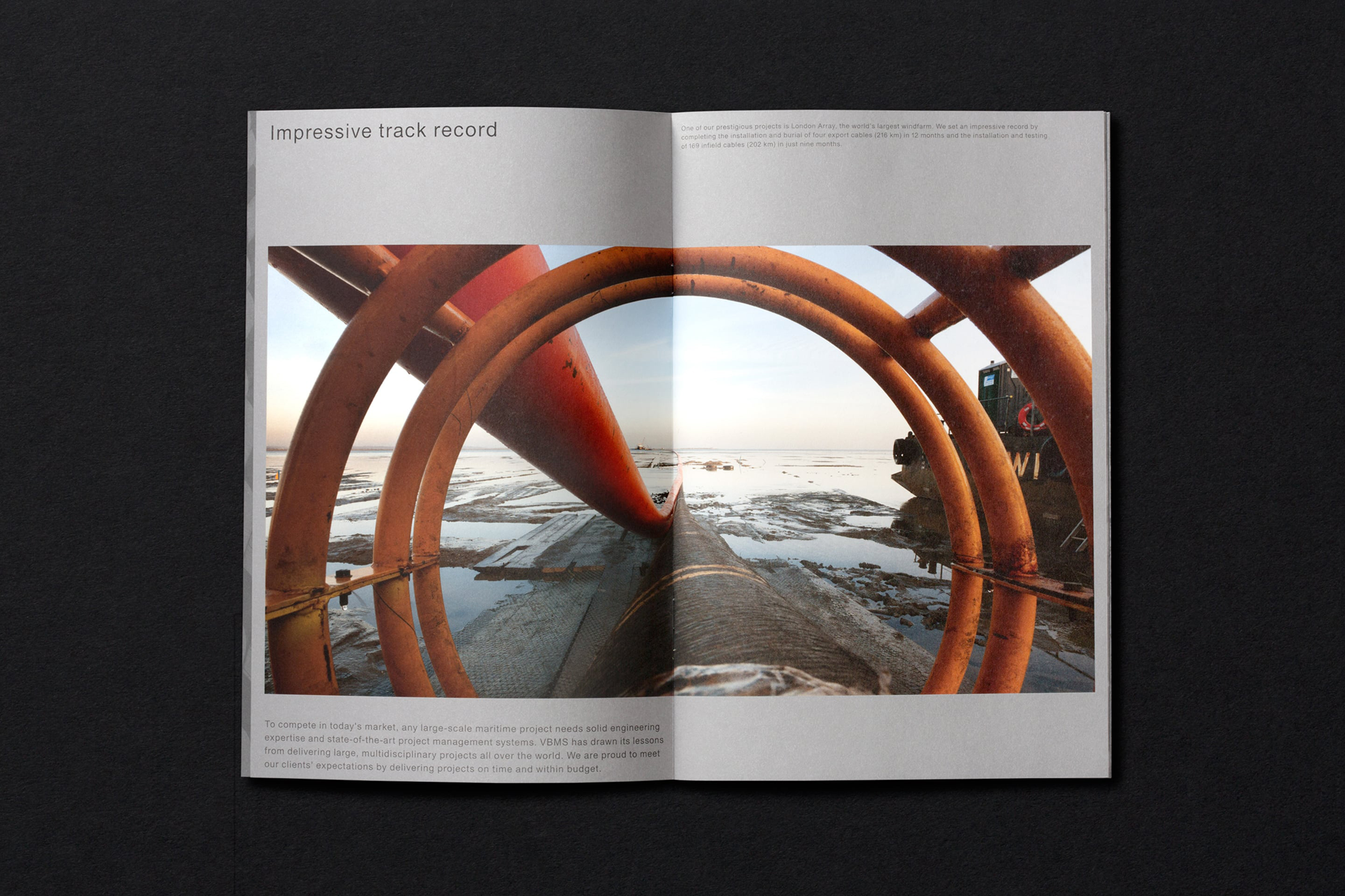
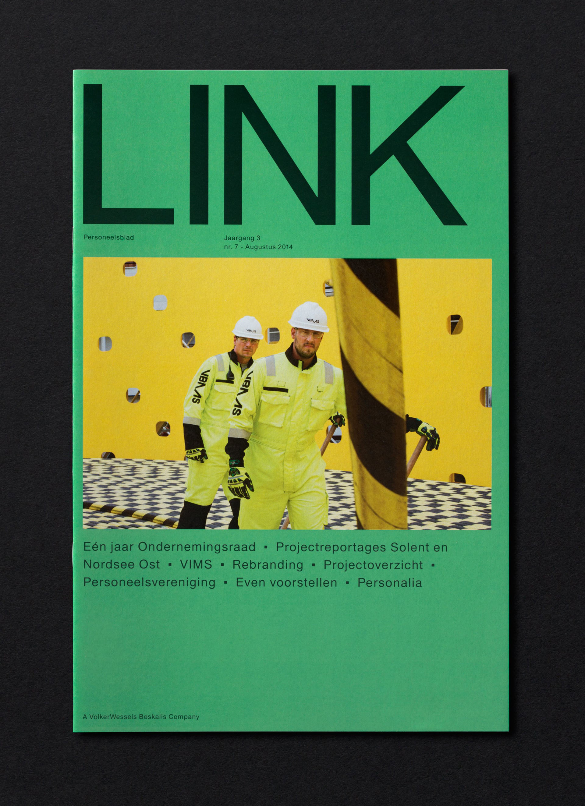
Uncoated paper choices, print finish and binding provide a layer of detail to the impact but economy of typographical reduction and consistency, and panels of grey and black. Photography brings colour and life, turning the functional qualities of subsea cables into a striking aesthetic element in print. These images also work well to introduce moments of scale that compliment the oversized typographical direction, a service led component through the workers, and act as both visual interruption and as a compelling contextual asset. More from Studio Dumbar on BP&O.
Design: Studio Dumbar. Opinion: Richard Baird
