Panini Internazionale by Stockholm Design Lab
Opinion by Richard Baird Posted 12 May 2015

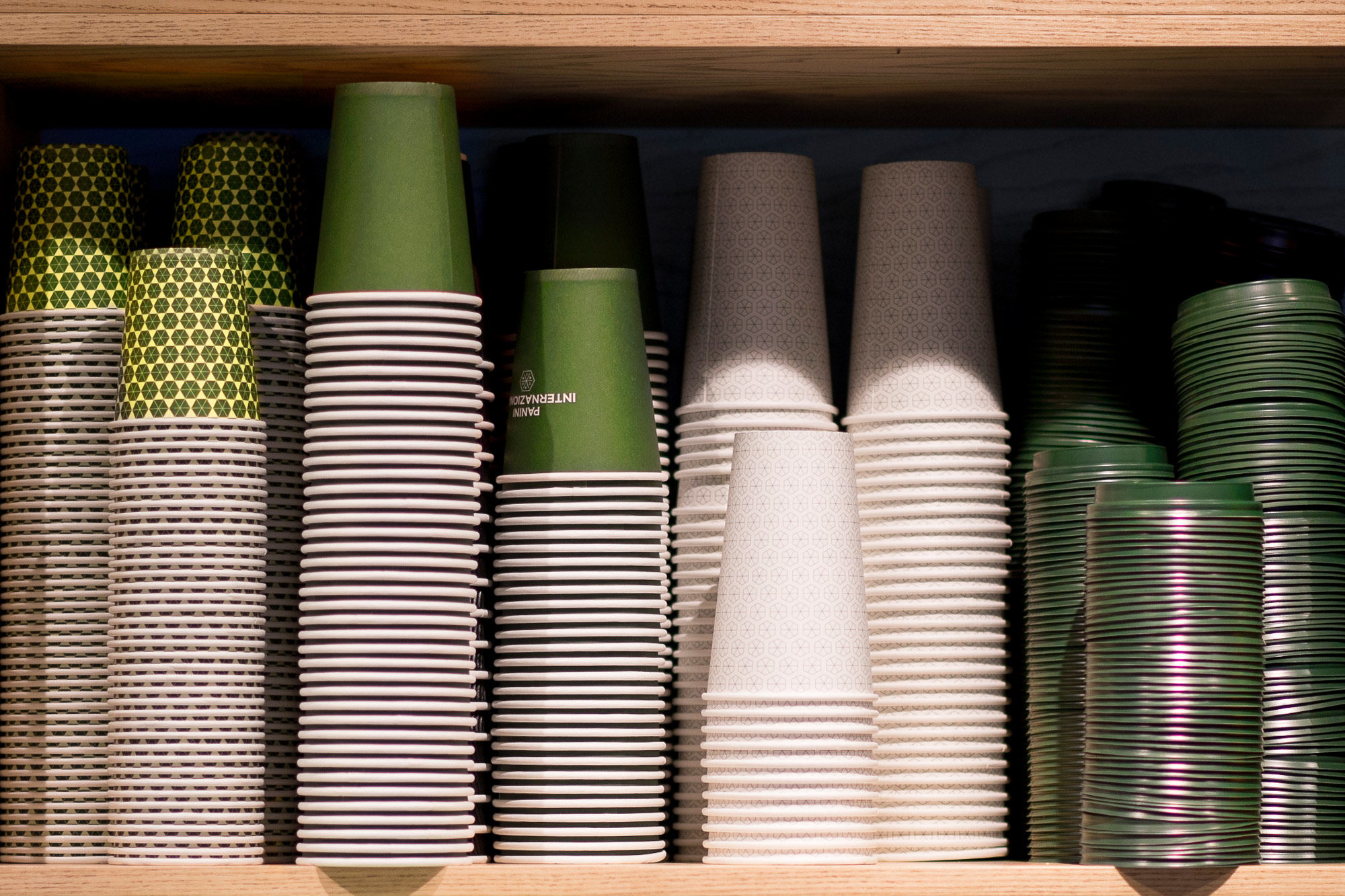
Panini Internazionale began life as a small delicatessen in 1990 and since then has grown to become a chain of fast food stores with 19 locations in and around the city of Stockholm, Sweden. Panini Internazionale delivers good quality healthy food quickly and conveniently, is a family run business, and features a name and brand identity treatment developed by Stockholm Design Lab. This included logo, logotype and patterns across menus, coffee cups, signage and packaging.

Stockholm Design Lab’s work for Panini Internazionale, designed in 2012 but recently added to their portfolio, confidently mixes a contemporary reduction, leverages the consistency, economy and flexibility of modularity, the simplicity yet texture of geometric patterns, with small typographic flourishes, an earthy colour palette and the organic detail and colour diversity of food photography.

A contrast of space and visual texture, typographic reduction and ornament, fine lines and heavy fills, panels of ink and unbleached boards, geometric patterns alongside bright natural food photography, work well to emphasise and make the most of a few assets, break up familiar and repetitive shapes, and waves of green.
Together, these secure a visual impact and address communicative intention, appearing as an understandable and distinctive distillation of convenience and natural quality through simple forms, colour choice and image.
A colour palette of deep green, pastel green and a more vibrant leaf green, does a great job of leveraging the colours associated with healthy living and natural foods but also appears sophisticated and perhaps less common in tone and combination. These, as flat panels of colour in print and online, pull out the detail and quality of food imagery and compliment the materials of Panini Internazionale’s interior design. More from Stockholm Design Lab on BP&O.
Design: Stockholm Design Lab. Opinion: Richard Baird.