Ulju Mountain Film Festival by Studio fnt
Opinion by Richard Baird Posted 21 May 2015

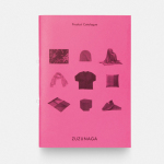
UMFF is a film festival that takes place at the Ulju Arts Centre located in the South Korean city of Ulsan, and draws its name from the Ulju mountains to the west. Studio fnt worked with the film festival to develop a new visual identity treatment, which went on to include logotype, iconography, business cards, stationery, t-shirt design and signage, based around a contemporary interpretation of a traditional Korean image.
The logotype draws its inspiration from Irworobongdo, a landscape painting of a sun, moon, five peaks, two streams and conifers. This image is believed to be a symbolic representation of balance within the universe that dates back to the Korean Joseon Dynasty. It is has been redrawn and reinterpreted many times, but typically illustrated across six panels, and was often seen behind the throne.
Studio fnt continue this tradition with a contemporary typographic reimagining of Irworobongdo. The logotype’s monolinear and geometric qualities, balance of positive and negative space–perhaps drawing on the ying and yang of sun and moon in the Irworobongdo–and five arches is a busy but legible treatment. It delivers a good balance of concept, cultural significance, regional reference to the Yeongnam Alps that run through Ulsan, and secures an aesthetic distinction.

Although the UMFF website build offers little in the way of insight into the festival for those who do not speak Korean, Studio fnt’s reference suggests that the film festival’s programme is one built on a regional, historic and cultural foundation whilst its aesthetic reflects a contemporary perspective. This presumption is supported by a set of monolinear pictograms that share the qualities of the logotype, and make references to environment and history. The signage hints at how these pictograms begin to play out as a modular system within the context of the festival and are complimented by monolinear hangul characters. More from Studio font on BP&O.
Design: Studio fnt. Opinion: Richard Baird.


Studio fnt expand on their work for Ulju Mountain Film Festival with two pre-festival posters. In contrast to the geometric logotype and reductive iconography, the posters add visual and communicative detail, and a lot more character to the identity, yet remain rooted in the image of the Irworobongdo.

Studio fnt continue to build on their brand identity design work for Ulju Mountain Film Festival, created in 2015, with two more pre-festival posters for 2016. Much like last year, Studio fnt play with contrast, juxtaposing geometric logotype and reductive iconography alongside the paint and collage of posters. These build out the character of the event but remain grounded in the image of the Irworobongdo.